The contents page targets young white males aged 17-30 interested in rock, indie, and alternative music. It uses a bold red masthead, bulky sans-serif fonts, and angled photos of casually dressed people to appeal to stereotypical male interests. Column sizes and placement of the editorial letter and main image follow design principles to draw the eye of the target audience. Informal language, article titles of popular bands, and a music festival advertisement further aim to engage this demographic.
The Indian economy is classified into different sectors to simplify the analysis and understanding of economic activities. For Class 10, it's essential to grasp the sectors of the Indian economy, understand their characteristics, and recognize their importance. This guide will provide detailed notes on the Sectors of the Indian Economy Class 10, using specific long-tail keywords to enhance comprehension.
For more information, visit-www.vavaclasses.com
How to Create Map Views in the Odoo 17 ERPCeline George
The map views are useful for providing a geographical representation of data. They allow users to visualize and analyze the data in a more intuitive manner.
Model Attribute Check Company Auto PropertyCeline George
In Odoo, the multi-company feature allows you to manage multiple companies within a single Odoo database instance. Each company can have its own configurations while still sharing common resources such as products, customers, and suppliers.
This is a presentation by Dada Robert in a Your Skill Boost masterclass organised by the Excellence Foundation for South Sudan (EFSS) on Saturday, the 25th and Sunday, the 26th of May 2024.
He discussed the concept of quality improvement, emphasizing its applicability to various aspects of life, including personal, project, and program improvements. He defined quality as doing the right thing at the right time in the right way to achieve the best possible results and discussed the concept of the "gap" between what we know and what we do, and how this gap represents the areas we need to improve. He explained the scientific approach to quality improvement, which involves systematic performance analysis, testing and learning, and implementing change ideas. He also highlighted the importance of client focus and a team approach to quality improvement.
2024.06.01 Introducing a competency framework for languag learning materials ...Sandy Millin
http://sandymillin.wordpress.com/iateflwebinar2024
Published classroom materials form the basis of syllabuses, drive teacher professional development, and have a potentially huge influence on learners, teachers and education systems. All teachers also create their own materials, whether a few sentences on a blackboard, a highly-structured fully-realised online course, or anything in between. Despite this, the knowledge and skills needed to create effective language learning materials are rarely part of teacher training, and are mostly learnt by trial and error.
Knowledge and skills frameworks, generally called competency frameworks, for ELT teachers, trainers and managers have existed for a few years now. However, until I created one for my MA dissertation, there wasn’t one drawing together what we need to know and do to be able to effectively produce language learning materials.
This webinar will introduce you to my framework, highlighting the key competencies I identified from my research. It will also show how anybody involved in language teaching (any language, not just English!), teacher training, managing schools or developing language learning materials can benefit from using the framework.
Ethnobotany and Ethnopharmacology:
Ethnobotany in herbal drug evaluation,
Impact of Ethnobotany in traditional medicine,
New development in herbals,
Bio-prospecting tools for drug discovery,
Role of Ethnopharmacology in drug evaluation,
Reverse Pharmacology.
Unit 8 - Information and Communication Technology (Paper I).pdfThiyagu K
This slides describes the basic concepts of ICT, basics of Email, Emerging Technology and Digital Initiatives in Education. This presentations aligns with the UGC Paper I syllabus.
Welcome to TechSoup New Member Orientation and Q&A (May 2024).pdfTechSoup
In this webinar you will learn how your organization can access TechSoup's wide variety of product discount and donation programs. From hardware to software, we'll give you a tour of the tools available to help your nonprofit with productivity, collaboration, financial management, donor tracking, security, and more.
Welcome to TechSoup New Member Orientation and Q&A (May 2024).pdf
1b
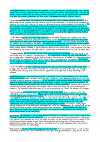
1. The target audience is the audience that a products, such as a magazine, is aimed towards. This includes
gender, age, ethnicity, social status and lifestyle. NME is targeted towards white males aged 17-30 who are
working class or middle class and have an interest in genres of music that are stereotypically more listened
to by men, such as rock, alternative and indie music. The genre is the style or type of a product.
The masthead is the title of the magazine and is conventionally used to create audience recognition. It is
placed again on the contents page and takes up quite a lot of the strapline. It is written in the same font and
colour as it is on the front cover as this is part of the house style and helps the audience to recognise it. The
bulky font and the red colour used both imply that the magazine is aimed towards males as a bold font is
conventionally more appealing to the stereotypical male and the colour red connotes anger and aggression,
which also links to the stereotypes of men. The masthead is part of the brand identity, which is the features
that are specific to that magazine, many of which often become icons for the magazine, meaning that they
will be associated with the magazine by the target audience.
The main heading is the title of the page, and here tells the reader that this is the contents page, which
follows convention as it makes it easier for the audience to read. It is written in the same bulky font as the
masthead which is again more appealing to their male target audience. This again follows the house style,
and makes it very noticeable for the reader. The house style of a magazine is the features that are included
in every edition of the magazine, and they help to increase audience recognition. The white font is used as it
is very striking against the black of the strapline and is part of the colour scheme for the magazine. The main
title is placed at the the top of the page, which is conventional as it will be the first thing that the reader sees.
The subheadings are the headings that but tall of the article titles into categories. Here they are all in the
same bulky white font, against a black background. This again helps to attract the male target audience. The
use of capital letters makes them all stand out and makes them seem very important. An exclamation mark is
also used after the subheading ‘LIVE!’, which makes it seem more exciting for the audience, and showing
that the magazine is targeted towards younger men as apposed to older men, as it seems less sophisticated
which will appear to the stereotypical young male.
The main subheading is the subheading that the editor feels is the most important subtitle on the page. is a
lot bigger than the other subheadings, making it one of the main focal points on the page, and making it
much more eye-catching. It also has a worn-out appearance, making it more visually appealing for the
audience.
An editorial letter is a letter written by the editor to the reader, and includes information about the content
inside the magazine. Here it is places below the main subheading, giving extra information about tours that
the target audience would be interested in. For this magazine, it has not been signed by the editor, making it
seem a bit less personal that it otherwise would have been. However, this demonstrates that although the
magazine is aimed towards younger men, it is not targeting children or teenagers. This text is also written in
a white font on a black background, which makes it easy to read, and follows the colour scheme of the
magazine. The large bold letter at the start of this text is conventional as it draws the attention of the reader.
The main image is the biggest and most noticeable image on the page. Here it is relevant to the main
subheading which it is situated above. Mise-en-scene is the elements that make up an image, including
costume, lighting, props, location and posture. The photo is of someone pointing to a coach. The coach has
connotations of tours and festivals, which links it to the editorial letter as it is about gigs and tours. The
connotations of something are the ideas or feelings implied. The subject herself is dressed in very casual
clothes, which again implies that the magazine is aimed towards younger males as this seems less
sophisticated. She is also smiling which will seem welcoming to the reader. The image is slightly angled,
making the page look busier and slightly less organised. It also has a border which is a white outline around
the image that helps to make it stand out against the dark background. A medium shot has been used,
which shows the subject from the waist and above. This allows the reader to clearly see the subject, but
also shows the coach in the background.
Article titles are the names of the articles inside the magazine, and are placed on the contents page so that
the reader knows where all of the articles are. They are placed under each of the subheadings, showing the
main articles in the magazine and giving the reader an insight into the types of content in the magazine. The
article titles contain the names of many bands as this is designed to attract fans of these artists, thus
appealing to the target audience. They are in a black font, which is visually appealing when placed next to
the back boxes behind the subheadings.
Page numbers are the number of the page that the article is on. They are positioned next to each of these
article titles, as this makes it easier for the reader to navigate through the magazine. They are in a red font,
2. which stands out next the the black and white texts used for the subheadings and article titles. This again fits
into the colour scheme of red, white and black, which appeals to a male audience as they connote anger and
aggression.
An advert is the promotion of a product, service or event. One is placed in the bottom right corner. This is
designed to attract the target audience as it is a deal for the magazine subscription. The colours used for this
advert include yellows, which do not fit in with the colour scheme for the magazine and so make the advert
more eye-catching.
The date is when that issue of a magazine was published. It is included on the contents page, which is
conventional as it helps the audience to know how recent the information in the magazine is.
The page has been split into columns which groups different features together. Here they are not equal. The
left hand column contains the ‘band index’, the middle column contains the main image, main subheading
and and anchorage text, and the right hand column contains the article titles and the advert. Making the
columns different sizes makes the page appear to be more busy and less organised, and this gives the
impression that the magazine contains a lot of content. It also again makes the magazine seem less
sophisticated, as it looks unorganised, and so this again shows that the magazine is aimed towards a
younger audience. The rule of thirds has also been applied here. This is where the page is split into thirds
both vertically and horizontally, and the main features on a page are placed where the lines intersect. Both
the editorial letter and the main image are positioned here, which will help to draw the attention of the target
audience.
The fonts are the style of the different texts used in the magazine. The fonts used for all of the heading,
subheadings and article titles are all sans serif, which makes them bolder and bulkier, which makes them
seem more masculine. This would attract the target audience as the magazine is aimed towards men. This
also makes the text stand out more.
The language used seems very informal, and is quite colloquial. For example, the word ‘eh’ makes it seem
more conversational, thus making it more friendly and seemingly personal. This again makes it seem less
sophisticated and so will help attract their younger target age range.