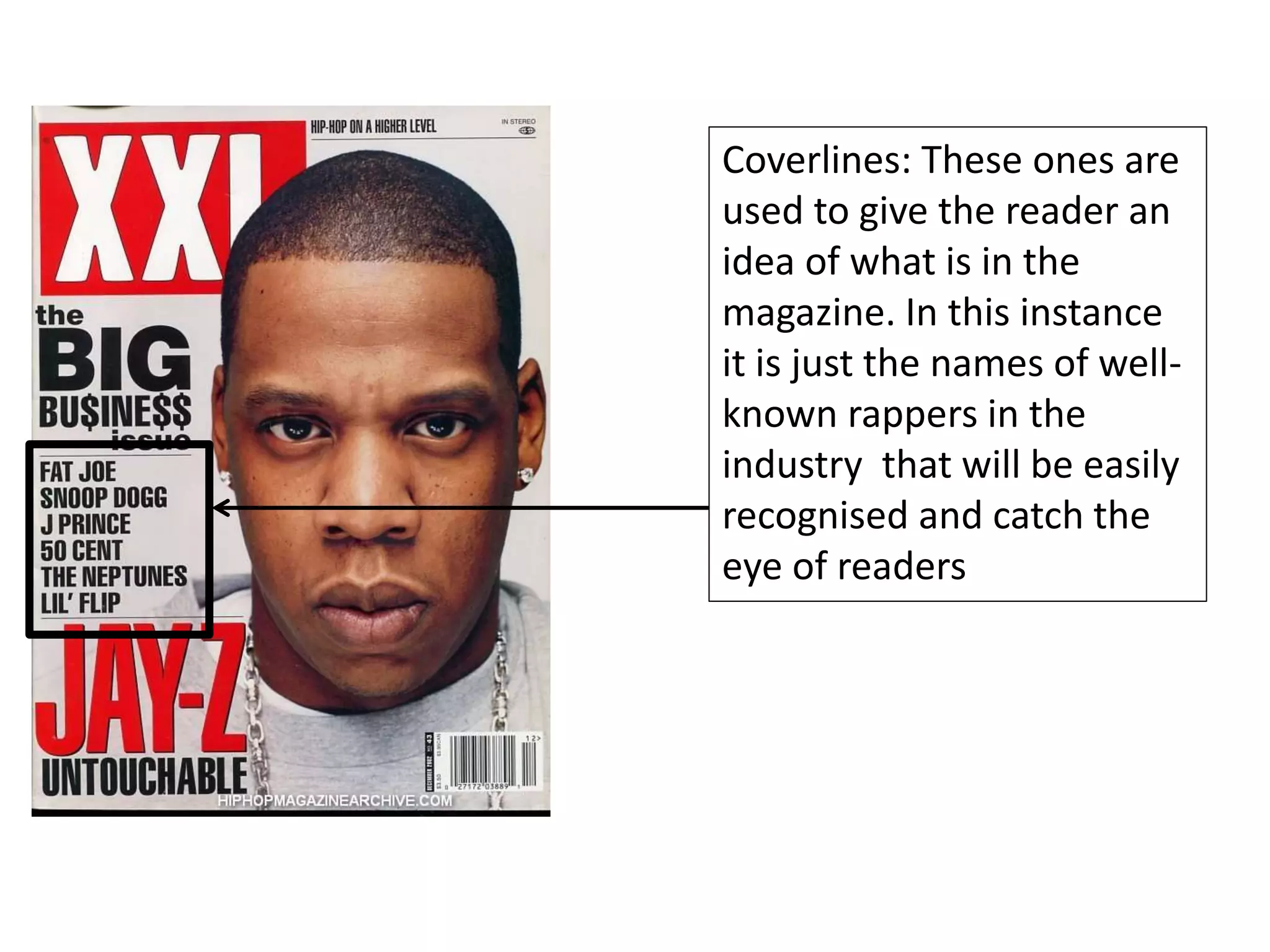
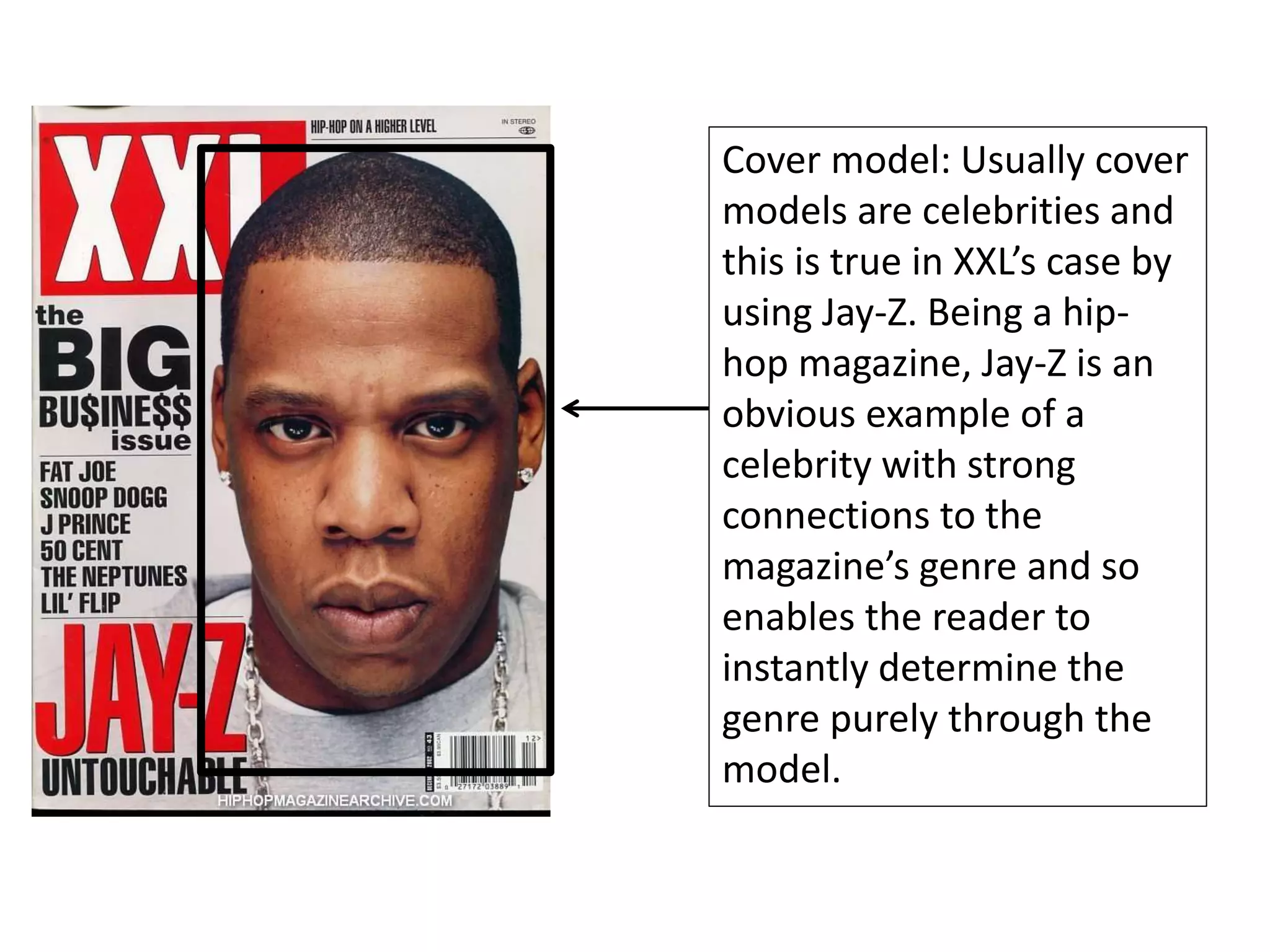
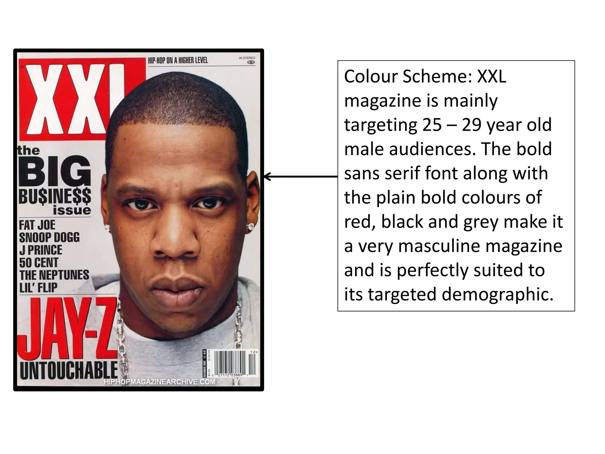
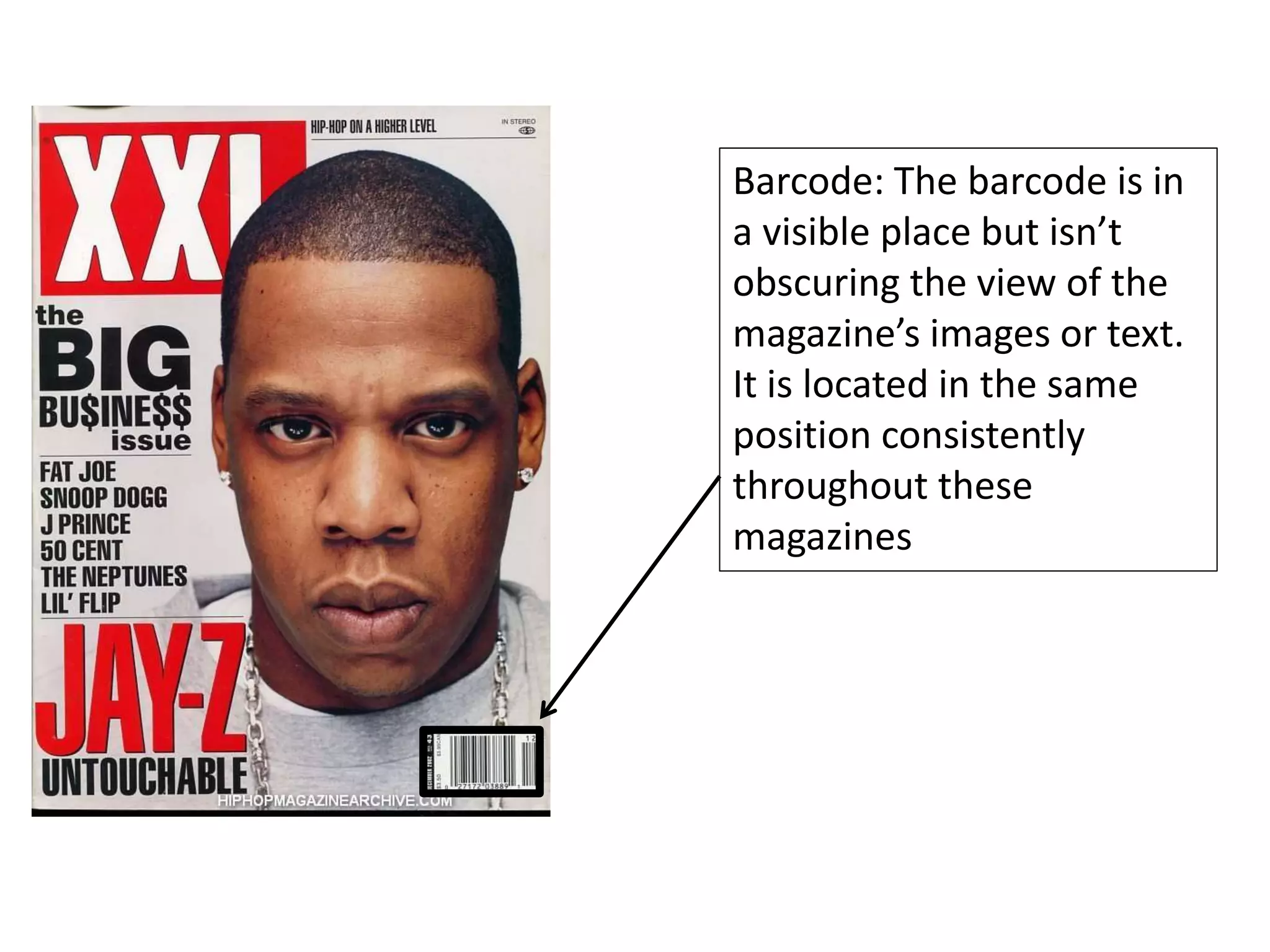
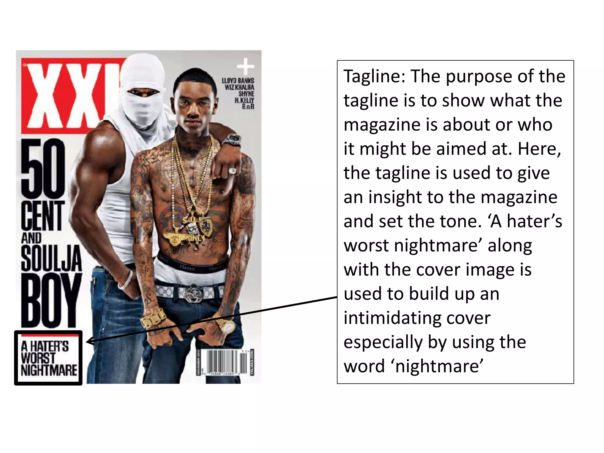
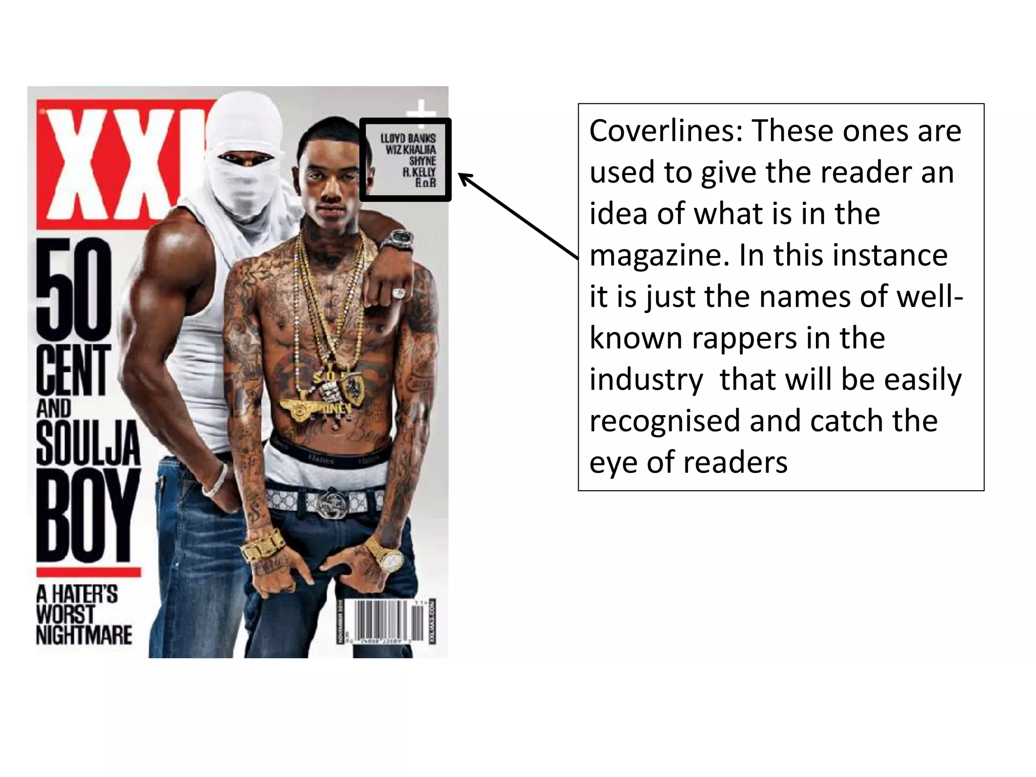
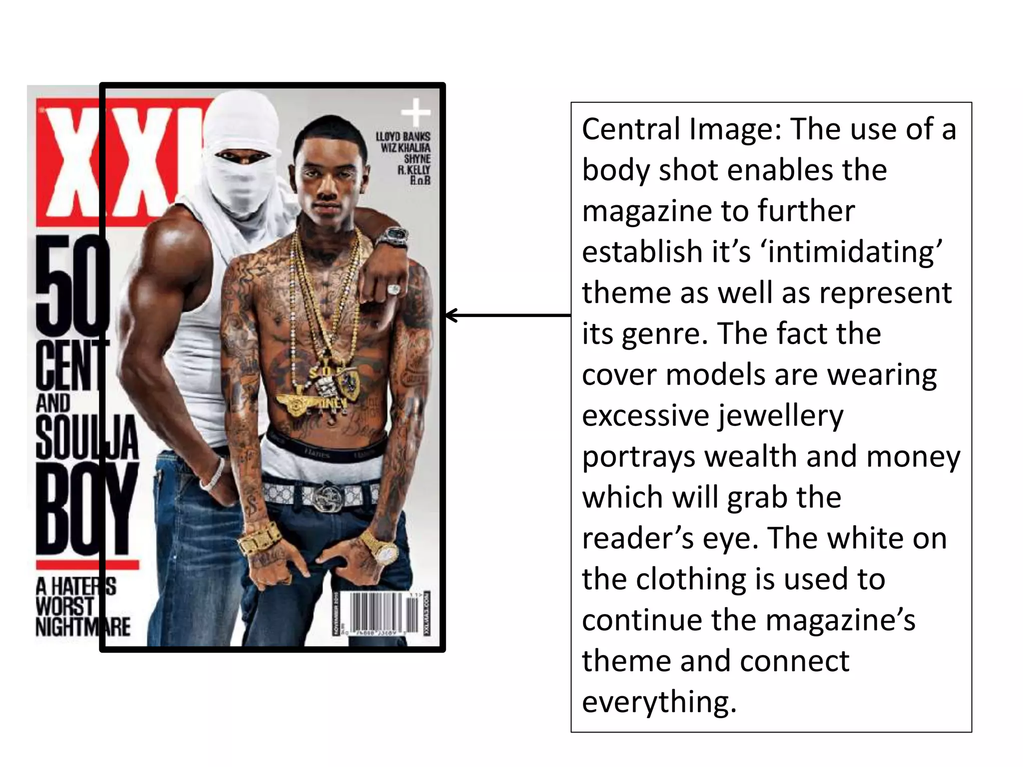
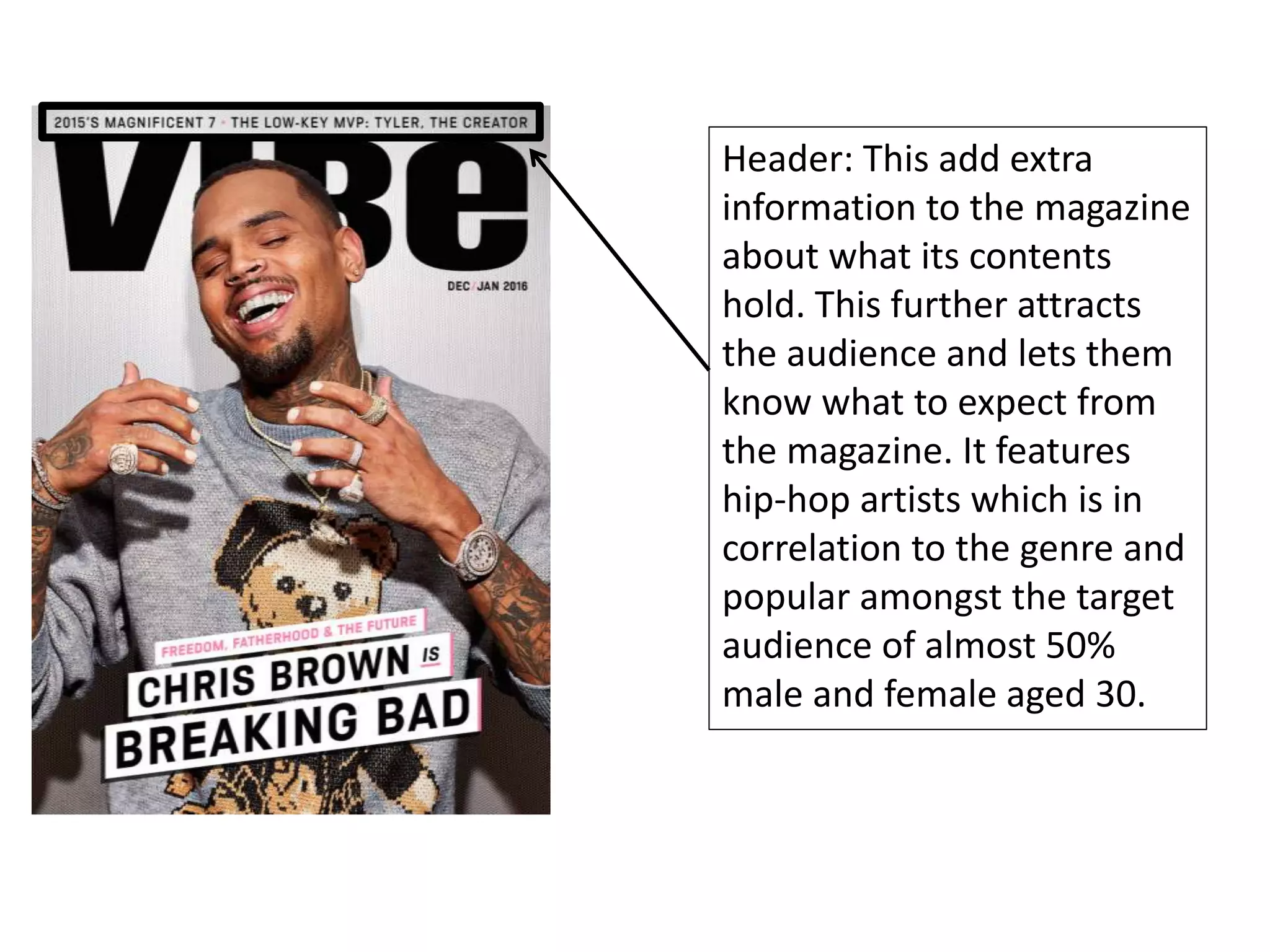
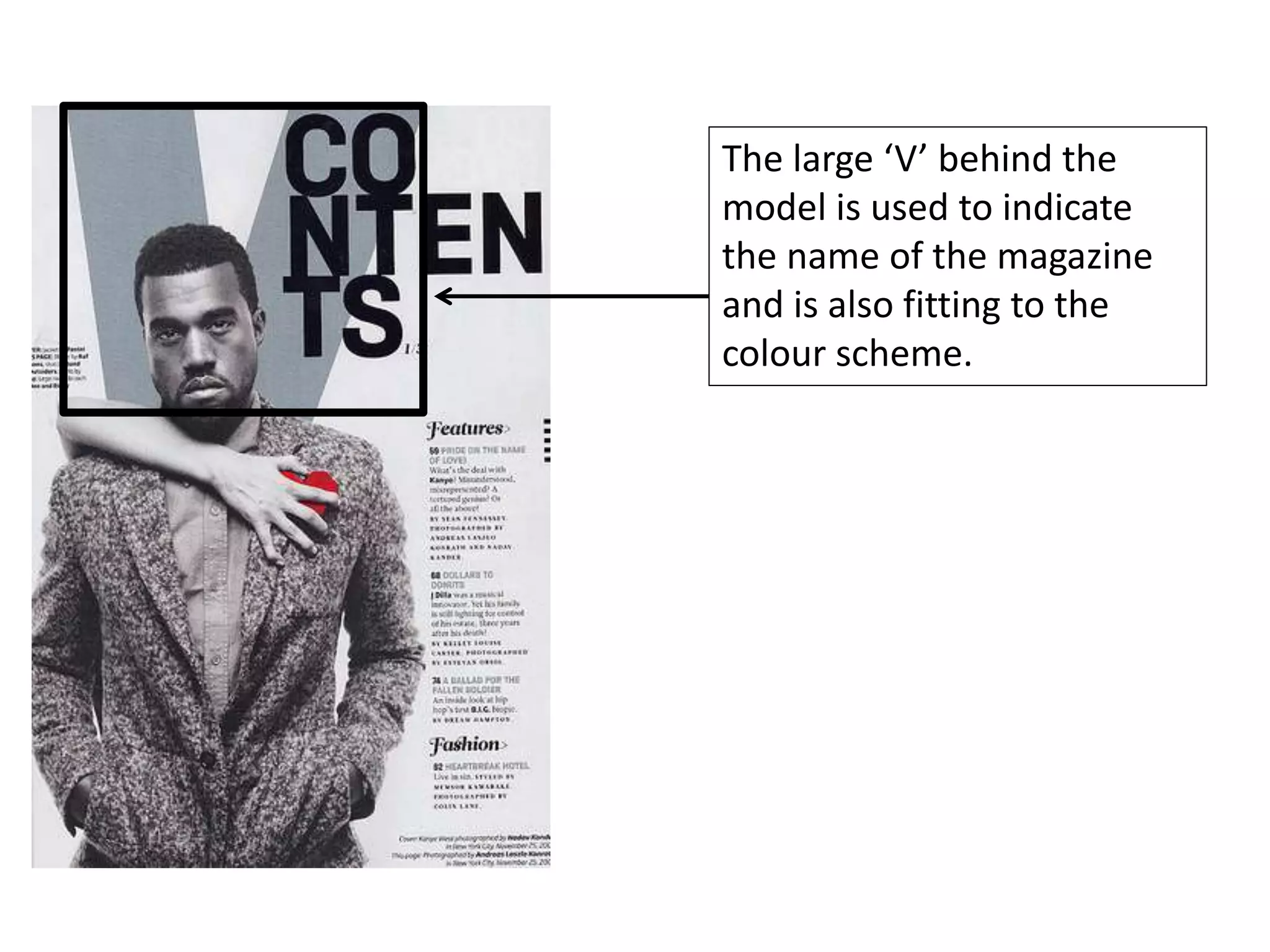
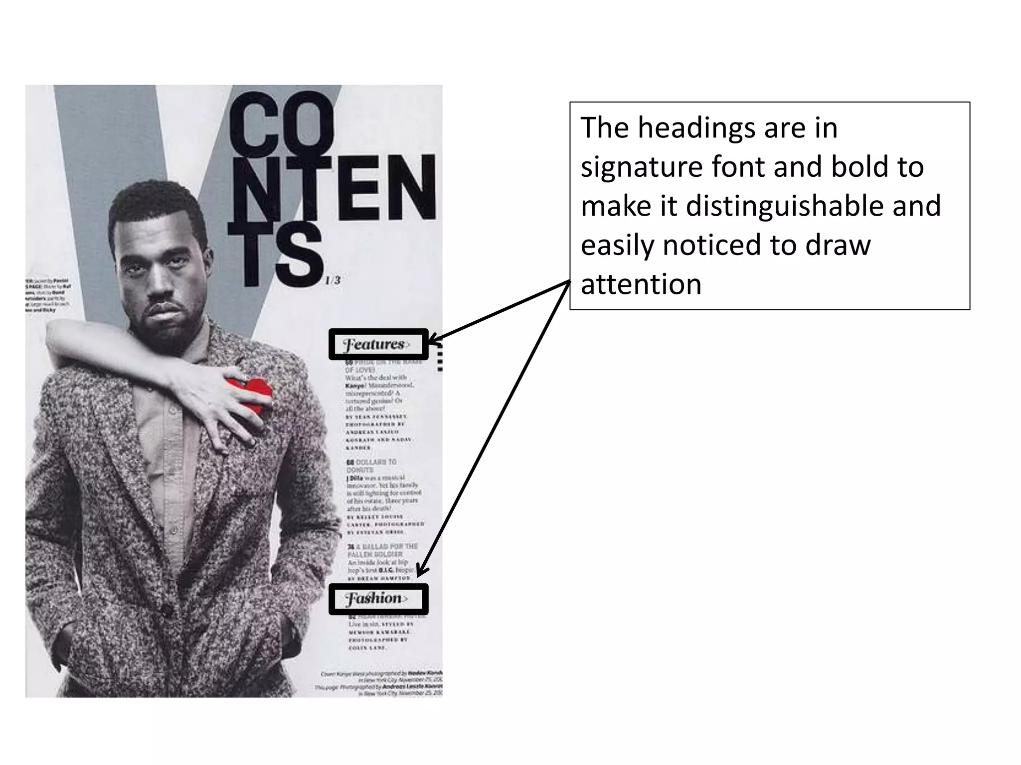
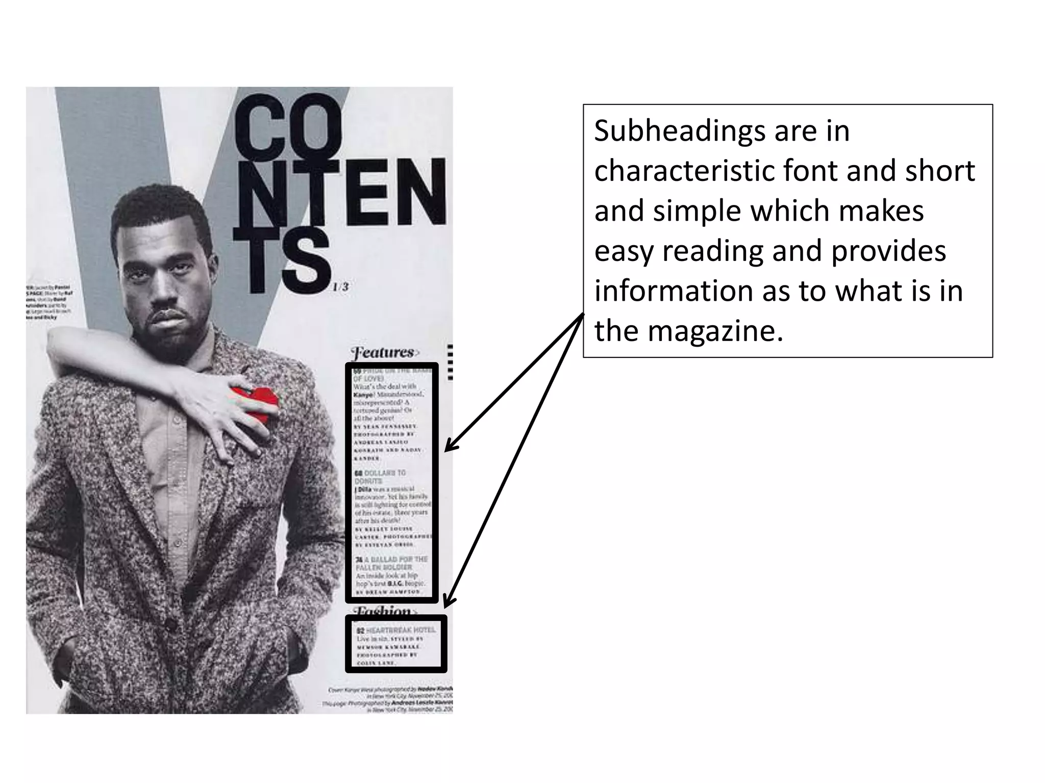
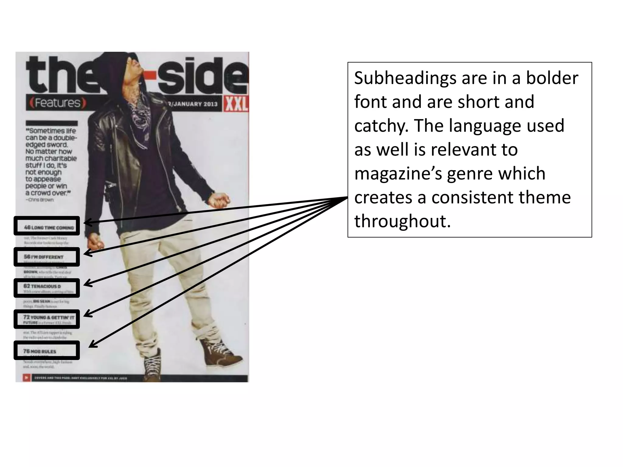
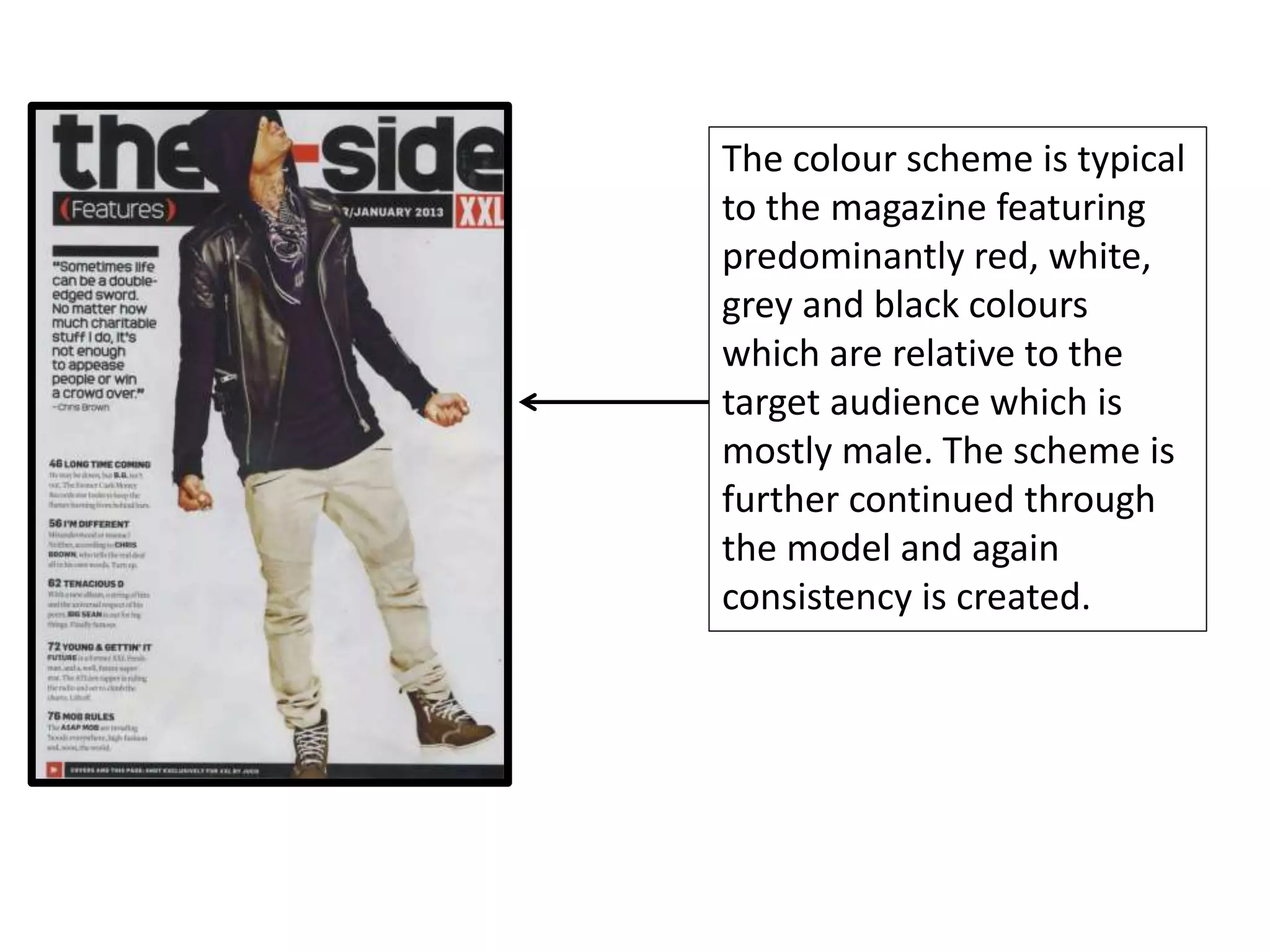
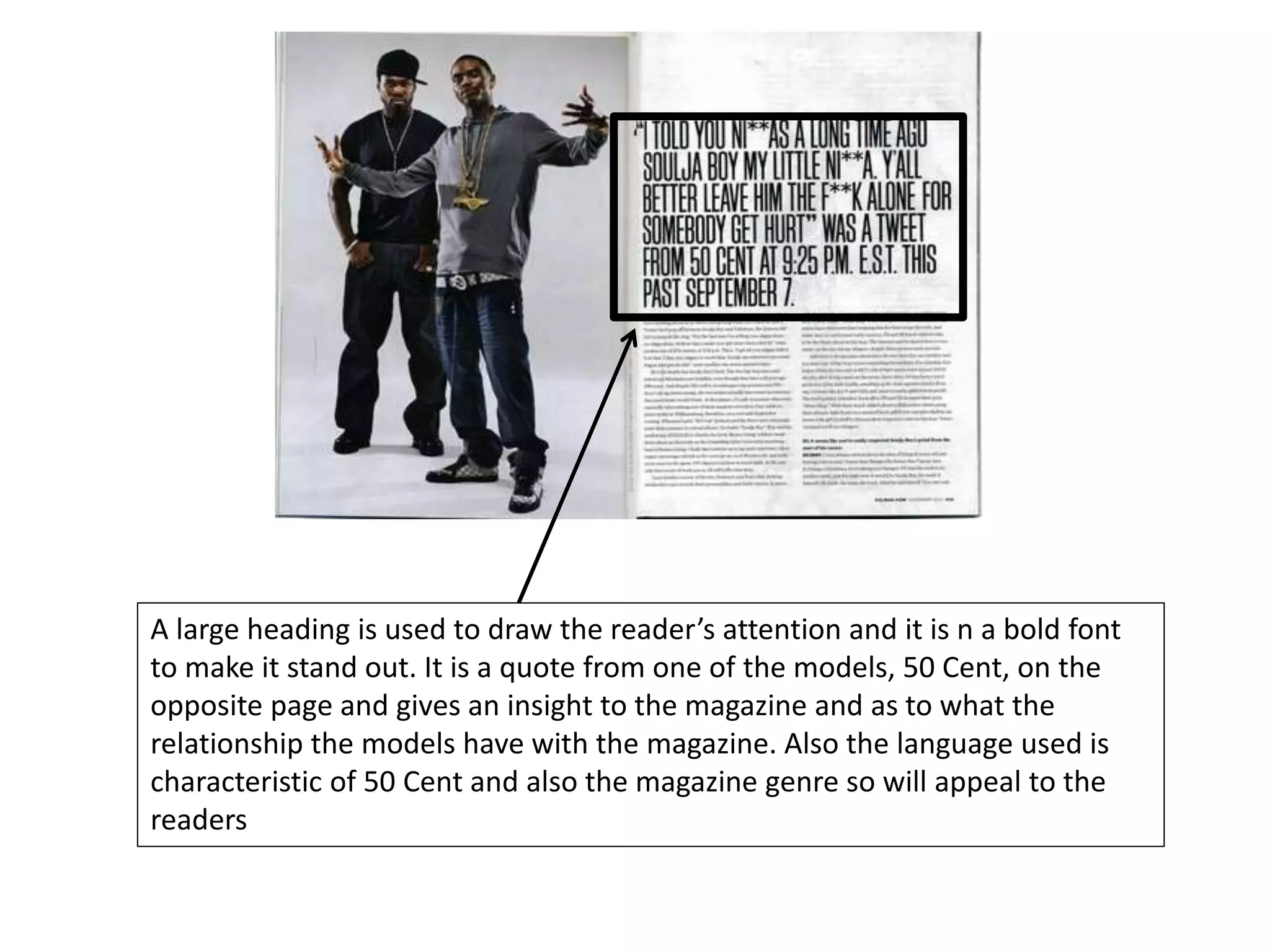
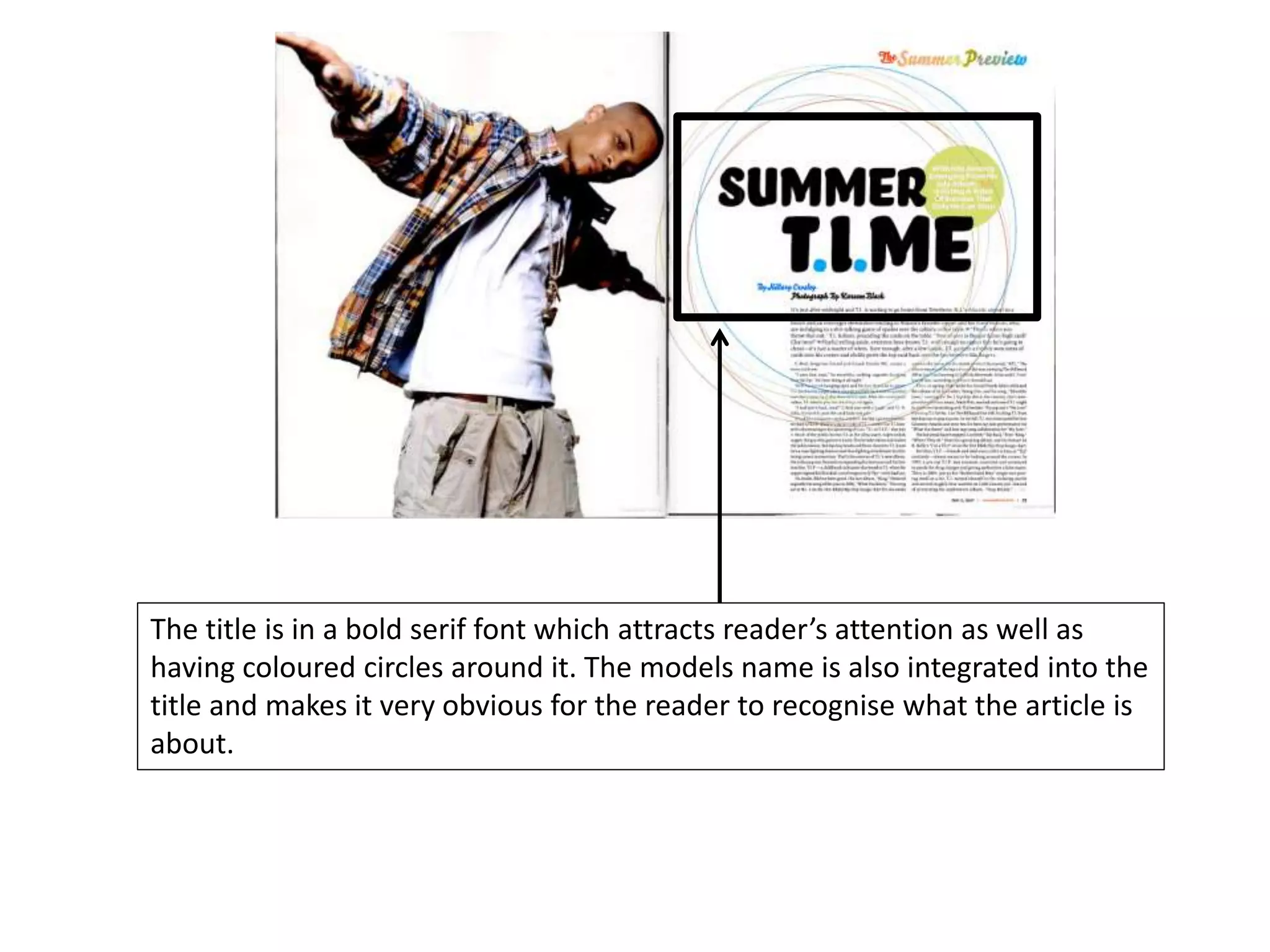
The document discusses the codes and conventions commonly used in magazine design. It provides examples from XXL magazine covers and pages. Key conventions discussed include the masthead logo, taglines, coverlines, central images, cover models, color schemes, barcodes, and fonts. Consistency of these visual elements is emphasized to create a recognizable brand and attract the target audience. Images of famous rappers are often used as they are instantly recognizable to readers and signal the magazine's genre. Color palettes and masculine fonts also aim to appeal to the intended demographic audience.
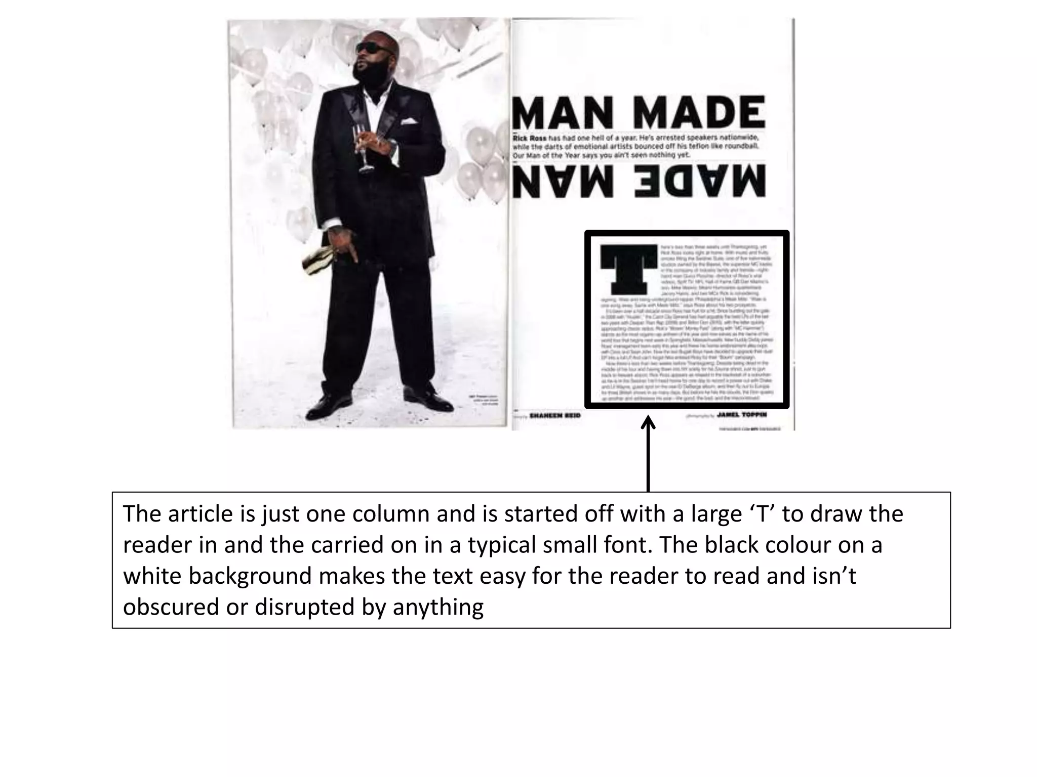
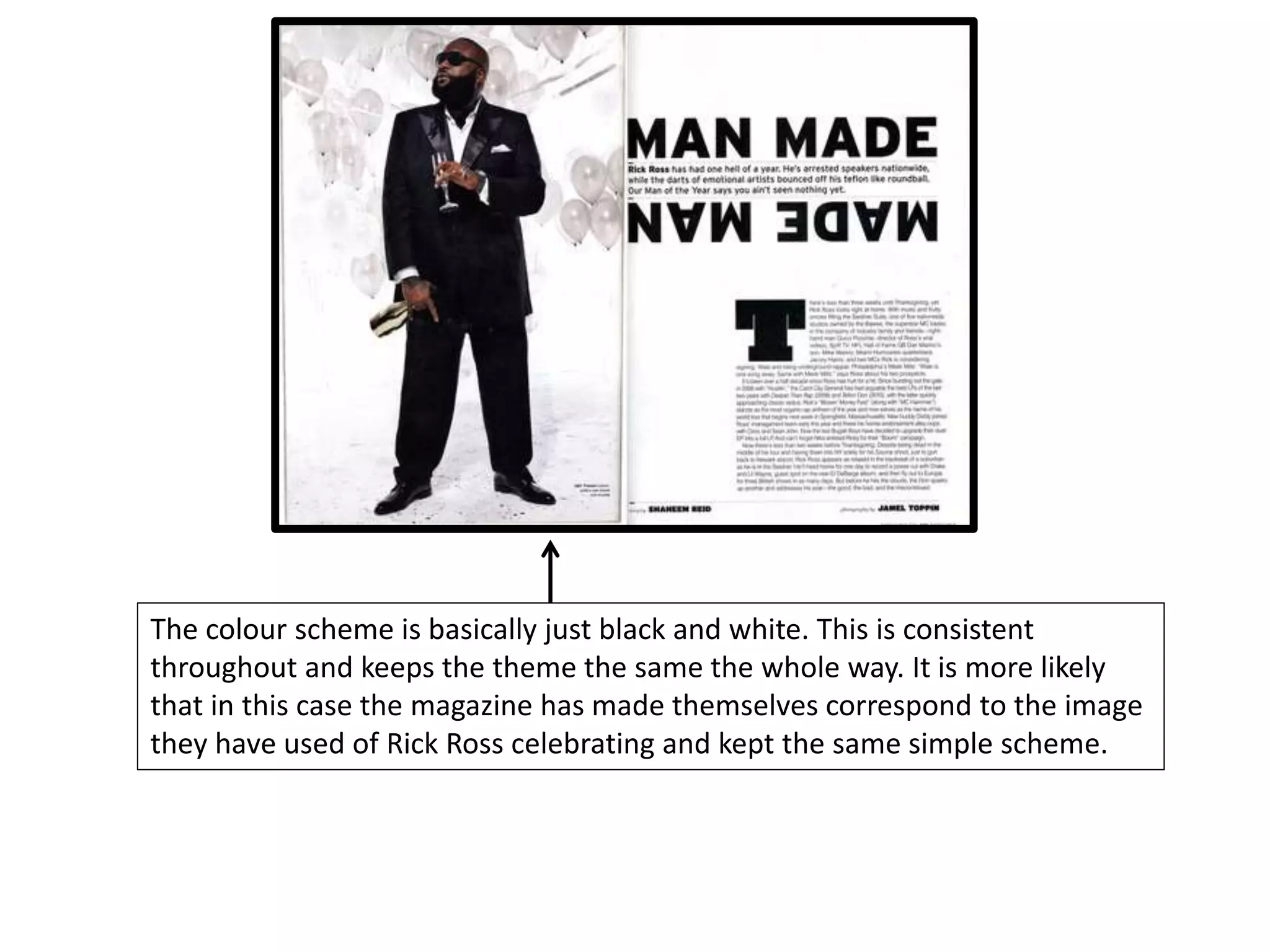
This is an entertaining presentation about analysis of 2 music magazine articles, it shows how the photos are different and unconventional in the different magazines. This is an entertaining presentation about analysis of 2 music magazine articles, it shows how the photos are different and unconventional in the different magazines!!
We all have good and bad thoughts from time to time and situation to situation. We are bombarded daily with spiraling thoughts(both negative and positive) creating all-consuming feel , making us difficult to manage with associated suffering. Good thoughts are like our Mob Signal (Positive thought) amidst noise(negative thought) in the atmosphere. Negative thoughts like noise outweigh positive thoughts. These thoughts often create unwanted confusion, trouble, stress and frustration in our mind as well as chaos in our physical world. Negative thoughts are also known as “distorted thinking”.
Unit 8 - Information and Communication Technology (Paper I).pdfThiyagu K
This slides describes the basic concepts of ICT, basics of Email, Emerging Technology and Digital Initiatives in Education. This presentations aligns with the UGC Paper I syllabus.
Welcome to TechSoup New Member Orientation and Q&A (May 2024).pdfTechSoup
In this webinar you will learn how your organization can access TechSoup's wide variety of product discount and donation programs. From hardware to software, we'll give you a tour of the tools available to help your nonprofit with productivity, collaboration, financial management, donor tracking, security, and more.
How to Split Bills in the Odoo 17 POS ModuleCeline George
Bills have a main role in point of sale procedure. It will help to track sales, handling payments and giving receipts to customers. Bill splitting also has an important role in POS. For example, If some friends come together for dinner and if they want to divide the bill then it is possible by POS bill splitting. This slide will show how to split bills in odoo 17 POS.
Palestine last event orientationfvgnh .pptxRaedMohamed3
An EFL lesson about the current events in Palestine. It is intended to be for intermediate students who wish to increase their listening skills through a short lesson in power point.
Model Attribute Check Company Auto PropertyCeline George
In Odoo, the multi-company feature allows you to manage multiple companies within a single Odoo database instance. Each company can have its own configurations while still sharing common resources such as products, customers, and suppliers.
Operation “Blue Star” is the only event in the history of Independent India where the state went into war with its own people. Even after about 40 years it is not clear if it was culmination of states anger over people of the region, a political game of power or start of dictatorial chapter in the democratic setup.
The people of Punjab felt alienated from main stream due to denial of their just demands during a long democratic struggle since independence. As it happen all over the word, it led to militant struggle with great loss of lives of military, police and civilian personnel. Killing of Indira Gandhi and massacre of innocent Sikhs in Delhi and other India cities was also associated with this movement.
The Art Pastor's Guide to Sabbath | Steve ThomasonSteve Thomason
What is the purpose of the Sabbath Law in the Torah. It is interesting to compare how the context of the law shifts from Exodus to Deuteronomy. Who gets to rest, and why?
Read| The latest issue of The Challenger is here! We are thrilled to announce that our school paper has qualified for the NATIONAL SCHOOLS PRESS CONFERENCE (NSPC) 2024. Thank you for your unwavering support and trust. Dive into the stories that made us stand out!
2. Masthead: The font used is
characteristic to the
magazine which makes it
instantly recognisable and
noticeable to the readers
along with the stand-out
red colour and bold letters.
The use of sans serif font
makes it simplified and
easy to read but also
makes a bold statement.
This is tied in with the
target audience and is
specifically designed to
attract them.
3. Tagline: The purpose of the
tagline is to show what the
magazine is about or who
it might be aimed at. Here,
the tagline is used to give
an insight to the magazine
and using vocabulary like
‘higher level’ builds up a
theme of superiority as it
suggests its contents and
features are above that of
rival magazines
4. Tagline: The tagline in this
case is one word which is
easily picked up and read
by the reader. The word
used, ‘untouchable’ gives a
sense of superiority and
exclusiveness that only XXL
magazine has. This will
entice the audience to buy
and read the magazine as
they feel this exclusiveness
is being shared with them
5. Coverlines: These ones are
used to give the reader an
idea of what is in the
magazine. In this instance
it is just the names of well-
known rappers in the
industry that will be easily
recognised and catch the
eye of readers
6. Central Image: In this case
we have a close up shot of
an iconic artist that is
globally known. The point
of the central image is to
attract readers even before
they have time to read any
text on the cover. Here
direct mode of address is
used to do this by having
the model looking into the
camera. This creates a
feeling that the reader is
being looked at and draws
them into the magazine.
7. Cover model: Usually cover
models are celebrities and
this is true in XXL’s case by
using Jay-Z. Being a hip-
hop magazine, Jay-Z is an
obvious example of a
celebrity with strong
connections to the
magazine’s genre and so
enables the reader to
instantly determine the
genre purely through the
model.
8. Colour Scheme: XXL
magazine is mainly
targeting 25 – 29 year old
male audiences. The bold
sans serif font along with
the plain bold colours of
red, black and grey make it
a very masculine magazine
and is perfectly suited to
its targeted demographic.
9. Barcode: The barcode is in
a visible place but isn’t
obscuring the view of the
magazine’s images or text.
It is located in the same
position consistently
throughout these
magazines
10. Masthead: The font used is
characteristic to the
magazine which makes it
instantly recognisable and
noticeable to the readers
along with the stand-out
red colour and bold letters.
The use of sans serif font
makes it simplified and
easy to read but also
makes a bold statement
11. Tagline: The purpose of the
tagline is to show what the
magazine is about or who
it might be aimed at. Here,
the tagline is used to give
an insight to the magazine
and set the tone. ‘A hater’s
worst nightmare’ along
with the cover image is
used to build up an
intimidating cover
especially by using the
word ‘nightmare’
12. Coverlines: These ones are
used to give the reader an
idea of what is in the
magazine. In this instance
it is just the names of well-
known rappers in the
industry that will be easily
recognised and catch the
eye of readers
13. Central Image: The use of a
body shot enables the
magazine to further
establish it’s ‘intimidating’
theme as well as represent
its genre. The fact the
cover models are wearing
excessive jewellery
portrays wealth and money
which will grab the
reader’s eye. The white on
the clothing is used to
continue the magazine’s
theme and connect
everything.
14. Cover models: The white of
50’s clothing and Soulja
Boy’s underwear is heavily
connected to the magazine’s
colour theme which is used
to make the image appear
exclusive to the magazine
and is purposefully done to
let readers know the image
belongs to that magazine.
This builds up an idea of
exclusiveness and will make
the reader want to buy the
magazine as they’ll feel they
are getting something
exclusive out of it.
15. Colour Scheme: XXL
magazine is mainly
targeting 25 – 29 year old
male audiences. The bold
sans serif font along with
the plain bold colours of
red, black and grey make it
a very masculine magazine
and is perfectly suited to
its targeted demographic.
16. Barcode: The barcode is in
a visible place but isn’t
obscuring the view of the
magazine’s images or text.
It is located in the same
position consistently
throughout these
magazines
17. Masthead: The masthead is
in a bold sans serif font
which makes it easy to read
and easily noticeable on the
magazine to draw attention.
It has been set behind the
central image of the cover
to show that it is a popular
and well-known magazine
that doesn’t need to show
the full word for people to
know what it is.
Furthermore this creates a
3D effect.
18. Tagline: The tagline is short,
simple and catchy, easy for
the reader to pick out and it
gives an insight as to what is
in the magazine by featuring
the name of the cover
model as well.
19. Header: This add extra
information to the magazine
about what its contents
hold. This further attracts
the audience and lets them
know what to expect from
the magazine. It features
hip-hop artists which is in
correlation to the genre and
popular amongst the target
audience of almost 50%
male and female aged 30.
20. Edition: The edition is
placed in a noticeable area
and to not obscure the view
of the rest of the magazine
as it isn’t as important. It
just lets the reader know as
and when the magazine has
been published and this is
commonly in monthly
editions.
21. Cover model: The cover
model, Chris Brown, is a
very well-known successful
artist, popular amongst men
and women which ties in
well with th demographic of
the magazine. The plain
grey and black featured on
his clothing and tattoos,
keeps the theme of the
magazine consistent and the
use of front lighting helps to
give the shadow effect
which further constructs the
3 dimensional build of the
magazine
22. Colour scheme: The colour
scheme is neutral which
helps coincide with the
almost equal gender
interest in the magazine. It
is consistent throughout
including the model used
which enables the magazine
to show that their image is
being used and makes it feel
exclusive to them and that
they will have exclusive
information about that
artist and other features in
the magazine.
23. The font used to display the
masthead is signature to the
magazine and therefore
keeps the same theme
consistent throughout the
magazine. The bold sans
serif font makes it stand out
and easily read without
much attention being paid
to it.
24. The colour scheme of the
contents page will be the
same to that of the
magazine front cover to
create consistency
throughout the magazine.
The scheme is again
continued through the
model as well which has
been edited to fit this.
25. The large ‘V’ behind the
model is used to indicate
the name of the magazine
and is also fitting to the
colour scheme.
26. The headings are in
signature font and bold to
make it distinguishable and
easily noticed to draw
attention
27. The model used, Kanye, is in
correlation to the
magazine’s genre and gives
further insight as to what
the magazine holds for the
reader. Kanye is edited to fit
the colour scheme to again,
further create a consistent
theme throughout.
28. Subheadings are in
characteristic font and short
and simple which makes
easy reading and provides
information as to what is in
the magazine.
29. The heading is in signature
font of the magazine and in
a bold sans serif font to
clearly title what it is for, in
this case, to show the
features of the magazine
30. The subheadings are also in
the same signature font to
continue the theme and are
of a smaller font size to
make them noticeable that
they are subheadings. They
title what is under that
section of the magazine to
give an insight
31. The colour scheme is
predominantly black and
white and is consistent
throughout the page and
continued through the
model as well
32. The model is iconic and
recognisable and gives an
insight as to what the
magazine has inside. He is
also used to further carry
the colour scheme and
takes up most of the page
which will catch the
attention of readers
33. The letter ‘V’ is obvious
again and matches the
colour scheme. It is used to
again indicate the name of
the magazine and it is well-
known enough to not
require the whole magazine
name to be recognised.
34. The masthead is in signature
font to he magazine and
keeps the theme consistent
throughout. It is titled ‘the
A-side’ but the letter ‘A’ is
covered by the model
however the magazine is
known enough that the
audience will already know
the title without seeing it
all. Also the way the model’s
hood is on and the way his
head is angled, it does come
out slightly as the letter ‘A’.
35. The header and footer are
corresponding and the
header holds the magazine
title ‘XXL’ to reinstate the
magazine’s name. The date
is also displayed on the
header which suggests the
magazine is issued in
editions and there is a loyal
audience. The footer also
says how the shots were
done exclusively which
again builds up the exclusive
image of the magazine to
attract readers
36. Sell quotes from Chris
Brown, who is the model on
this page, attract readers
and give an insight as to
what is in th magazine. It is
in a bold font, larger than
the other features which
makes it stand out and
draws the reader’s eye to it.
37. Subheadings are in a bolder
font and are short and
catchy. The language used
as well is relevant to
magazine’s genre which
creates a consistent theme
throughout.
38. The colour scheme is typical
to the magazine featuring
predominantly red, white,
grey and black colours
which are relative to the
target audience which is
mostly male. The scheme is
further continued through
the model and again
consistency is created.
39. The model used is the most
noticeable feature on the
page. It draws the reader’s
eye before they even have
to read any text and is of an
iconic artist to fit the
magazine’s genre. By also
featuring quotes from the
artist on the same page it
will make the reader feel
like the magazine has
something exclusive to do
with the model.
40. A large heading is used to draw the reader’s attention and it is n a bold font
to make it stand out. It is a quote from one of the models, 50 Cent, on the
opposite page and gives an insight to the magazine and as to what the
relationship the models have with the magazine. Also the language used is
characteristic of 50 Cent and also the magazine genre so will appeal to the
readers
41. One side of this double page spread is devoted entirely to an image of two
artists. The image heavily links to the gene of the magazine and hip-hop
culture particularly through mise-en-scene. This is noticeable through the
attire of the two artists such as the sagging jeans if Soulja Boy and the hate
50 wears as well as the neckwear of them both. The stance they both have,
Soulja with his arms out and 50 leaning back, as well as the use of direct
mode of address helps build up an intimidating image as well as connecting
the reader to the magazine by establishing eye contact with the models.
42. The colour scheme is again consistent throughout, including the models.
Consistency is once again maintained and it is a very simple scheme that
makes reading easy and is a tone that fits the genre well; quite plain and dark
with a rough kind of look.
43. The font used is characteristic to the magazine, it is also small and aligned to
the left. The text is broken up into two separate columns and isn’t designed
to attract any reader attention as the heading and image used does that job.
There is however one interview question that is in bold and the start of a new
paragraph. This acts a subheading in which attention will be drawn to.
44. The title is in a bold serif font which attracts reader’s attention as well as
having coloured circles around it. The models name is also integrated into the
title and makes it very obvious for the reader to recognise what the article is
about.
45. Again we see that a whole page is devoted to the model. In this case we can
see that T.I.’s clothing colour correlates to the coloured circles on the
opposite page and builds a connection between the two pages. Furthermore
the use of direct mode of address again makes a connection between the
reader and magazine as the reader gets drawn into it.
46. The colour scheme is consistent throughout the spread and is connected to
the title ‘SUMMER T.I.ME’ as all the colours are light and bright which builds a
‘summery’ feel to it.
47. The article is comprised of a beginning paragraph and then two columns
underneath. The font again is small but in a sans serif font which makes it
easier for the reader when reading across a line quickly.
48. The heading is in a bold, sans serif font which makes it very noticeable and
draws the reader’s attention. Underneath is strap-line which says ‘Rick Ross
has had one hell of a year’ which gives an insight and explanation to the
double page spread.
49. There is again a whole page just for an image of the model which the article
is about. The use of a long shot allows us to see that Rick Ross is in a suit
holding a bottle and glass of champagne. Also the background has balloons in
and all this ties into the article about him and how he ‘[Rick Ross] has had
one hell of a year’. The champagne, balloons and tuxedo all connote
celebration and parties which would be corresponding to Rick Ross
celebrating his success
50. The article is just one column and is started off with a large ‘T’ to draw the
reader in and the carried on in a typical small font. The black colour on a
white background makes the text easy for the reader to read and isn’t
obscured or disrupted by anything
51. The colour scheme is basically just black and white. This is consistent
throughout and keeps the theme the same the whole way. It is more likely
that in this case the magazine has made themselves correspond to the image
they have used of Rick Ross celebrating and kept the same simple scheme.