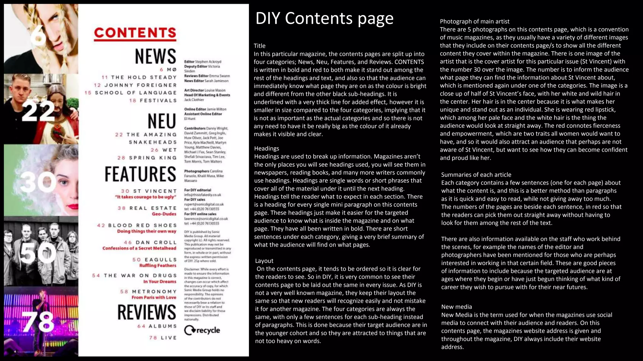
Title
In this particular magazine, the contents pages are split up into
four categories; News, Neu, Features, and Reviews. CONTENTS
is written in bold and red to both make it stand out among the
rest of the headings and text, and also so that the audience can
immediately know what page they are on as the colour is bright
and different from the other black sub-headings. It is
underlined with a very thick line for added effect, however it is
smaller in size compared to the four categories, implying that it
is not as important as the actual categories and so there is not
any need to have it be really big as the colour of it already
makes it visible and clear.
Headings
Headings are used to break up information. Magazines aren’t
the only places you will see headings used, you will see them in
newspapers, reading books, and many more writers commonly
use headings. Headings are single words or short phrases that
cover all of the material under it until the next heading.
Headings tell the reader what to expect in each section. There
is a heading for every single mini paragraph on this contents
page. These headings just make it easier for the targeted
audience to know what is inside the magazine and on what
page. They have all been written in bold. There are short
sentences under each category, giving a very brief summary of
what the audience will find on what pages.
Layout
On the contents page, it tends to be ordered so it is clear for
the readers to see. So in DIY, it is very common to see their
contents page to be laid out the same in every issue. As DIY is
not a very well known magazine, they keep their layout the
same so that new readers will recognize easily and not mistake
it for another magazine. The four categories are always the
same, with only a few sentences for each sub-heading instead
of paragraphs. This is done because their target audience are in
the younger cohort and so they are attracted to things that are
not too heavy on words.
Photograph of main artist
There are 5 photographs on this contents page, which is a convention
of music magazines, as they usually have a variety of different images
that they include on their contents page/s to show all the different
content they cover within the magazine. There is one image of the
artist that is the cover artist for this particular issue (St Vincent) with
the number 30 over the image. The number is to inform the audience
what page they can find the information about St Vincent about,
which is mentioned again under one of the categories. The image is a
close up of half of St Vincent’s face, with her white and wild hair in
the center. Her hair is in the center because it is what makes her
unique and stand out as an individual. She is wearing red lipstick,
which among her pale face and the white hair is the thing the
audience would look at straight away. The red connotes fierceness
and empowerment, which are two traits all women would want to
have, and so it would also attract an audience that perhaps are not
aware of St Vincent, but want to see how they can become confident
and proud like her.
Summaries of each article
Each category contains a few sentences (one for each page) about
what the content is, and this is a better method than paragraphs
as it is quick and easy to read, while not giving away too much.
The numbers of the pages are beside each sentence, in red so that
the readers can pick them out straight away without having to
look for them among the rest of the text.
There are also information available on the staff who work behind
the scenes, for example the names of the editor and
photographers have been mentioned for those who are perhaps
interested in working in that certain field. These are good pieces
of information to include because the targeted audience are at
ages where they begin or have just begun thinking of what kind of
career they wish to pursue with for their near futures.
New media
New Media is the term used for when the magazines use social
media to connect with their audience and readers. On this
contents page, the magazines website address is given and
throughout the magazine, DIY always include their website
address.
DIY Contents page
Title
The Font of the masthead is of a Serifed font which connotes to the reader that this magazine is traditional as well as
being stylish, therefore breaking the convention of that all hip hop magazines are based around being new and
modern. The colour used by Rolling Stone is very simple yet it has major effects on the magazine. The masthead on the
contents page is pitch black for the “RS” stating that its the important part whereas the issue number is an alarming
red suggesting that it is the extra information they are adding onto the “RS”. These two colours where primarily used
as they are eye catching as they stand out on the pure white background therefore enticing the reader.
Headings
Headings are used to break up information. Magazines aren’t the only places you will see headings used, you will see
them in newspapers, reading books, and many more writers commonly use headings. Headings are single words or short
phrases that cover all of the material under it until the next heading. Headings tell the reader what to expect in each
section. There is a heading for every single mini paragraph on this contents page. These headings just make it easier for
the targeted audience to know what is inside the magazine and on what page. They have all been written in bold. Some
of the headings have a ‘On the cover’ box beside them, to inform the readers the pages have been mentioned on the
front cover. There are some mini paragraphs that have been placed in front of half of the masthead. This connotes that
yet again, Teen Vogue are very well known and do not have to clearly show their magazine name in order for the
targeted audience to recognise.
Layout
The layout of the actual contents page has been done to allow the reader to easily interpret what section consists of
what and what pages you need. The sections are created by gutters. The gutters are inserted so that it doesn’t confuse
the reader, furthermore for the reader to avoid confusion, they have used the alarming red colour for the section title
and for each story that is with that section they have put them in bold and black. This technique of drip feeding the
readers is like “Movie of The Year” where this tells the reader what is to come in the section and they either have the
choice to go direct to the page as the number is located beside the title of each subheading or they can read the
information below. There is a consistent house style of font used by Rolling Stone and this is Serifed as they have used it
within every word on the contents page. The fact that they have numbered each story on the contents page in
chronological order and finishes off with each page on 90 suggest to us and the reader that this magazine is worthy of
reading as it consists of 90+ pages. The layout of the contents page is a conventional for a magazine therefore Rolling
Stone have followed this by anchoring the contents information on the left hand side of the page.
Photograph of main artist
They have used their 3 other images of the same “50 Greatest Hip-Hop Songs of All Time” edition. This connotes to the reader
that Rolling Stones cherish their title as being a Hip-Hop magazine and as they are doing a “Greatest Hip-Hop Songs” edition, it
would be appropriate to show the reader the 3 other editions that consist of the best Hip-Hop artist the and now; Eminem,
Notorious B.I.G, Tupac & Jay-Z. Each image is of a previously existing magazine front cover, with four of some of the greatest
hip-hop artists of all time. This could be seen as ’boasting’ about the magazine itself as they have been able to cover such big
artists for a long period of time, highlighting how seriously people who work at Rolling stones take their jobs.
Rolling Stones Contents
page
Billboard Contents page
This is a contents page from one of the issues from Billboard magazine’s and it is very detailed and neatly laid out.
This suggests that like the contents page, the rest of the magazine is laid out in an orderly manner in order for the
targeted audience to feel comfortable and at east whilst reading the magazine content. There are 4 images across
the page, with one being much bigger than the others. This tells us that the bigger one must be the most
important, and that the women must be one of the main features in this magazine. The model is kneeling down
while laughing brightly. Her hair has the effect of it blowing in the wind and she is wearing quite rock-ish like
clothing while still remaining feminine by wearing the high heels and having long, made-up hair that make her
seem sweet in a sense as it looks feminine.
On the left side of the contents page, the music charts are present, with everything being chronological order,
implying that the whole magazine is in a organised and tidy fashion, which is sometimes rare to find in music
magazines as they tend to have pages with words put everywhere and appears very busy, making it hard to
actually read.
Just above the ‘NO.1’, the billboard logo is included, this is for further advertising purposes and to inform the
readers who it is that is giving them all the information.
The font used for ‘CONTENTS’ is odd and unusual which is also used where it says 'No.1', showing a link that the
readers would make subconsciously. The word 'contents' is written in a big size with the colour being black which
against a white background, makes the best contrast to help catch the readers eye.
There are different sections used for all the words, and are all separated to give the impression that they are yet
again a professional and formal magazine and to prevent readers from thinking there is too much writing on the
contents page. There are a lot of bold highlighted parts on the contents page that show which bits are the most
important, and can allow the reader to read the bold parts, to get a better idea about the topic so they don’t have
to read all the writing.

Contents page analysis

  • 1.
    Title In this particularmagazine, the contents pages are split up into four categories; News, Neu, Features, and Reviews. CONTENTS is written in bold and red to both make it stand out among the rest of the headings and text, and also so that the audience can immediately know what page they are on as the colour is bright and different from the other black sub-headings. It is underlined with a very thick line for added effect, however it is smaller in size compared to the four categories, implying that it is not as important as the actual categories and so there is not any need to have it be really big as the colour of it already makes it visible and clear. Headings Headings are used to break up information. Magazines aren’t the only places you will see headings used, you will see them in newspapers, reading books, and many more writers commonly use headings. Headings are single words or short phrases that cover all of the material under it until the next heading. Headings tell the reader what to expect in each section. There is a heading for every single mini paragraph on this contents page. These headings just make it easier for the targeted audience to know what is inside the magazine and on what page. They have all been written in bold. There are short sentences under each category, giving a very brief summary of what the audience will find on what pages. Layout On the contents page, it tends to be ordered so it is clear for the readers to see. So in DIY, it is very common to see their contents page to be laid out the same in every issue. As DIY is not a very well known magazine, they keep their layout the same so that new readers will recognize easily and not mistake it for another magazine. The four categories are always the same, with only a few sentences for each sub-heading instead of paragraphs. This is done because their target audience are in the younger cohort and so they are attracted to things that are not too heavy on words. Photograph of main artist There are 5 photographs on this contents page, which is a convention of music magazines, as they usually have a variety of different images that they include on their contents page/s to show all the different content they cover within the magazine. There is one image of the artist that is the cover artist for this particular issue (St Vincent) with the number 30 over the image. The number is to inform the audience what page they can find the information about St Vincent about, which is mentioned again under one of the categories. The image is a close up of half of St Vincent’s face, with her white and wild hair in the center. Her hair is in the center because it is what makes her unique and stand out as an individual. She is wearing red lipstick, which among her pale face and the white hair is the thing the audience would look at straight away. The red connotes fierceness and empowerment, which are two traits all women would want to have, and so it would also attract an audience that perhaps are not aware of St Vincent, but want to see how they can become confident and proud like her. Summaries of each article Each category contains a few sentences (one for each page) about what the content is, and this is a better method than paragraphs as it is quick and easy to read, while not giving away too much. The numbers of the pages are beside each sentence, in red so that the readers can pick them out straight away without having to look for them among the rest of the text. There are also information available on the staff who work behind the scenes, for example the names of the editor and photographers have been mentioned for those who are perhaps interested in working in that certain field. These are good pieces of information to include because the targeted audience are at ages where they begin or have just begun thinking of what kind of career they wish to pursue with for their near futures. New media New Media is the term used for when the magazines use social media to connect with their audience and readers. On this contents page, the magazines website address is given and throughout the magazine, DIY always include their website address. DIY Contents page
  • 2.
    Title The Font ofthe masthead is of a Serifed font which connotes to the reader that this magazine is traditional as well as being stylish, therefore breaking the convention of that all hip hop magazines are based around being new and modern. The colour used by Rolling Stone is very simple yet it has major effects on the magazine. The masthead on the contents page is pitch black for the “RS” stating that its the important part whereas the issue number is an alarming red suggesting that it is the extra information they are adding onto the “RS”. These two colours where primarily used as they are eye catching as they stand out on the pure white background therefore enticing the reader. Headings Headings are used to break up information. Magazines aren’t the only places you will see headings used, you will see them in newspapers, reading books, and many more writers commonly use headings. Headings are single words or short phrases that cover all of the material under it until the next heading. Headings tell the reader what to expect in each section. There is a heading for every single mini paragraph on this contents page. These headings just make it easier for the targeted audience to know what is inside the magazine and on what page. They have all been written in bold. Some of the headings have a ‘On the cover’ box beside them, to inform the readers the pages have been mentioned on the front cover. There are some mini paragraphs that have been placed in front of half of the masthead. This connotes that yet again, Teen Vogue are very well known and do not have to clearly show their magazine name in order for the targeted audience to recognise. Layout The layout of the actual contents page has been done to allow the reader to easily interpret what section consists of what and what pages you need. The sections are created by gutters. The gutters are inserted so that it doesn’t confuse the reader, furthermore for the reader to avoid confusion, they have used the alarming red colour for the section title and for each story that is with that section they have put them in bold and black. This technique of drip feeding the readers is like “Movie of The Year” where this tells the reader what is to come in the section and they either have the choice to go direct to the page as the number is located beside the title of each subheading or they can read the information below. There is a consistent house style of font used by Rolling Stone and this is Serifed as they have used it within every word on the contents page. The fact that they have numbered each story on the contents page in chronological order and finishes off with each page on 90 suggest to us and the reader that this magazine is worthy of reading as it consists of 90+ pages. The layout of the contents page is a conventional for a magazine therefore Rolling Stone have followed this by anchoring the contents information on the left hand side of the page. Photograph of main artist They have used their 3 other images of the same “50 Greatest Hip-Hop Songs of All Time” edition. This connotes to the reader that Rolling Stones cherish their title as being a Hip-Hop magazine and as they are doing a “Greatest Hip-Hop Songs” edition, it would be appropriate to show the reader the 3 other editions that consist of the best Hip-Hop artist the and now; Eminem, Notorious B.I.G, Tupac & Jay-Z. Each image is of a previously existing magazine front cover, with four of some of the greatest hip-hop artists of all time. This could be seen as ’boasting’ about the magazine itself as they have been able to cover such big artists for a long period of time, highlighting how seriously people who work at Rolling stones take their jobs. Rolling Stones Contents page
  • 3.
    Billboard Contents page Thisis a contents page from one of the issues from Billboard magazine’s and it is very detailed and neatly laid out. This suggests that like the contents page, the rest of the magazine is laid out in an orderly manner in order for the targeted audience to feel comfortable and at east whilst reading the magazine content. There are 4 images across the page, with one being much bigger than the others. This tells us that the bigger one must be the most important, and that the women must be one of the main features in this magazine. The model is kneeling down while laughing brightly. Her hair has the effect of it blowing in the wind and she is wearing quite rock-ish like clothing while still remaining feminine by wearing the high heels and having long, made-up hair that make her seem sweet in a sense as it looks feminine. On the left side of the contents page, the music charts are present, with everything being chronological order, implying that the whole magazine is in a organised and tidy fashion, which is sometimes rare to find in music magazines as they tend to have pages with words put everywhere and appears very busy, making it hard to actually read. Just above the ‘NO.1’, the billboard logo is included, this is for further advertising purposes and to inform the readers who it is that is giving them all the information. The font used for ‘CONTENTS’ is odd and unusual which is also used where it says 'No.1', showing a link that the readers would make subconsciously. The word 'contents' is written in a big size with the colour being black which against a white background, makes the best contrast to help catch the readers eye. There are different sections used for all the words, and are all separated to give the impression that they are yet again a professional and formal magazine and to prevent readers from thinking there is too much writing on the contents page. There are a lot of bold highlighted parts on the contents page that show which bits are the most important, and can allow the reader to read the bold parts, to get a better idea about the topic so they don’t have to read all the writing.