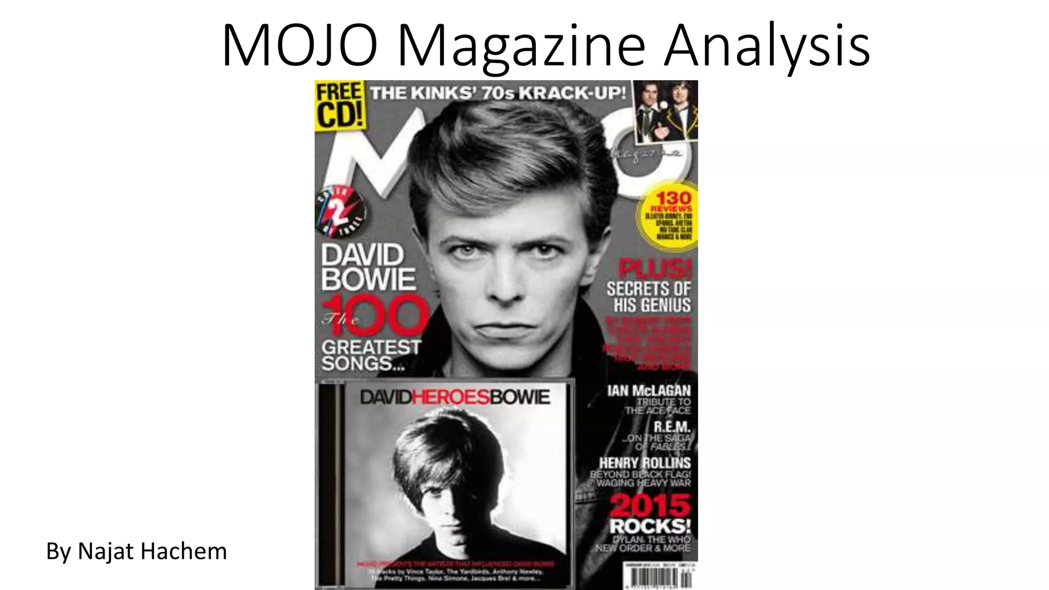
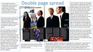
The document provides an in-depth analysis of the cover of MOJO magazine issue 255. Some key points analyzed include the placement of the masthead at the top in bold and its 3D effect. The unique selling proposition is a free CD placed in the top corner in yellow. The center of visual interest is an image of David Bowie that overlays the masthead. Design elements like fonts, colors, images and placements follow conventions to effectively communicate information to the target audience.
This is a powerpoint analysis of the front cover, contents page and double page spread of the XXL music magazine. However, these pages do not come from the same issue.
An advisory firm delivering services to the investors may help you in this sector. They use to provide such professionals who give such tips and hints which benefits the traders and help them to achieve the desired success.
Trong trường hợp tưới gốc nên áp dụng kết
hợp với tủ gốc giữ ẩm cho cà phê (màng phủ PE),
lượng nước tưới áp dụng bình quân là 500 m3
/ha cho mỗi lần tưới và chu kỳ tưới là 30-35 ngày. Công
thức tưới này tiết kiệm 37% lượng nước tưới so với
công thức tưới đang dược áp dụng phổ biến hiện
nay
How to Create Map Views in the Odoo 17 ERPCeline George
The map views are useful for providing a geographical representation of data. They allow users to visualize and analyze the data in a more intuitive manner.
Instructions for Submissions thorugh G- Classroom.pptxJheel Barad
This presentation provides a briefing on how to upload submissions and documents in Google Classroom. It was prepared as part of an orientation for new Sainik School in-service teacher trainees. As a training officer, my goal is to ensure that you are comfortable and proficient with this essential tool for managing assignments and fostering student engagement.
The French Revolution, which began in 1789, was a period of radical social and political upheaval in France. It marked the decline of absolute monarchies, the rise of secular and democratic republics, and the eventual rise of Napoleon Bonaparte. This revolutionary period is crucial in understanding the transition from feudalism to modernity in Europe.
For more information, visit-www.vavaclasses.com
The Roman Empire A Historical Colossus.pdfkaushalkr1407
The Roman Empire, a vast and enduring power, stands as one of history's most remarkable civilizations, leaving an indelible imprint on the world. It emerged from the Roman Republic, transitioning into an imperial powerhouse under the leadership of Augustus Caesar in 27 BCE. This transformation marked the beginning of an era defined by unprecedented territorial expansion, architectural marvels, and profound cultural influence.
The empire's roots lie in the city of Rome, founded, according to legend, by Romulus in 753 BCE. Over centuries, Rome evolved from a small settlement to a formidable republic, characterized by a complex political system with elected officials and checks on power. However, internal strife, class conflicts, and military ambitions paved the way for the end of the Republic. Julius Caesar’s dictatorship and subsequent assassination in 44 BCE created a power vacuum, leading to a civil war. Octavian, later Augustus, emerged victorious, heralding the Roman Empire’s birth.
Under Augustus, the empire experienced the Pax Romana, a 200-year period of relative peace and stability. Augustus reformed the military, established efficient administrative systems, and initiated grand construction projects. The empire's borders expanded, encompassing territories from Britain to Egypt and from Spain to the Euphrates. Roman legions, renowned for their discipline and engineering prowess, secured and maintained these vast territories, building roads, fortifications, and cities that facilitated control and integration.
The Roman Empire’s society was hierarchical, with a rigid class system. At the top were the patricians, wealthy elites who held significant political power. Below them were the plebeians, free citizens with limited political influence, and the vast numbers of slaves who formed the backbone of the economy. The family unit was central, governed by the paterfamilias, the male head who held absolute authority.
Culturally, the Romans were eclectic, absorbing and adapting elements from the civilizations they encountered, particularly the Greeks. Roman art, literature, and philosophy reflected this synthesis, creating a rich cultural tapestry. Latin, the Roman language, became the lingua franca of the Western world, influencing numerous modern languages.
Roman architecture and engineering achievements were monumental. They perfected the arch, vault, and dome, constructing enduring structures like the Colosseum, Pantheon, and aqueducts. These engineering marvels not only showcased Roman ingenuity but also served practical purposes, from public entertainment to water supply.
Read| The latest issue of The Challenger is here! We are thrilled to announce that our school paper has qualified for the NATIONAL SCHOOLS PRESS CONFERENCE (NSPC) 2024. Thank you for your unwavering support and trust. Dive into the stories that made us stand out!
This is a presentation by Dada Robert in a Your Skill Boost masterclass organised by the Excellence Foundation for South Sudan (EFSS) on Saturday, the 25th and Sunday, the 26th of May 2024.
He discussed the concept of quality improvement, emphasizing its applicability to various aspects of life, including personal, project, and program improvements. He defined quality as doing the right thing at the right time in the right way to achieve the best possible results and discussed the concept of the "gap" between what we know and what we do, and how this gap represents the areas we need to improve. He explained the scientific approach to quality improvement, which involves systematic performance analysis, testing and learning, and implementing change ideas. He also highlighted the importance of client focus and a team approach to quality improvement.
The Indian economy is classified into different sectors to simplify the analysis and understanding of economic activities. For Class 10, it's essential to grasp the sectors of the Indian economy, understand their characteristics, and recognize their importance. This guide will provide detailed notes on the Sectors of the Indian Economy Class 10, using specific long-tail keywords to enhance comprehension.
For more information, visit-www.vavaclasses.com
Unit 8 - Information and Communication Technology (Paper I).pdfThiyagu K
This slides describes the basic concepts of ICT, basics of Email, Emerging Technology and Digital Initiatives in Education. This presentations aligns with the UGC Paper I syllabus.
Students, digital devices and success - Andreas Schleicher - 27 May 2024..pptxEduSkills OECD
Andreas Schleicher presents at the OECD webinar ‘Digital devices in schools: detrimental distraction or secret to success?’ on 27 May 2024. The presentation was based on findings from PISA 2022 results and the webinar helped launch the PISA in Focus ‘Managing screen time: How to protect and equip students against distraction’ https://www.oecd-ilibrary.org/education/managing-screen-time_7c225af4-en and the OECD Education Policy Perspective ‘Students, digital devices and success’ can be found here - https://oe.cd/il/5yV
Synthetic Fiber Construction in lab .pptxPavel ( NSTU)
Synthetic fiber production is a fascinating and complex field that blends chemistry, engineering, and environmental science. By understanding these aspects, students can gain a comprehensive view of synthetic fiber production, its impact on society and the environment, and the potential for future innovations. Synthetic fibers play a crucial role in modern society, impacting various aspects of daily life, industry, and the environment. ynthetic fibers are integral to modern life, offering a range of benefits from cost-effectiveness and versatility to innovative applications and performance characteristics. While they pose environmental challenges, ongoing research and development aim to create more sustainable and eco-friendly alternatives. Understanding the importance of synthetic fibers helps in appreciating their role in the economy, industry, and daily life, while also emphasizing the need for sustainable practices and innovation.
2. The masthead of the magazine is ‘MOJO’ which is in bold and white and has a 3D
effect behind it to make it look different and more superior to the rest of the
cover. Moreover, it is placed at the top of the cover page meaning it is following
conventions. The title is placed behind the main image at the top of the cover
page, this shows that the company is well known enough to hide their name but
also shows that they are aiming their magazine to present and trusted
customers. The title is large compared to the text and takes up a lot of space on
the front cover; also the masthead is placed across the width of the magazine
which is unlikely to see on most magazines, however this makes it more dominant
on the page and unique. This shows that the magazine is powerful as it takes up
most of the page on the page which makes it stand out to the readers. Moreover,
the title is in capitals, this suggests its importance and would be recognised by the
audience. The target audience of ‘MOJO’ is about 35 years old and over, so the
masthead is simple and dull which clearly relates to this age range. The white text
is on a grey background which is called a wob.
The Unique selling proposition (USP) is the 'Free CD' which is placed in the top corner of the
page and in a yellow box with black sans-serif writing. This font has been used so it stands out to
the audience and it attracts them and would want to make them buy the magazine. Moreover,
the 'free CD' that is advertised fits in the contents of the magazine and the genre. This is a puff
piece as they are usually located in the top corner of the front cover and stands out.
The centre of visual interest is the image of David Bowie which is a
famous celebrity and it is linked with the main cover line. It is a medium
close up shot which overlays the masthead which shows how significant
the celebrity is. Furthermore, the 'free CD' reinforces the genre to the
audience and the main story and the image has a link with the CD. The
image is placed in the centre of the page that attracts the audience and it
is the first thing they see. Also it is a common code and convention of
magazines to have an image in the centre of the front cover. The colour of
the image is the same as the background colour (grey).
The slogan for the magazine is 'The music magazine' which is half hidden by the image, this suggests
that the magazines slogan is well-known by the readers which shows that this magazine was created
for people that have been reading MOJO for a long period of time and they are very familiar with it
so they don't have to always show it. Also this slogan suggests that it is the only music magazine.
The sky line is the same font and colour as the masthead, however in a smaller
font which makes it look less significant that the masthead. In addition, as they
have used the same colour and font as the masthead this shows that it is as
important as the masthead.
The theme of the magazine is grey, white, black and red text. The white text is
used to create a wob effect for the masthead, the red is normally used to make
significant words to stand out and the most important parts of the text on the
page is in red for example, the word 'PLUS' which is in capital letters and in bold
red which gives the effect of it being important and the reader would want to
know what also will be in the magazine and what are the main stories. The
colour red is a powerful colour and makes words stand out and shows how
important they are.
The second centre of visual interest is the name of the artist, this is to
inform the readers that it is the main story and the 'Free CD' will be based
on him. Also it attracts the readers that are interested in him and will
make people aware of him if they don't know who the artist is, so this will
create some recognition. They will know what some features of the
magazine are about. Moreover, this is a form of code and convention as in
most magazines they will base the main story on the artists they have on
the front cover and the free CD.
The bar code is placed at the bottom right third of the page which is a
common code and convention of a magazine. Also the price is placed on
the bar code which is also is a code and convention in most magazines.
This price is placed next to the bar code is because when the reader wants
to buy the magazine they would of looked at all the features in the
magazine and then decide if they want to buy it or not so they just look at
where the bar code is placed to see the price. Also the date of the issue is
placed on the bar code so they know if it is the most recent issue or not.
The price is in pounds and dollars, so this shows that it is not only in the
UK.
The free CD is placed on the front cover and at
the bottom left third of the page which follows
codes and conventions. Also, MOJO magazines
includes a Free CD in all their monthly issues.
This puff piece is used to encourage the
consumer to buy the magazine and look at the
features inside issue. As it is in a yellow circle
with red writing which is the similar to the 'free
CD' so it will catch the readers attention and
would want to buy the magazine as they will
be interested.
The word ‘PLUS!’ which is all in capital letters in red and includes an
exclamation mark as well which indicates the variety of stories that are
covered within the issue, and makes the reader want to look inside.
3. The heading is the same font and colour as the
masthead, to show that they are linked together
however, the writing is smaller than the masthead.
Moreover, they placed the heading at the top of the
page and in the middle. The title of the magazine
wasn’t mentioned on the contents to show that the
masthead has already been branded and doesn’t have
to be reintroduced to the audience as they know it
well enough.
The issue number and issue date are located
below the heading and subheading. This
doesn’t follow codes and conventions like
other magazines as they are usually located on
the front cover. However, including the issue
number and issue date in a magazine is a
common code and convention. The purpose of
adding the issue number and issue date is to
address the readers what issue they are
reading and to know if it the latest issue. The
issue number is 255 which shows that it is a
successful magazine from the number of
issues they have.
The subheading is placed below the heading and it is
in the same font and colour as the heading, however
smaller font. The subheading are locations which is
common in all MOJO magazines.
Page numbers are in red and are in a large
sans-serif font which follows the colour
scheme and this follows common code and
convention of magazines as they want them to
stand out for the audience and also gives it a
professional look.
The contents titles are in a red box and the writing is
in white. This also makes it look professional as it
follows the colour scheme. Moreover, it makes it
easier for the audience to read which is a main code
and convention. Also the contents title is capital
letters which makes it stand out to the audience that
it is the contents title.
This technique where the words are stuck together and
separated by the colour difference. This shows
repetition throughout the magazine and follows a
particular scheme, which creates a sense of
professionalism in the magazine.
This sell is advertising the different covers of this
magazine, which shows they are self-promoting the
magazine. This is a common code and convention in
magazines as they usually self-promote.
The main image is a black and white long
shot a man playing the piano. He is dressed in
an old fashioned way (70s look). Due to the
use of black and white and the way they are
dressed, it links with the running head on the
front page “THE KINKS’ 70S KRACK-UP!”.
This suggests that it has a sense of
professionalism, which makes the
magazine successful.
4. The pull quote is placed at the bottom of the page this is emphasised in capital letters, in
a red rectangle shape box, one word is in white and the next word is in black which
catches the readers attention as it is a quote from the main artist. The colours used are
the main colours of the magazine which creates a sense of professionalism in the
magazine. Also it has a sense that it’s shouting at the audience and makes them read it in
a different way.
The main image is spread over two pages
which includes a medium shot and it is an
image of four men which two of them are
directly looking at the camera and the
other two are looking side ways. They are
the centre of visual interest and all four
men are wearing similar suits which
suggests that they are all in one band (Tin
Men). The suits show that they are
successful men and that they are serious.
Moreover, this also indicates to the
audience that the article will be about
them as they are the main focus on the
page. The denotation of the background
that it is a studio this connotes that they
were at a photo shoot or shooting a music
video at the time the picture was taken.
Beside the image there is a cut line where
they state who the men in the image are,
to inform the readers who they are if they
don’t know them. It is in white which
stands out on the black background. It
makes it effective as it provides the reader
some information.
The image of the artist that that is placed
between the text and it changes the way
the text is laid out.
The heading links with the
contents title, this shows that it
is important and the way it is
written makes it effective.
“100” and “Bowie” are both in
red which makes them stand
out from the rest of the text.
The article heading is located in a
black rectangle shape box which
includes the all the text in the
article and in bold serif font and it is
in white and red which follows the
colour scheme in the magazine. The
title is all one word where there is
no spaces, however it is separated
by making one words ‘THE’ and
‘ARTIST’ in white and the word
‘ESCAPE’ in red. This effect has been
used a few times in this magazine.
This effect is unique and specific
with this magazine.
They advertised four different CD
album covers by the band, which
makes the readers more
interested and they would want
to know more about it if they are
interested in a particular CD
album.
Double page spread