SlideShare a Scribd company logo
1 of 3
The masthead of this magazine stands out from the rest of
the page as it uses a black and white, which are
contrasting colours. This means the audience will be well
aware of which brand of magazine they are reading. The
font used for the masthead is signature to their brand as
the eroded, jagged style of font is unique to their
magazine. This punk/rock style of font corresponds with
with the genre of the magazine, so the audience can
determine the type of features within the magazine
instantly. The masthead is behind the dominant image so
it does not take the attention away from the main
attraction of the magazine. Also, this could imply that
artist is bigger than the magazine itself.
The cover lines on this magazine have the main title of what is
involved highlighted and more information about it underneath,
this gives the reader an insight of what is involved in the
magazine without giving too much away. The colours used, stick
to the colour scheme of the magazine, and make the cover lines
stand out whilst not taking attention away from the dominant
image.
“Kerrang” magazine has used a dominant image central to the
frame of the magazine, in order to make it more visible to the
audience and therefore attract their attention. The style of the
artist; their hair colour being bright, and their style of clothes
being mostly leather implies that the artist is from a punk rock
music background. The facial expression of the artist is quite
natural with a half smile/smirk and, due to the eye level camera
angle, he is providing the audience with direct mode of address;
giving the audience the impression that there is something to
look forward to in the magazine about their band. In addition to
the artists face, their body language is also providing direct
mode of address, by pointing at the audience. This makes the
audience feel more attracted and connected with the magazine.
The magazine has also used a blank background in the image,
this could mean that they are giving away no information on the
front cover so the viewer will have to read the article to find out
more or that they don’t want to draw attention away once again
from the features. The only thing in the background s a shadow
to the bottom left of the page, which could imply a dark past for
the artist; linking to the sub-heading “danger days”.
The plug on Kerrang uses the same font and colour scheme as
the rest of the magazine however is highlighted with a red circle,
suggesting it has some sort of importance to the magazine. It
also attracts the readers eye as it is a different design (circle) to
the rest of the magazine. Another plug of the magazine is the
free covers and posters given away with the magazine which
suggests that the audience will be younger teens.
The main sell-line of the magazine is the name of the
band, this makes the reader well aware of who the main
article will be about. The magazine further shows the
importance of this band by using the same font as what is
on the bands album and the ‘spider’ symbol in the ‘o’ of
“Romance.” This shows the magazine is going to have the
main focus on the band as it is the only font that has been
changed and adapted due to the artist or band.
The sub-head expands on the main sell-line of this
magazine, it is also highlighted in a different colour to
all the other text linking it to the importance of the
main sell-line. The background colour of this text is red
which has connotations of danger; linking it to the
‘danger days’ aspect of the sub-head.in addition to this
the alliteration used makes the term “danger days”
more memorable to the audience and therefore
makes them more likely to ready the story. On this
sub-head the magazine has wrote ‘the inside story’
which does not give much away about the article but
makes the reader want to keep reading and open the
magazine.
The target audience for this magazine is mainly male teenagers to mid
twenties (15-25) based on the font covers text and the format. The
cluttered layout suggests a younger element along with the bold colours.
The colour scheme of this magazine includes many contrasting, bright
colours like: red, yellow black and white which create a very bold
front page. This makes the magazine stand out on the shelf from
other magazine as it will be the first thing the reader sees.
The colour scheme of this page mainly consists of red,
white and black. These colours have a classical theme
as they are often associated with older images. The
connotations which are presented with these colours
are purity, darkness, love and hate; by combining these
colours, and therefore themes, the magazine appears to
imply that they are a classic magazine that features
stories ranging from love to despair and destruction to
redemption in the world of music.
The contents page has features filling the entire left
hand side of the page, in a column format. This clean
and clearly displayed format implies that the magazine
is being targeted towards an older audience rather
than young teens. The features also include an “Oasis
Special” which is presented in a totally different font
and colouring. By using the gold colouring and thinner
text of the page numbers and font, it implies that
these stories are special, much like the title states.
The dominant denotation is of a band named the
“The Courteeners.” It is clear that they are featured
in a story as there is an anchor which includes the
page number . On the image the band is featured
on a hill which could imply that the band is rising
above others or that they think they are higher than
everyone else. Combining this with the camera
angle that makes the audience appear to be looking
up at the band, it further suggests this sense of a
superior nature.
The contents page also features the masthead which
creates synergy throughout the magazine. The running
head, heading and some essential information, such as
the date and issue number, are presented in a black
block of colour across the page top of the page. The
pugs are adorned with the information already
featured on the front cover. Also shown in this bar are
links to social media and the magazines website.
This magazine also features an “Every Month”
segment which is clearly separated by the title
backed in solid red. These additions feature plugs
that may entice or be a bonus for buying the
magazine in the audiences opinions.
Q Magazine also shows a slug in the form of their
review. The feature has a sub head, “the worlds
biggest and best music guide” which, despite being
bias, shows to the audience that this is a magazine
that takes pride in their features and is established
enough to be considered the best for reviews. The
sub image of a male, Nick Cave, shows him in a suit
which makes the audience think he knows what he
is talking about as a suit has connotations of being
professional and educated.
This article is framed in a boarder that resembles spotlights which
have connotations of stardom and fame. This implies that the artist is
used to being in the spot light when you combine this with the fact
that the dominant image of the artist over laps the spotlight boarder.
The style of this article is question and answer which
creates a much more laid back and casual feel. One can
infer that the target audience for this article will be old
teens as the article isn't as detailed and worded
difficultly compared to the typical written article.
On this double page spread article
the dominant image is featured on
the entire left side page. The
denotation of Davey Havok is taken
with three point lighting which
creates a glossy image, typically
featured in magazines. The way in
which the artist is presented: with
tattoos, messy hair and unshaven
face, suggests that he may be from
either a rock or punk genre of
music as these are connotations of
these genres. Judging by his facial
expression he is being portrayed as
‘moody’, meaning he may be about
to express something he is not
pleased about. In addition to this
the artists body language, with his
hands assumingly in his pockets
and the tilt/slouch to his body,
gives of a “casual” vibe or sense of
relaxation. This creates binary
opposition between his face and
body. The singers image also
shows iconography by him wearing
a cross around his neck, which is
may suggest some sort of religion
or belief he may have however,
typically this genre often uses
religious symbols as more of a
fashion statement rather than to
represent their beliefs. His body
language is slouched and clothing
is casual suggesting he is relaxed
with the situation.
The article title is based on the
colour scheme of white and pink,
highlighted in black so the writing
stands out against the
background. Furthermore the
colours used are stereotypically
feminine meaning the article
could interest more females. The
word ‘absolutely’ is bigger than
the rest of the title, this, in my
opinion, is to intrigue the
audience to read the whole article
and find out what the artist means
by this. The strapline, is in a
smaller text to the title so it
doesn't take the effect away from
it, however it is still bigger than
the actual typed article. This is so
the reader finds out more
information about the article but
at the same time too much isn’t
revealed so the audience has to
carry on reading. The magazine
still sticks to the feminine colour
scheme for the strapline. Both the
title and strapline are situated on
a slant, the side closest to the
artist tilted further down than the
other. This particular effect gives
off the sense that the words are
coming from the artists mouth,
which they are as this is a pull
quote, in both a literal and visual
sense.
This double page spread includes a
website for the magazine which allows the
audience to gain more information on
artists and “Kerrang” itself.

More Related Content

What's hot

Mojo magazine analysis
Mojo magazine analysisMojo magazine analysis
Mojo magazine analysisLittlePainter
 
Analysis of music magazine one nme
Analysis of music magazine one nmeAnalysis of music magazine one nme
Analysis of music magazine one nmealishalumsden
 
5 magazine front covers
5 magazine front covers5 magazine front covers
5 magazine front coversrobyngarcia
 
Music mag evaluation [recovered]
Music mag evaluation [recovered]Music mag evaluation [recovered]
Music mag evaluation [recovered]mediafan
 
Mojo magazine analysis
Mojo magazine analysis Mojo magazine analysis
Mojo magazine analysis Najat Hachem
 
Mojo’ magazine analysis
Mojo’ magazine analysisMojo’ magazine analysis
Mojo’ magazine analysisasmediac14
 
NME Music magazine analysis
NME Music magazine analysisNME Music magazine analysis
NME Music magazine analysisNajat Hachem
 
Analysis of music magazine covers/contents/doublepage
Analysis of music magazine covers/contents/doublepageAnalysis of music magazine covers/contents/doublepage
Analysis of music magazine covers/contents/doublepagejamsterdj
 
Kerrang analysis
Kerrang analysisKerrang analysis
Kerrang analysisShelby
 
Unit 14 - LO1
Unit 14 - LO1Unit 14 - LO1
Unit 14 - LO1jbowers96
 
media studies Magazine cover analysis
media studies Magazine cover analysis media studies Magazine cover analysis
media studies Magazine cover analysis shrutiramnath1
 
Magazine analysis: The Fly
Magazine analysis: The FlyMagazine analysis: The Fly
Magazine analysis: The Flytheresakuhn4
 
Media studies xxl magazine analysis pdf
Media studies xxl magazine analysis pdfMedia studies xxl magazine analysis pdf
Media studies xxl magazine analysis pdfdebbiesmediawork
 

What's hot (20)

Contents analysis
Contents analysisContents analysis
Contents analysis
 
Kerrang analysis
Kerrang analysisKerrang analysis
Kerrang analysis
 
Mojo magazine analysis
Mojo magazine analysisMojo magazine analysis
Mojo magazine analysis
 
Analysis of music magazine one nme
Analysis of music magazine one nmeAnalysis of music magazine one nme
Analysis of music magazine one nme
 
Magazine Analyses
Magazine AnalysesMagazine Analyses
Magazine Analyses
 
5 magazine front covers
5 magazine front covers5 magazine front covers
5 magazine front covers
 
Q
QQ
Q
 
Music mag evaluation [recovered]
Music mag evaluation [recovered]Music mag evaluation [recovered]
Music mag evaluation [recovered]
 
Mojo magazine analysis
Mojo magazine analysis Mojo magazine analysis
Mojo magazine analysis
 
Mojo’ magazine analysis
Mojo’ magazine analysisMojo’ magazine analysis
Mojo’ magazine analysis
 
Magazine analysis
Magazine analysisMagazine analysis
Magazine analysis
 
Classic Rock
Classic Rock Classic Rock
Classic Rock
 
NME Music magazine analysis
NME Music magazine analysisNME Music magazine analysis
NME Music magazine analysis
 
Analysis of music magazine covers/contents/doublepage
Analysis of music magazine covers/contents/doublepageAnalysis of music magazine covers/contents/doublepage
Analysis of music magazine covers/contents/doublepage
 
Kerrang analysis
Kerrang analysisKerrang analysis
Kerrang analysis
 
Unit 14 - LO1
Unit 14 - LO1Unit 14 - LO1
Unit 14 - LO1
 
media studies Magazine cover analysis
media studies Magazine cover analysis media studies Magazine cover analysis
media studies Magazine cover analysis
 
Xxl magazine analysis
Xxl magazine analysisXxl magazine analysis
Xxl magazine analysis
 
Magazine analysis: The Fly
Magazine analysis: The FlyMagazine analysis: The Fly
Magazine analysis: The Fly
 
Media studies xxl magazine analysis pdf
Media studies xxl magazine analysis pdfMedia studies xxl magazine analysis pdf
Media studies xxl magazine analysis pdf
 

Viewers also liked

Flat plan for contents page
Flat plan for contents pageFlat plan for contents page
Flat plan for contents pageHannah Ould
 
Compare and contrast of a double page spread
Compare and contrast of a double page spreadCompare and contrast of a double page spread
Compare and contrast of a double page spreadHannah Ould
 
Flat plan contents page
Flat plan  contents page Flat plan  contents page
Flat plan contents page LaurenHolyoak1
 
Third email with katie
Third email with katieThird email with katie
Third email with katieHannah Ould
 
Second email with katie
Second email with katieSecond email with katie
Second email with katieHannah Ould
 
Poses and facial expressions
Poses and facial expressionsPoses and facial expressions
Poses and facial expressionsHannah Ould
 
Magazine inspirations
Magazine inspirationsMagazine inspirations
Magazine inspirationsHannah Ould
 
Flat plan for double page spread
Flat plan for double page spreadFlat plan for double page spread
Flat plan for double page spreadHannah Ould
 
Target audience moodboard
Target audience moodboardTarget audience moodboard
Target audience moodboardHannah Ould
 
Email with Model 1
Email with Model 1Email with Model 1
Email with Model 1Hannah Ould
 
Flat plan for my cover
Flat plan for my coverFlat plan for my cover
Flat plan for my coverHannah Ould
 
Compare and contrast contents page
Compare and contrast contents pageCompare and contrast contents page
Compare and contrast contents pageHannah Ould
 

Viewers also liked (20)

Magazine collage
Magazine collageMagazine collage
Magazine collage
 
Flat plan for contents page
Flat plan for contents pageFlat plan for contents page
Flat plan for contents page
 
Compare and contrast of a double page spread
Compare and contrast of a double page spreadCompare and contrast of a double page spread
Compare and contrast of a double page spread
 
Flat plan contents page
Flat plan  contents page Flat plan  contents page
Flat plan contents page
 
Third email with katie
Third email with katieThird email with katie
Third email with katie
 
Flat plan front cover
Flat plan   front coverFlat plan   front cover
Flat plan front cover
 
Second email with katie
Second email with katieSecond email with katie
Second email with katie
 
Poses and facial expressions
Poses and facial expressionsPoses and facial expressions
Poses and facial expressions
 
Magazine inspirations
Magazine inspirationsMagazine inspirations
Magazine inspirations
 
Flat plan for double page spread
Flat plan for double page spreadFlat plan for double page spread
Flat plan for double page spread
 
Flat plan dps
Flat plan  dpsFlat plan  dps
Flat plan dps
 
Fonts
FontsFonts
Fonts
 
Target audience moodboard
Target audience moodboardTarget audience moodboard
Target audience moodboard
 
Email with Model 1
Email with Model 1Email with Model 1
Email with Model 1
 
December
DecemberDecember
December
 
January
JanuaryJanuary
January
 
Flat plan for my cover
Flat plan for my coverFlat plan for my cover
Flat plan for my cover
 
Compare and contrast contents page
Compare and contrast contents pageCompare and contrast contents page
Compare and contrast contents page
 
Jan cal
Jan calJan cal
Jan cal
 
Dec cal
Dec calDec cal
Dec cal
 

Similar to Deconstruction of magazines

Task 3 research bmth
Task 3 research bmthTask 3 research bmth
Task 3 research bmthasmediae15
 
Magazine analysis
Magazine analysisMagazine analysis
Magazine analysisjudytakulpa
 
Format research of music magazines
Format research of music magazinesFormat research of music magazines
Format research of music magazinesellisputnam
 
Analyising music magazines
Analyising music magazinesAnalyising music magazines
Analyising music magazinesJess Stafford
 
Market research
Market researchMarket research
Market researchKaris Hays
 
Front cover analysis.
Front cover analysis.Front cover analysis.
Front cover analysis.AmyShields00
 
Music Magazine Analysis
Music Magazine AnalysisMusic Magazine Analysis
Music Magazine Analysislaurencowey
 
Music Magazine Analysis
Music Magazine AnalysisMusic Magazine Analysis
Music Magazine Analysislaurencowey
 
Music Magazine Analysis
Music Magazine AnalysisMusic Magazine Analysis
Music Magazine Analysislaurencowey
 
Magazine analysis - Cover Pages
Magazine analysis - Cover PagesMagazine analysis - Cover Pages
Magazine analysis - Cover Pagesalexhooseman
 
Analaysius of front cover
Analaysius of front coverAnalaysius of front cover
Analaysius of front coverbeth_media
 
Analyising music magazines
Analyising music magazinesAnalyising music magazines
Analyising music magazinesjessasmedia4
 
Market research
Market researchMarket research
Market researchKaris Hays
 
Magazine Analysis
Magazine AnalysisMagazine Analysis
Magazine Analysissarahbonita
 
Music Magazine Research
Music Magazine ResearchMusic Magazine Research
Music Magazine Researchasiyam
 

Similar to Deconstruction of magazines (20)

Task 3 research bmth
Task 3 research bmthTask 3 research bmth
Task 3 research bmth
 
Magazine analysis
Magazine analysisMagazine analysis
Magazine analysis
 
BBC Music Analysis
BBC Music AnalysisBBC Music Analysis
BBC Music Analysis
 
Format research of music magazines
Format research of music magazinesFormat research of music magazines
Format research of music magazines
 
NME ANALYSIS
NME ANALYSISNME ANALYSIS
NME ANALYSIS
 
Analyising music magazines
Analyising music magazinesAnalyising music magazines
Analyising music magazines
 
Magazine Cover Analysis
Magazine Cover AnalysisMagazine Cover Analysis
Magazine Cover Analysis
 
Market research
Market researchMarket research
Market research
 
Front cover analysis.
Front cover analysis.Front cover analysis.
Front cover analysis.
 
Music Magazine Analysis
Music Magazine AnalysisMusic Magazine Analysis
Music Magazine Analysis
 
Music Magazine Analysis
Music Magazine AnalysisMusic Magazine Analysis
Music Magazine Analysis
 
Music Magazine Analysis
Music Magazine AnalysisMusic Magazine Analysis
Music Magazine Analysis
 
MOJO
MOJOMOJO
MOJO
 
Magazine analysis - Cover Pages
Magazine analysis - Cover PagesMagazine analysis - Cover Pages
Magazine analysis - Cover Pages
 
Analaysius of front cover
Analaysius of front coverAnalaysius of front cover
Analaysius of front cover
 
Analyising music magazines
Analyising music magazinesAnalyising music magazines
Analyising music magazines
 
Market research
Market researchMarket research
Market research
 
Magazine Analysis
Magazine AnalysisMagazine Analysis
Magazine Analysis
 
1b
1b1b
1b
 
Music Magazine Research
Music Magazine ResearchMusic Magazine Research
Music Magazine Research
 

Recently uploaded

microwave assisted reaction. General introduction
microwave assisted reaction. General introductionmicrowave assisted reaction. General introduction
microwave assisted reaction. General introductionMaksud Ahmed
 
Grant Readiness 101 TechSoup and Remy Consulting
Grant Readiness 101 TechSoup and Remy ConsultingGrant Readiness 101 TechSoup and Remy Consulting
Grant Readiness 101 TechSoup and Remy ConsultingTechSoup
 
SOCIAL AND HISTORICAL CONTEXT - LFTVD.pptx
SOCIAL AND HISTORICAL CONTEXT - LFTVD.pptxSOCIAL AND HISTORICAL CONTEXT - LFTVD.pptx
SOCIAL AND HISTORICAL CONTEXT - LFTVD.pptxiammrhaywood
 
Ecosystem Interactions Class Discussion Presentation in Blue Green Lined Styl...
Ecosystem Interactions Class Discussion Presentation in Blue Green Lined Styl...Ecosystem Interactions Class Discussion Presentation in Blue Green Lined Styl...
Ecosystem Interactions Class Discussion Presentation in Blue Green Lined Styl...fonyou31
 
BASLIQ CURRENT LOOKBOOK LOOKBOOK(1) (1).pdf
BASLIQ CURRENT LOOKBOOK  LOOKBOOK(1) (1).pdfBASLIQ CURRENT LOOKBOOK  LOOKBOOK(1) (1).pdf
BASLIQ CURRENT LOOKBOOK LOOKBOOK(1) (1).pdfSoniaTolstoy
 
Z Score,T Score, Percential Rank and Box Plot Graph
Z Score,T Score, Percential Rank and Box Plot GraphZ Score,T Score, Percential Rank and Box Plot Graph
Z Score,T Score, Percential Rank and Box Plot GraphThiyagu K
 
POINT- BIOCHEMISTRY SEM 2 ENZYMES UNIT 5.pptx
POINT- BIOCHEMISTRY SEM 2 ENZYMES UNIT 5.pptxPOINT- BIOCHEMISTRY SEM 2 ENZYMES UNIT 5.pptx
POINT- BIOCHEMISTRY SEM 2 ENZYMES UNIT 5.pptxSayali Powar
 
9548086042 for call girls in Indira Nagar with room service
9548086042  for call girls in Indira Nagar  with room service9548086042  for call girls in Indira Nagar  with room service
9548086042 for call girls in Indira Nagar with room servicediscovermytutordmt
 
BAG TECHNIQUE Bag technique-a tool making use of public health bag through wh...
BAG TECHNIQUE Bag technique-a tool making use of public health bag through wh...BAG TECHNIQUE Bag technique-a tool making use of public health bag through wh...
BAG TECHNIQUE Bag technique-a tool making use of public health bag through wh...Sapna Thakur
 
Student login on Anyboli platform.helpin
Student login on Anyboli platform.helpinStudent login on Anyboli platform.helpin
Student login on Anyboli platform.helpinRaunakKeshri1
 
The Most Excellent Way | 1 Corinthians 13
The Most Excellent Way | 1 Corinthians 13The Most Excellent Way | 1 Corinthians 13
The Most Excellent Way | 1 Corinthians 13Steve Thomason
 
Beyond the EU: DORA and NIS 2 Directive's Global Impact
Beyond the EU: DORA and NIS 2 Directive's Global ImpactBeyond the EU: DORA and NIS 2 Directive's Global Impact
Beyond the EU: DORA and NIS 2 Directive's Global ImpactPECB
 
Separation of Lanthanides/ Lanthanides and Actinides
Separation of Lanthanides/ Lanthanides and ActinidesSeparation of Lanthanides/ Lanthanides and Actinides
Separation of Lanthanides/ Lanthanides and ActinidesFatimaKhan178732
 
APM Welcome, APM North West Network Conference, Synergies Across Sectors
APM Welcome, APM North West Network Conference, Synergies Across SectorsAPM Welcome, APM North West Network Conference, Synergies Across Sectors
APM Welcome, APM North West Network Conference, Synergies Across SectorsAssociation for Project Management
 
Disha NEET Physics Guide for classes 11 and 12.pdf
Disha NEET Physics Guide for classes 11 and 12.pdfDisha NEET Physics Guide for classes 11 and 12.pdf
Disha NEET Physics Guide for classes 11 and 12.pdfchloefrazer622
 
Interactive Powerpoint_How to Master effective communication
Interactive Powerpoint_How to Master effective communicationInteractive Powerpoint_How to Master effective communication
Interactive Powerpoint_How to Master effective communicationnomboosow
 
Sports & Fitness Value Added Course FY..
Sports & Fitness Value Added Course FY..Sports & Fitness Value Added Course FY..
Sports & Fitness Value Added Course FY..Disha Kariya
 
1029 - Danh muc Sach Giao Khoa 10 . pdf
1029 -  Danh muc Sach Giao Khoa 10 . pdf1029 -  Danh muc Sach Giao Khoa 10 . pdf
1029 - Danh muc Sach Giao Khoa 10 . pdfQucHHunhnh
 

Recently uploaded (20)

microwave assisted reaction. General introduction
microwave assisted reaction. General introductionmicrowave assisted reaction. General introduction
microwave assisted reaction. General introduction
 
Grant Readiness 101 TechSoup and Remy Consulting
Grant Readiness 101 TechSoup and Remy ConsultingGrant Readiness 101 TechSoup and Remy Consulting
Grant Readiness 101 TechSoup and Remy Consulting
 
SOCIAL AND HISTORICAL CONTEXT - LFTVD.pptx
SOCIAL AND HISTORICAL CONTEXT - LFTVD.pptxSOCIAL AND HISTORICAL CONTEXT - LFTVD.pptx
SOCIAL AND HISTORICAL CONTEXT - LFTVD.pptx
 
Ecosystem Interactions Class Discussion Presentation in Blue Green Lined Styl...
Ecosystem Interactions Class Discussion Presentation in Blue Green Lined Styl...Ecosystem Interactions Class Discussion Presentation in Blue Green Lined Styl...
Ecosystem Interactions Class Discussion Presentation in Blue Green Lined Styl...
 
Mattingly "AI & Prompt Design: The Basics of Prompt Design"
Mattingly "AI & Prompt Design: The Basics of Prompt Design"Mattingly "AI & Prompt Design: The Basics of Prompt Design"
Mattingly "AI & Prompt Design: The Basics of Prompt Design"
 
BASLIQ CURRENT LOOKBOOK LOOKBOOK(1) (1).pdf
BASLIQ CURRENT LOOKBOOK  LOOKBOOK(1) (1).pdfBASLIQ CURRENT LOOKBOOK  LOOKBOOK(1) (1).pdf
BASLIQ CURRENT LOOKBOOK LOOKBOOK(1) (1).pdf
 
Z Score,T Score, Percential Rank and Box Plot Graph
Z Score,T Score, Percential Rank and Box Plot GraphZ Score,T Score, Percential Rank and Box Plot Graph
Z Score,T Score, Percential Rank and Box Plot Graph
 
Mattingly "AI & Prompt Design: Structured Data, Assistants, & RAG"
Mattingly "AI & Prompt Design: Structured Data, Assistants, & RAG"Mattingly "AI & Prompt Design: Structured Data, Assistants, & RAG"
Mattingly "AI & Prompt Design: Structured Data, Assistants, & RAG"
 
POINT- BIOCHEMISTRY SEM 2 ENZYMES UNIT 5.pptx
POINT- BIOCHEMISTRY SEM 2 ENZYMES UNIT 5.pptxPOINT- BIOCHEMISTRY SEM 2 ENZYMES UNIT 5.pptx
POINT- BIOCHEMISTRY SEM 2 ENZYMES UNIT 5.pptx
 
9548086042 for call girls in Indira Nagar with room service
9548086042  for call girls in Indira Nagar  with room service9548086042  for call girls in Indira Nagar  with room service
9548086042 for call girls in Indira Nagar with room service
 
BAG TECHNIQUE Bag technique-a tool making use of public health bag through wh...
BAG TECHNIQUE Bag technique-a tool making use of public health bag through wh...BAG TECHNIQUE Bag technique-a tool making use of public health bag through wh...
BAG TECHNIQUE Bag technique-a tool making use of public health bag through wh...
 
Student login on Anyboli platform.helpin
Student login on Anyboli platform.helpinStudent login on Anyboli platform.helpin
Student login on Anyboli platform.helpin
 
The Most Excellent Way | 1 Corinthians 13
The Most Excellent Way | 1 Corinthians 13The Most Excellent Way | 1 Corinthians 13
The Most Excellent Way | 1 Corinthians 13
 
Beyond the EU: DORA and NIS 2 Directive's Global Impact
Beyond the EU: DORA and NIS 2 Directive's Global ImpactBeyond the EU: DORA and NIS 2 Directive's Global Impact
Beyond the EU: DORA and NIS 2 Directive's Global Impact
 
Separation of Lanthanides/ Lanthanides and Actinides
Separation of Lanthanides/ Lanthanides and ActinidesSeparation of Lanthanides/ Lanthanides and Actinides
Separation of Lanthanides/ Lanthanides and Actinides
 
APM Welcome, APM North West Network Conference, Synergies Across Sectors
APM Welcome, APM North West Network Conference, Synergies Across SectorsAPM Welcome, APM North West Network Conference, Synergies Across Sectors
APM Welcome, APM North West Network Conference, Synergies Across Sectors
 
Disha NEET Physics Guide for classes 11 and 12.pdf
Disha NEET Physics Guide for classes 11 and 12.pdfDisha NEET Physics Guide for classes 11 and 12.pdf
Disha NEET Physics Guide for classes 11 and 12.pdf
 
Interactive Powerpoint_How to Master effective communication
Interactive Powerpoint_How to Master effective communicationInteractive Powerpoint_How to Master effective communication
Interactive Powerpoint_How to Master effective communication
 
Sports & Fitness Value Added Course FY..
Sports & Fitness Value Added Course FY..Sports & Fitness Value Added Course FY..
Sports & Fitness Value Added Course FY..
 
1029 - Danh muc Sach Giao Khoa 10 . pdf
1029 -  Danh muc Sach Giao Khoa 10 . pdf1029 -  Danh muc Sach Giao Khoa 10 . pdf
1029 - Danh muc Sach Giao Khoa 10 . pdf
 

Deconstruction of magazines

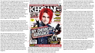
  • 1. The masthead of this magazine stands out from the rest of the page as it uses a black and white, which are contrasting colours. This means the audience will be well aware of which brand of magazine they are reading. The font used for the masthead is signature to their brand as the eroded, jagged style of font is unique to their magazine. This punk/rock style of font corresponds with with the genre of the magazine, so the audience can determine the type of features within the magazine instantly. The masthead is behind the dominant image so it does not take the attention away from the main attraction of the magazine. Also, this could imply that artist is bigger than the magazine itself. The cover lines on this magazine have the main title of what is involved highlighted and more information about it underneath, this gives the reader an insight of what is involved in the magazine without giving too much away. The colours used, stick to the colour scheme of the magazine, and make the cover lines stand out whilst not taking attention away from the dominant image. “Kerrang” magazine has used a dominant image central to the frame of the magazine, in order to make it more visible to the audience and therefore attract their attention. The style of the artist; their hair colour being bright, and their style of clothes being mostly leather implies that the artist is from a punk rock music background. The facial expression of the artist is quite natural with a half smile/smirk and, due to the eye level camera angle, he is providing the audience with direct mode of address; giving the audience the impression that there is something to look forward to in the magazine about their band. In addition to the artists face, their body language is also providing direct mode of address, by pointing at the audience. This makes the audience feel more attracted and connected with the magazine. The magazine has also used a blank background in the image, this could mean that they are giving away no information on the front cover so the viewer will have to read the article to find out more or that they don’t want to draw attention away once again from the features. The only thing in the background s a shadow to the bottom left of the page, which could imply a dark past for the artist; linking to the sub-heading “danger days”. The plug on Kerrang uses the same font and colour scheme as the rest of the magazine however is highlighted with a red circle, suggesting it has some sort of importance to the magazine. It also attracts the readers eye as it is a different design (circle) to the rest of the magazine. Another plug of the magazine is the free covers and posters given away with the magazine which suggests that the audience will be younger teens. The main sell-line of the magazine is the name of the band, this makes the reader well aware of who the main article will be about. The magazine further shows the importance of this band by using the same font as what is on the bands album and the ‘spider’ symbol in the ‘o’ of “Romance.” This shows the magazine is going to have the main focus on the band as it is the only font that has been changed and adapted due to the artist or band. The sub-head expands on the main sell-line of this magazine, it is also highlighted in a different colour to all the other text linking it to the importance of the main sell-line. The background colour of this text is red which has connotations of danger; linking it to the ‘danger days’ aspect of the sub-head.in addition to this the alliteration used makes the term “danger days” more memorable to the audience and therefore makes them more likely to ready the story. On this sub-head the magazine has wrote ‘the inside story’ which does not give much away about the article but makes the reader want to keep reading and open the magazine. The target audience for this magazine is mainly male teenagers to mid twenties (15-25) based on the font covers text and the format. The cluttered layout suggests a younger element along with the bold colours. The colour scheme of this magazine includes many contrasting, bright colours like: red, yellow black and white which create a very bold front page. This makes the magazine stand out on the shelf from other magazine as it will be the first thing the reader sees.
  • 2. The colour scheme of this page mainly consists of red, white and black. These colours have a classical theme as they are often associated with older images. The connotations which are presented with these colours are purity, darkness, love and hate; by combining these colours, and therefore themes, the magazine appears to imply that they are a classic magazine that features stories ranging from love to despair and destruction to redemption in the world of music. The contents page has features filling the entire left hand side of the page, in a column format. This clean and clearly displayed format implies that the magazine is being targeted towards an older audience rather than young teens. The features also include an “Oasis Special” which is presented in a totally different font and colouring. By using the gold colouring and thinner text of the page numbers and font, it implies that these stories are special, much like the title states. The dominant denotation is of a band named the “The Courteeners.” It is clear that they are featured in a story as there is an anchor which includes the page number . On the image the band is featured on a hill which could imply that the band is rising above others or that they think they are higher than everyone else. Combining this with the camera angle that makes the audience appear to be looking up at the band, it further suggests this sense of a superior nature. The contents page also features the masthead which creates synergy throughout the magazine. The running head, heading and some essential information, such as the date and issue number, are presented in a black block of colour across the page top of the page. The pugs are adorned with the information already featured on the front cover. Also shown in this bar are links to social media and the magazines website. This magazine also features an “Every Month” segment which is clearly separated by the title backed in solid red. These additions feature plugs that may entice or be a bonus for buying the magazine in the audiences opinions. Q Magazine also shows a slug in the form of their review. The feature has a sub head, “the worlds biggest and best music guide” which, despite being bias, shows to the audience that this is a magazine that takes pride in their features and is established enough to be considered the best for reviews. The sub image of a male, Nick Cave, shows him in a suit which makes the audience think he knows what he is talking about as a suit has connotations of being professional and educated.
  • 3. This article is framed in a boarder that resembles spotlights which have connotations of stardom and fame. This implies that the artist is used to being in the spot light when you combine this with the fact that the dominant image of the artist over laps the spotlight boarder. The style of this article is question and answer which creates a much more laid back and casual feel. One can infer that the target audience for this article will be old teens as the article isn't as detailed and worded difficultly compared to the typical written article. On this double page spread article the dominant image is featured on the entire left side page. The denotation of Davey Havok is taken with three point lighting which creates a glossy image, typically featured in magazines. The way in which the artist is presented: with tattoos, messy hair and unshaven face, suggests that he may be from either a rock or punk genre of music as these are connotations of these genres. Judging by his facial expression he is being portrayed as ‘moody’, meaning he may be about to express something he is not pleased about. In addition to this the artists body language, with his hands assumingly in his pockets and the tilt/slouch to his body, gives of a “casual” vibe or sense of relaxation. This creates binary opposition between his face and body. The singers image also shows iconography by him wearing a cross around his neck, which is may suggest some sort of religion or belief he may have however, typically this genre often uses religious symbols as more of a fashion statement rather than to represent their beliefs. His body language is slouched and clothing is casual suggesting he is relaxed with the situation. The article title is based on the colour scheme of white and pink, highlighted in black so the writing stands out against the background. Furthermore the colours used are stereotypically feminine meaning the article could interest more females. The word ‘absolutely’ is bigger than the rest of the title, this, in my opinion, is to intrigue the audience to read the whole article and find out what the artist means by this. The strapline, is in a smaller text to the title so it doesn't take the effect away from it, however it is still bigger than the actual typed article. This is so the reader finds out more information about the article but at the same time too much isn’t revealed so the audience has to carry on reading. The magazine still sticks to the feminine colour scheme for the strapline. Both the title and strapline are situated on a slant, the side closest to the artist tilted further down than the other. This particular effect gives off the sense that the words are coming from the artists mouth, which they are as this is a pull quote, in both a literal and visual sense. This double page spread includes a website for the magazine which allows the audience to gain more information on artists and “Kerrang” itself.