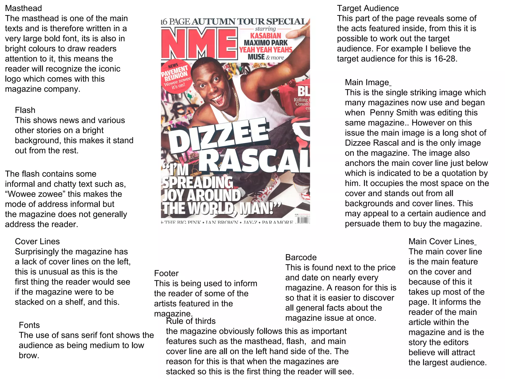
Masthead The masthead is one of the main texts and is therefore written in a very large bold font, its is also in bright colours to draw readers attention to it, this means the reader will recognize the iconic logo which comes with this magazine company. Flash This shows news and various other stories on a bright background, this makes it stand out from the rest. The flash contains some informal and chatty text such as, “Wowee zowee” this makes the mode of address informal but the magazine does not generally address the reader. Cover Lines Surprisingly the magazine has a lack of cover lines on the left, this is unusual as this is the first thing the reader would see if the magazine were to be stacked on a shelf, and this. Fonts The use of sans serif font shows the audience as being medium to low brow. Footer This is being used to inform the reader of some of the artists featured in the magazine. Rule of thirds the magazine obviously follows this as important features such as the masthead, flash,  and main cover line are all on the left hand side of the. The reason for this is that when the magazines are stacked so this is the first thing the reader will see. Main Image   This is the single striking image which many magazines now use and began when  Penny Smith was editing this same magazine.. However on this issue the main image is a long shot of Dizzee Rascal and is the only image on the magazine. The image also anchors the main cover line just below which is indicated to be a quotation by him. It occupies the most space on the cover and stands out from all backgrounds and cover lines. This may appeal to a certain audience and persuade them to buy the magazine. Target Audience This part of the page reveals some of the acts featured inside, from this it is possible to work out the target audience. For example I believe the target audience for this is 16-28. Main Cover Lines   The main cover line is the main feature on the cover and because of this it takes up most of the page. It informs the reader of the main article within the magazine and is the story the editors believe will attract the largest audience. Barcode This is found next to the price and date on nearly every magazine. A reason for this is so that it is easier to discover all general facts about the magazine issue at once.
The masthead of the magazine is used again at the top of the page. This is the iconic logo and is used so that readers can see consistency in the magazine. The masthead is big and bold and stands out from the background. The main image is situated in the middle of the page meaning it is one of the first thing the reader will see. Also the way it is taken, to make it look like a photo, shows the magazine has a casual feeling. They have put what the magazine mainly contains on the right under sub-headings, this means it is easier for the reader to spot their favourite aspect and go straight to it. They use drop caps to start the main article off, the puts emphasis on the article and draws the readers eye to it. The use of sans serif font shows the audience as being medium to low brow. Once again there is a limited colour pallet, however by doing this they are keeping to the magazines traditional colours. Black, white and red. They have included a subscription box with previous issues and a phone number to order it. By doing this they may interest reader into becoming a full paying subscriber. The main text is white and written against a black background, this not only makes it easier to see but also helps it stick out and grab the readers attention. The insides of the magazine are split into 5 sections, news, radar, reviews, live! And feature. This is effective because readers know where to look for what things.
By captioning the word Dizzee beneath the picture, it shows the important of him and the image itself, also it uses colloquialism or slang There is a minimal amount of text , and the text that is there is small. This shows that they wanted to use the image to portray the main message, also the text is wrapped around the image at the bottom on the third column. Using one single striking image is effective for the magazine as all the attention is put onto the image and the size of this image will attract a lot of readers in to read this particular story. The Masthead is also in a street font adding to the overall image the magazine portrays. Also san serif font is used meaning they believe their audience is medium to low brow. The editors have used an entire page for the main image this clearly shows its importance. Also the image itself represents the artist and how he is portrayed. The mis-en-scene is a wall with graffiti, this could be used to show the artists street background and his music.

Task1 nme analysis

  • 1.
    Masthead The mastheadis one of the main texts and is therefore written in a very large bold font, its is also in bright colours to draw readers attention to it, this means the reader will recognize the iconic logo which comes with this magazine company. Flash This shows news and various other stories on a bright background, this makes it stand out from the rest. The flash contains some informal and chatty text such as, “Wowee zowee” this makes the mode of address informal but the magazine does not generally address the reader. Cover Lines Surprisingly the magazine has a lack of cover lines on the left, this is unusual as this is the first thing the reader would see if the magazine were to be stacked on a shelf, and this. Fonts The use of sans serif font shows the audience as being medium to low brow. Footer This is being used to inform the reader of some of the artists featured in the magazine. Rule of thirds the magazine obviously follows this as important features such as the masthead, flash, and main cover line are all on the left hand side of the. The reason for this is that when the magazines are stacked so this is the first thing the reader will see. Main Image This is the single striking image which many magazines now use and began when Penny Smith was editing this same magazine.. However on this issue the main image is a long shot of Dizzee Rascal and is the only image on the magazine. The image also anchors the main cover line just below which is indicated to be a quotation by him. It occupies the most space on the cover and stands out from all backgrounds and cover lines. This may appeal to a certain audience and persuade them to buy the magazine. Target Audience This part of the page reveals some of the acts featured inside, from this it is possible to work out the target audience. For example I believe the target audience for this is 16-28. Main Cover Lines The main cover line is the main feature on the cover and because of this it takes up most of the page. It informs the reader of the main article within the magazine and is the story the editors believe will attract the largest audience. Barcode This is found next to the price and date on nearly every magazine. A reason for this is so that it is easier to discover all general facts about the magazine issue at once.
  • 2.
    The masthead ofthe magazine is used again at the top of the page. This is the iconic logo and is used so that readers can see consistency in the magazine. The masthead is big and bold and stands out from the background. The main image is situated in the middle of the page meaning it is one of the first thing the reader will see. Also the way it is taken, to make it look like a photo, shows the magazine has a casual feeling. They have put what the magazine mainly contains on the right under sub-headings, this means it is easier for the reader to spot their favourite aspect and go straight to it. They use drop caps to start the main article off, the puts emphasis on the article and draws the readers eye to it. The use of sans serif font shows the audience as being medium to low brow. Once again there is a limited colour pallet, however by doing this they are keeping to the magazines traditional colours. Black, white and red. They have included a subscription box with previous issues and a phone number to order it. By doing this they may interest reader into becoming a full paying subscriber. The main text is white and written against a black background, this not only makes it easier to see but also helps it stick out and grab the readers attention. The insides of the magazine are split into 5 sections, news, radar, reviews, live! And feature. This is effective because readers know where to look for what things.
  • 3.
    By captioning theword Dizzee beneath the picture, it shows the important of him and the image itself, also it uses colloquialism or slang There is a minimal amount of text , and the text that is there is small. This shows that they wanted to use the image to portray the main message, also the text is wrapped around the image at the bottom on the third column. Using one single striking image is effective for the magazine as all the attention is put onto the image and the size of this image will attract a lot of readers in to read this particular story. The Masthead is also in a street font adding to the overall image the magazine portrays. Also san serif font is used meaning they believe their audience is medium to low brow. The editors have used an entire page for the main image this clearly shows its importance. Also the image itself represents the artist and how he is portrayed. The mis-en-scene is a wall with graffiti, this could be used to show the artists street background and his music.