The document discusses how a magazine cover and contents page conform to and challenge conventions of rock music magazines.
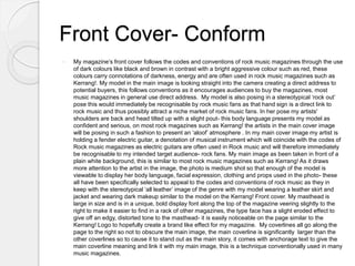
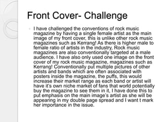
The magazine cover conforms by using dark colors and a model posing in a "rock out" style to appeal to rock fans. It challenges conventions by featuring a sole female artist rather than multiple images.
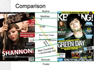
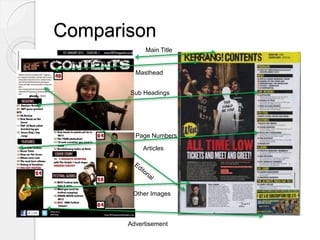
The contents page conforms through consistent branding, a letter from the editor, and categorized content similar to Kerrang! magazine. It provides page numbers and variety of smaller artist images organized neatly.
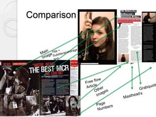
The double page feature conforms with a large central image, eye-catching title, and 3-box article format like Kerrang! to emphasize the focus artist and intrigue readers. Consistent branding is