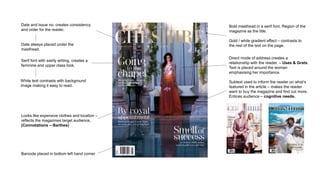
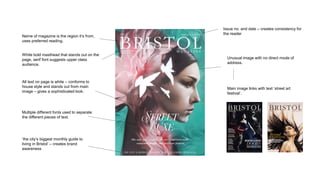
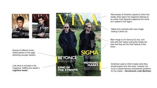
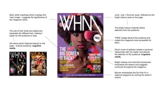
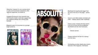
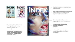
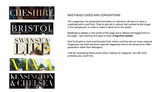
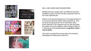
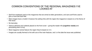
CODES AND
CONVENTIONS
REGIONAL MAGAZINE FRONT COVERS
Bold masthead in a serif font. Region of the
magazine as the title.
Gold / white gradient effect – contrasts to
the rest of the text on the page.
Direct mode of address creates a
relationship with the reader. – Uses & Grats.
Text is placed around the woman
emphasising her importance.
Looks like expensive clothes and location –
reflects the magazines target audience,
(Connotations – Barthes)
Serif font with swirly writing, creates a
feminine and upper class look.
White text contrasts with background
image making it easy to read.
Barcode placed in bottom left hand corner
Date and issue no. creates consistency
and order for the reader.
Date always placed under the
masthead.
Subtext used to inform the reader on what’s
featured in the article – makes the reader
want to buy the magazine and find out more.
Entices audience – cognitive needs.
Name of magazine is the region it’s from,
uses preferred reading.
White bold masthead that stands out on the
page, serif font suggests upper class
audience.
Issue no. and date – creates consistency for
the reader
Unusual image with no direct mode of
address.
Main image links with text ‘street art
festival’.
‘the city’s biggest monthly guide to
living in Bristol’ – creates brand
awareness
Multiple different fonts used to separate
the different pieces of text.
All text on page is white – conforms to
house style and stands out from main
image – gives a sophisticated look.
‘Manchester & Cheshire’ placed to inform the
reader what region the magazine belongs to,
as unlike most regional magazines the name
isn’t related to the region.
Yellow font contrasts with main image,
making it stand out.
Main image is of a famous DJ duo, and
links with text ‘sigma’ giving the reader the
idea that they are the main feature of this
issue.
Lists what is included in the
magazine, fulfilling the reader’s
cognitive needs.
Names of different music
artists placed on the page,
attracting younger readers.
Small text used to inform reader what they
should expect from this issue, however not
much is placed leaving unanswered questions
for the reader – Hermeneutic code (Barthes)
June / July = Summer issue, reflected by the
bright colours used on the page
The bright colours instantly attract
attention from the audience.
‘FREE’ badge attracts the audience and
makes the magazine more accessible for
them.
Banner emphasises the fact that it’s a
regional magazine by naming the areas it
covers.
Direct mode of address creates a personal
relationship with the reader and attracts
the attention of the audience. Cognitive
needs.
Bright makeup and colourful accessories
emphasise the season and suggests
continuity throughout the magazine.
Bold, white masthead which overlaps the
main image – suggests the significance of
the magazine name.
The use of both white and yellow text
separates the different text, making it
easier for the audience to read.
Info about what’s featured placed on the
page – entices audience, cognitive
needs.
Masthead font significantly bigger than
the rest of the font on the page – stands
out.
Subheading provides details about what’s
featured in the magazine, informative
Issue no. and date creates consistency &
order. – Always placed under masthead.
Flowers reinforce the fact it’s a spring /
summer issue
Close up shot, however the face seems
to be out of focus and the sunglasses
and flowers are the main focal point.
Attracts women
White font, however it’s very minimal which
is quite unconventional compared to other
regional magazines I’ve looked at.
Magazine seems to be aimed at a younger
target audience.
Suggests the layouts more important than
informing the reader, could also suggest that
the magazine already has a strong loyal
fanbase.
Masthead divided into 2 fonts, ‘index’ being
more prominent.
‘Arts special’ links with the main
image, suggesting the main subject
of this issue.
Bold masthead interestingly placed over part
of the woman’s eyes, emphasizing the
importance of the masthead itself.
Simplistic layout with short sentences
and easy to read text – creates a
casual and laid back feel.
Red, white and black house style,
suggests gender neutral target audience.
Close up image, unconventional
especially for a regional
magazine.
Brief sentences about what’s inside –
intrigues the reader and makes them
want to read on. (Creates enigma,
hermeneutic code.)
MASTHEAD CODES AND CONVENTIONS
The magazines I’ve researched and taken an interest to all seem to have a
masthead with a serif font. They’re also all in colours that contrast to the image
in the background, in order to make it stand out to the reader.
Masthead is always in the centre of the page and is always the biggest text on
the page – eye catching and easy to read. (Cognitive needs).
Serif fonts give a more sophisticated look, which could be why so many regional
magazines use them because regional magazines tend to be aimed at an older
generation rather than teenagers.
I will be considering these points when making my magazine, and will most
probably use a serif font.
SELL LINE CODES AND CONVENTIONS
Multiple fonts are usually used, and different size fonts –
probably to split up the text and also emphasise which is
the most important part.
Sell line is the second largest font on the page therefore it
is the second thing the reader will be attracted by. They
are short but also provide a lot of information about
what’s featured in the magazine and can also persuade
the reader to buy the magazine, after hinting at what’s in
it. Also leaves unansweredquestions (cognitive needs –
uses & grats).
Text colours usually fit the house style and contrast to
thebackground making them stand out.
COMMON CONVENTIONS OF THE REGIONAL MAGAZINES I’VE
LOOKED AT
• Serif font masthead used on the magazines that are aimed at older generations, and sans serif fonts used to
give a more laid back feel.
• Main images have a model in however the setting links with the region the magazine is based on or the theme of
that issue.
• No barcodes
• Various sell lines and subtexts placed on the front cover – giving the reader info (cognitive needs) and
persuading them to buy.
• Most magazine names feature the region they’re based on in it.
• Images are usually themed to link with one of the main features, and / or the date the issue was published.

Codes and conventions regional front covers

  • 1.
  • 2.
    Bold masthead ina serif font. Region of the magazine as the title. Gold / white gradient effect – contrasts to the rest of the text on the page. Direct mode of address creates a relationship with the reader. – Uses & Grats. Text is placed around the woman emphasising her importance. Looks like expensive clothes and location – reflects the magazines target audience, (Connotations – Barthes) Serif font with swirly writing, creates a feminine and upper class look. White text contrasts with background image making it easy to read. Barcode placed in bottom left hand corner Date and issue no. creates consistency and order for the reader. Date always placed under the masthead. Subtext used to inform the reader on what’s featured in the article – makes the reader want to buy the magazine and find out more. Entices audience – cognitive needs.
  • 3.
    Name of magazineis the region it’s from, uses preferred reading. White bold masthead that stands out on the page, serif font suggests upper class audience. Issue no. and date – creates consistency for the reader Unusual image with no direct mode of address. Main image links with text ‘street art festival’. ‘the city’s biggest monthly guide to living in Bristol’ – creates brand awareness Multiple different fonts used to separate the different pieces of text. All text on page is white – conforms to house style and stands out from main image – gives a sophisticated look.
  • 4.
    ‘Manchester & Cheshire’placed to inform the reader what region the magazine belongs to, as unlike most regional magazines the name isn’t related to the region. Yellow font contrasts with main image, making it stand out. Main image is of a famous DJ duo, and links with text ‘sigma’ giving the reader the idea that they are the main feature of this issue. Lists what is included in the magazine, fulfilling the reader’s cognitive needs. Names of different music artists placed on the page, attracting younger readers. Small text used to inform reader what they should expect from this issue, however not much is placed leaving unanswered questions for the reader – Hermeneutic code (Barthes)
  • 5.
    June / July= Summer issue, reflected by the bright colours used on the page The bright colours instantly attract attention from the audience. ‘FREE’ badge attracts the audience and makes the magazine more accessible for them. Banner emphasises the fact that it’s a regional magazine by naming the areas it covers. Direct mode of address creates a personal relationship with the reader and attracts the attention of the audience. Cognitive needs. Bright makeup and colourful accessories emphasise the season and suggests continuity throughout the magazine. Bold, white masthead which overlaps the main image – suggests the significance of the magazine name. The use of both white and yellow text separates the different text, making it easier for the audience to read. Info about what’s featured placed on the page – entices audience, cognitive needs.
  • 6.
    Masthead font significantlybigger than the rest of the font on the page – stands out. Subheading provides details about what’s featured in the magazine, informative Issue no. and date creates consistency & order. – Always placed under masthead. Flowers reinforce the fact it’s a spring / summer issue Close up shot, however the face seems to be out of focus and the sunglasses and flowers are the main focal point. Attracts women White font, however it’s very minimal which is quite unconventional compared to other regional magazines I’ve looked at. Magazine seems to be aimed at a younger target audience. Suggests the layouts more important than informing the reader, could also suggest that the magazine already has a strong loyal fanbase.
  • 7.
    Masthead divided into2 fonts, ‘index’ being more prominent. ‘Arts special’ links with the main image, suggesting the main subject of this issue. Bold masthead interestingly placed over part of the woman’s eyes, emphasizing the importance of the masthead itself. Simplistic layout with short sentences and easy to read text – creates a casual and laid back feel. Red, white and black house style, suggests gender neutral target audience. Close up image, unconventional especially for a regional magazine. Brief sentences about what’s inside – intrigues the reader and makes them want to read on. (Creates enigma, hermeneutic code.)
  • 8.
    MASTHEAD CODES ANDCONVENTIONS The magazines I’ve researched and taken an interest to all seem to have a masthead with a serif font. They’re also all in colours that contrast to the image in the background, in order to make it stand out to the reader. Masthead is always in the centre of the page and is always the biggest text on the page – eye catching and easy to read. (Cognitive needs). Serif fonts give a more sophisticated look, which could be why so many regional magazines use them because regional magazines tend to be aimed at an older generation rather than teenagers. I will be considering these points when making my magazine, and will most probably use a serif font.
  • 9.
    SELL LINE CODESAND CONVENTIONS Multiple fonts are usually used, and different size fonts – probably to split up the text and also emphasise which is the most important part. Sell line is the second largest font on the page therefore it is the second thing the reader will be attracted by. They are short but also provide a lot of information about what’s featured in the magazine and can also persuade the reader to buy the magazine, after hinting at what’s in it. Also leaves unansweredquestions (cognitive needs – uses & grats). Text colours usually fit the house style and contrast to thebackground making them stand out.
  • 10.
    COMMON CONVENTIONS OFTHE REGIONAL MAGAZINES I’VE LOOKED AT • Serif font masthead used on the magazines that are aimed at older generations, and sans serif fonts used to give a more laid back feel. • Main images have a model in however the setting links with the region the magazine is based on or the theme of that issue. • No barcodes • Various sell lines and subtexts placed on the front cover – giving the reader info (cognitive needs) and persuading them to buy. • Most magazine names feature the region they’re based on in it. • Images are usually themed to link with one of the main features, and / or the date the issue was published.