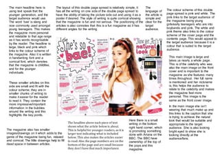
The colour scheme of this double
page spread is pink and white. The
pink links to the target audience of
the magazine being young
girls/early teenagers who are into
boybands and pink. The white and
pink theme also links to the colour
scheme of the cover page and the
contents page. This would appeal to
the target audience because it is a
colour that is suited to the target
audience.
This main image is large and
takes us nearly a whole page.
This is of the celebrity who was
also the main image on the front
cover and is important to the
magazine as she features many
times throughout. Her full name
is mentioned and her nickname
is, this helps the audience to
relate to the celebrity and makes
the magazine feel more
personal. This image is the
same as the front cover image.
The main headline here is
using text speak that the
younger generation, and the
target audience would use.
The word ‘bae’ is slang and
now commonly used amongst
young teenagers. This makes
the magazine more personal
and relatable to that age range
as it has words recognisable
by the reader. The headline is
large, black and pink which
links to the colour scheme of
the magazine. Also it is written
in handwriting font and a
comical font, which denotes
that the magazine is childlike,
and for the younger
individuals.
These smaller articles on this
side are small and fit with the
colour scheme; they are in
smaller chunks of writing to
make it easier for the reader
to read it. They contain the
more impressive/important
information in the bubbles
around the writing and this
highlights the key points.
The layout of this double page spread is relatively simple, it
has all the writing on one side of the double page spread to
have the ability of taking the picture side out and using it as a
poster if desired. The style of writing is quite comical showing
that the magazine is fun and not serious. The positioning of the
articles is also connotes that this is a fun magazine as it has
different angles for the writing.
In the main image she isn’t
wearing that much make up and
this links to the caption that she
is trying to achieve the natural
look that would be suitable and
appropriate to the target
audience. She is also looking
bright eyed to show she is
looking directly at the
audience/fans.
The magazine also has smaller
images/drawings on it which adds to the
genre of the magazine being fun, relaxed
and comical. The little drawings help to fill
dead space in between articles.
The headline above each piece of text
shows what the article below is about.
This is helpful for younger readers, as it is
larger text indicating what is included
below. This also makes the articles easier
to read. Also the page numbers are on the
bottom of the page and are small because
they don’t have that much importance.
Here there is a small
writing in the bottom
right hand corner, which
is promoting something
done with Ariana on the
BBC. The BBC have
ownership of the top of
the pops and this
magazine.
The
language of
the article is
simple and
clear for the
target
audience.

Own magazine double page spread

  • 1.
    The colour schemeof this double page spread is pink and white. The pink links to the target audience of the magazine being young girls/early teenagers who are into boybands and pink. The white and pink theme also links to the colour scheme of the cover page and the contents page. This would appeal to the target audience because it is a colour that is suited to the target audience. This main image is large and takes us nearly a whole page. This is of the celebrity who was also the main image on the front cover and is important to the magazine as she features many times throughout. Her full name is mentioned and her nickname is, this helps the audience to relate to the celebrity and makes the magazine feel more personal. This image is the same as the front cover image. The main headline here is using text speak that the younger generation, and the target audience would use. The word ‘bae’ is slang and now commonly used amongst young teenagers. This makes the magazine more personal and relatable to that age range as it has words recognisable by the reader. The headline is large, black and pink which links to the colour scheme of the magazine. Also it is written in handwriting font and a comical font, which denotes that the magazine is childlike, and for the younger individuals. These smaller articles on this side are small and fit with the colour scheme; they are in smaller chunks of writing to make it easier for the reader to read it. They contain the more impressive/important information in the bubbles around the writing and this highlights the key points. The layout of this double page spread is relatively simple, it has all the writing on one side of the double page spread to have the ability of taking the picture side out and using it as a poster if desired. The style of writing is quite comical showing that the magazine is fun and not serious. The positioning of the articles is also connotes that this is a fun magazine as it has different angles for the writing. In the main image she isn’t wearing that much make up and this links to the caption that she is trying to achieve the natural look that would be suitable and appropriate to the target audience. She is also looking bright eyed to show she is looking directly at the audience/fans. The magazine also has smaller images/drawings on it which adds to the genre of the magazine being fun, relaxed and comical. The little drawings help to fill dead space in between articles. The headline above each piece of text shows what the article below is about. This is helpful for younger readers, as it is larger text indicating what is included below. This also makes the articles easier to read. Also the page numbers are on the bottom of the page and are small because they don’t have that much importance. Here there is a small writing in the bottom right hand corner, which is promoting something done with Ariana on the BBC. The BBC have ownership of the top of the pops and this magazine. The language of the article is simple and clear for the target audience.