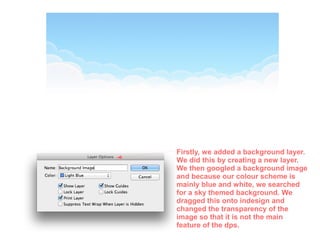
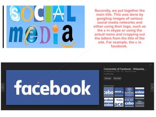
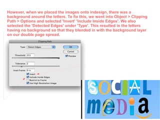
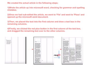
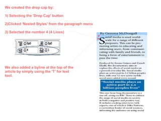
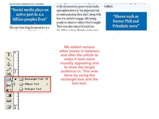
3. This is a screenshot of our completed Tv Listing.
This post will include a step by step guide of the
process in which we constructed our magazine. The
app that we used was called Indesign. This allowed
us to create a double page spread.
4. Firstly, we added a background layer.
We did this by creating a new layer.
We then googled a background image
and because our colour scheme is
mainly blue and white, we searched
for a sky themed background. We
dragged this onto indesign and
changed the transparency of the
image so that it is not the main
feature of the dps.
5. Secondly, we put together the
main title. This was done by
googling images of various
social media networks and
either using their logo, such as
the s in skype or using the
actual name and cropping out
the letters from the title of the
site. For example, the c in
facebook.
6. However, when we placed the images onto indesign, there was a
background around the letters. To fix this, we went into Object > Clipping
Path > Options and selected 'Invert' 'Include Inside Edges'. We also
selected the 'Detected Edges' under 'Type'. This resulted in the letters
having no background so that they blended in with the background layer
on our double page spread.
7. Next, we created this strip at the right hand
side of the DPS. This was created by using the
rectangle tool to create a rectangle and then by
selecting the chosen colour (blue) which
matches our colour scheme. Then, we googled
images of social media apps and dragged them
onto indesign. We positioned them in line with
eachother and made them all the same size.
We then acted text underneath each app with
various statistics and changed the font of the
text to made it stand out.
8. Then, we created the sub-heading. Firstly, we
created two rectangles, using the rectangle tool in
the tool box section. We changed the boxes to 2
different colours so that they both stood out on the
page. Then, we added the text. We changed the font
of the main sub-heading to italic. This makes the
writing stand out even more. This introduction gives
the audience a better understanding of what the
double page spread and article is all about, drawing
them in.
9. To add images to our Tv Listing, we firstly had
to draw a rectangle frame box in the places
where we wanted to place pictures. Then, we
went to File, and then 'Place' to insert the
images into the positioned graphic frames. We
could then resize and adjust the images to
suit the page. We then added captions along
with the images by using the text tool.
10.
11. We created the actual article in the following steps;
1)Wrote the article up into microsoft word, checking for grammar and spelling
mistakes.
2)Once we had sub-edited the article, we went to 'File' and went to 'Place' and
opened up the microsoft word document.
3)Then, we placed the text into the first column and drew a text box in the
remaining columns.
4)Finally, we clicked the red plus button in the first column of the text box,
and dragged the remaining text over to the other columns.
12. We created the drop cap by:
1) Selecting the 'Drop Cap' button
2)Clicked 'Nested Styles' from the paragraph menu
3) Selected the number 4 (4 Lines)
We also added a byline at the top of the
article by simply using the 'T' for text
tool.
13. We added various
other boxes in between
and after the article to
make it look more
viusally appealing and
to draw the target
audience in. This was
done by using the
rectangle box and the
text tool.