
Recommended
More Related Content
What's hot
What's hot (20)
Similar to Task 1b - Contents Page Analysis
Similar to Task 1b - Contents Page Analysis (20)
More from asmediad14
More from asmediad14 (20)
Recently uploaded
Recently uploaded (20)
Task 1b - Contents Page Analysis
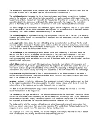
- 1. The masthead is again placed on the contents page. It is written in the same font and colour as it is on the front cover as this is part of the house style and helps the audience to recognise it. The main heading tells the reader that this is the contents page, which follows convention as it makes it easier for the audience to read. It is written in the same bulky font as the masthead, which again follows the house theme, and also makes it very noticeable for the audience. The white font is used as it is very striking against the black in the background and is part of the colour scheme for the magazine. The main title is placed at the the top of the page, which is conventional as it will be the first thing that the reader sees. The subheadings are all in the same bulky white font, against a black background. The use of capital letters makes them all stand out and makes them seem very important. An exclamation mark is also used after the subheading ‘LIVE!’, which makes it seem more exciting for the audience. The main subheading is a lot bigger than the other subheadings, making it one of the main focal points on the page, and making it much more eye-catching. It also has a worn-out appearance, making it more visually appealing for the audience. Anchorage text is places below the main subheading, giving extra information about tours that the target audience would be interested in. This text is also written in a white font on a black background, which makes it easy to read, and follows the colour scheme of the magazine. The large bold letter at the start of this text is conventional as it draws the attention of the reader. The main image on the contents page is also relevant to the main subheading. It is situated above the heading itself and is a photo of someone pointing to a coach. The coach has connotations of tours and festivals, which links it to the anchorage text as it is about gigs and tours. The image is slightly angled, making the page look busier and slightly less organised. It also has a border which helps to make it stand out against the dark background. Article titles are placed under each of the subheadings, showing the main articles in the magazine and giving the reader an insight into the types of content in the magazine. The article titles contain the names of many bands as this is designed to attract fans of these artists, thus appealing to the target audience. They are in a black font, which is visually appealing when placed next to the back boxes behind the subheadings. Page numbers are positioned next to each of these article titles, as this makes it easier for the reader to navigate through the magazine. They are in a red font, which stands out next the the black and white texts used for the subheadings and article titles. An advert is placed in the bottom right corner. This is designed to attract the target audience as it is a deal for the magazine subscription. The colours used for this advert include yellows, which do not fit in with the colour scheme for the magazine and so make the advert more eye-catching. The date is included on the contents page, which is conventional as it helps the audience to know how recent the information in the magazine is. The columns on this page are not equal. The left hand column contains the ‘band index’, the middle column contains the main image, main subheading and and anchorage text, and the right hand column contains the article titles and the advert. Making the columns different sizes makes the page appear to be more busy and less organised, and this gives the impression that the magazine contains a lot of content. The fonts used for all of the heading, subheadings and article titles are all sans serif, which makes them bolder and bulkier, which makes them seem more masculine. This would attract the target audience as the magazine is aimed towards men. This also makes the text stand out more. The language used seems very informal, and is quite colloquial. For example, the word ‘eh’ makes it seem more conversational, thus making it more friendly and seemingly personal.
- 2. Masthead Main image Main Subheading Anchorage text Main heading Date Subheadings Article titles Page numbers Advertisement