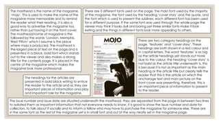
This document analyzes the front cover and contents page of a music magazine.
The front cover summary includes:
- The main image of Jack White is centrally placed and uses lighting/color scheme to stand out.
- Circles advertise special vinyl issues and extras to entice readers.
- Cover lines and taglines frame the image and provide article previews.
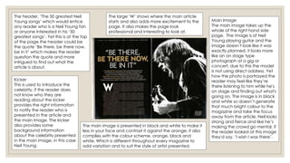
The contents page summary includes:
- The main image of musician Bert Jansch uses direct address.
- Articles are outlined with sublines providing more detail.
- A quote and photo preview an article to encourage reading.
- Different fonts are used for headings, body text, and sublines.