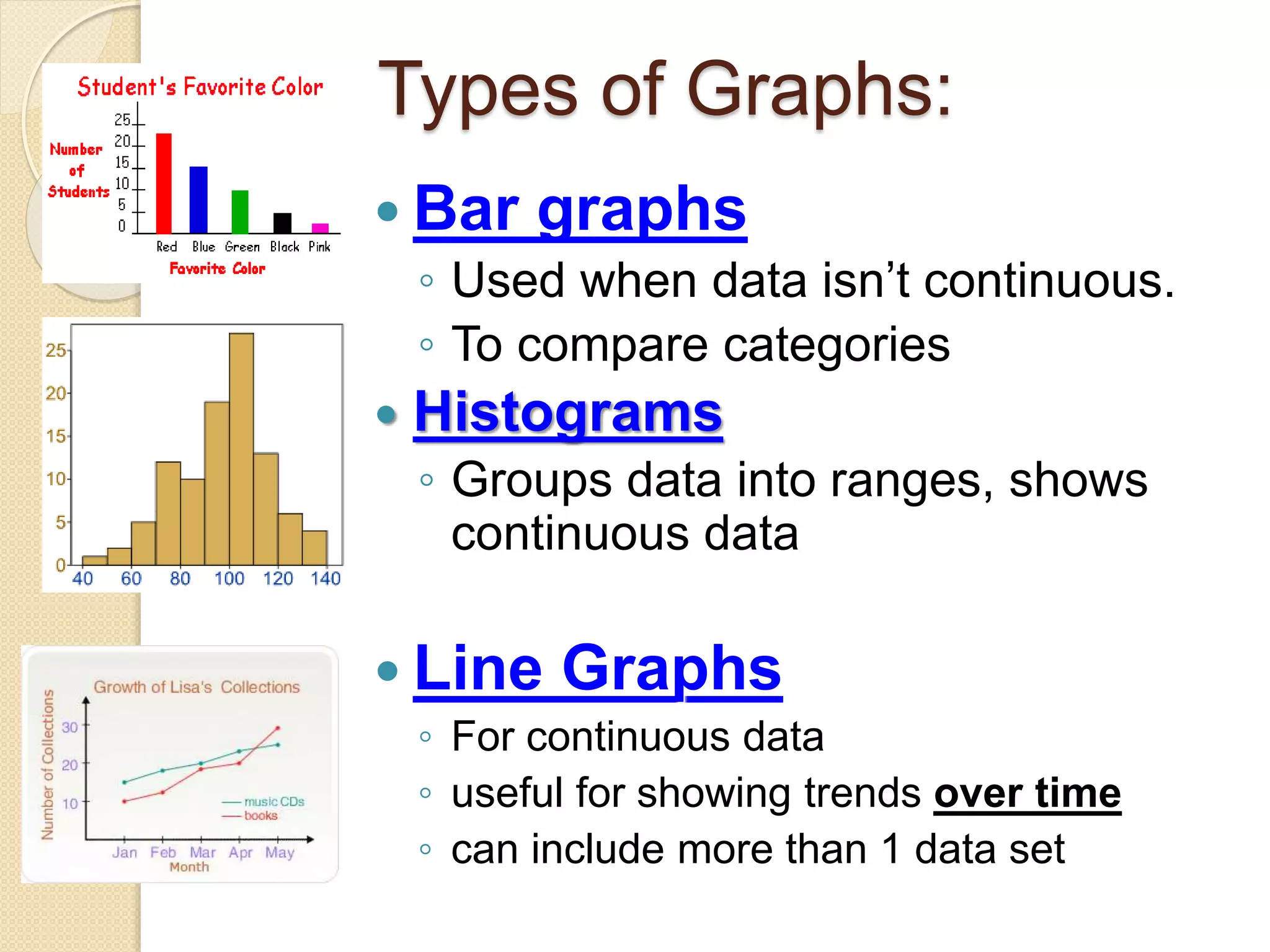
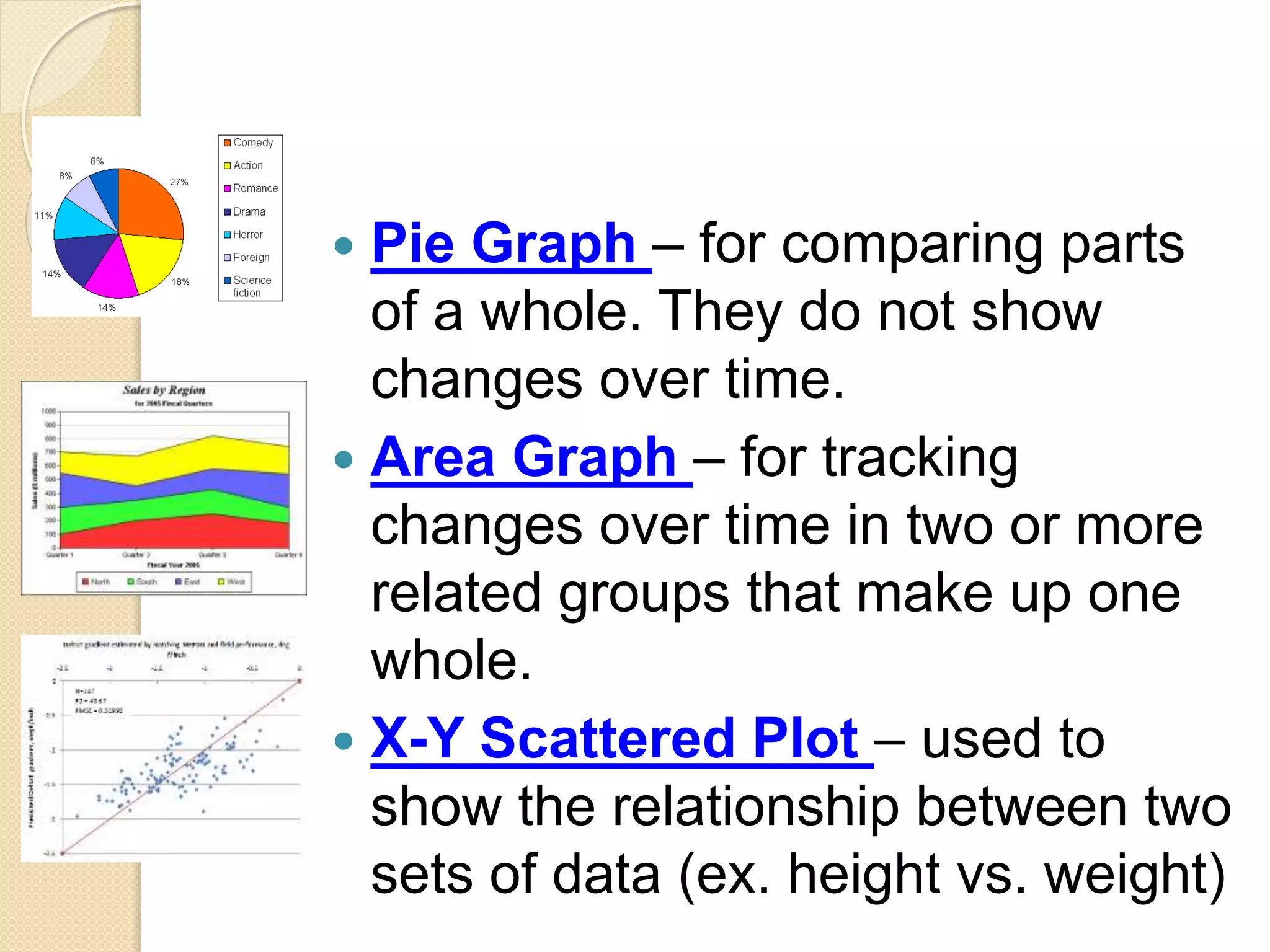
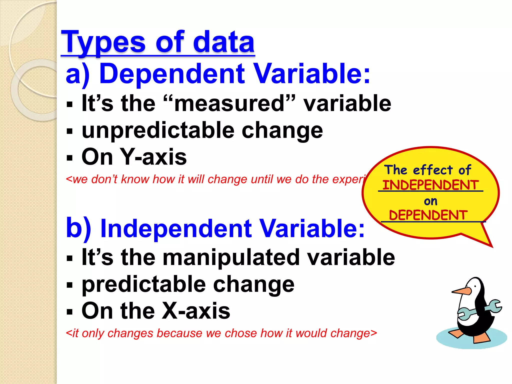
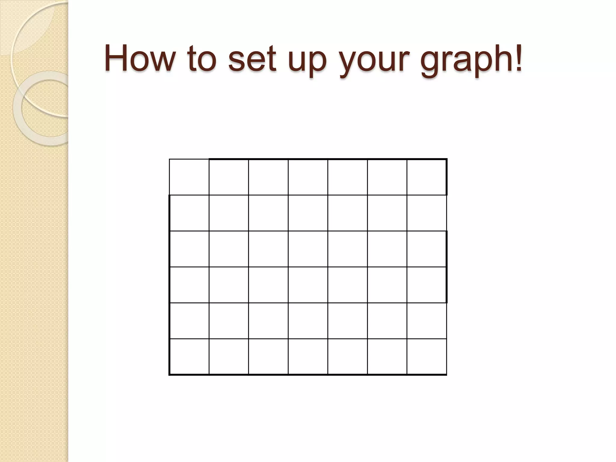
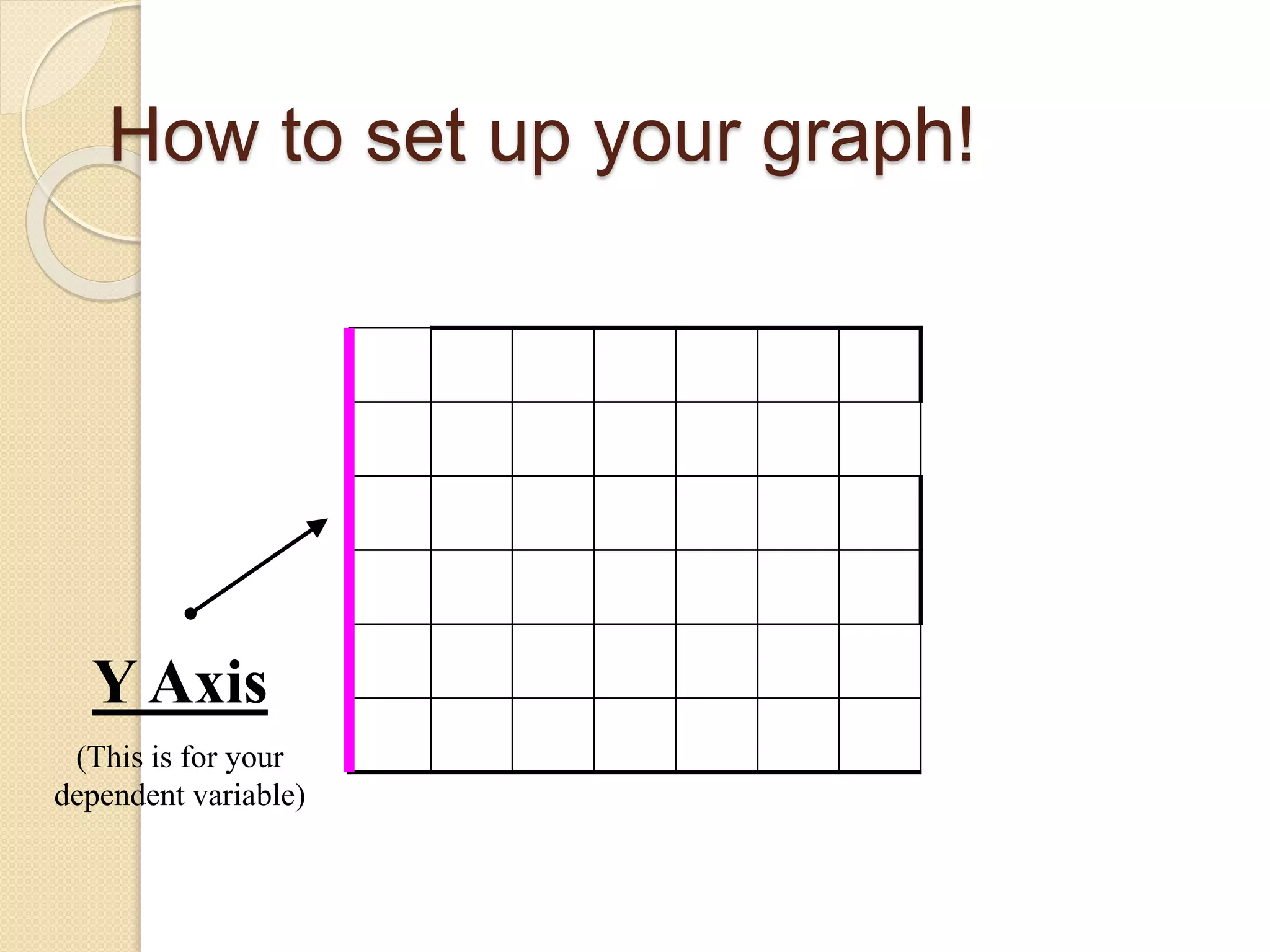
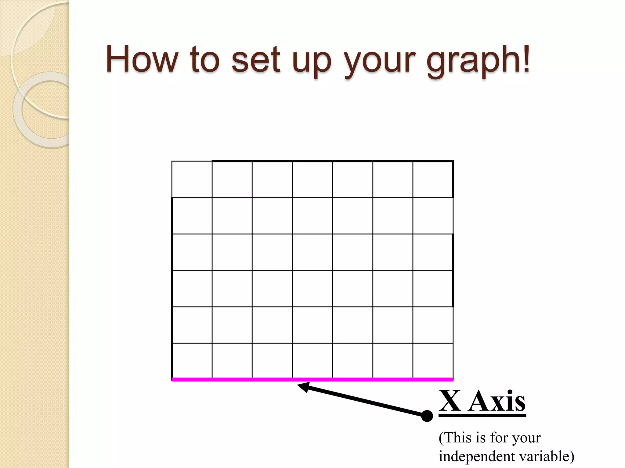
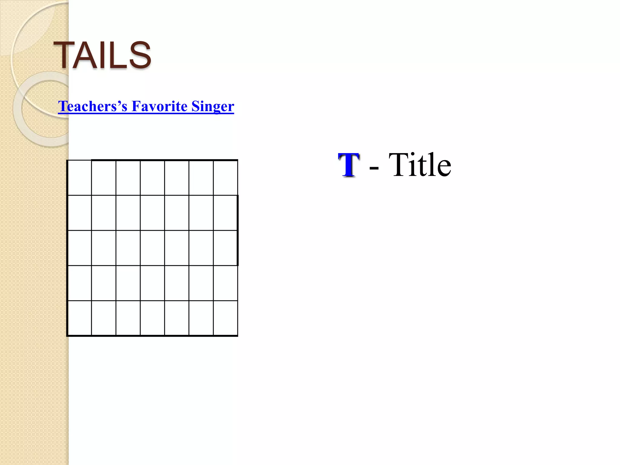
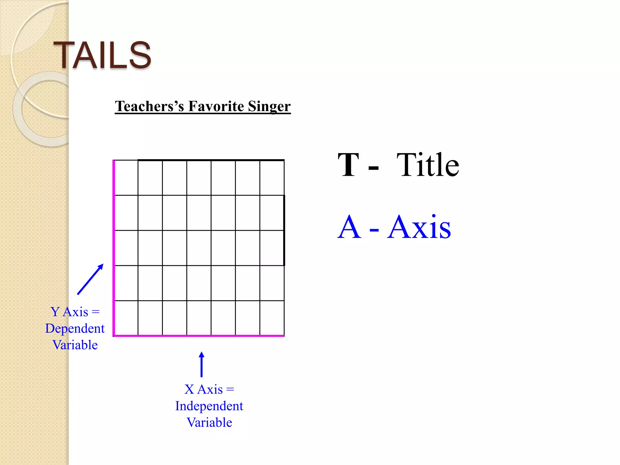
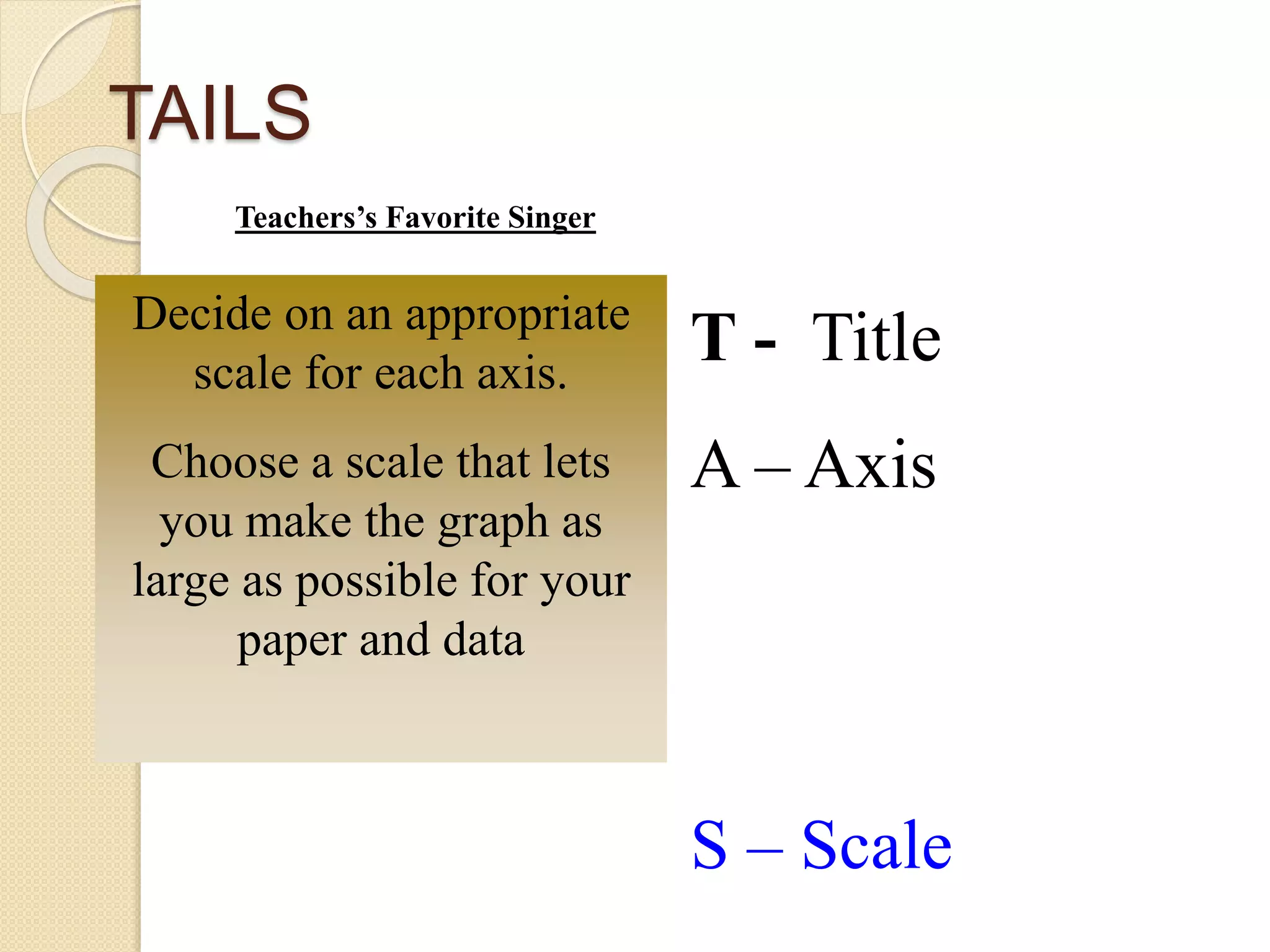
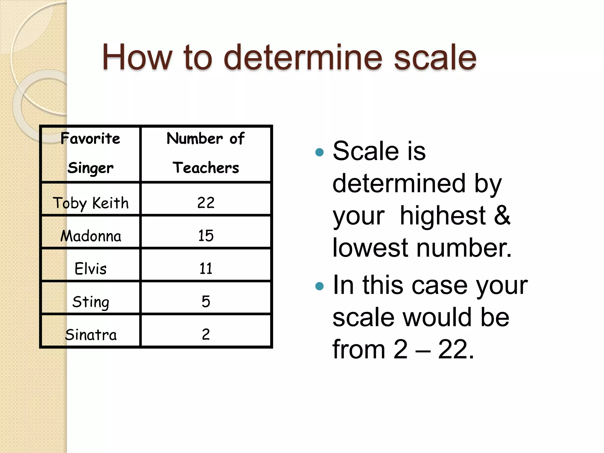
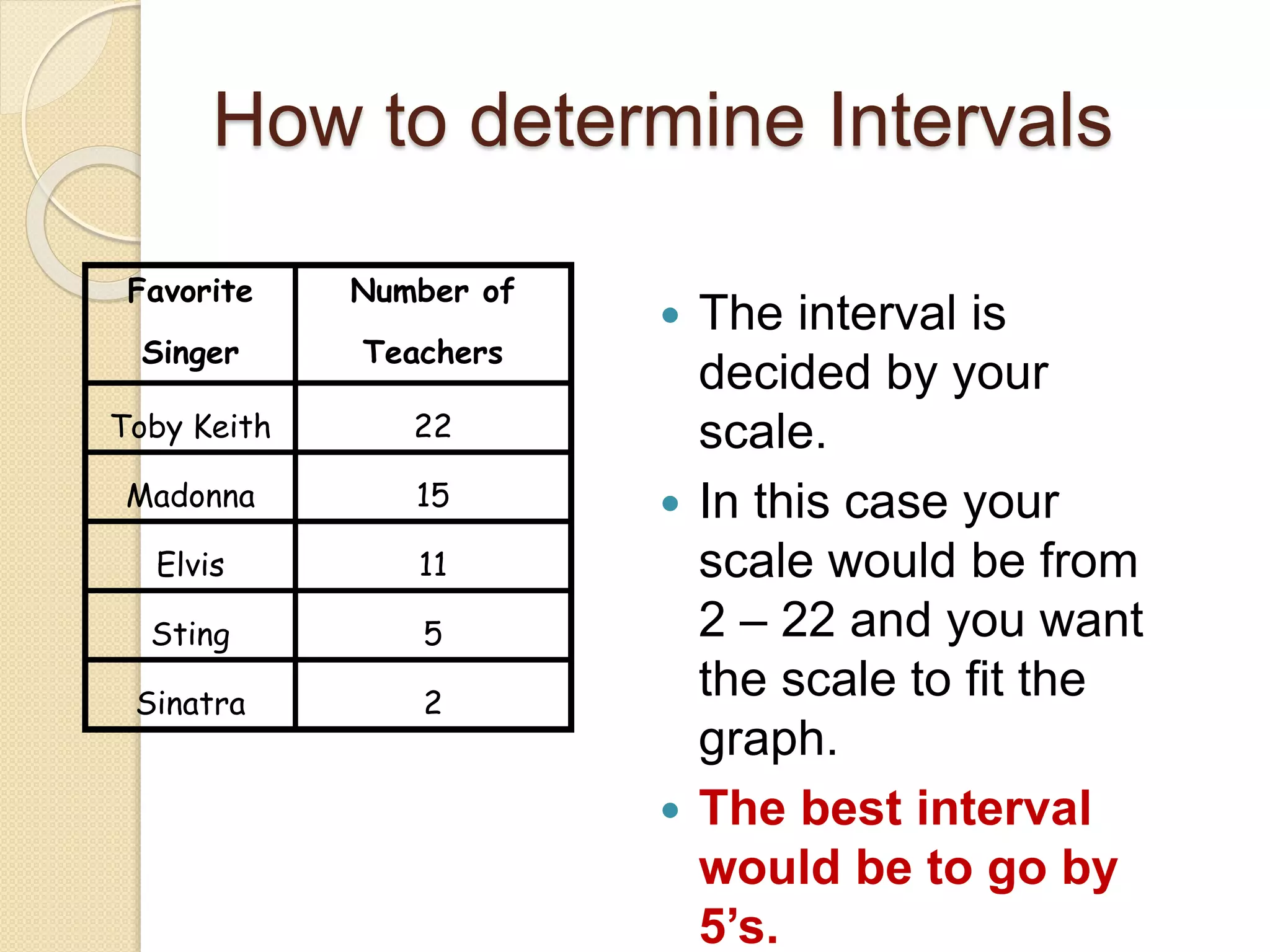
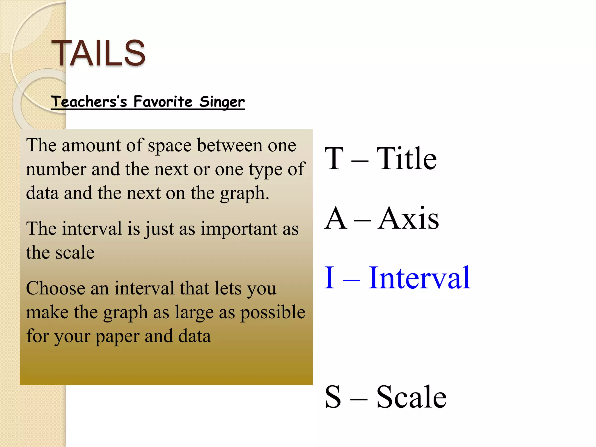
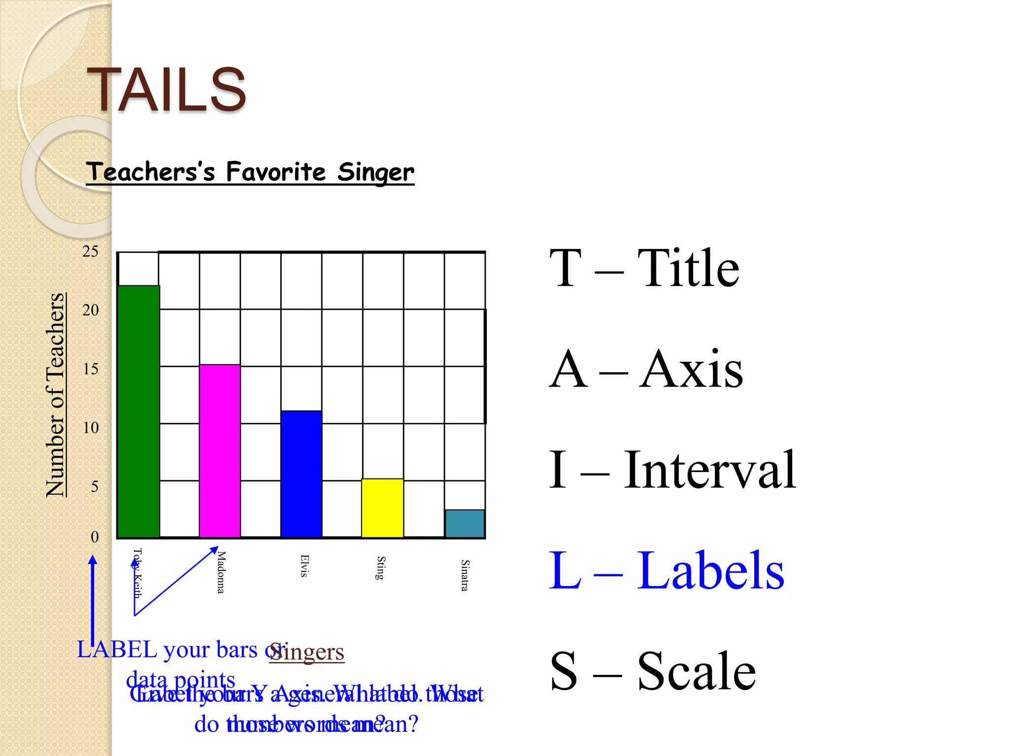
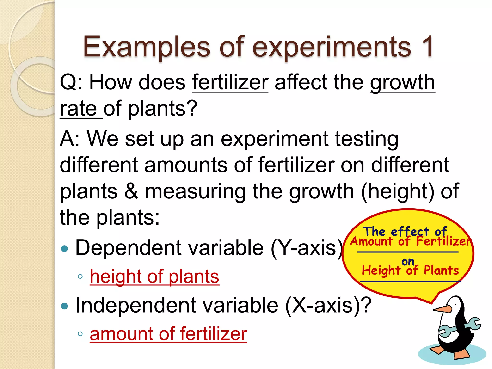
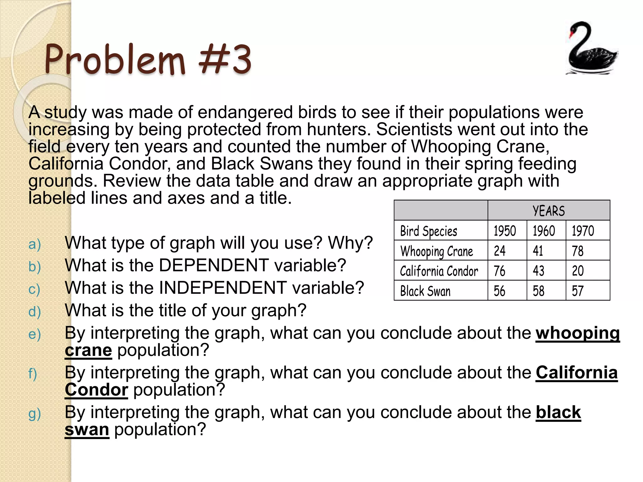
Graphing Notes (PPT)
(Cornell Note)
Date: 8/19/14
Main Topic: Graphing, Scientific
Method & Variables
Learning Objective:
How to set up a successful graph.
Subtitle: Different Types of Graphs
 Bar graphs
◦ Used when data isn’t continuous.
◦ To compare categories
 Histograms
◦ Groups data into ranges, shows
continuous data
 Line Graphs
◦ For continuous data
◦ useful for showing trends over time
◦ can include more than 1 data set
Types of Graphs:
 Pie Graph – for comparing parts
of a whole. They do not show
changes over time.
 Area Graph – for tracking
changes over time in two or more
related groups that make up one
whole.
 X-Y Scattered Plot – used to
show the relationship between two
sets of data (ex. height vs. weight)
Types of data
a) Dependent Variable:
 It’s the “measured” variable
 unpredictable change
 On Y-axis
<we don’t know how it will change until we do the experiment>
b) Independent Variable:
 It’s the manipulated variable
 predictable change
 On the X-axis
<it only changes because we chose how it would change>
The effect of
_____________
on
_____________
INDEPENDENT
DEPENDENT
GRAPHING REVIEW:
<No need to copy the following slides>
How to set up your graph!
Y Axis
(This is for your
dependent variable)
How to set up your graph!
X Axis
(This is for your
independent variable)
TAILS
T - Title
Teachers’s Favorite Singer
TAILS
T - Title
A - Axis
Teachers’s Favorite Singer
Y Axis =
Dependent
Variable
X Axis =
Independent
Variable
TAILS
T - Title
A – Axis
S – Scale
Teachers’s Favorite Singer
Decide on an appropriate
scale for each axis.
Choose a scale that lets
you make the graph as
large as possible for your
paper and data
How to determine scale
 Scale is
determined by
your highest &
lowest number.
 In this case your
scale would be
from 2 – 22.
Favorite
Singer
Number of
Teachers
Toby Keith 22
Madonna 15
Elvis 11
Sting 5
Sinatra 2
How to determine Intervals
 The interval is
decided by your
scale.
 In this case your
scale would be from
2 – 22 and you want
the scale to fit the
graph.
 The best interval
would be to go by
5’s.
Favorite
Singer
Number of
Teachers
Toby Keith 22
Madonna 15
Elvis 11
Sting 5
Sinatra 2
TAILS
T – Title
A – Axis
I – Interval
S – Scale
Teachers’s Favorite Singer
The amount of space between one
number and the next or one type of
data and the next on the graph.
The interval is just as important as
the scale
Choose an interval that lets you
make the graph as large as possible
for your paper and data
TAILS
T – Title
A – Axis
I – Interval
S – Scale
Teachers’s Favorite Singer
0
5
10
15
20
25
TAILS
T – Title
A – Axis
I – Interval
L – Labels
S – Scale
Teachers’s Favorite Singer
0
5
10
15
20
25
LABEL your bars or
data points
Singers
Give the bars a general label. What
do those words mean?
NumberofTeachers
Label your Y Axis. What do those
numbers mean?
Examples of experiments 1
Q: How does fertilizer affect the growth
rate of plants?
A: We set up an experiment testing
different amounts of fertilizer on different
plants & measuring the growth (height) of
the plants:
 Dependent variable (Y-axis)?
◦ height of plants
 Independent variable (X-axis)?
◦ amount of fertilizer
The effect of
_____________
on
_____________
Amount of Fertilizer
Height of Plants
Examples of experiments 2
Q:How does exercise affect heart rate of
10th grade student?
A: We set up an experiment testing
different lengths of time of exercise
(minutes) on the heart rate of students:
 Dependent variable (Y-axis)?
◦ heart rate
 Independent variable (X-axis)?
◦ minutes of exercise
The effect of
_____________
on
_____________
Exercise
Heart Rate
Examples of experiments 3
Q: What’s the favorite drink of students?
A: we set up an experiment surveying
students and asking which is their favorite
drink :
 Dependent variable (Y-axis)?
◦ number of students
 Independent variable (X-axis)?
◦ type of drink
The effect of
_____________
on
_____________
Type of Drink
How many students chose it
How does elevation affect temperature?
elevation
temperature
5
10
15
20
25
30
0 500 1000 1500 2000 2500
0
elevation
(feet above
sea level)
temp.
(°C)
0 30
500 25
1000 20
1500 15
2000 10
2500 5
1200 ft?
18
Line graph!
1200
Which drink do you like best?
type of drink
numberofstudents
1
2
3
4
5
6
Coke Pepsi water tea Gatorade
0
drink number
Coke 1
Pepsi 1
Water 4
Iced tea 4
Gatorade 3
Red Bull?
RBRB
Bar graph!
Classwork:
*Do problems #1 Questions A - E
*Write the Questions & Answers
*Graph Data
*Do the same for Problem #3
Problem #1
A study was conducted on the feeding preferences of slugs. Specimens were
fed a variety of food sources and data were collected on number of grams of
each type of food eaten. Construct the appropriate type of graph and make a
conclusion on food preference.
Questions for problem #1:
a) What type of graph will you use? Why?
b) What is the DEPENDENT variable? (hint: what is being measured?)
c) What is the INDEPENDENT variable (hint: what are we testing?)
d) Which food source was favored by slugs the most, and how do you know
that?
e) What is the title of your graph?
**REMEMBER TO GRAPH THE
DATA SET  
Problem #3
A study was made of endangered birds to see if their populations were
increasing by being protected from hunters. Scientists went out into the
field every ten years and counted the number of Whooping Crane,
California Condor, and Black Swans they found in their spring feeding
grounds. Review the data table and draw an appropriate graph with
labeled lines and axes and a title.
a) What type of graph will you use? Why?
b) What is the DEPENDENT variable?
c) What is the INDEPENDENT variable?
d) What is the title of your graph?
e) By interpreting the graph, what can you conclude about the whooping
crane population?
f) By interpreting the graph, what can you conclude about the California
Condor population?
g) By interpreting the graph, what can you conclude about the black
swan population?
YEARS
Bird Species 1950 1960 1970
Whooping Crane 24 41 78
California Condor 76 43 20
Black Swan 56 58 57

Graphing notes & practice problems

  • 1.
  • 2.
    Date: 8/19/14 Main Topic:Graphing, Scientific Method & Variables Learning Objective: How to set up a successful graph. Subtitle: Different Types of Graphs
  • 3.
     Bar graphs ◦Used when data isn’t continuous. ◦ To compare categories  Histograms ◦ Groups data into ranges, shows continuous data  Line Graphs ◦ For continuous data ◦ useful for showing trends over time ◦ can include more than 1 data set Types of Graphs:
  • 4.
     Pie Graph– for comparing parts of a whole. They do not show changes over time.  Area Graph – for tracking changes over time in two or more related groups that make up one whole.  X-Y Scattered Plot – used to show the relationship between two sets of data (ex. height vs. weight)
  • 5.
    Types of data a)Dependent Variable:  It’s the “measured” variable  unpredictable change  On Y-axis <we don’t know how it will change until we do the experiment> b) Independent Variable:  It’s the manipulated variable  predictable change  On the X-axis <it only changes because we chose how it would change> The effect of _____________ on _____________ INDEPENDENT DEPENDENT
  • 6.
    GRAPHING REVIEW: <No needto copy the following slides>
  • 7.
    How to setup your graph!
  • 8.
    How to setup your graph! Y Axis (This is for your dependent variable)
  • 9.
    How to setup your graph! X Axis (This is for your independent variable)
  • 10.
  • 11.
    TAILS T - Title A- Axis Teachers’s Favorite Singer Y Axis = Dependent Variable X Axis = Independent Variable
  • 12.
    TAILS T - Title A– Axis S – Scale Teachers’s Favorite Singer Decide on an appropriate scale for each axis. Choose a scale that lets you make the graph as large as possible for your paper and data
  • 13.
    How to determinescale  Scale is determined by your highest & lowest number.  In this case your scale would be from 2 – 22. Favorite Singer Number of Teachers Toby Keith 22 Madonna 15 Elvis 11 Sting 5 Sinatra 2
  • 14.
    How to determineIntervals  The interval is decided by your scale.  In this case your scale would be from 2 – 22 and you want the scale to fit the graph.  The best interval would be to go by 5’s. Favorite Singer Number of Teachers Toby Keith 22 Madonna 15 Elvis 11 Sting 5 Sinatra 2
  • 15.
    TAILS T – Title A– Axis I – Interval S – Scale Teachers’s Favorite Singer The amount of space between one number and the next or one type of data and the next on the graph. The interval is just as important as the scale Choose an interval that lets you make the graph as large as possible for your paper and data
  • 16.
    TAILS T – Title A– Axis I – Interval S – Scale Teachers’s Favorite Singer 0 5 10 15 20 25
  • 17.
    TAILS T – Title A– Axis I – Interval L – Labels S – Scale Teachers’s Favorite Singer 0 5 10 15 20 25 LABEL your bars or data points Singers Give the bars a general label. What do those words mean? NumberofTeachers Label your Y Axis. What do those numbers mean?
  • 18.
    Examples of experiments1 Q: How does fertilizer affect the growth rate of plants? A: We set up an experiment testing different amounts of fertilizer on different plants & measuring the growth (height) of the plants:  Dependent variable (Y-axis)? ◦ height of plants  Independent variable (X-axis)? ◦ amount of fertilizer The effect of _____________ on _____________ Amount of Fertilizer Height of Plants
  • 19.
    Examples of experiments2 Q:How does exercise affect heart rate of 10th grade student? A: We set up an experiment testing different lengths of time of exercise (minutes) on the heart rate of students:  Dependent variable (Y-axis)? ◦ heart rate  Independent variable (X-axis)? ◦ minutes of exercise The effect of _____________ on _____________ Exercise Heart Rate
  • 20.
    Examples of experiments3 Q: What’s the favorite drink of students? A: we set up an experiment surveying students and asking which is their favorite drink :  Dependent variable (Y-axis)? ◦ number of students  Independent variable (X-axis)? ◦ type of drink The effect of _____________ on _____________ Type of Drink How many students chose it
  • 21.
    How does elevationaffect temperature? elevation temperature 5 10 15 20 25 30 0 500 1000 1500 2000 2500 0 elevation (feet above sea level) temp. (°C) 0 30 500 25 1000 20 1500 15 2000 10 2500 5 1200 ft? 18 Line graph! 1200
  • 22.
    Which drink doyou like best? type of drink numberofstudents 1 2 3 4 5 6 Coke Pepsi water tea Gatorade 0 drink number Coke 1 Pepsi 1 Water 4 Iced tea 4 Gatorade 3 Red Bull? RBRB Bar graph!
  • 23.
    Classwork: *Do problems #1Questions A - E *Write the Questions & Answers *Graph Data *Do the same for Problem #3
  • 24.
    Problem #1 A studywas conducted on the feeding preferences of slugs. Specimens were fed a variety of food sources and data were collected on number of grams of each type of food eaten. Construct the appropriate type of graph and make a conclusion on food preference. Questions for problem #1: a) What type of graph will you use? Why? b) What is the DEPENDENT variable? (hint: what is being measured?) c) What is the INDEPENDENT variable (hint: what are we testing?) d) Which food source was favored by slugs the most, and how do you know that? e) What is the title of your graph? **REMEMBER TO GRAPH THE DATA SET  
  • 25.
    Problem #3 A studywas made of endangered birds to see if their populations were increasing by being protected from hunters. Scientists went out into the field every ten years and counted the number of Whooping Crane, California Condor, and Black Swans they found in their spring feeding grounds. Review the data table and draw an appropriate graph with labeled lines and axes and a title. a) What type of graph will you use? Why? b) What is the DEPENDENT variable? c) What is the INDEPENDENT variable? d) What is the title of your graph? e) By interpreting the graph, what can you conclude about the whooping crane population? f) By interpreting the graph, what can you conclude about the California Condor population? g) By interpreting the graph, what can you conclude about the black swan population? YEARS Bird Species 1950 1960 1970 Whooping Crane 24 41 78 California Condor 76 43 20 Black Swan 56 58 57