Downloaded 277 times

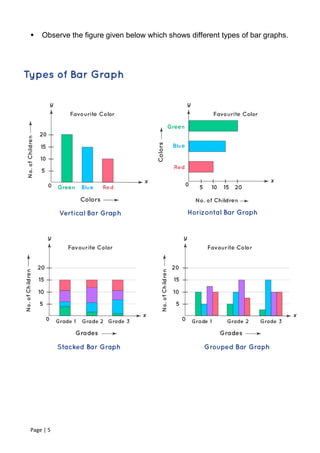


The document discusses different types of bar graphs, including vertical, horizontal, stacked, and grouped bar graphs. It provides examples of how to represent data using bar graphs and tips for creating bar graphs. Some key points covered include that bar graphs show data using rectangular bars of varying heights, they can represent categorical or quantitative data, and they are useful for comparing quantities across different categories.


![제 23회 보아즈(BOAZ) 빅데이터 컨퍼런스 - [MBOAX] : ABSA를 활용한 소비자 반응 분석 기반 운영 효율화 대시보드 설계](https://cdn.slidesharecdn.com/ss_thumbnails/3-1boaz23rdconferencemboax-260203102709-9d519923-thumbnail.jpg?width=640&height=640&fit=bounds)
![7.__Developing_a_Research_Proposal[1].pptx](https://cdn.slidesharecdn.com/ss_thumbnails/7-260131073037-df92dd7d-thumbnail.jpg?width=640&height=640&fit=bounds)
