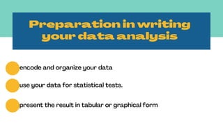
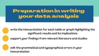
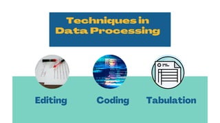
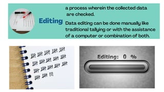
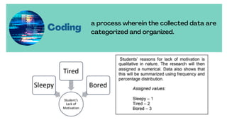
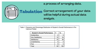
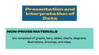
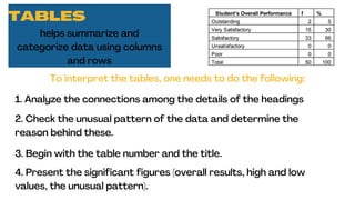
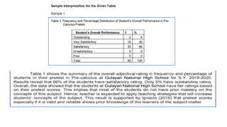
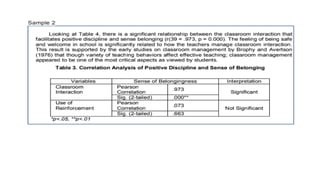
DATA
PRESENTATION &
INTERPRETATION
RESEARCH
CLASS
Presented by:
Jimnaira Abanto
Table of
Contents
02
Preparation in writing
your data analysis
Techniques in Data
Processing
03 Presentation and
Interpretation of
Data
04 Using statistical
Techniques (Sample)
01
Data
presentation
and analysis
one of the most essential
part in your research
study
Preparation in writing
your data analysis
encode and organize your data
use your data for statistical tests.
present the result in tabular or graphical form
Preparation in writing
your data analysis
write the interpretation for each table or graph highlighting the
significant results and its implications
support your findings from relevant literature and studies
edit the grammatical and typographical errors in your
interpretation
Techniques in
Data Processing
Editing Coding Tabulation
Editing
a process wherein the collected data
are checked.
Data editing can be done manually like
traditional tallying or with the assistance
of a computer or combination of both.
Coding
a process wherein the collected data are
categorized and organized.
Tabulation
a process of arranging data.
Correct arrangement of your data
will be helpful during actual data
analysis.
Presentation and
Interpretation of
Data
NON-PROSE MATERIALS
are composed of graphs, bars, tables, charts, diagrams,
illustrations, drawings, and maps.
TABLES
helps summarize and
categorize data using columns
and rows
To interpret the tables, one needs to do the following:
1. Analyze the connections among the details of the headings
2. Check the unusual pattern of the data and determine the
reason behind these.
3. Begin with the table number and the title.
4. Present the significant figures (overall results, high and low
values, the unusual pattern).
TABLES
helps summarize and
categorize data using columns
and rows
To interpret the tables, one needs to do the following:
5. Refrain from repeating again what’s inside the table.
6. Support your findings with literature and studies that confirms
or contrasts your results.
7. Establish the practical implications of the results.
8. End with a brief generalization.
GRAPHS
focuses on how a change in
one variable relates to anothe
Line Graph illustrates trends and
changes in data over time.
Bar Graph illustrates comparisons of
amounts and quantities, while
Pie Graph (Circle Graph) displays the
relationship of parts to a whole.
Data presentation and interpretation I Quantitative Research

Data presentation and interpretation I Quantitative Research

  • 1.
  • 2.
    Table of Contents 02 Preparation inwriting your data analysis Techniques in Data Processing 03 Presentation and Interpretation of Data 04 Using statistical Techniques (Sample) 01
  • 3.
    Data presentation and analysis one ofthe most essential part in your research study
  • 4.
    Preparation in writing yourdata analysis encode and organize your data use your data for statistical tests. present the result in tabular or graphical form
  • 5.
    Preparation in writing yourdata analysis write the interpretation for each table or graph highlighting the significant results and its implications support your findings from relevant literature and studies edit the grammatical and typographical errors in your interpretation
  • 6.
  • 7.
    Editing a process whereinthe collected data are checked. Data editing can be done manually like traditional tallying or with the assistance of a computer or combination of both.
  • 8.
    Coding a process whereinthe collected data are categorized and organized.
  • 9.
    Tabulation a process ofarranging data. Correct arrangement of your data will be helpful during actual data analysis.
  • 10.
    Presentation and Interpretation of Data NON-PROSEMATERIALS are composed of graphs, bars, tables, charts, diagrams, illustrations, drawings, and maps.
  • 11.
    TABLES helps summarize and categorizedata using columns and rows To interpret the tables, one needs to do the following: 1. Analyze the connections among the details of the headings 2. Check the unusual pattern of the data and determine the reason behind these. 3. Begin with the table number and the title. 4. Present the significant figures (overall results, high and low values, the unusual pattern).
  • 12.
    TABLES helps summarize and categorizedata using columns and rows To interpret the tables, one needs to do the following: 5. Refrain from repeating again what’s inside the table. 6. Support your findings with literature and studies that confirms or contrasts your results. 7. Establish the practical implications of the results. 8. End with a brief generalization.
  • 15.
    GRAPHS focuses on howa change in one variable relates to anothe Line Graph illustrates trends and changes in data over time. Bar Graph illustrates comparisons of amounts and quantities, while Pie Graph (Circle Graph) displays the relationship of parts to a whole.