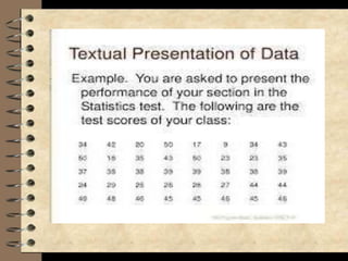
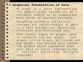
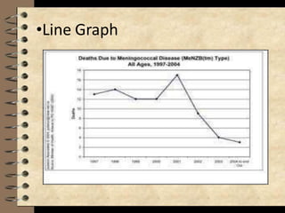
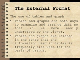
This chapter discusses the presentation, analysis, and interpretation of data collected for a study. Data should be presented clearly and logically using appropriate tables, graphs, and figures with clear titles and labeling. The analysis section should highlight only the most important findings relevant to the research questions. Interpretation involves establishing relationships between data and checking if findings support any hypotheses. Both quantitative and qualitative analysis can be used depending on the study. Graphs like bar graphs, pie charts, and line graphs are commonly used to visually represent data trends or relationships. Captions, labels, and other design elements of tables and figures should follow standard conventions for clear communication.