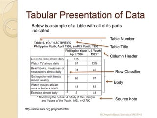
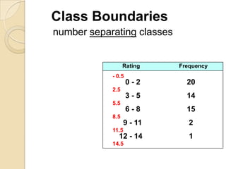
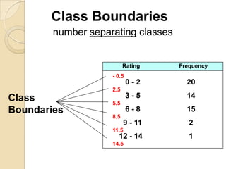
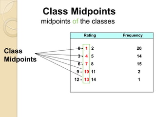
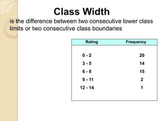
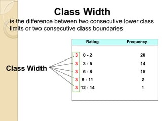
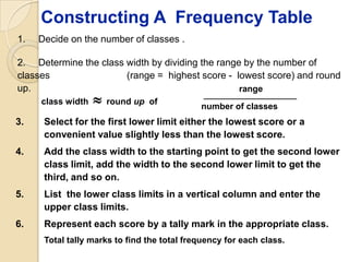
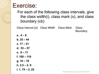
Here are the class widths, marks and boundaries for the given class intervals:
a. Class interval (ci): 4 – 8
Class Width: 4
Class Mark: 6
Class Boundary: 3.5 – 8.5
b. Class interval (ci): 35 – 44
Class Width: 9
Class Mark: 39.5
Class Boundary: 34.5 – 43.5
c. Class interval (ci): 17 – 21
Class Width: 4
Class Mark: 19
Class Boundary: 16.5 – 20.5
d. Class interval (ci): 53 – 57
Class Width: 4
Class Mark: 55
Class Boundary: 52.5 –
Data presentation and interpretation I Quantitative ResearchJimnaira Abanto
Topics;
DATA PRESENTATION & INTERPRETATION
Preparation in writing your data analysis
Techniques in Data Processing
Presentation and Interpretation of Data
Using statistical Techniques (Sample)
Introduction to Statistics - Basic Statistical Termssheisirenebkm
This is a presentation which focuses on the basic concepts of statistics. It includes the branches of statistics, population and sample, qualitative and quantitative data, and discrete and continuous variable.
To arrange the data in such a way that it should create interest in the reader’s mind at the first sight.
To present the information in a compact and concise form without losing important details.
UiPath Test Automation using UiPath Test Suite series, part 4DianaGray10
Welcome to UiPath Test Automation using UiPath Test Suite series part 4. In this session, we will cover Test Manager overview along with SAP heatmap.
The UiPath Test Manager overview with SAP heatmap webinar offers a concise yet comprehensive exploration of the role of a Test Manager within SAP environments, coupled with the utilization of heatmaps for effective testing strategies.
Participants will gain insights into the responsibilities, challenges, and best practices associated with test management in SAP projects. Additionally, the webinar delves into the significance of heatmaps as a visual aid for identifying testing priorities, areas of risk, and resource allocation within SAP landscapes. Through this session, attendees can expect to enhance their understanding of test management principles while learning practical approaches to optimize testing processes in SAP environments using heatmap visualization techniques
What will you get from this session?
1. Insights into SAP testing best practices
2. Heatmap utilization for testing
3. Optimization of testing processes
4. Demo
Topics covered:
Execution from the test manager
Orchestrator execution result
Defect reporting
SAP heatmap example with demo
Speaker:
Deepak Rai, Automation Practice Lead, Boundaryless Group and UiPath MVP
Epistemic Interaction - tuning interfaces to provide information for AI supportAlan Dix
Paper presented at SYNERGY workshop at AVI 2024, Genoa, Italy. 3rd June 2024
https://alandix.com/academic/papers/synergy2024-epistemic/
As machine learning integrates deeper into human-computer interactions, the concept of epistemic interaction emerges, aiming to refine these interactions to enhance system adaptability. This approach encourages minor, intentional adjustments in user behaviour to enrich the data available for system learning. This paper introduces epistemic interaction within the context of human-system communication, illustrating how deliberate interaction design can improve system understanding and adaptation. Through concrete examples, we demonstrate the potential of epistemic interaction to significantly advance human-computer interaction by leveraging intuitive human communication strategies to inform system design and functionality, offering a novel pathway for enriching user-system engagements.
Slack (or Teams) Automation for Bonterra Impact Management (fka Social Soluti...Jeffrey Haguewood
Sidekick Solutions uses Bonterra Impact Management (fka Social Solutions Apricot) and automation solutions to integrate data for business workflows.
We believe integration and automation are essential to user experience and the promise of efficient work through technology. Automation is the critical ingredient to realizing that full vision. We develop integration products and services for Bonterra Case Management software to support the deployment of automations for a variety of use cases.
This video focuses on the notifications, alerts, and approval requests using Slack for Bonterra Impact Management. The solutions covered in this webinar can also be deployed for Microsoft Teams.
Interested in deploying notification automations for Bonterra Impact Management? Contact us at sales@sidekicksolutionsllc.com to discuss next steps.
LF Energy Webinar: Electrical Grid Modelling and Simulation Through PowSyBl -...DanBrown980551
Do you want to learn how to model and simulate an electrical network from scratch in under an hour?
Then welcome to this PowSyBl workshop, hosted by Rte, the French Transmission System Operator (TSO)!
During the webinar, you will discover the PowSyBl ecosystem as well as handle and study an electrical network through an interactive Python notebook.
PowSyBl is an open source project hosted by LF Energy, which offers a comprehensive set of features for electrical grid modelling and simulation. Among other advanced features, PowSyBl provides:
- A fully editable and extendable library for grid component modelling;
- Visualization tools to display your network;
- Grid simulation tools, such as power flows, security analyses (with or without remedial actions) and sensitivity analyses;
The framework is mostly written in Java, with a Python binding so that Python developers can access PowSyBl functionalities as well.
What you will learn during the webinar:
- For beginners: discover PowSyBl's functionalities through a quick general presentation and the notebook, without needing any expert coding skills;
- For advanced developers: master the skills to efficiently apply PowSyBl functionalities to your real-world scenarios.
Accelerate your Kubernetes clusters with Varnish CachingThijs Feryn
A presentation about the usage and availability of Varnish on Kubernetes. This talk explores the capabilities of Varnish caching and shows how to use the Varnish Helm chart to deploy it to Kubernetes.
This presentation was delivered at K8SUG Singapore. See https://feryn.eu/presentations/accelerate-your-kubernetes-clusters-with-varnish-caching-k8sug-singapore-28-2024 for more details.
Smart TV Buyer Insights Survey 2024 by 91mobiles.pdf91mobiles
91mobiles recently conducted a Smart TV Buyer Insights Survey in which we asked over 3,000 respondents about the TV they own, aspects they look at on a new TV, and their TV buying preferences.
Kubernetes & AI - Beauty and the Beast !?! @KCD Istanbul 2024Tobias Schneck
As AI technology is pushing into IT I was wondering myself, as an “infrastructure container kubernetes guy”, how get this fancy AI technology get managed from an infrastructure operational view? Is it possible to apply our lovely cloud native principals as well? What benefit’s both technologies could bring to each other?
Let me take this questions and provide you a short journey through existing deployment models and use cases for AI software. On practical examples, we discuss what cloud/on-premise strategy we may need for applying it to our own infrastructure to get it to work from an enterprise perspective. I want to give an overview about infrastructure requirements and technologies, what could be beneficial or limiting your AI use cases in an enterprise environment. An interactive Demo will give you some insides, what approaches I got already working for real.
Securing your Kubernetes cluster_ a step-by-step guide to success !KatiaHIMEUR1
Today, after several years of existence, an extremely active community and an ultra-dynamic ecosystem, Kubernetes has established itself as the de facto standard in container orchestration. Thanks to a wide range of managed services, it has never been so easy to set up a ready-to-use Kubernetes cluster.
However, this ease of use means that the subject of security in Kubernetes is often left for later, or even neglected. This exposes companies to significant risks.
In this talk, I'll show you step-by-step how to secure your Kubernetes cluster for greater peace of mind and reliability.
Connector Corner: Automate dynamic content and events by pushing a buttonDianaGray10
Here is something new! In our next Connector Corner webinar, we will demonstrate how you can use a single workflow to:
Create a campaign using Mailchimp with merge tags/fields
Send an interactive Slack channel message (using buttons)
Have the message received by managers and peers along with a test email for review
But there’s more:
In a second workflow supporting the same use case, you’ll see:
Your campaign sent to target colleagues for approval
If the “Approve” button is clicked, a Jira/Zendesk ticket is created for the marketing design team
But—if the “Reject” button is pushed, colleagues will be alerted via Slack message
Join us to learn more about this new, human-in-the-loop capability, brought to you by Integration Service connectors.
And...
Speakers:
Akshay Agnihotri, Product Manager
Charlie Greenberg, Host
Generating a custom Ruby SDK for your web service or Rails API using Smithyg2nightmarescribd
Have you ever wanted a Ruby client API to communicate with your web service? Smithy is a protocol-agnostic language for defining services and SDKs. Smithy Ruby is an implementation of Smithy that generates a Ruby SDK using a Smithy model. In this talk, we will explore Smithy and Smithy Ruby to learn how to generate custom feature-rich SDKs that can communicate with any web service, such as a Rails JSON API.
Key Trends Shaping the Future of Infrastructure.pdfCheryl Hung
Keynote at DIGIT West Expo, Glasgow on 29 May 2024.
Cheryl Hung, ochery.com
Sr Director, Infrastructure Ecosystem, Arm.
The key trends across hardware, cloud and open-source; exploring how these areas are likely to mature and develop over the short and long-term, and then considering how organisations can position themselves to adapt and thrive.
Software Delivery At the Speed of AI: Inflectra Invests In AI-Powered QualityInflectra
In this insightful webinar, Inflectra explores how artificial intelligence (AI) is transforming software development and testing. Discover how AI-powered tools are revolutionizing every stage of the software development lifecycle (SDLC), from design and prototyping to testing, deployment, and monitoring.
Learn about:
• The Future of Testing: How AI is shifting testing towards verification, analysis, and higher-level skills, while reducing repetitive tasks.
• Test Automation: How AI-powered test case generation, optimization, and self-healing tests are making testing more efficient and effective.
• Visual Testing: Explore the emerging capabilities of AI in visual testing and how it's set to revolutionize UI verification.
• Inflectra's AI Solutions: See demonstrations of Inflectra's cutting-edge AI tools like the ChatGPT plugin and Azure Open AI platform, designed to streamline your testing process.
Whether you're a developer, tester, or QA professional, this webinar will give you valuable insights into how AI is shaping the future of software delivery.
DevOps and Testing slides at DASA ConnectKari Kakkonen
My and Rik Marselis slides at 30.5.2024 DASA Connect conference. We discuss about what is testing, then what is agile testing and finally what is Testing in DevOps. Finally we had lovely workshop with the participants trying to find out different ways to think about quality and testing in different parts of the DevOps infinity loop.
2. Presentation of Data
Objectives: At the end of the
lesson, the students should be able to:
1. Prepare a stem-and-leaf plot
2. Describe data in textual form
3. Construct frequency distribution table
4. Create graphs
5. Read and interpret graphs and tables
MCPegollo/Basic Statistics/SRSTHS
3. Ungrouped vs. Grouped Data
Data can be classified as grouped or
ungrouped.
Ungrouped data are data that are not
organized, or if arranged, could only be
from highest to lowest or lowest to
highest.
Grouped data are data that are
organized and arranged into different
classes or categories.
MCPegollo/Basic Statistics/SRSTHS
4. Presentation of Data
Textual Tabular Graphical
Method Method Method
• Rearrangem • Frequency • Bar Chart
ent from distribution • Histogram
lowest to table (FDT) • Frequency
highest • Relative Polygon
• Stem-and- FDT • Pie Chart
leaf plot • Cumulative • Less than,
FDT greater than
• Contingency Ogive
Table
MCPegollo/Basic Statistics/SRSTHS
5. Textual Presentation of Data
Data can be presented using
paragraphs or sentences. It involves
enumerating important
characteristics, emphasizing
significant figures and identifying
important features of data.
MCPegollo/Basic Statistics/SRSTHS
6. Textual Presentation of Data
Example. You are asked to present the
performance of your section in the
Statistics test. The following are the
test scores of your class:
34 42 20 50 17 9 34 43
50 18 35 43 50 23 23 35
37 38 38 39 39 38 38 39
24 29 25 26 28 27 44 44
49 48 46 45 45 46 45 46
MCPegollo/Basic Statistics/SRSTHS
7. Solution
First, arrange the data in order for you to
identify the important characteristics. This
can be done in two ways: rearranging from
lowest to highest or using the stem-and-leaf
plot.
Below is the rearrangement of data from lowest
to highest:
9 23 28 35 38 43 45 48
17 24 29 37 39 43 45 49
18 25 34 38 39 44 46 50
20 26 34 38 39 44 46 50
23 27 35 38 42 45 46 50
MCPegollo/Basic Statistics/SRSTHS
8. With the rearranged data, pertinent data
worth mentioning can be easily
recognized. The following is one way
of presenting data in textual form.
In the Statistics class of 40
students, 3 obtained the perfect score
of 50. Sixteen students got a score of
40 and above, while only 3 got 19 and
below. Generally, the students
performed well in the test with 23 or
70% getting a passing score of 38 and
MCPegollo/Basic Statistics/SRSTHS
9. Another way of rearranging data is by
making use of the stem-and-leaf plot.
What is a stem-and-leaf plot?
Stem-and-leaf Plot is a table which
sorts data according to a certain pattern. It
involves separating a number into two parts.
In a two-digit number, the stem consists of
the first digit, and the leaf consists of the
second digit. While in a three-digit
number, the stem consists of the first two
digits, and the leaf consists of the last digit.
In a one-digit number, the stem is zero.
MCPegollo/Basic Statistics/SRSTHS
10. Below is the stem-and-leaf plot of the
ungrouped data given in the example.
Stem Leaves
0 9
1 7,8
2 0,3,3,4,5,6,7,8,9
3 4,4,5,5,7,8,8,8,8,9,9,9
4 2,3,3,4,4,5,5,5,6,6,6,8,9
5 0,0,0
Utilizing the stem-and-leaf plot, we can readily see the
order of the data. Thus, we can say that the top ten
got scores 50, 50, 50, 49, 48, 46, 46, 46,45, and 45
and the ten lowest scores are 9, 17, 18, 20,
MCPegollo/Basic Statistics/SRSTHS
23,23,24,25,26, and 27.
11. Exercise:
Prepare a stem-and-leaf plot and
present in textual form.
The ages Leaf teachers in a public
Stem of 40
school
2 3,6,7,8,8,9
23 27 28 36 35 38 39 40
32 42 0,1,2,4,4,5,5,5,6,6,6,6,8,8,8,8,9,9
3 44 54 56 48 55 48
30 31 35 36 47 48 43 38
4 0,0,0,2,3,4,4,5,5,7,8,8,8
34 26 28 29 45 34 45 44
5 4,5,6
36 38 39 38 36 35 40 40
MCPegollo/Basic Statistics/SRSTHS
12. Tabular Presentation of Data
Below is a sample of a table with all of its parts
indicated:
Table Number
Table Title
Column Header
Row Classifier
Body
Source Note
http://www.sws.org.ph/youth.htm
MCPegollo/Basic Statistics/SRSTHS
13. Frequency Distribution Table
A frequency distribution table is a table
which shows the data arranged into
different classes(or categories) and
the number of cases(or frequencies)
which fall into each class.
The following is an illustration of a
frequency distribution table for
ungrouped data:
MCPegollo/Basic Statistics/SRSTHS
14. Sample of a Frequency Distribution
Table for Ungrouped Data
Table 1.1
Frequency Distribution for the Ages of 50
Students Enrolled in Statistics
Age Frequency
12 2
13 13
14 27
15 4
16 3
17 1
N = 50
MCPegollo/Basic Statistics/SRSTHS
15. Sample of a Frequency
Distribution Table for Grouped
Data Table 1.2
Frequency Distribution Table for the Quiz Scores of
50 Students in Geometry
Scores Frequency
0-2 1
3-5 2
6-8 13
9 - 11 15
12 - 14 19
MCPegollo/Basic Statistics/SRSTHS
16. Lower Class Limits
are the smallest numbers that can actually belong
to different classes
Rating Frequency
0-2 1
3-5 2
6-8 13
9 - 11 15
12 - 14 19
17. Lower Class Limits
are the smallest numbers that can
actually belong to different classes
Rating Frequency
0-2 1
Lower Class 3-5 2
Limits 6-8 13
9 - 11 15
12 - 14 19
18. Upper Class Limits
are the largest numbers that can actually
belong to different classes
Rating Frequency
0-2 1
3-5 2
6-8 13
9 - 11 15
12 - 14 19
19. Upper Class Limits
are the largest numbers that can actually
belong to different classes
Rating Frequency
Upper Class 0-2 1
Limits 3-5 2
6-8 13
9 - 11 15
12 - 14 19
20. Class Boundaries
are the numbers used to separate
classes, but without the gaps created by class
limits
24. Class Midpoints
midpoints of the classes
Rating Frequency
0- 1 2 20
Class
3- 4 5 14
Midpoints
6- 7 8 15
9 - 10 11 2
12 - 13 14 1
25. Class Width
is the difference between two consecutive lower class
limits or two consecutive class boundaries
Rating Frequency
0-2 20
3-5 14
6-8 15
9 - 11 2
12 - 14 1
26. Class Width
is the difference between two consecutive lower class
limits or two consecutive class boundaries
Rating Frequency
3 0-2 20
3 3-5 14
Class Width 3 6-8 15
3 9 - 11 2
3 12 - 14 1
27. Guidelines For Frequency Tables
1. Be sure that the classes are mutually exclusive.
2. Include all classes, even if the frequency is zero.
3. Try to use the same width for all classes.
4. Select convenient numbers for class limits.
5. Use between 5 and 20 classes.
6. The sum of the class frequencies must equal the
number of original data values.
28. Constructing A Frequency Table
1. Decide on the number of classes .
2. Determine the class width by dividing the range by the number of
classes (range = highest score - lowest score) and round
up. range
class width round up of
number of classes
3. Select for the first lower limit either the lowest score or a
convenient value slightly less than the lowest score.
4. Add the class width to the starting point to get the second lower
class limit, add the width to the second lower limit to get the
third, and so on.
5. List the lower class limits in a vertical column and enter the
upper class limits.
6. Represent each score by a tally mark in the appropriate class.
Total tally marks to find the total frequency for each class.
29. Homework
Gather data on the ages of your
classmates’ fathers, include your own.
Construct a frequency distribution table for
the data gathered using grouped and
ungrouped data.
What are the advantages and
disadvantages of using ungrouped
frequency distribution table?
What are the advantages and
disadvantages of using grouped
frequency distribution table?
MCPegollo/Basic Statistics/SRSTHS
34. Complete FDT
A complete FDT has class mark or
midpoint (x), class boundaries (c.b),
relative frequency or percentage
frequency, and the less than
cumulative frequency (<cf) and the
greater than cumulative frequency
(>cf).
MCPegollo/Basic Statistics/SRSTHS
35. Complete Frequency Table
Table 2-6
Grouped Frequency Distribution for the Test
Scores of 52 Students in Statistics
Class Class Relative
Frequency Class
Intervals Boundary Frequency <cf >cf
(f) Mark (x)
(ci) (cb) (rf)
0-2 20 1 -0.5 – 2.5 38.5% 20 52
3–5 14 4 2.5 – 5.5 26.9% 34 32
6–8 15 7 5.5 – 8.5 28.8% 49 18
9 – 11 2 10 8.5 – 11.5 3.8% 51 3
12 – 14 1 13 11.5 – 14.5 1.9% 52 1
36. Exercise:
For each of the following class intervals, give
the class width(i), class mark (x), and class
boundary (cb)
Class interval (ci) Class Width Class Mark Class
Boundary
a. 4 – 8
b. 35 – 44
c. 17 – 21
d. 53 – 57
e. 8 – 11
f. 108 – 119
g. 10 – 19
h. 2.5 – 2. 9
i. 1. 75 – 2. 25
MCPegollo/Basic Statistics/SRSTHS
37. Construct a complete FDT with 7
classes
The following are the IQ scores of 60
student applicants in a certain high
school 106
128 96 94 85 75
113 103 96 91 94 70
109 113 109 100 81 81
103 113 91 88 78 75
106 103 100 88 81 81
113 106 100 96 88 78
96 109 94 96 88 70
103 102 88 78 95 90
99 89 87 96 95 104
89 99 101 105 103 125
MCPegollo/Basic Statistics/SRSTHS
38. Contingency Table
This is a table which shows the data
enumerated by cell. One type of such
table is the “r by c” (r x c) where the
columns refer to “c” samples and the
rows refer to “r” choices or
alternatives.
MCPegollo/Basic Statistics/SRSTHS
39. Example
Table 1
The Contingency Table for the Opinion of Viewers on
the TV program “Budoy”
Choice/Sample Men Women Children Total
Like the Program 50 56 45 151
Indifferent 23 16 12 51
Do not like the 43 55 40 138
program
Total 116 127 97 340
Give as many findings as you can, and draw as many conclusions
from your findings. The next table can help you identify significant
findings.
MCPegollo/Basic Statistics/SRSTHS
40. Example
Table 1
The Contingency Table for the Opinion of Viewers on
the TV program “Budoy”
Choice/Sampl Men Women Children Total
e
Like the 50 (33%) 56(37%) 45(30%) 151
Program (43%) (44%) (46%) (44%)
Indifferent 23(45%) 16(31%) 12(24%) 51
(20%) (13%) (12%) (15%)
Do not like the 43(53%) 55(40%) 40(29%) 138(41%)
program (37%) (43%) (41%)
Total 116 127 97 340
(34%) (37%) (28%)
Do not use this table for presentation because the percentages might
confuse the readers. Can you explain the percentages in each cell?
MCPegollo/Basic Statistics/SRSTHS
Editor's Notes
Data presented in a grouped frequency distribution are easier to analyze and to describe. However, the identity of individual score is lost due to grouping.