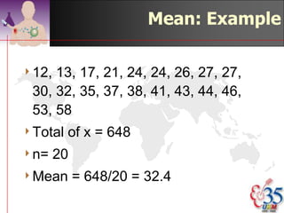
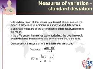
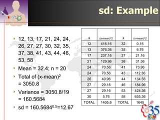
Downloaded 339 times


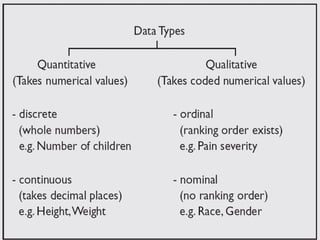
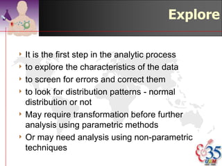
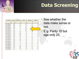
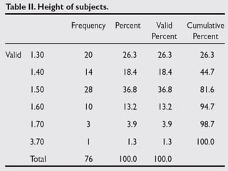

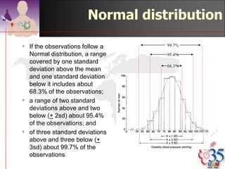
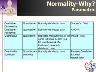
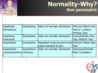
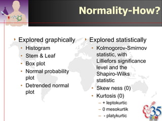
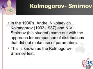
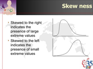

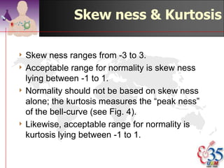

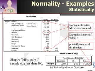
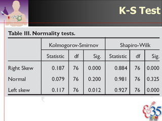
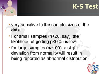
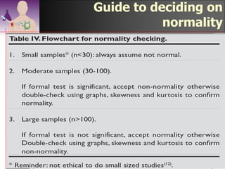

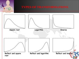
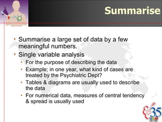
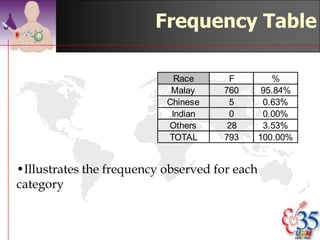
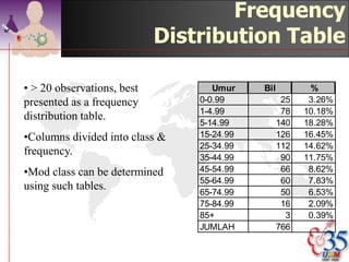
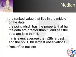
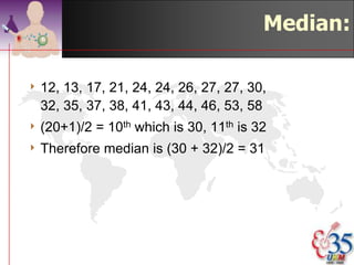
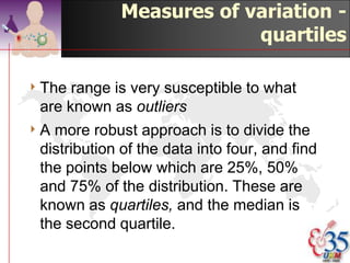
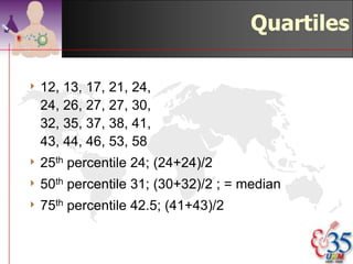


This document discusses methods for exploring and summarizing data according to variable type. It covers exploring data characteristics, screening for errors, and examining distribution patterns. Normality is important because it determines what types of analyses can be used. The document explores normality statistically using tests like Kolmogorov-Smirnov and graphically with histograms, normal probability plots, and examining skewness and kurtosis. Ensuring normality and cleaning data of errors are important first steps before further analysis.