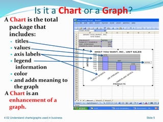
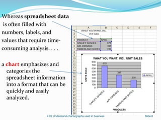
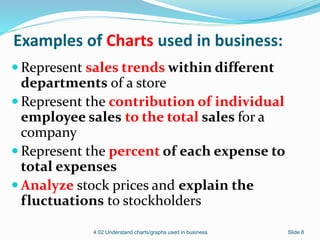
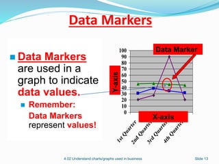
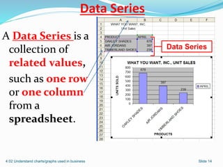
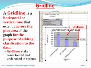
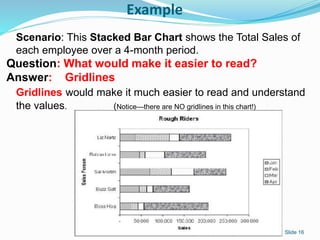
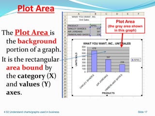
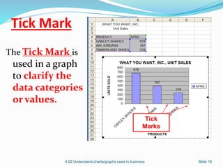
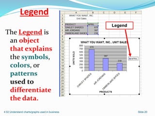
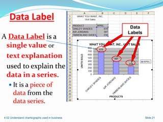
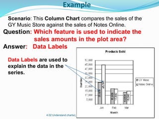
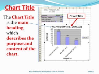
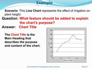
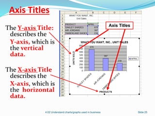
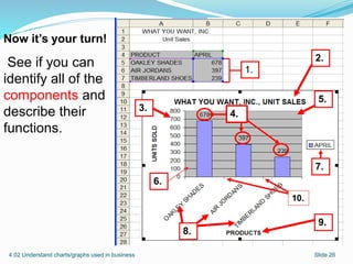
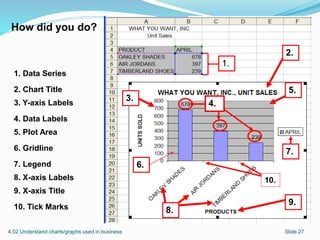
The document discusses charts and graphs used in business. It explains that charts and graphs communicate and clarify spreadsheet information by emphasizing and categorizing data in a format that can be quickly analyzed. It distinguishes between charts and graphs, with graphs being features that plot data within a chart. The document provides examples of chart components and different chart types used in business analysis.
This is a quick tutorial on how to use tables in Microsoft Word. Tables can be very useful in legal documents, not only for organizing data but also for formatting captions.
Insert option is the most important option of MS word. It not only gives you chance to add charts and graphs but also gives you the facility to add your own pictures
In this presentation you will find everything about Insert option of MS word.
this ppt is about charts in ms excel.there are many types of chart used in ms excel but in this ppt some common types are defined,as line chart,bar,column,area ,scatter chart etc...
Types of charts in Excel and How to use themVijay Perepa
There are different Chart types and some times we face difficulty to find which chart is suitable for a specific Data set. In this series of Videos, we have discussed about each chart type and when to use etc.
$5 COUPON LINK - Excel Udemy Course: Excel with Excel Dynamic Graphs, Dashboa...mellontraining
Learn everything about Charts with Excel 2013
Create Interactive Advanced Excel Charts, Pivot Charts and Dashboards - with Microsoft Excel 2013 + Free Excel Templates
******************************************************************************************************
GET THE COURSE FOR $5 WITH THE COUPON LINK:
https://www.udemy.com/excel-charts-learn-everything-about-charts-with-excel-2013/?couponCode=STUDENT5
RS Trainings: is a brand and providing quality online and offline trainings for students in world wide. Rs Trainings providing Best DataScience online training in Hyderabad
Chapter 2 Graphical Descriptions of Data 25 Chapter 2.docxcravennichole326
Chapter 2: Graphical Descriptions of Data
25
Chapter 2: Graphical Descriptions of Data
In chapter 1, you were introduced to the concepts of population, which again is a
collection of all the measurements from the individuals of interest. Remember, in most
cases you can’t collect the entire population, so you have to take a sample. Thus, you
collect data either through a sample or a census. Now you have a large number of data
values. What can you do with them? No one likes to look at just a set of numbers. One
thing is to organize the data into a table or graph. Ultimately though, you want to be able
to use that graph to interpret the data, to describe the distribution of the data set, and to
explore different characteristics of the data. The characteristics that will be discussed in
this chapter and the next chapter are:
1. Center: middle of the data set, also known as the average.
2. Variation: how much the data varies.
3. Distribution: shape of the data (symmetric, uniform, or skewed).
4. Qualitative data: analysis of the data
5. Outliers: data values that are far from the majority of the data.
6. Time: changing characteristics of the data over time.
This chapter will focus mostly on using the graphs to understand aspects of the data, and
not as much on how to create the graphs. There is technology that will create most of the
graphs, though it is important for you to understand the basics of how to create them.
Section 2.1: Qualitative Data
Remember, qualitative data are words describing a characteristic of the individual. There
are several different graphs that are used for qualitative data. These graphs include bar
graphs, Pareto charts, and pie charts.
Pie charts and bar graphs are the most common ways of displaying qualitative data. A
spreadsheet program like Excel can make both of them. The first step for either graph is
to make a frequency or relative frequency table. A frequency table is a summary of
the data with counts of how often a data value (or category) occurs.
Example #2.1.1: Creating a Frequency Table
Suppose you have the following data for which type of car students at a college
drive?
Ford, Chevy, Honda, Toyota, Toyota, Nissan, Kia, Nissan, Chevy, Toyota,
Honda, Chevy, Toyota, Nissan, Ford, Toyota, Nissan, Mercedes, Chevy,
Ford, Nissan, Toyota, Nissan, Ford, Chevy, Toyota, Nissan, Honda,
Porsche, Hyundai, Chevy, Chevy, Honda, Toyota, Chevy, Ford, Nissan,
Toyota, Chevy, Honda, Chevy, Saturn, Toyota, Chevy, Chevy, Nissan,
Honda, Toyota, Toyota, Nissan
Chapter 2: Graphical Descriptions of Data
26
A listing of data is too hard to look at and analyze, so you need to summarize it.
First you need to decide the categories. In this case it is relatively easy; just use
the car type. However, there are several cars that only have one car in the list. In
that case it is easier to make a category called other for the ones with low values.
Now ...
need step by step instruction If you can do visual so I kno.pdfsaravanan544051
need step by step instruction. If you can do visual so I know what's it suppose to look like.
There are no results for 6. Using the data in the range B4:C28 of the Recent Website Sales
worksheet, create a Forecast sheet, forecasting website revenue through 12/31/2022.
Assume a seasonality in the data of 12 periods (or months). Name the Forecast sheet as
Forecasts. 7. Move the forecast chart to the Summary Report worksheet in the range
B18:H29. Remove the chart legend and add the chart title Two-Year Forecast. 8. Dmitry has
a sampling of product sales from three Cup and Platter classes. Create a query that
retrieves the Customers, Customer Orders, Items, Item Sales, and Stores tables from the
Support_EX_10_Sales03.accdb Access database. Create a connection to the database file
and add the tables in the Excel Data Model. Do not load any tables in an Excel table,
PivotTable, or PivotChart. 9. Go to Power Pivot and create the following table relations
between the five database tables: Connect the Customer Orders and Customers tables
through the Cust ID field. Connect the Customer Orders and Stores tables through Store ID
field Connect the Customer Orders and Item Sales tables through the Order ID field.
Connect the Item Sales and Items tables through the Item ID field. 10. Add a hierarchy to
the Items table named Item Tree and add the Class, Subclass, and Group fields to it in that
order. 11. Close Power Pivot and return to the workbook. In the Items Pivot worksheet, in
cell B4, insert a PivotTable from the Data Model. Rename the table as Items Pivot. Add the
Item Tree hierarchy from the Items table to the Rows area box, add the Type field from the
Stores table to Column area box, and add the Revenue field from the Item Sales table to the
Values area box (displaying the revenue sum). 12. Create a clustered bar PivotChart from
the Items Pivot PivotTable. Move the chart to the Summary Report worksheet in the range
J11:P29. Remove the field buttons, primary horizontal axis, and gridlines from the chart.
Move the chart legend to the bottom of the chart area. Add data labels to the chart. 13.
Dmitry wants to examine revenue from coffee maker sales. Use the Quick Explore tool to
drill down the bar chart categories through the Electrics class and the Coffee Makers
subclass down to the group level, displaying total revenue of three coffee maker types. 14.
Dmitry wants to view sales by state. In the State Revenue worksheet, add a PivotTable from
the Data Model to cell B4. Name the PivotTable as State Revenue. Place the State field from
the Customers table in the Rows area and the Revenue field from the Item Sales table in the
Values area. In the PivotTable Options dialog box, on the Display tab, click the check boxes
to show items with no data on the rows and columns. 15. Copy the data in the range
B5:C55. Use Paste Link to paste references to the data values in the range E5:F55. Format
the values in the range F5:F55 as currency. Enter State in cell E4 an.
[Note: This is a partial preview. To download this presentation, visit:
https://www.oeconsulting.com.sg/training-presentations]
Sustainability has become an increasingly critical topic as the world recognizes the need to protect our planet and its resources for future generations. Sustainability means meeting our current needs without compromising the ability of future generations to meet theirs. It involves long-term planning and consideration of the consequences of our actions. The goal is to create strategies that ensure the long-term viability of People, Planet, and Profit.
Leading companies such as Nike, Toyota, and Siemens are prioritizing sustainable innovation in their business models, setting an example for others to follow. In this Sustainability training presentation, you will learn key concepts, principles, and practices of sustainability applicable across industries. This training aims to create awareness and educate employees, senior executives, consultants, and other key stakeholders, including investors, policymakers, and supply chain partners, on the importance and implementation of sustainability.
LEARNING OBJECTIVES
1. Develop a comprehensive understanding of the fundamental principles and concepts that form the foundation of sustainability within corporate environments.
2. Explore the sustainability implementation model, focusing on effective measures and reporting strategies to track and communicate sustainability efforts.
3. Identify and define best practices and critical success factors essential for achieving sustainability goals within organizations.
CONTENTS
1. Introduction and Key Concepts of Sustainability
2. Principles and Practices of Sustainability
3. Measures and Reporting in Sustainability
4. Sustainability Implementation & Best Practices
To download the complete presentation, visit: https://www.oeconsulting.com.sg/training-presentations
Discover the innovative and creative projects that highlight my journey throu...dylandmeas
Discover the innovative and creative projects that highlight my journey through Full Sail University. Below, you’ll find a collection of my work showcasing my skills and expertise in digital marketing, event planning, and media production.
Personal Brand Statement:
As an Army veteran dedicated to lifelong learning, I bring a disciplined, strategic mindset to my pursuits. I am constantly expanding my knowledge to innovate and lead effectively. My journey is driven by a commitment to excellence, and to make a meaningful impact in the world.
Explore our most comprehensive guide on lookback analysis at SafePaaS, covering access governance and how it can transform modern ERP audits. Browse now!
RMD24 | Debunking the non-endemic revenue myth Marvin Vacquier Droop | First ...BBPMedia1
Marvin neemt je in deze presentatie mee in de voordelen van non-endemic advertising op retail media netwerken. Hij brengt ook de uitdagingen in beeld die de markt op dit moment heeft op het gebied van retail media voor niet-leveranciers.
Retail media wordt gezien als het nieuwe advertising-medium en ook mediabureaus richten massaal retail media-afdelingen op. Merken die niet in de betreffende winkel liggen staan ook nog niet in de rij om op de retail media netwerken te adverteren. Marvin belicht de uitdagingen die er zijn om echt aansluiting te vinden op die markt van non-endemic advertising.
Taurus Zodiac Sign_ Personality Traits and Sign Dates.pptxmy Pandit
Explore the world of the Taurus zodiac sign. Learn about their stability, determination, and appreciation for beauty. Discover how Taureans' grounded nature and hardworking mindset define their unique personality.
Premium MEAN Stack Development Solutions for Modern BusinessesSynapseIndia
Stay ahead of the curve with our premium MEAN Stack Development Solutions. Our expert developers utilize MongoDB, Express.js, AngularJS, and Node.js to create modern and responsive web applications. Trust us for cutting-edge solutions that drive your business growth and success.
Know more: https://www.synapseindia.com/technology/mean-stack-development-company.html
What are the main advantages of using HR recruiter services.pdfHumanResourceDimensi1
HR recruiter services offer top talents to companies according to their specific needs. They handle all recruitment tasks from job posting to onboarding and help companies concentrate on their business growth. With their expertise and years of experience, they streamline the hiring process and save time and resources for the company.
Accpac to QuickBooks Conversion Navigating the Transition with Online Account...PaulBryant58
This article provides a comprehensive guide on how to
effectively manage the convert Accpac to QuickBooks , with a particular focus on utilizing online accounting services to streamline the process.
Cracking the Workplace Discipline Code Main.pptxWorkforce Group
Cultivating and maintaining discipline within teams is a critical differentiator for successful organisations.
Forward-thinking leaders and business managers understand the impact that discipline has on organisational success. A disciplined workforce operates with clarity, focus, and a shared understanding of expectations, ultimately driving better results, optimising productivity, and facilitating seamless collaboration.
Although discipline is not a one-size-fits-all approach, it can help create a work environment that encourages personal growth and accountability rather than solely relying on punitive measures.
In this deck, you will learn the significance of workplace discipline for organisational success. You’ll also learn
• Four (4) workplace discipline methods you should consider
• The best and most practical approach to implementing workplace discipline.
• Three (3) key tips to maintain a disciplined workplace.
Affordable Stationery Printing Services in Jaipur | Navpack n PrintNavpack & Print
Looking for professional printing services in Jaipur? Navpack n Print offers high-quality and affordable stationery printing for all your business needs. Stand out with custom stationery designs and fast turnaround times. Contact us today for a quote!
What is the TDS Return Filing Due Date for FY 2024-25.pdfseoforlegalpillers
It is crucial for the taxpayers to understand about the TDS Return Filing Due Date, so that they can fulfill your TDS obligations efficiently. Taxpayers can avoid penalties by sticking to the deadlines and by accurate filing of TDS. Timely filing of TDS will make sure about the availability of tax credits. You can also seek the professional guidance of experts like Legal Pillers for timely filing of the TDS Return.
Falcon stands out as a top-tier P2P Invoice Discounting platform in India, bridging esteemed blue-chip companies and eager investors. Our goal is to transform the investment landscape in India by establishing a comprehensive destination for borrowers and investors with diverse profiles and needs, all while minimizing risk. What sets Falcon apart is the elimination of intermediaries such as commercial banks and depository institutions, allowing investors to enjoy higher yields.
2. Purpose of Charts and Graphs
Charts and graphs are used in business to
communicate and clarify spreadsheet
information.
Charts and graphs emphasize and categorize
spreadsheet information into a format
that can be quickly and easily analyzed.
4.02 Understand charts/graphs used in business Slide 2
3. Why do you need to learn about charts?
Can you answer these questions?
(1) Why might you use a chart to present
spreadsheet information?
(2) What does a chart or graph do that a
spreadsheet does not?
4.02 Understand charts/graphs used in business Slide 3
4. Is it a Chart or a Graph?
A Graph is a feature of a
chart used to plot
data.
A Graph is a pictorial
representation of
data.
It includes the:
plot area
gridlines
and values.
A graph is used in a
chart .
4.02 Understand charts/graphs used in business Slide 4
5. Is it a Chart or a Graph?
A Chart is the total
package that
includes:
titles
values
axis labels
legend
information
color
and adds meaning to
the graph
A Chart is an
enhancement of a
graph.
4.02 Understand charts/graphs used in business Slide 5
6. Whereas spreadsheet data
is often filled with
numbers, labels, and
values that require time-
consuming analysis. . . .
a chart emphasizes and
categories the
spreadsheet information
into a format that can be
quickly and easily
analyzed.
4.02 Understand charts/graphs used in business Slide 6
7.
8. Examples of Charts used in business:
Represent sales trends within different
departments of a store
Represent the contribution of individual
employee sales to the total sales for a
company
Represent the percent of each expense to
total expenses
Analyze stock prices and explain the
fluctuations to stockholders
4.02 Understand charts/graphs used in business Slide 8
9.
10. Components of Graphs
Y-axis
X-axis
Data markers
Data series
Gridline
Plot area
Tick mark
Slide 104.02 Understand charts/graphs used in business
11. 4.02 Understand charts/graphs used in business Slide 11
The Y- axis is
the left vertical
side of the
graph.
It contains the
numerical
data.
0
10
20
30
40
50
60
70
80
90
100
1st Q
uarter
2nd
Q
uarter
3rd
Q
uarter
4th
Q
uarter
Y-axis
Y-axis
12. 4.02 Understand charts/graphs used in business Slide 12
0
10
20
30
40
50
60
70
80
90
100
1st Q
uarter
2nd
Q
uarter
3rd
Q
uarter
4th
Q
uarter
Y-axis X-axis
The X- axis is
the bottom
horizontal
side of the
graph.
It contains the
category
information.
X-axis
13. 4.02 Understand charts/graphs used in business Slide 13
Data Markers
are used in a
graph to indicate
data values.
Remember:
Data Markers
represent values!
0
10
20
30
40
50
60
70
80
90
100
1st Q
uarter
2nd
Q
uarter
3rd
Q
uarter
4th
Q
uarter
Y-axis X-axis
Data Marker
Data Markers
14. A Data Series is a
collection of
related values,
such as one row
or one column
from a
spreadsheet.
4.02 Understand charts/graphs used in business Slide 14
Data Series
Data Series
15. Gridline
4.02 Understand charts/graphs used in business Slide 15
Gridlines
A Gridline is a
horizontal or
vertical line that
extends across the
plot area of the
graph for the
purpose of adding
clarification to the
data.
Gridlines make it
easier to read and
understand the values.
16. Example
4.02 Understand charts/graphs used in business Slide 16
Scenario: This Stacked Bar Chart shows the Total Sales of
each employee over a 4-month period.
Question: What would make it easier to read?
Answer: Gridlines
Gridlines would make it much easier to read and understand
the values. (Notice—there are NO gridlines in this chart!)
17. Plot Area
The Plot Area is
the background
portion of a graph.
It is the rectangular
area bound by
the category (X)
and values (Y)
axes.
4.02 Understand charts/graphs used in business Slide 17
Plot Area
(the gray area shown
in this graph)
18. Tick Mark
The Tick Mark is
used in a graph
to clarify the
data categories
or values.
4.02 Understand charts/graphs used in business Slide 18
Tick
Marks
19. Components of Charts
Legend
Data Label
Chart Title
X-Axis Title
Y-Axis Title
Slide 194.02 Understand charts/graphs used in business
20. Legend
The Legend is
an object
that explains
the symbols,
colors, or
patterns
used to
differentiate
the data.
4.02 Understand charts/graphs used in business Slide 20
Legend
21. Data Label
A Data Label is a
single value or
text explanation
used to explain the
data in a series.
It is a piece of
data from the
data series.
4.02 Understand charts/graphs used in business Slide 21
Data
Labels
22. Example
4.02 Understand charts/graphs used in business Slide 22
Scenario: This Column Chart compares the sales of the
GY Music Store against the sales of Notes Online.
Question: Which feature is used to indicate the
sales amounts in the plot area?
Answer: Data Labels
Data Labels are used to
explain the data in the
series.
23. Chart Title
The Chart Title
is the main
heading,
which
describes the
purpose and
content of the
chart.
4.02 Understand charts/graphs used in business Slide 23
Chart Title
24. Example
4.02 Understand charts/graphs used in business Slide 24
Scenario: This Line Chart represents the effect of irrigation on
plant height.
Question: What feature should be added to explain
the chart’s purpose?
Answer: Chart Title
The Chart Title is the
Main Heading that
describes the purpose
and content of the chart.
25. Axis Titles
4.02 Understand charts/graphs used in business Slide 25
Axis Titles
The Y-axis Title:
describes the
Y-axis, which is
the vertical
data.
The X-axis Title
describes the
X-axis, which is
the horizontal
data.
26. 4.02 Understand charts/graphs used in business Slide 26
Now it’s your turn!
See if you can
identify all of the
components and
describe their
functions.
7.
4.
1.
6.
5.
8.
3.
2.
9.
10.
27. 4.02 Understand charts/graphs used in business Slide 27
7.
1.
6.
8.
5.
3.
2.
9.
4.
10.
How did you do?
1. Data Series
2. Chart Title
3. Y-axis Labels
4. Data Labels
5. Plot Area
6. Gridline
7. Legend
8. X-axis Labels
9. X-axis Title
10. Tick Marks
28. Embedded Chart
or a
Separate Chart
An Embedded chart is one that appears on
the same sheet as the spreadsheet/worksheet
it represents.
otherwise, it is referred to as a separate
chart.
A Separate chart is one that does not
appear on the same sheet as the
spreadsheet/worksheet it represents.
4.02 Understand charts/graphs used in business Slide 28
29. Linked Chart
A Linked chart is one that will change to
reflect changes made to the spreadsheet it
represents.
4.02 Understand charts/graphs used in business Slide 29