$5 COUPON LINK - Excel Udemy Course: Excel with Excel Dynamic Graphs, Dashboa...mellontraining
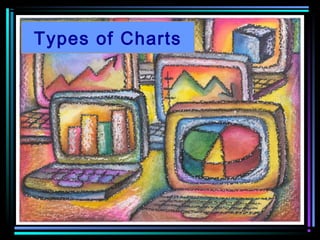
Learn everything about Charts with Excel 2013
Create Interactive Advanced Excel Charts, Pivot Charts and Dashboards - with Microsoft Excel 2013 + Free Excel Templates
******************************************************************************************************
GET THE COURSE FOR $5 WITH THE COUPON LINK:
https://www.udemy.com/excel-charts-learn-everything-about-charts-with-excel-2013/?couponCode=STUDENT5
$5 COUPON LINK - Excel Udemy Course: Excel with Excel Dynamic Graphs, Dashboa...mellontraining
Learn everything about Charts with Excel 2013
Create Interactive Advanced Excel Charts, Pivot Charts and Dashboards - with Microsoft Excel 2013 + Free Excel Templates
******************************************************************************************************
GET THE COURSE FOR $5 WITH THE COUPON LINK:
https://www.udemy.com/excel-charts-learn-everything-about-charts-with-excel-2013/?couponCode=STUDENT5
RS Trainings: is a brand and providing quality online and offline trainings for students in world wide. Rs Trainings providing Best DataScience online training in Hyderabad
RS Trainings: is a brand and providing quality online and offline trainings for students in world wide. Rs Trainings providing Best DataScience online training in Hyderabad
Data Visualization for Management Consultants & AnalystAsen Gyczew
What is the aim of this course?
In consulting you will spend a lot of time on creating presentations to show the results of your analyses to the customer. That is why, data visualization is so important. With proper display of data you have more chances of convincing the customers that your approach makes sense. In this course I will teach how to use different data visualization techniques to show the results of your analyses during consulting projects.
In the course you will learn the following things:
1. What types of slides you should use to present your thoughts
2. What types of charts you should use for data visualization
3. How to read the charts
4. How to create charts in Excel
5. How to create charts in PowerPoint
6. How to create dynamic charts in Excel
For more check the following course
https://bit.ly/DataVisualizationMC
Chapter 2 Graphical Descriptions of Data 25 Chapter 2.docxcravennichole326
Chapter 2: Graphical Descriptions of Data
25
Chapter 2: Graphical Descriptions of Data
In chapter 1, you were introduced to the concepts of population, which again is a
collection of all the measurements from the individuals of interest. Remember, in most
cases you can’t collect the entire population, so you have to take a sample. Thus, you
collect data either through a sample or a census. Now you have a large number of data
values. What can you do with them? No one likes to look at just a set of numbers. One
thing is to organize the data into a table or graph. Ultimately though, you want to be able
to use that graph to interpret the data, to describe the distribution of the data set, and to
explore different characteristics of the data. The characteristics that will be discussed in
this chapter and the next chapter are:
1. Center: middle of the data set, also known as the average.
2. Variation: how much the data varies.
3. Distribution: shape of the data (symmetric, uniform, or skewed).
4. Qualitative data: analysis of the data
5. Outliers: data values that are far from the majority of the data.
6. Time: changing characteristics of the data over time.
This chapter will focus mostly on using the graphs to understand aspects of the data, and
not as much on how to create the graphs. There is technology that will create most of the
graphs, though it is important for you to understand the basics of how to create them.
Section 2.1: Qualitative Data
Remember, qualitative data are words describing a characteristic of the individual. There
are several different graphs that are used for qualitative data. These graphs include bar
graphs, Pareto charts, and pie charts.
Pie charts and bar graphs are the most common ways of displaying qualitative data. A
spreadsheet program like Excel can make both of them. The first step for either graph is
to make a frequency or relative frequency table. A frequency table is a summary of
the data with counts of how often a data value (or category) occurs.
Example #2.1.1: Creating a Frequency Table
Suppose you have the following data for which type of car students at a college
drive?
Ford, Chevy, Honda, Toyota, Toyota, Nissan, Kia, Nissan, Chevy, Toyota,
Honda, Chevy, Toyota, Nissan, Ford, Toyota, Nissan, Mercedes, Chevy,
Ford, Nissan, Toyota, Nissan, Ford, Chevy, Toyota, Nissan, Honda,
Porsche, Hyundai, Chevy, Chevy, Honda, Toyota, Chevy, Ford, Nissan,
Toyota, Chevy, Honda, Chevy, Saturn, Toyota, Chevy, Chevy, Nissan,
Honda, Toyota, Toyota, Nissan
Chapter 2: Graphical Descriptions of Data
26
A listing of data is too hard to look at and analyze, so you need to summarize it.
First you need to decide the categories. In this case it is relatively easy; just use
the car type. However, there are several cars that only have one car in the list. In
that case it is easier to make a category called other for the ones with low values.
Now ...
Slide Makeover #87: Showing the components that add up to a totalDave Paradi
When analyzing results, it is important to look at how a total value was achieved. The components that contribute to the total help the audience understand how that total was arrived at. This makeover shows how you can use a Steps to a Total graph created in PowerPoint to visually show this instead of using a spreadsheet from Excel.
This presentation shows you a few different ideas on how to bring your presentations up a notch by presenting data in a more creative way. We'll show you exactly how to recreate each design. Don't forget to check out the helpful resources at the end of the deck.
This presentation was created 100% in PowerPoint. View more presentation and production ideas on our blog: https://www.macroproductions.net/blog/
RMD24 | Debunking the non-endemic revenue myth Marvin Vacquier Droop | First ...BBPMedia1
Marvin neemt je in deze presentatie mee in de voordelen van non-endemic advertising op retail media netwerken. Hij brengt ook de uitdagingen in beeld die de markt op dit moment heeft op het gebied van retail media voor niet-leveranciers.
Retail media wordt gezien als het nieuwe advertising-medium en ook mediabureaus richten massaal retail media-afdelingen op. Merken die niet in de betreffende winkel liggen staan ook nog niet in de rij om op de retail media netwerken te adverteren. Marvin belicht de uitdagingen die er zijn om echt aansluiting te vinden op die markt van non-endemic advertising.
Unveiling the Secrets How Does Generative AI Work.pdfSam H
At its core, generative artificial intelligence relies on the concept of generative models, which serve as engines that churn out entirely new data resembling their training data. It is like a sculptor who has studied so many forms found in nature and then uses this knowledge to create sculptures from his imagination that have never been seen before anywhere else. If taken to cyberspace, gans work almost the same way.
Affordable Stationery Printing Services in Jaipur | Navpack n PrintNavpack & Print
Looking for professional printing services in Jaipur? Navpack n Print offers high-quality and affordable stationery printing for all your business needs. Stand out with custom stationery designs and fast turnaround times. Contact us today for a quote!
Premium MEAN Stack Development Solutions for Modern BusinessesSynapseIndia
Stay ahead of the curve with our premium MEAN Stack Development Solutions. Our expert developers utilize MongoDB, Express.js, AngularJS, and Node.js to create modern and responsive web applications. Trust us for cutting-edge solutions that drive your business growth and success.
Know more: https://www.synapseindia.com/technology/mean-stack-development-company.html
Business Valuation Principles for EntrepreneursBen Wann
This insightful presentation is designed to equip entrepreneurs with the essential knowledge and tools needed to accurately value their businesses. Understanding business valuation is crucial for making informed decisions, whether you're seeking investment, planning to sell, or simply want to gauge your company's worth.
What are the main advantages of using HR recruiter services.pdfHumanResourceDimensi1
HR recruiter services offer top talents to companies according to their specific needs. They handle all recruitment tasks from job posting to onboarding and help companies concentrate on their business growth. With their expertise and years of experience, they streamline the hiring process and save time and resources for the company.
[Note: This is a partial preview. To download this presentation, visit:
https://www.oeconsulting.com.sg/training-presentations]
Sustainability has become an increasingly critical topic as the world recognizes the need to protect our planet and its resources for future generations. Sustainability means meeting our current needs without compromising the ability of future generations to meet theirs. It involves long-term planning and consideration of the consequences of our actions. The goal is to create strategies that ensure the long-term viability of People, Planet, and Profit.
Leading companies such as Nike, Toyota, and Siemens are prioritizing sustainable innovation in their business models, setting an example for others to follow. In this Sustainability training presentation, you will learn key concepts, principles, and practices of sustainability applicable across industries. This training aims to create awareness and educate employees, senior executives, consultants, and other key stakeholders, including investors, policymakers, and supply chain partners, on the importance and implementation of sustainability.
LEARNING OBJECTIVES
1. Develop a comprehensive understanding of the fundamental principles and concepts that form the foundation of sustainability within corporate environments.
2. Explore the sustainability implementation model, focusing on effective measures and reporting strategies to track and communicate sustainability efforts.
3. Identify and define best practices and critical success factors essential for achieving sustainability goals within organizations.
CONTENTS
1. Introduction and Key Concepts of Sustainability
2. Principles and Practices of Sustainability
3. Measures and Reporting in Sustainability
4. Sustainability Implementation & Best Practices
To download the complete presentation, visit: https://www.oeconsulting.com.sg/training-presentations
"𝑩𝑬𝑮𝑼𝑵 𝑾𝑰𝑻𝑯 𝑻𝑱 𝑰𝑺 𝑯𝑨𝑳𝑭 𝑫𝑶𝑵𝑬"
𝐓𝐉 𝐂𝐨𝐦𝐬 (𝐓𝐉 𝐂𝐨𝐦𝐦𝐮𝐧𝐢𝐜𝐚𝐭𝐢𝐨𝐧𝐬) is a professional event agency that includes experts in the event-organizing market in Vietnam, Korea, and ASEAN countries. We provide unlimited types of events from Music concerts, Fan meetings, and Culture festivals to Corporate events, Internal company events, Golf tournaments, MICE events, and Exhibitions.
𝐓𝐉 𝐂𝐨𝐦𝐬 provides unlimited package services including such as Event organizing, Event planning, Event production, Manpower, PR marketing, Design 2D/3D, VIP protocols, Interpreter agency, etc.
Sports events - Golf competitions/billiards competitions/company sports events: dynamic and challenging
⭐ 𝐅𝐞𝐚𝐭𝐮𝐫𝐞𝐝 𝐩𝐫𝐨𝐣𝐞𝐜𝐭𝐬:
➢ 2024 BAEKHYUN [Lonsdaleite] IN HO CHI MINH
➢ SUPER JUNIOR-L.S.S. THE SHOW : Th3ee Guys in HO CHI MINH
➢FreenBecky 1st Fan Meeting in Vietnam
➢CHILDREN ART EXHIBITION 2024: BEYOND BARRIERS
➢ WOW K-Music Festival 2023
➢ Winner [CROSS] Tour in HCM
➢ Super Show 9 in HCM with Super Junior
➢ HCMC - Gyeongsangbuk-do Culture and Tourism Festival
➢ Korean Vietnam Partnership - Fair with LG
➢ Korean President visits Samsung Electronics R&D Center
➢ Vietnam Food Expo with Lotte Wellfood
"𝐄𝐯𝐞𝐫𝐲 𝐞𝐯𝐞𝐧𝐭 𝐢𝐬 𝐚 𝐬𝐭𝐨𝐫𝐲, 𝐚 𝐬𝐩𝐞𝐜𝐢𝐚𝐥 𝐣𝐨𝐮𝐫𝐧𝐞𝐲. 𝐖𝐞 𝐚𝐥𝐰𝐚𝐲𝐬 𝐛𝐞𝐥𝐢𝐞𝐯𝐞 𝐭𝐡𝐚𝐭 𝐬𝐡𝐨𝐫𝐭𝐥𝐲 𝐲𝐨𝐮 𝐰𝐢𝐥𝐥 𝐛𝐞 𝐚 𝐩𝐚𝐫𝐭 𝐨𝐟 𝐨𝐮𝐫 𝐬𝐭𝐨𝐫𝐢𝐞𝐬."
Accpac to QuickBooks Conversion Navigating the Transition with Online Account...PaulBryant58
This article provides a comprehensive guide on how to
effectively manage the convert Accpac to QuickBooks , with a particular focus on utilizing online accounting services to streamline the process.
Cracking the Workplace Discipline Code Main.pptxWorkforce Group
Cultivating and maintaining discipline within teams is a critical differentiator for successful organisations.
Forward-thinking leaders and business managers understand the impact that discipline has on organisational success. A disciplined workforce operates with clarity, focus, and a shared understanding of expectations, ultimately driving better results, optimising productivity, and facilitating seamless collaboration.
Although discipline is not a one-size-fits-all approach, it can help create a work environment that encourages personal growth and accountability rather than solely relying on punitive measures.
In this deck, you will learn the significance of workplace discipline for organisational success. You’ll also learn
• Four (4) workplace discipline methods you should consider
• The best and most practical approach to implementing workplace discipline.
• Three (3) key tips to maintain a disciplined workplace.
Enterprise Excellence is Inclusive Excellence.pdfKaiNexus
Enterprise excellence and inclusive excellence are closely linked, and real-world challenges have shown that both are essential to the success of any organization. To achieve enterprise excellence, organizations must focus on improving their operations and processes while creating an inclusive environment that engages everyone. In this interactive session, the facilitator will highlight commonly established business practices and how they limit our ability to engage everyone every day. More importantly, though, participants will likely gain increased awareness of what we can do differently to maximize enterprise excellence through deliberate inclusion.
What is Enterprise Excellence?
Enterprise Excellence is a holistic approach that's aimed at achieving world-class performance across all aspects of the organization.
What might I learn?
A way to engage all in creating Inclusive Excellence. Lessons from the US military and their parallels to the story of Harry Potter. How belt systems and CI teams can destroy inclusive practices. How leadership language invites people to the party. There are three things leaders can do to engage everyone every day: maximizing psychological safety to create environments where folks learn, contribute, and challenge the status quo.
Who might benefit? Anyone and everyone leading folks from the shop floor to top floor.
Dr. William Harvey is a seasoned Operations Leader with extensive experience in chemical processing, manufacturing, and operations management. At Michelman, he currently oversees multiple sites, leading teams in strategic planning and coaching/practicing continuous improvement. William is set to start his eighth year of teaching at the University of Cincinnati where he teaches marketing, finance, and management. William holds various certifications in change management, quality, leadership, operational excellence, team building, and DiSC, among others.
2. 4.02 Understand charts and graphs used in business. Slide 2
What you need to know:
• This objective will explain six common
charts used in business. The object of
the game in this objective is to
understand how each chart is used to
communicate information.
• For example, if you are trying to
compare the sales of Honda Civics to
the sales of Nisson Altimas, what chart
will best explain the data?
3. 4.02 Understand charts and graphs used in business. Slide 3
How do you know which chart to use?
• In this PowerPoint, each chart will be
defined and described with an example
of the data it is most appropriately
suited to represent
4. 4.02 Understand charts and graphs used in business. Slide 4
Column Chart
• The first chart we will study is a Column
Chart
• It is used to make comparisons about
groups of data
5. 4.02 Understand charts and graphs used in business. Slide 5
Column Chart
Spirit Participation
0
20
40
60
80
100
January February March April
Month
AttendanceRate
Seniors
Juniors
Sophomores
This chart compares Senior, Junior, and Sophomore attendance rates at
assemblies over a period of four months.
6. 4.02 Understand charts and graphs used in business. Slide 6
Compare
• View the next four slides to compare
how the Spirit Participation data is
represented in different charts and then
decide which chart makes the most
sense of the information
• Remember, you are comparing
attendance rates of students over
a period of four months
7. 4.02 Understand charts and graphs used in business. Slide 7
Stacked Bar Spirit Participation
0 50 100 150 200
January
February
March
April
Month
Percent
Sophomores
Juniors
Seniors
This chart focuses
more on each
group’s
contribution to the
whole for any
given month
8. 4.02 Understand charts and graphs used in business. Slide 8
Line
Spirit Participation
0
10
20
30
40
50
60
70
80
90
100
January February March April
Month
Percent
Sophomores
Juniors
SeniorsThis chart
would be okay
if we were
analyzing
trends in
attendance
rates, but it
does not
provide a good
side-by-side
comparison
9. 4.02 Understand charts and graphs used in business. Slide 9
XY Scatter
Spirit Participation
0
10
20
30
40
50
60
70
80
90
100
0 1 2 3 4 5
Month
Percent
Juniors
Seniors
Sophomores
This chart is trying to determine if there is a
correlation between the month and the attendance
rate
10. 4.02 Understand charts and graphs used in business. Slide 10
Pie
Sophomores
25%
26%25%
24%
January
February
March
April
Finally, this chart is
useless for
representing the
data because it only
allows for one data
series.
11. 4.02 Understand charts and graphs used in business. Slide 11
What did you think?
• Which chart best represented the data?
• Why?
12. 4.02 Understand charts and graphs used in business. Slide 12
Stacked Bar Chart
• The next common business chart we
will view is a Stacked Bar Chart
• It is used to represent the
contribution of individual items to
a whole
• Each bar is divided into two or more parts
• The length of the stacked bar represents a
total
13. 4.02 Understand charts and graphs used in business. Slide 13
Stacked Bar
This example shows the contributions of three components: Computers, Printers,
and Monitors to total sales during each quarter (three-month period)
8,000
7,000
8,000
5,000
15,755
25,000
12,575
10,500
2,500
3,500
3,500
3,300
0 10,000 20,000 30,000 40,000
1st Quarter
2nd Quarter
3rd Quarter
4th Quarter
Period
Sales (in Thousands)
Printers
Computers
Monitors
ABC
Computers
Quarterly
Report
Sales
Analysis
15. 4.02 Understand charts and graphs used in business. Slide 15
Column
ABC Computers Quarterly Report
Component Analysis
0
5,000
10,000
15,000
20,000
25,000
30,000
1st
Quarter
2nd
Quarter
3rd
Quarter
4th
Quarter
Quarter
Sales(inThousands) Printers
Computers
Monitors
Bar
This chart does
not accurately
represent the
contributions of
each part to the
whole and is
instead
comparing them
against each
other
16. 4.02 Understand charts and graphs used in business. Slide 16
Line ABC Company Quarterly Report
Component Analysis
0
5,000
10,000
15,000
20,000
25,000
30,000
1st
Quarter
2nd
Quarter
3rd
Quarter
4th
Quarter
Quarter
Sales(inThousands)
Printers
Computers
Monitors
Line
What about
this chart?
Can you
clearly
identify each
component’s
contribution
to the
whole?
17. 4.02 Understand charts and graphs used in business. Slide 17
XY Scatter
ABC Computers Quarterly Report
0
5,000
10,000
15,000
20,000
25,000
30,000
0 1 2 3 4 5
Quarter
Sales(inThousands)
Printers
Computers
Monitors
XY Scatter
Why does
this chart
not work?
18. 4.02 Understand charts and graphs used in business. Slide 18
Pie ABC Computers Quarterly Report
Component Analysis
18%
28%
25%
29%
1st Quarter
2nd Quarter
3rd Quarter
4th Quarter
Pie
The chart
only looks at
one
department
19. 4.02 Understand charts and graphs used in business. Slide 19
What did you think?
• Which chart best represented the data?
• Why?
20. 4.02 Understand charts and graphs used in business. Slide 20
Line Chart
• The next common business chart we
will view is a Line Chart
• It is used to indicate trends in
data
21. 4.02 Understand charts and graphs used in business. Slide 21
Line Chart
Which
department
showed the most
growth?
Which
department
showed a steady
increase in sales?
Which
department
showed a decline
in sales?
Sales Trends by Department
0
10,000
20,000
30,000
40,000
50,000
60,000
1st Quarter 2nd
Quarter
3rd Quarter 4th Quarter
Period
Sales(inThousands)
Music
Shoes
Clothing
23. 4.02 Understand charts and graphs used in business. Slide 23
Column
Sales Trends by Department
1,000
11,000
21,000
31,000
41,000
51,000
61,000
1stQ
uarter
2nd
Q
uarter
3rd
Q
uarter
4th
Q
uarter
Quarter
Sales(inThousands)
Music
Shoes
Clothing
Bar
•To analyze the
trends in this chart,
the reader must read
each data series
separately and then
make comparisons
and generalizations
•In the line chart,
trends were clearly
and quickly analyzed
just by looking at the
lines
24. 4.02 Understand charts and graphs used in business. Slide 24
Stacked Bar
- 20,000 40,000 60,000 80,000
Sales (in Thousands)
1st Quarter
2nd Quarter
3rd Quarter
4th Quarter
Quarter
Sales Trends by Department
Music
Shoes
Clothing Stacked Bar
Does this chart
describe
trends?
25. 4.02 Understand charts and graphs used in business. Slide 25
Pie
Music
15%
19%
25%
41%
1st Quarter
2nd Quarter
3rd Quarter
4th Quarter
Pie
The pie
chart fails to
present all
of the data
26. 4.02 Understand charts and graphs used in business. Slide 26
What did you think?
• Which chart best represented the data?
• Why?
27. 4.02 Understand charts and graphs used in business. Slide 27
XY Scatter
• The next common business chart is an
XY Scatter Chart
• Used to indicate a correlation
between two or more sets of data
• A business example of an XY Chart is
one that represents the effect (if any) of
caffeine on worker productivity
28. 4.02 Understand charts and graphs used in business. Slide 28
XY Scatter
What affect
did the wait
time in the
principal’s
office have on
pulse rate?
What affect
did the wait
time in the
doctor’s office
have on pulse
rate?
Stress Analysis
0
20
40
60
80
100
120
140
0 5 10 15
Wait Time (in Minutes)
PulseRate
Principal's
Office
Doctor's
Office
This data is fictional
30. 4.02 Understand charts and graphs used in business. Slide 30
Column
Stress Rates
0
20
40
60
80
100
120
140
1 2 3 4 5 6
Minutes
PulseRate
Principal's Office Pulse Rate
Principal's Office Minutes
Doctor's Office Pulse Rate
Doctor's Office Minutes
Bar
As you can
see, if this
chart is used,
the data is
confusing and
not easily
interpreted
31. 4.02 Understand charts and graphs used in business. Slide 31
Stacked Bar
Stress Rates
0 50 100 150 200 250
1
2
3
4
5
6
Minutes
Pulse Rate
Principal's Office Pulse Rate
Principal's Office Minutes
Doctor's Office Pulse Rate
Doctor's Office Minutes
Stacked Bar
This chart is
also hard to
interpret
32. 4.02 Understand charts and graphs used in business. Slide 32
Pie
Principal's Office Pulse Rate
60
70
80
90
100
125
1
2
3
4
5
6
Pie
The pie chart,
once again, is
clearly not the
preferred chart for
representing and
communicating the
data!
33. 4.02 Understand charts and graphs used in business. Slide 33
What did you think?
• Which chart best represented the data?
• Why?
34. 4.02 Understand charts and graphs used in business. Slide 34
Pie Chart and Exploded Pie
• Pie Chart: Used to represent only
one series of data
– Examples:
• % of each expenditure in a budget
• % of each investment type in a portfolio
– It answers the question, “What is the
percentage of each part to the whole?”
• Exploded Pie: Used to emphasize
one or more portions of the data
35. 4.02 Understand charts and graphs used in business. Slide 35
Pie Chart
Which item
contributed
the most
percent to
total sales?
Financial Budget
East Region
57%
17%
13%13%
Printers
PDAs
Desktops
Laptops
36. 4.02 Understand charts and graphs used in business. Slide 36
Exploded Pie Chart
Music Sales by Genre
16%
24%
33%
27% Classical
Country
Rock
Hip Hop
37. 4.02 Understand charts and graphs used in business. Slide 37
Review: Can you identify the charts?
1. Represents the contribution of individual
items to the whole
2. Indicates trends in data
3. Makes comparisons about groups of data
4. Emphasizes one or more portions of the
data
5. Represents only one series of data
6. Indicates a correlation
38. 4.02 Understand charts and graphs used in business. Slide 38
That’s all folks . . .
• Let’s get busy and chart some data!
39. 4.02 Understand charts and graphs used in business. Slide 39
Stacked Bar
8,000
7,000
8,000
5,000
15,755
25,000
12,575
10,500
2,500
3,500
3,500
3,300
0 10,000 20,000 30,000 40,000
1st Quarter
2nd Quarter
3rd Quarter
4th Quarter
Period
Sales (in Thousands)
Printers
Computers
Monitors
ABC
Computers
Quarterly
Report
Sales
Analysis
40. 4.02 Understand charts and graphs used in business. Slide 40
XY Scatter
Stress Analysis
0
20
40
60
80
100
120
140
0 5 10 15
Wait Time (in Minutes)
PulseRate
Principal's
Office
Doctor's
Office
41. 4.02 Understand charts and graphs used in business. Slide 41
Column Chart
Spirit Participation
0
20
40
60
80
100
January February March April
Month
AttendanceRate
Seniors
Juniors
Sophomores
42. 4.02 Understand charts and graphs used in business. Slide 42
Exploded Pie
Music Sales by Genre
16%
24%
33%
27% Classical
Country
Rock
Hip Hop
43. 4.02 Understand charts and graphs used in business. Slide 43
Pie
Financial Budget
East Region
57%
17%
13%13%
Printers
PDAs
Desktops
Laptops
44. 4.02 Understand charts and graphs used in business. Slide 44
Line
Sales Trends by Department
0
10,000
20,000
30,000
40,000
50,000
60,000
1st Quarter 2nd
Quarter
3rd Quarter 4th Quarter
Period
Sales(inThousands)
Music
Shoes
Clothing
Editor's Notes
Which group attends assemblies most consistently? – The sophomores have the most consistent attendance as evidenced by the green bars.
Which group attends the assemblies most inconsistently? The seniors. Their attendance increases in January and February, shows a dramatic increase in March, and declines by more than half in April.
The components are displayed in the order presented in the spreadsheet.
What was the total sales for the first quarter? About $18,000
How much did printer sales contribute to the total sales for the first quarter? $5,000
How would you determine the percent of sales for printers to the total sales for the first quarter?