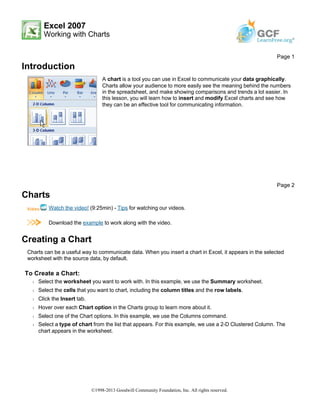
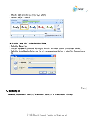
Excel 2007
Working with Charts
Introduction
Charts
Watch the video! (9:25min) - Tips for watching our videos.
Download the example to work along with the video.
Creating a Chart
Charts can be a useful way to communicate data. When you insert a chart in Excel, it appears in the selected
worksheet with the source data, by default.
To Create a Chart:
Š Select the worksheet you want to work with. In this example, we use the Summary worksheet.
Š Select the cells that you want to chart, including the column titles and the row labels.
Š Click the Insert tab.
Š Hover over each Chart option in the Charts group to learn more about it.
Š Select one of the Chart options. In this example, we use the Columns command.
Š Select a type of chart from the list that appears. For this example, we use a 2-D Clustered Column. The
chart appears in the worksheet.
Page 1
A chart is a tool you can use in Excel to communicate your data graphically.
Charts allow your audience to more easily see the meaning behind the numbers
in the spreadsheet, and make showing comparisons and trends a lot easier. In
this lesson, you will learn how to insert and modify Excel charts and see how
they can be an effective tool for communicating information.
Page 2
©1998-2013 Goodwill Community Foundation, Inc. All rights reserved.
Identifying the Parts of a Chart
Have you ever read something you didn't fully understand but when you saw a chart or graph, the concept
became clear and understandable? Charts are a visual representation of data in a worksheet. Charts make it
easy to see comparisons, patterns, and trends in the data.
Source Data
The range of cells that make up a chart. The chart is updated automatically whenever the information in these
Page 3
©1998-2013 Goodwill Community Foundation, Inc. All rights reserved.
cells change.
Title
The title of the chart.
Legend
The chart key, which identifies each color on the chart represents.
Axis
The vertical and horizontal parts of a chart. The vertical axis is often referred to as the Y axis, and the horizontal
axis is referred to as the X axis.
Data Series
The actual charted values, usually rows or columns of the source data.
Value Axis
The axis that represents the values or units of the source data.
Category Axis
The axis identifying each data series.
Chart Tools
Once you insert a chart, a new set of Chart Tools, arranged into 3 tabs, will appear above the Ribbon. These
are only visible when the chart is selected.
To Change the Chart Type:
Š Select the Design tab.
Š Click the Change Chart Type command. A dialog box appears.
Page 4
©1998-2013 Goodwill Community Foundation, Inc. All rights reserved.
Š Select another chart type.
Š Click OK.
The chart in the example compares each salesperson's monthly sales to his/her other month's sales; however
you can change what is being compared. Just click the Switch Row/Column Data command, which will rotate
the data displayed on the x and y axes. To return to the original view, click the Switch Row/Column command
again.
To Change Chart Layout:
Š Select the Design tab.
Š Locate the Chart Layouts group.
Š Click the More arrow to view all your layout options.
Š Left-click a layout to select it.
If your new layout includes chart titles, axes, or legend labels, just insert your cursor into the text and begin typing
to add your own text.
To Change Chart Style:
Š Select the Design tab.
Š Locate the Chart Style group.
Page 5
©1998-2013 Goodwill Community Foundation, Inc. All rights reserved.
Š Click the More arrow to view all your style options.
Š Left-click a style to select it.
To Move the Chart to a Different Worksheet:
Š Select the Design tab.
Š Click the Move Chart command. A dialog box appears. The current location of the chart is selected.
Š Select the desired location for the chart (i.e., choose an existing worksheet, or select New Sheet and name
it).
Challenge!
Use the Company Sales workbook or any other workbook to complete this challenge.
Page 6
©1998-2013 Goodwill Community Foundation, Inc. All rights reserved.
Š Use worksheet data to create a chart.
Š Change the chart layout.
Š Apply a chart style.
Š Move the chart to a separate worksheet.
©1998-2013 Goodwill Community Foundation, Inc. All rights reserved.

Print16

  • 1.
    Excel 2007 Working withCharts Introduction Charts Watch the video! (9:25min) - Tips for watching our videos. Download the example to work along with the video. Creating a Chart Charts can be a useful way to communicate data. When you insert a chart in Excel, it appears in the selected worksheet with the source data, by default. To Create a Chart: Š Select the worksheet you want to work with. In this example, we use the Summary worksheet. Š Select the cells that you want to chart, including the column titles and the row labels. Š Click the Insert tab. Š Hover over each Chart option in the Charts group to learn more about it. Š Select one of the Chart options. In this example, we use the Columns command. Š Select a type of chart from the list that appears. For this example, we use a 2-D Clustered Column. The chart appears in the worksheet. Page 1 A chart is a tool you can use in Excel to communicate your data graphically. Charts allow your audience to more easily see the meaning behind the numbers in the spreadsheet, and make showing comparisons and trends a lot easier. In this lesson, you will learn how to insert and modify Excel charts and see how they can be an effective tool for communicating information. Page 2 ©1998-2013 Goodwill Community Foundation, Inc. All rights reserved.
  • 2.
    Identifying the Partsof a Chart Have you ever read something you didn't fully understand but when you saw a chart or graph, the concept became clear and understandable? Charts are a visual representation of data in a worksheet. Charts make it easy to see comparisons, patterns, and trends in the data. Source Data The range of cells that make up a chart. The chart is updated automatically whenever the information in these Page 3 ©1998-2013 Goodwill Community Foundation, Inc. All rights reserved.
  • 3.
    cells change. Title The titleof the chart. Legend The chart key, which identifies each color on the chart represents. Axis The vertical and horizontal parts of a chart. The vertical axis is often referred to as the Y axis, and the horizontal axis is referred to as the X axis. Data Series The actual charted values, usually rows or columns of the source data. Value Axis The axis that represents the values or units of the source data. Category Axis The axis identifying each data series. Chart Tools Once you insert a chart, a new set of Chart Tools, arranged into 3 tabs, will appear above the Ribbon. These are only visible when the chart is selected. To Change the Chart Type: Š Select the Design tab. Š Click the Change Chart Type command. A dialog box appears. Page 4 ©1998-2013 Goodwill Community Foundation, Inc. All rights reserved.
  • 4.
    Š Select anotherchart type. Š Click OK. The chart in the example compares each salesperson's monthly sales to his/her other month's sales; however you can change what is being compared. Just click the Switch Row/Column Data command, which will rotate the data displayed on the x and y axes. To return to the original view, click the Switch Row/Column command again. To Change Chart Layout: Š Select the Design tab. Š Locate the Chart Layouts group. Š Click the More arrow to view all your layout options. Š Left-click a layout to select it. If your new layout includes chart titles, axes, or legend labels, just insert your cursor into the text and begin typing to add your own text. To Change Chart Style: Š Select the Design tab. Š Locate the Chart Style group. Page 5 ©1998-2013 Goodwill Community Foundation, Inc. All rights reserved.
  • 5.
    Š Click theMore arrow to view all your style options. Š Left-click a style to select it. To Move the Chart to a Different Worksheet: Š Select the Design tab. Š Click the Move Chart command. A dialog box appears. The current location of the chart is selected. Š Select the desired location for the chart (i.e., choose an existing worksheet, or select New Sheet and name it). Challenge! Use the Company Sales workbook or any other workbook to complete this challenge. Page 6 ©1998-2013 Goodwill Community Foundation, Inc. All rights reserved.
  • 6.
    Š Use worksheetdata to create a chart. Š Change the chart layout. Š Apply a chart style. Š Move the chart to a separate worksheet. ©1998-2013 Goodwill Community Foundation, Inc. All rights reserved.