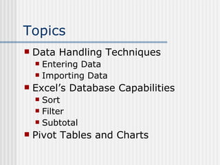
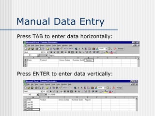
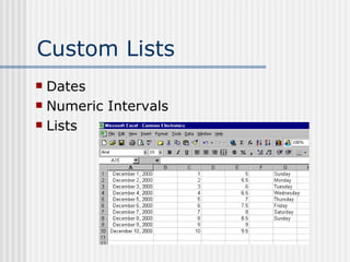
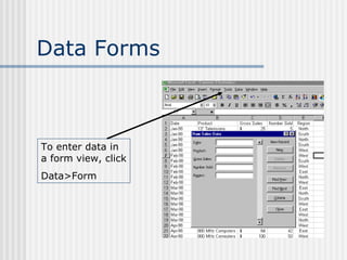
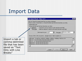
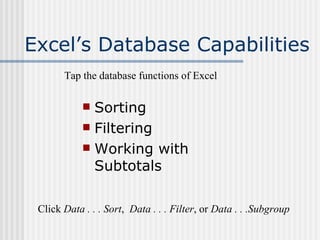
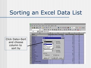
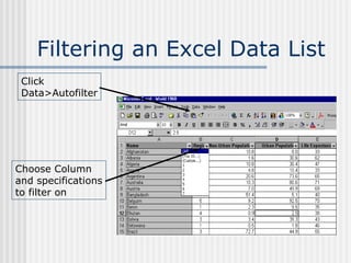
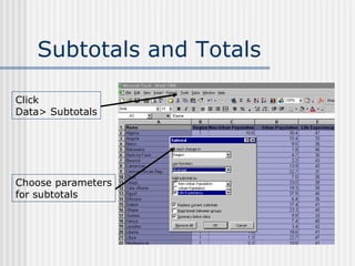
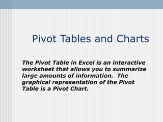
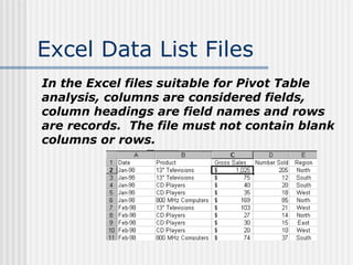
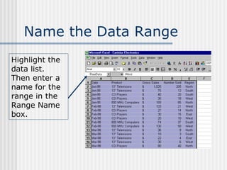
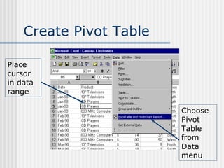
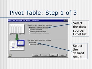
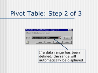
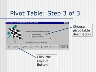
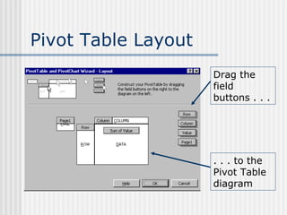
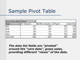
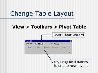
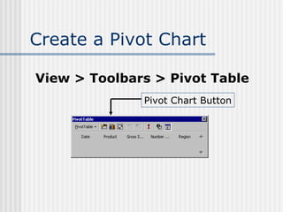
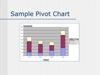
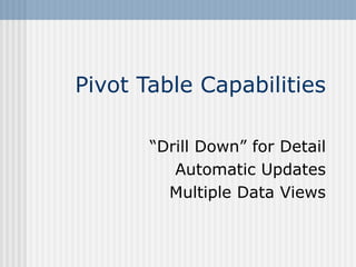
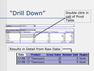
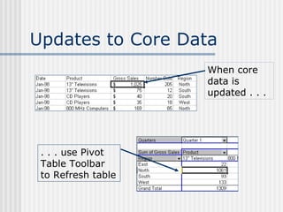
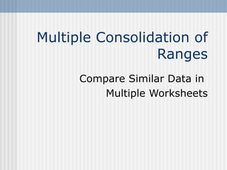
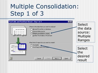
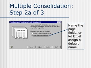
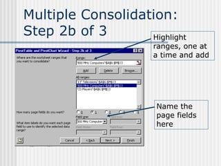
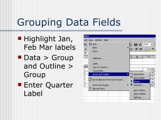
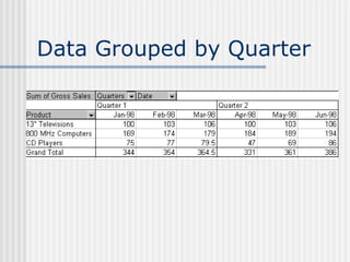
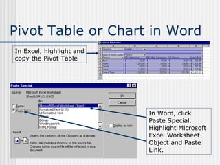
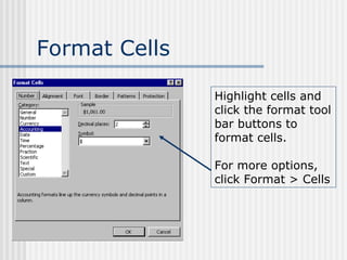
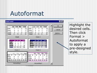
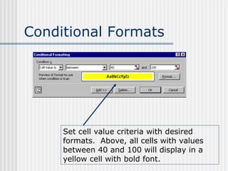
The document discusses various techniques for handling data in Excel, including entering data manually or importing it, sorting and filtering data, using subtotals and pivot tables to summarize data, and formatting options. Key techniques covered include importing tab-delimited files, sorting data by clicking Data > Sort, filtering data using Data > Autofilter, creating pivot tables by selecting the data source and dragging field buttons, and formatting cells using conditional formats.
Presentation is about advance excel advance feature PIVOT Table and contains steps to insert pivot table and some useful features of pivot table in case of large amount of data
The pivot tables are not created mechanically. In Microsoft excel the user should select the data first for which the pivot table should be created. The pivot table option is available on the insert tab. The user has the option of inserting the pivot table either in the existing sheet or creating the pivot table in the new sheet. Copy the link given below and paste it in new browser window to get more information on Pivot Table:- http://www.transtutors.com/homework-help/statistics/pivot-table.aspx
Excel Tutorials - VLOOKUP and HLOOKUP FunctionsMerve Nur Taş
Excel Tutorials with screenshots.
Reference and lookup functions in Excel: How to use VLOOKUP and HLOOKUP functions. VLOOKUP function example.
MS Excel 2016 for Mac
Learn to anchor cells, move around Excel without a mouse, functions to summarize data, PivotTables, filters, sorting, charts, and macros in this course to take your Excel skills to the next level. Include information on functions: countif, sumif, vlookup, index, match, left, right, mid, len, trim, find, now, date, int
From this power point you can get the details about Advanced Filter, Use of Macros with Advanced Filter, Data Validation, Creation of data validation Drop-Down List, Handling of External Data, Goal Seek, What-if analysis,
Excel 2010 brought with it two new features which extend the usefulness of pivot tables: the slicer and the timeline. They are really useful, among other use cases, when you want to easily monitor indicators in your data. Join our fellow Sheena Opulencia-Calub to learn more about this.
How to use Pivot Table is a detailed tutorial using Microsoft Excel and Google Spreadsheets.
Making a statistical or figure presentation considers a detailed and presentable report in order to get the attention of the employer, clients or customers. Pivot table is one big help so that figures presentation is enhanced and may create positive impact to the audience.
Enjoy and learn with the slide presentation.
May the Gem be with you!
How To Interpret Data By Using Pivot Tables in Excel Joyce Pacis
Are you having trouble on how to do a report? You have the source data but you don't know what to do with it? Don't fret this tutorial will help you to make a report in an easy way by using pivot table in excel. Just view this tutorial and let it help you with your problem.
One of the most popular function of Microsoft Excel is VLOOKUP. Most of the users when first time use this function are pretty confused, as it have several options through which it can operate. This slide presentation is created to help the people interested in learning this wonderful function.
Racial conflict, a special kind of actual or perceived opposition of values, interest, thoughts and need at place where one works as noted by Singley and Bell (2002). Racial conflicts can either be internal or external and at the same time categorized as substantive conflict or personalized conflict. Generally, racial conflicts in the workplace are triggered by a myriad of factors for instance fueled by ignorance and hatred over promotion, hard work or just racism. The easiest detonator of racism is difference individual voices concerning political stand concerning particular minority community in the society. This has given the civil society and most of the voluntary organization whom are whistle blowers to this menace a head ache on the fact that after all the diversity training and the destruction that this atrocity brings still workers deploy it in the working place (Budd & Bhave, 2010).
Our Associate Search Marketing Strategist, Jeff Malczyk, teaches us all about Excel pivot tables: how to interpret data faster, easier, and more efficiently. Complete with in-depth instructions, screenshots, video, and memes. Because you have to laugh. Download the practice worksheet: http://cl.ly/2f0t3x3M0d30
Tableau online training and tableau desktop , tableau admin
tableau certification, tableau interview questions, tableau training institutes in hyderabad, tableau training institutes in Bangalore
Tableau online training and tableau desktop training by United Trainings.
http://unitedtrainings.com/tableau-online-training/
Whatsapp / call :- +91 - 9100 77 3003/2 ,
Email: info@unitedtrainings.com
Tableau training uk,
Tableau online training,
Tableau training in hyderabad,
Tableau training in bangalore,
Tableau training online,
Tableau online course,
Tableau desktop training,
Tableau interview questions,
Tableau certification,
Tableau training material,
Tableau training chennai,
Tableau training pune,
Qlikview online training,
Qlikview training videos,
Qlikview designer training,
Qlikview certification,
Qlikview interview questions,
Qlikview training in hyderabad
Tableau online training and tableau desktop training by United Trainings.
http://unitedtrainings.com/tableau-online-training/
Whatsapp / call :- +91 - 9100 77 3003/2 ,
Email: info@unitedtrainings.com
Tableau training chicago,
Tableau online training,
Tableau training in hyderabad,
Tableau training in bangalore,
Tableau training online,
Tableau online course,
Tableau developer training,
Tableau interview questions,
Tableau certification,
Tableau training material,
Tableau training chennai,
Tableau training pune,
Qlikview online training,
Qlikview training videos,
Qlikview designer training
This presentation discusses the following topics:
Basic features of R
Exploring R GUI
Data Frames & Lists
Handling Data in R Workspace
Reading Data Sets & Exporting Data from R
Manipulating & Processing Data in R
A study on “Diagnosis Test of Diabetics and Hypertension by AI”, Presentation slides for International Conference on "Life Sciences: Acceptance of the New Normal", St. Aloysius' College, Jabalpur, Madhya Pradesh, India, 27-28 August, 2021
A study on “impact of artificial intelligence in covid19 diagnosis”Dr. C.V. Suresh Babu
A study on “Impact of Artificial Intelligence in COVID-19 Diagnosis”, Presentation slides for International Conference on "Life Sciences: Acceptance of the New Normal", St. Aloysius' College, Jabalpur, Madhya Pradesh, India, 27-28 August, 2021
A study on “impact of artificial intelligence in covid19 diagnosis”Dr. C.V. Suresh Babu
Although the lungs are one of the most vital organs in the body, they are vulnerable to infection and injury. COVID-19 has put the entire world in an unprecedented difficult situation, bringing life to a halt and claiming thousands of lives all across the world. Medical imaging, such as X-rays and computed tomography (CT), is essential in the global fight against COVID-19, and newly emerging artificial intelligence (AI) technologies are boosting the power of imaging tools and assisting medical specialists. AI can improve job efficiency by precisely identifying infections in X-ray and CT images and allowing further measurement. We focus on the integration of AI with X-ray and CT, both of which are routinely used in frontline hospitals, to reflect the most recent progress in medical imaging and radiology combating COVID-19.
Elevating Tactical DDD Patterns Through Object CalisthenicsDorra BARTAGUIZ
After immersing yourself in the blue book and its red counterpart, attending DDD-focused conferences, and applying tactical patterns, you're left with a crucial question: How do I ensure my design is effective? Tactical patterns within Domain-Driven Design (DDD) serve as guiding principles for creating clear and manageable domain models. However, achieving success with these patterns requires additional guidance. Interestingly, we've observed that a set of constraints initially designed for training purposes remarkably aligns with effective pattern implementation, offering a more ‘mechanical’ approach. Let's explore together how Object Calisthenics can elevate the design of your tactical DDD patterns, offering concrete help for those venturing into DDD for the first time!
JMeter webinar - integration with InfluxDB and GrafanaRTTS
Watch this recorded webinar about real-time monitoring of application performance. See how to integrate Apache JMeter, the open-source leader in performance testing, with InfluxDB, the open-source time-series database, and Grafana, the open-source analytics and visualization application.
In this webinar, we will review the benefits of leveraging InfluxDB and Grafana when executing load tests and demonstrate how these tools are used to visualize performance metrics.
Length: 30 minutes
Session Overview
-------------------------------------------
During this webinar, we will cover the following topics while demonstrating the integrations of JMeter, InfluxDB and Grafana:
- What out-of-the-box solutions are available for real-time monitoring JMeter tests?
- What are the benefits of integrating InfluxDB and Grafana into the load testing stack?
- Which features are provided by Grafana?
- Demonstration of InfluxDB and Grafana using a practice web application
To view the webinar recording, go to:
https://www.rttsweb.com/jmeter-integration-webinar
Kubernetes & AI - Beauty and the Beast !?! @KCD Istanbul 2024Tobias Schneck
As AI technology is pushing into IT I was wondering myself, as an “infrastructure container kubernetes guy”, how get this fancy AI technology get managed from an infrastructure operational view? Is it possible to apply our lovely cloud native principals as well? What benefit’s both technologies could bring to each other?
Let me take this questions and provide you a short journey through existing deployment models and use cases for AI software. On practical examples, we discuss what cloud/on-premise strategy we may need for applying it to our own infrastructure to get it to work from an enterprise perspective. I want to give an overview about infrastructure requirements and technologies, what could be beneficial or limiting your AI use cases in an enterprise environment. An interactive Demo will give you some insides, what approaches I got already working for real.
Neuro-symbolic is not enough, we need neuro-*semantic*Frank van Harmelen
Neuro-symbolic (NeSy) AI is on the rise. However, simply machine learning on just any symbolic structure is not sufficient to really harvest the gains of NeSy. These will only be gained when the symbolic structures have an actual semantics. I give an operational definition of semantics as “predictable inference”.
All of this illustrated with link prediction over knowledge graphs, but the argument is general.
DevOps and Testing slides at DASA ConnectKari Kakkonen
My and Rik Marselis slides at 30.5.2024 DASA Connect conference. We discuss about what is testing, then what is agile testing and finally what is Testing in DevOps. Finally we had lovely workshop with the participants trying to find out different ways to think about quality and testing in different parts of the DevOps infinity loop.
Generating a custom Ruby SDK for your web service or Rails API using Smithyg2nightmarescribd
Have you ever wanted a Ruby client API to communicate with your web service? Smithy is a protocol-agnostic language for defining services and SDKs. Smithy Ruby is an implementation of Smithy that generates a Ruby SDK using a Smithy model. In this talk, we will explore Smithy and Smithy Ruby to learn how to generate custom feature-rich SDKs that can communicate with any web service, such as a Rails JSON API.
GDG Cloud Southlake #33: Boule & Rebala: Effective AppSec in SDLC using Deplo...James Anderson
Effective Application Security in Software Delivery lifecycle using Deployment Firewall and DBOM
The modern software delivery process (or the CI/CD process) includes many tools, distributed teams, open-source code, and cloud platforms. Constant focus on speed to release software to market, along with the traditional slow and manual security checks has caused gaps in continuous security as an important piece in the software supply chain. Today organizations feel more susceptible to external and internal cyber threats due to the vast attack surface in their applications supply chain and the lack of end-to-end governance and risk management.
The software team must secure its software delivery process to avoid vulnerability and security breaches. This needs to be achieved with existing tool chains and without extensive rework of the delivery processes. This talk will present strategies and techniques for providing visibility into the true risk of the existing vulnerabilities, preventing the introduction of security issues in the software, resolving vulnerabilities in production environments quickly, and capturing the deployment bill of materials (DBOM).
Speakers:
Bob Boule
Robert Boule is a technology enthusiast with PASSION for technology and making things work along with a knack for helping others understand how things work. He comes with around 20 years of solution engineering experience in application security, software continuous delivery, and SaaS platforms. He is known for his dynamic presentations in CI/CD and application security integrated in software delivery lifecycle.
Gopinath Rebala
Gopinath Rebala is the CTO of OpsMx, where he has overall responsibility for the machine learning and data processing architectures for Secure Software Delivery. Gopi also has a strong connection with our customers, leading design and architecture for strategic implementations. Gopi is a frequent speaker and well-known leader in continuous delivery and integrating security into software delivery.
Essentials of Automations: Optimizing FME Workflows with ParametersSafe Software
Are you looking to streamline your workflows and boost your projects’ efficiency? Do you find yourself searching for ways to add flexibility and control over your FME workflows? If so, you’re in the right place.
Join us for an insightful dive into the world of FME parameters, a critical element in optimizing workflow efficiency. This webinar marks the beginning of our three-part “Essentials of Automation” series. This first webinar is designed to equip you with the knowledge and skills to utilize parameters effectively: enhancing the flexibility, maintainability, and user control of your FME projects.
Here’s what you’ll gain:
- Essentials of FME Parameters: Understand the pivotal role of parameters, including Reader/Writer, Transformer, User, and FME Flow categories. Discover how they are the key to unlocking automation and optimization within your workflows.
- Practical Applications in FME Form: Delve into key user parameter types including choice, connections, and file URLs. Allow users to control how a workflow runs, making your workflows more reusable. Learn to import values and deliver the best user experience for your workflows while enhancing accuracy.
- Optimization Strategies in FME Flow: Explore the creation and strategic deployment of parameters in FME Flow, including the use of deployment and geometry parameters, to maximize workflow efficiency.
- Pro Tips for Success: Gain insights on parameterizing connections and leveraging new features like Conditional Visibility for clarity and simplicity.
We’ll wrap up with a glimpse into future webinars, followed by a Q&A session to address your specific questions surrounding this topic.
Don’t miss this opportunity to elevate your FME expertise and drive your projects to new heights of efficiency.
Accelerate your Kubernetes clusters with Varnish CachingThijs Feryn
A presentation about the usage and availability of Varnish on Kubernetes. This talk explores the capabilities of Varnish caching and shows how to use the Varnish Helm chart to deploy it to Kubernetes.
This presentation was delivered at K8SUG Singapore. See https://feryn.eu/presentations/accelerate-your-kubernetes-clusters-with-varnish-caching-k8sug-singapore-28-2024 for more details.
UiPath Test Automation using UiPath Test Suite series, part 4DianaGray10
Welcome to UiPath Test Automation using UiPath Test Suite series part 4. In this session, we will cover Test Manager overview along with SAP heatmap.
The UiPath Test Manager overview with SAP heatmap webinar offers a concise yet comprehensive exploration of the role of a Test Manager within SAP environments, coupled with the utilization of heatmaps for effective testing strategies.
Participants will gain insights into the responsibilities, challenges, and best practices associated with test management in SAP projects. Additionally, the webinar delves into the significance of heatmaps as a visual aid for identifying testing priorities, areas of risk, and resource allocation within SAP landscapes. Through this session, attendees can expect to enhance their understanding of test management principles while learning practical approaches to optimize testing processes in SAP environments using heatmap visualization techniques
What will you get from this session?
1. Insights into SAP testing best practices
2. Heatmap utilization for testing
3. Optimization of testing processes
4. Demo
Topics covered:
Execution from the test manager
Orchestrator execution result
Defect reporting
SAP heatmap example with demo
Speaker:
Deepak Rai, Automation Practice Lead, Boundaryless Group and UiPath MVP
Smart TV Buyer Insights Survey 2024 by 91mobiles.pdf91mobiles
91mobiles recently conducted a Smart TV Buyer Insights Survey in which we asked over 3,000 respondents about the TV they own, aspects they look at on a new TV, and their TV buying preferences.
Slack (or Teams) Automation for Bonterra Impact Management (fka Social Soluti...Jeffrey Haguewood
Sidekick Solutions uses Bonterra Impact Management (fka Social Solutions Apricot) and automation solutions to integrate data for business workflows.
We believe integration and automation are essential to user experience and the promise of efficient work through technology. Automation is the critical ingredient to realizing that full vision. We develop integration products and services for Bonterra Case Management software to support the deployment of automations for a variety of use cases.
This video focuses on the notifications, alerts, and approval requests using Slack for Bonterra Impact Management. The solutions covered in this webinar can also be deployed for Microsoft Teams.
Interested in deploying notification automations for Bonterra Impact Management? Contact us at sales@sidekicksolutionsllc.com to discuss next steps.
11. Pivot Tables and Charts The Pivot Table in Excel is an interactive worksheet that allows you to summarize large amounts of information. The graphical representation of the Pivot Table is a Pivot Chart.
12. Excel Data List Files In the Excel files suitable for Pivot Table analysis, columns are considered fields, column headings are field names and rows are records. The file must not contain blank columns or rows.
13. Name the Data Range Highlight the data list. Then enter a name for the range in the Range Name box.
14. Create Pivot Table Place cursor in data range Choose Pivot Table from Data menu
15. Pivot Table: Step 1 of 3 Select the data source: Excel list Select the desired result
16. Pivot Table: Step 2 of 3 If a data range has been defined, the range will automatically be displayed
17. Pivot Table: Step 3 of 3 Choose pivot table destination Click the Layout Button
18. Pivot Table Layout Drag the field buttons . . . . . . to the Pivot Table diagram
19. Sample Pivot Table The data list fields are “pivoted” around the “core data”, gross sales, providing different “views” of the data.
20. Change Table Layout View > Toolbars > Pivot Table Pivot Chart Wizard Or, drag field names to create new layout
36. Pivot Table or Chart in Word In Excel, highlight and copy the Pivot Table In Word, click Paste Special. Highlight Microsoft Excel Worksheet Object and Paste Link.
38. Format Cells Highlight cells and click the format tool bar buttons to format cells. For more options, click Format > Cells
39. Autoformat Highlight the desired cells. Then click Format > Autoformat to apply a pre-designed style.
40. Conditional Formats Set cell value criteria with desired formats. Above, all cells with values between 40 and 100 will display in a yellow cell with bold font.
Editor's Notes
Custom Lists Open a new file Enter dates (Jan 1998) in column 1, row 5 Enter numbers in column 2 row 1; first 1 and copy across row (result: all 1’s) Enter number interval in column 2 & 3 row 2; then copy across Do the same with interval of 5 (start 0 and 5) Do the same with a decimal (1.1 and 1.2) Open RawData File in Excel Dec-98 13" Televisions $ 46 10 West Dec-98 CD Players $ 40 20 East Dec-98 CD Players $ 60 30 West Dec-98 800 MHz Computers $ 25 13 North Hand enter one line Use a data form to complete the rest
In days of e-mail attachments, you may receive files that are not already in Excel format, but which you need to “read” into Excel. Show on the File> Open dialog box, the File Types which can be imported Show a comma-delimited file: Budget Data Comma Delimited Save as Text only with line breaks Open in Excel (Note must close file in word first, or there will be an error) Show Word file with a table: RawData in Table Convert Table to Text Save as Text only with line breaks Import into Excel (Note must close file in word first, or there will be an error)
WORLD 1960 Sorting: Do several sorts; one level, two levels, three levels Filtering: for what-if operations: MAKE SURE A1 IS HIGHLIGHTED all regions =4 life expectancy =60 go back to “all” on life exp.; to do another filter >60 do several more to get rid of all filters: Data . . . Filter . . . Turn off autofilter Subtotals: Sort by region first: now in a group count number in each region ave life exp by region ave pop by region at each subtotal: remove all; or leave in by region show expand and collapse by region Some options: remove current and replace by new subtotals; put each group on a different page; summary below data Remove all - to go back to original
Open Canisius Electronics Name the Data Range because: Excel recognizes the data range for the pivot table updates can be made
Column: Product Row: Region Data: Gross Sales (Sum of)
Note: created in new sheet Show: Choosing only some products vs. all Choosing only some regions vs. all Drop Date in Page Field Choosing a particular date vs. All Show changing “statistic” to show: sum of sales vs. Average sales
Show multi field columns and rows: put region in column put date in rows Then show “putting them back”: drag field to Pivot Toolbar
Create a chart
Note: created in new worksheet Then “pivot” All as in Pivot Table Show putting date in page field Alter legend Alter axis Alter Value calculated
Are you losing detail? No, you can “drill down” to see the detail on which the summary is based. Click twice in the desired cell Note: the detail goes on a new worksheet; you can return to the pivot table Note: the database, or data mining terminology
Change jan 98 TV gross sales to 2025, number sold to 205 Return to Pivot table; position cursor; refresh data Add new data: it’s included in the range – one of the reasons we named it! But it will have to be re-sorted before we can refresh the pivot table data>sort> date, product Then refresh Pivot table
Data in Multiple Worksheets to be compared Example: separate budget sheets for each product compare over date range
User can create the “page field” names
To see each product separately, choose from the “Page Field” drop down list.
This can be done on the Pivot Table itself
Move Quarter field up to page field line Double click on it to rename to “Quarters” Show how to choose quarters and display data
Pivot Table formatting works the same as regular worksheet formatting Choose Toolbar buttons, or, for more options, click Format > Cells
Click one cell in the pivot table and then click format report from Pivot table toolbar for some autoformats Or highlight the whole Pivot table, click Format > Autoformat and apply a predesigned format