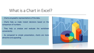
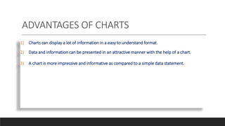
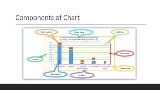
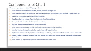
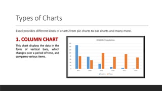
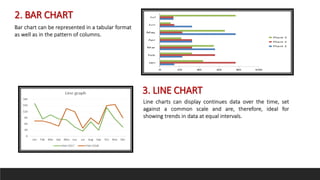
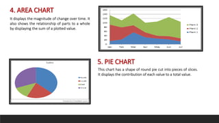
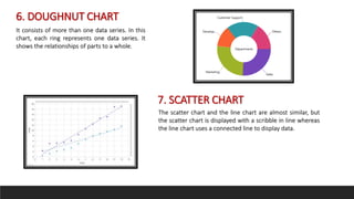
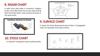
Charts in Excel can display data in a more visually appealing and easy to understand format compared to tables of numbers. There are many components that make up a chart, including axes, data series, plot area, legend and more. Excel offers different types of charts, such as column, bar, line, area, pie, doughnut, scatter, radar, surface and stock charts, each suited to displaying certain types of data trends over time or in relation to other factors.
this ppt is about charts in ms excel.there are many types of chart used in ms excel but in this ppt some common types are defined,as line chart,bar,column,area ,scatter chart etc...
Types of charts in Excel and How to use themVijay Perepa
There are different Chart types and some times we face difficulty to find which chart is suitable for a specific Data set. In this series of Videos, we have discussed about each chart type and when to use etc.
Learn to anchor cells, move around Excel without a mouse, functions to summarize data, PivotTables, filters, sorting, charts, and macros in this course to take your Excel skills to the next level. Include information on functions: countif, sumif, vlookup, index, match, left, right, mid, len, trim, find, now, date, int
Curious about the different types of chart? This presentation demonstrates the variety of charts and their purpose. All these charts have been created using Chartblocks online chart building tool.
The site present the assignment to the students in well- structured manner including all the information in the simplest form, so that students need not spend extra time and effort in completion of the assignment and along with these they can also gain all the content engraved in the brain.
Synthetic Fiber Construction in lab .pptxPavel ( NSTU)
Synthetic fiber production is a fascinating and complex field that blends chemistry, engineering, and environmental science. By understanding these aspects, students can gain a comprehensive view of synthetic fiber production, its impact on society and the environment, and the potential for future innovations. Synthetic fibers play a crucial role in modern society, impacting various aspects of daily life, industry, and the environment. ynthetic fibers are integral to modern life, offering a range of benefits from cost-effectiveness and versatility to innovative applications and performance characteristics. While they pose environmental challenges, ongoing research and development aim to create more sustainable and eco-friendly alternatives. Understanding the importance of synthetic fibers helps in appreciating their role in the economy, industry, and daily life, while also emphasizing the need for sustainable practices and innovation.
Ethnobotany and Ethnopharmacology:
Ethnobotany in herbal drug evaluation,
Impact of Ethnobotany in traditional medicine,
New development in herbals,
Bio-prospecting tools for drug discovery,
Role of Ethnopharmacology in drug evaluation,
Reverse Pharmacology.
Welcome to TechSoup New Member Orientation and Q&A (May 2024).pdfTechSoup
In this webinar you will learn how your organization can access TechSoup's wide variety of product discount and donation programs. From hardware to software, we'll give you a tour of the tools available to help your nonprofit with productivity, collaboration, financial management, donor tracking, security, and more.
How to Create Map Views in the Odoo 17 ERPCeline George
The map views are useful for providing a geographical representation of data. They allow users to visualize and analyze the data in a more intuitive manner.
2. What is a Chart in Excel?
o Charts are graphic representations of the data.
o Charts help us make instant decisions based on the
comparison of numbers.
o They help us analyze and evaluate the worksheet
conveniently.
o As compared to simple presentation, charts are more
attractive and appealing.
3. ADVANTAGES OF CHARTS
1) Charts can display a lot of information in a easy to understand format.
2) Data and information can be presented in an attractive manner with the help of a chart.
3) A chart is more impressive and informative as compared to a simple data statement.
5. Components of Chart
There are many components of a chart. They are given below:
1) X-axis: The X-axis is horizontal axis of the chart, and it is also known as category axis.
2) Y-axis: The Y-axis is vertical axis of the chart, and it is also known as value axis. The value of each data series is plotted on this axis.
3) Dara Series: It is a group of data from which a chart is derived.
4) Data Object: Charts are made up of a variety of elements, also called data objects.
5) Chart Area: It is the area where chart components are enclosed.
6) Plot Area: The area of the chart where the actual chart is plotted.
7) Chart Title: The text at the top of the chart that helps to understand what the chart represents.
8) Axis Title: These are the titles given to the two axis, i.e., X-axis and Y-axis of the chart.
9) Gridlines: The gridlines are the horizontal and vertical lines on the plot area, which are inserted in the chart to enhance its readability.
10) Legend: A legend is to the right of the plot area, and it identifies each series can be uniquely identified by assigning a unique color or
pattern to it.
11) Data Label: This is a text or label that provides additional information on data points.
6. Types of Charts
Excel provides different kinds of charts from pie charts to bar charts and many more.
1. COLUMN CHART
This chart displays the data in the
form of vertical bars, which
changes over a period of time, and
compares various items.
7. 2. BAR CHART
Bar chart can be represented in a tabular format
as well as in the pattern of columns.
3. LINE CHART
Line charts can display continues data over the time, set
against a common scale and are, therefore, ideal for
showing trends in data at equal intervals.
8. 4. AREA CHART
It displays the magnitude of change over time. It
also shows the relationship of parts to a whole
by displaying the sum of a plotted value.
5. PIE CHART
This chart has a shape of round pie cut into pieces of slices.
It displays the contribution of each value to a total value.
9. 6. DOUGHNUT CHART
It consists of more than one data series. In this
chart, each ring represents one data series. It
shows the relationships of parts to a whole.
7. SCATTER CHART
The scatter chart and the line chart are almost similar, but
the scatter chart is displayed with a scribble in line whereas
the line chart uses a connected line to display data.
10. 8. RADAR CHART
A radar chart plots data in concentric irregular
circles. Each data series has its own value arising
from the center point. Lines connect all values in
the same series.
9. SURFACE CHART
It shows the three dimensional view of data. A topographic
map is an example of this type of chart.
10. STOCK CHART
It is ideal for tracking the stock market activity.