
Recommended
More Related Content
What's hot
What's hot (18)
Viewers also liked
Similar to Q2
Similar to Q2 (20)
More from welche8692
More from welche8692 (20)
Recently uploaded
Recently uploaded (20)
Q2
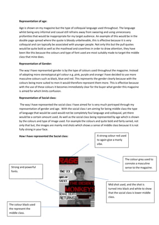
- 1. Representation of age: Age is shown on my magazine but the type of colloquial language used throughout. The language whilst being very informal and casual still refrains away from swearing and using unnecessary profanities that would be inappropriate for my target audience. An example of this would be in the double page spread where the quote is bloody unbelievable, this is effective because it is very colloquial and can typically be associated with younger people. Not only this but the pull quotes would be quite bold as well as the masthead and coverlines in order to draw attention, they have been like this because the colours and type of font used are most suitably made to target the middle class that mine does. Representation of Gender: The way I have represented gender is by the type of colours used throughout the magazine. Instead of adopting more stereotypical girl colour e.g. pink, purple and orange I have decided to use more masculine colours such as black, blue and red. This represents the gender clearly because with the colours being more suited to men it would therefore represent them more. This is effective because with the use of these colours it becomes immediately clear for the buyer what gender this magazine is aimed for which limits confusion. Representation of Social class: The way I have represented the social class I have aimed for is very much portrayed through my representation of gender and age. With the social class I am aiming for being middle class the type of language that would be used would not be completely foul language and colloquial, yet there would be a certain amount used. As well as the social class being represented by age which is shown by the colours and type of image used. For example the colours and quite bold and fairly varied, not only that but, the images are mainly mid shots which shows a sense of middle class because it is not fully strong in your face. How I have represented the Social class: Mid shot used, and the shot is turned into black and white to show that the social class is lower middle class. The colour grey used to connote a masculine sense to the magazine. A strong colour red used to again give a manly vibe. Strong and powerful fonts. The colour black used the represent the middle class.
- 2. The front cover can be seen to target the middle class social group because of the things highlighted above, for example the black and white photo, the powerful fonts and the type of colours used. The reason it can be seen to target this specific type of class is because it is out of the three main social classes the one it can be mostly associated to. For example if you was reading an upper class magazine there would not be such powerful colours and fonts used. Whereas, if you were targeting the lower class, the camera shot that would be used more would be close ups in order to give of a more violent and chaotic vibe. The contents page represents the middle class because similarly to the front cover it has the same qualities that were used to make the front cover middle class orientated. For example again the colours used where not completely outstanding but likewise where not colours that did not stand out. As well as the picture again being a mid-shot that is commonly associated with being a shot used for the middle class and the background and colours of the picture being turned to black and white. This is proven and effective by not using complete bold and outgoing colours which can be construed as a more lower class colours, equally it is not just black and white which would be commonly associated with the upper classes. The picture has been turned into black and white. It also is a mid- shot There is again a wide range of manly colours with dark red and blue. The contents isblack and red with powerful sub-headings. The colours and font of the headline is not a completely aggressive, but not completely passive either.
- 3. The double page is the only page in the magazine that is a little irregular because the picture is not typical of middle class because it is not clearly a mid-shot and the colour has been used in the picture because having the Indie genre it is meant to be sporadic and irregular. This is effective because in Indie/Rock magazines the type of audiences it targets are open to sporadic changes, but do prefer consistency. However, there are still some features that represent the middle class, for example the colours used again are similar to the other parts of the magazine. As well as the colours that were chosen were used throughout the whole of the magazine, this is also conventional to the middle social class because of order and consistency. The text used is black that is used to show that is middle class by the consistency used throughout the whole of the magazine. The title is a medium strength colours that does stand out but is not other the top. The picture in this one is the only thing that is irregular for middle class, however the sporadic nature of the genre indie means that is typical for it to be like this.