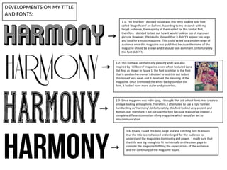
The document discusses the development of fonts for the title of a music magazine. Several fonts were tested but did not meet the goals of appearing bold, large, eye-catching, and dominant for the magazine title. Finally, a bold, large font was selected that emphasized the title and fit horizontally across the cover to convey the magazine's fulfillment of audience expectations.