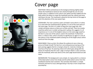
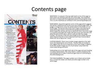
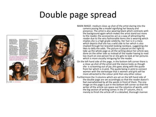
BILLBOARD MAGAZINE
Cover page
 MASTHEAD: White and bold due to the background being slightly darker
 allows the masthead to stand out very clearly through the use of a very
 simple colour. In addition to this colours red, yellow and blue added into the
 holes within the letters to make the masthead more hip, vibrant and more
 catching to the eye. The masthead is placed at the top centre of the page to
 catch the attention of the near passer byer.

 COVERLINES: The main coverline used is of Drake’s name which is in white
 to co exist with the masthead which signifies it is one of the main parts of
 the cover page. The font is in calibri to keep the cover page tidy, neat
 ,simple and quite mature so there are no flicks and tails. There are smaller
 coverlines which are in smaller writing and in yellow, this suggests it is of
 importance as it is one of the brighter colours on the cover page aswell as
 the fact it is also one of the colours used in the masthead. Furthermore
 there is a flash in blue which connotes its significance as again it is one of
 the colours in the masthead aswell as being one of the bright colours which
 stand out from the page.

 MAIN IMAGE: Close up shot, this allows the audience to see a close up
 picture of Drake himself. The fact he is not smiling but just staring as if he
 were posing suggests that he is trying to show his maturity in being ‘the
 new face of hip hop’. His wearing a black shirt which goes along with the
 theme of simplicity that this cover page is trying to depict. It also contrasts
 with the masthead, which was done so the cover page would stand out abit
 more.

 BACKGROUND: The background is very simple, its in grey which is a mixture
 of the black which comes from Drake and the white which comes from the
 mastboard and the main coverline. This connotes that Drake is a simple
 character and that his music although being in hip hop is more simple then
 acounted for .
Contents page
      MASTHEAD: it is placed in the top right hand corner of the page so
      that it does not interfere with the rest of the page. The masthead
      this time is in black with the brightened colours remaining the same.
      This is so the masthead can standout in the contrasting background.

      MAIN IMAGE: placed through the centre of the page which suggests
      she will be a significant part of the issue and contents page itself. The
      image is a long shot to cover the whole extent of the body so it can
      fill the page. The woman who is the main image is also wearing on
      white which goes hand in hand with the background behind her
      which makes the red she also has on stand out more. Since the image
      is so tasteful and bright the reader will want to go and read who and
      what the story of this lady is which is why she also has a page
      number. The woman is also the same length as the smaller pictures
      which depicts how she is more important and how 3 stories about
      others are not as big as her 1 story.

      FURTHER IMAGES: There more smaller images aligned on the right
      hand side following the rule of thirds . The fact they are smaller in
      size suggest they are not as important as the main image in addition
      to this the smaller images are of a much darker colour with the
      colour black being prominent.

      Subheadings are on the right hand side of the page and each heading
      is in black capital letters, The colour black is used to emphasise the
      sub headings and to make it stand out again due to it contrasting to
      the white background.

      THE PAGE NUMBERS: The page numbers are in black and are bold,
      this is so that the reader can clearly see what page number is for
      which page.
Double page spread
        MAIN IMAGE: medium close up shot of the artist staring into the
             camera posing like a model signifying her beauty and
             presence. The artist is also wearing black which contrasts with
             the background again which makes the artist stand out more
             to the reader, the accessories act as a way of attracting the
             reader due to the very fashionable items she is wearing which
             implies she is a high grade celebrity. Her hair is in a mess
             which depicts that she has a wild side to her which is also
             implied through her bracelet looking necklace, suggesting she
             likes to defy the odds. The picture is placed on the right to
             take up the whole page as all the writing about her article was
             done on the other side so instead of the reader having to read
             too much on one person he or she gets to look at her pictures
             which is more visually intriguing for the reader.
        On the left hand side of the page, in the bottom left corner there is
             a close up shot of the artist and the stance looks as though
             she is screaming out of joy ,this goes along with the quote
             from her which is in pink. The quote being in pink to connect
             women with the stereotype that is women and girls will be
             more attracted to the colour pink then any other colour.
        Furthermore the 3 columns which are set on the left hand side of
             the double page are set accordingly so that the reader doesn’t
             feel overwhelmed by all the words in front of them. The one
             image on this page is put in the bottom left corner so that the
             writer of the article can space out the columns of words, until
             the big section of writing comes in the 3rd column, this is
             merely to finish the article off in a detailed, thorough manner.
About Billboard
• Billboard had its first issue published in 1894 in
  the U.S.A
• It originally started out as a billboard advertising
  agency, implying where the name came from
• Began coverage of motion picture from 1909 and
  of radios in the early 1920s
• In the 1930s it introduced a music chart. And
  from 1961 onwards the magazine was mainly
  devoted to the music industry.
House style
• Billboard magazine tend to have a theme which consists of
  the colours black and white mainly. The red , blue, yellow in
  the masthead are rarely used but used they are.
• The masthead also is consistently in the top centre of almost
  all their magazines.
• The magazine also always have the main cover line linking
  with the main image

Billboard magazine

  • 1.
  • 2.
    Cover page MASTHEAD:White and bold due to the background being slightly darker allows the masthead to stand out very clearly through the use of a very simple colour. In addition to this colours red, yellow and blue added into the holes within the letters to make the masthead more hip, vibrant and more catching to the eye. The masthead is placed at the top centre of the page to catch the attention of the near passer byer. COVERLINES: The main coverline used is of Drake’s name which is in white to co exist with the masthead which signifies it is one of the main parts of the cover page. The font is in calibri to keep the cover page tidy, neat ,simple and quite mature so there are no flicks and tails. There are smaller coverlines which are in smaller writing and in yellow, this suggests it is of importance as it is one of the brighter colours on the cover page aswell as the fact it is also one of the colours used in the masthead. Furthermore there is a flash in blue which connotes its significance as again it is one of the colours in the masthead aswell as being one of the bright colours which stand out from the page. MAIN IMAGE: Close up shot, this allows the audience to see a close up picture of Drake himself. The fact he is not smiling but just staring as if he were posing suggests that he is trying to show his maturity in being ‘the new face of hip hop’. His wearing a black shirt which goes along with the theme of simplicity that this cover page is trying to depict. It also contrasts with the masthead, which was done so the cover page would stand out abit more. BACKGROUND: The background is very simple, its in grey which is a mixture of the black which comes from Drake and the white which comes from the mastboard and the main coverline. This connotes that Drake is a simple character and that his music although being in hip hop is more simple then acounted for .
  • 3.
    Contents page MASTHEAD: it is placed in the top right hand corner of the page so that it does not interfere with the rest of the page. The masthead this time is in black with the brightened colours remaining the same. This is so the masthead can standout in the contrasting background. MAIN IMAGE: placed through the centre of the page which suggests she will be a significant part of the issue and contents page itself. The image is a long shot to cover the whole extent of the body so it can fill the page. The woman who is the main image is also wearing on white which goes hand in hand with the background behind her which makes the red she also has on stand out more. Since the image is so tasteful and bright the reader will want to go and read who and what the story of this lady is which is why she also has a page number. The woman is also the same length as the smaller pictures which depicts how she is more important and how 3 stories about others are not as big as her 1 story. FURTHER IMAGES: There more smaller images aligned on the right hand side following the rule of thirds . The fact they are smaller in size suggest they are not as important as the main image in addition to this the smaller images are of a much darker colour with the colour black being prominent. Subheadings are on the right hand side of the page and each heading is in black capital letters, The colour black is used to emphasise the sub headings and to make it stand out again due to it contrasting to the white background. THE PAGE NUMBERS: The page numbers are in black and are bold, this is so that the reader can clearly see what page number is for which page.
  • 4.
    Double page spread MAIN IMAGE: medium close up shot of the artist staring into the camera posing like a model signifying her beauty and presence. The artist is also wearing black which contrasts with the background again which makes the artist stand out more to the reader, the accessories act as a way of attracting the reader due to the very fashionable items she is wearing which implies she is a high grade celebrity. Her hair is in a mess which depicts that she has a wild side to her which is also implied through her bracelet looking necklace, suggesting she likes to defy the odds. The picture is placed on the right to take up the whole page as all the writing about her article was done on the other side so instead of the reader having to read too much on one person he or she gets to look at her pictures which is more visually intriguing for the reader. On the left hand side of the page, in the bottom left corner there is a close up shot of the artist and the stance looks as though she is screaming out of joy ,this goes along with the quote from her which is in pink. The quote being in pink to connect women with the stereotype that is women and girls will be more attracted to the colour pink then any other colour. Furthermore the 3 columns which are set on the left hand side of the double page are set accordingly so that the reader doesn’t feel overwhelmed by all the words in front of them. The one image on this page is put in the bottom left corner so that the writer of the article can space out the columns of words, until the big section of writing comes in the 3rd column, this is merely to finish the article off in a detailed, thorough manner.
  • 5.
    About Billboard • Billboardhad its first issue published in 1894 in the U.S.A • It originally started out as a billboard advertising agency, implying where the name came from • Began coverage of motion picture from 1909 and of radios in the early 1920s • In the 1930s it introduced a music chart. And from 1961 onwards the magazine was mainly devoted to the music industry.
  • 6.
    House style • Billboardmagazine tend to have a theme which consists of the colours black and white mainly. The red , blue, yellow in the masthead are rarely used but used they are. • The masthead also is consistently in the top centre of almost all their magazines. • The magazine also always have the main cover line linking with the main image