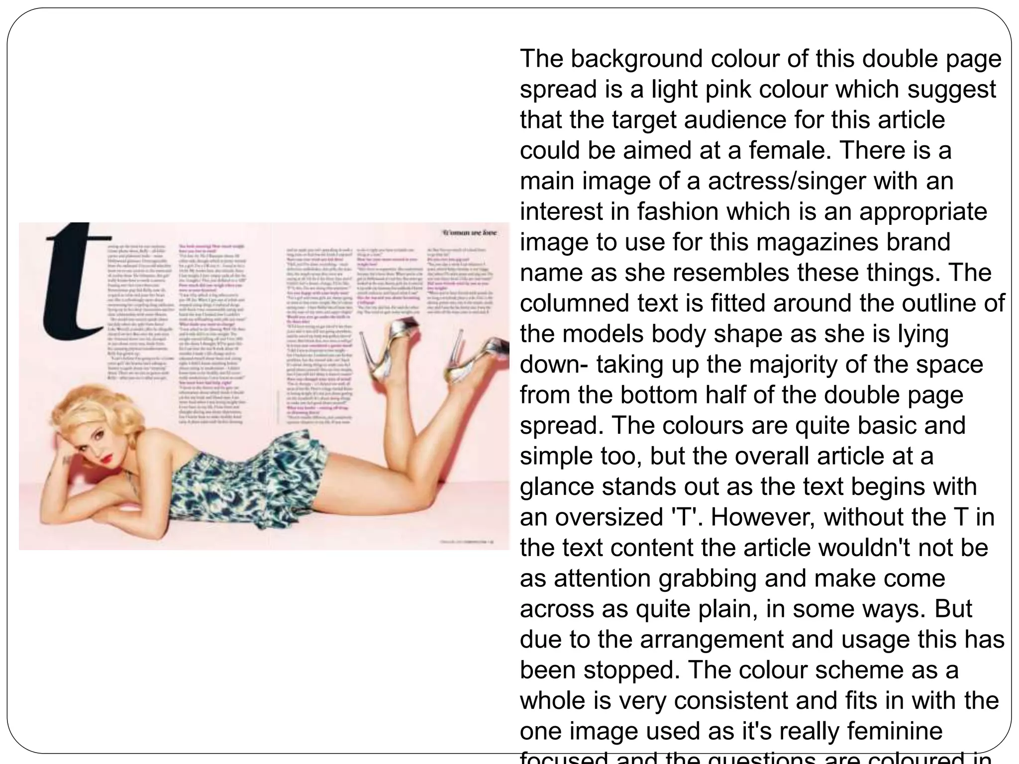
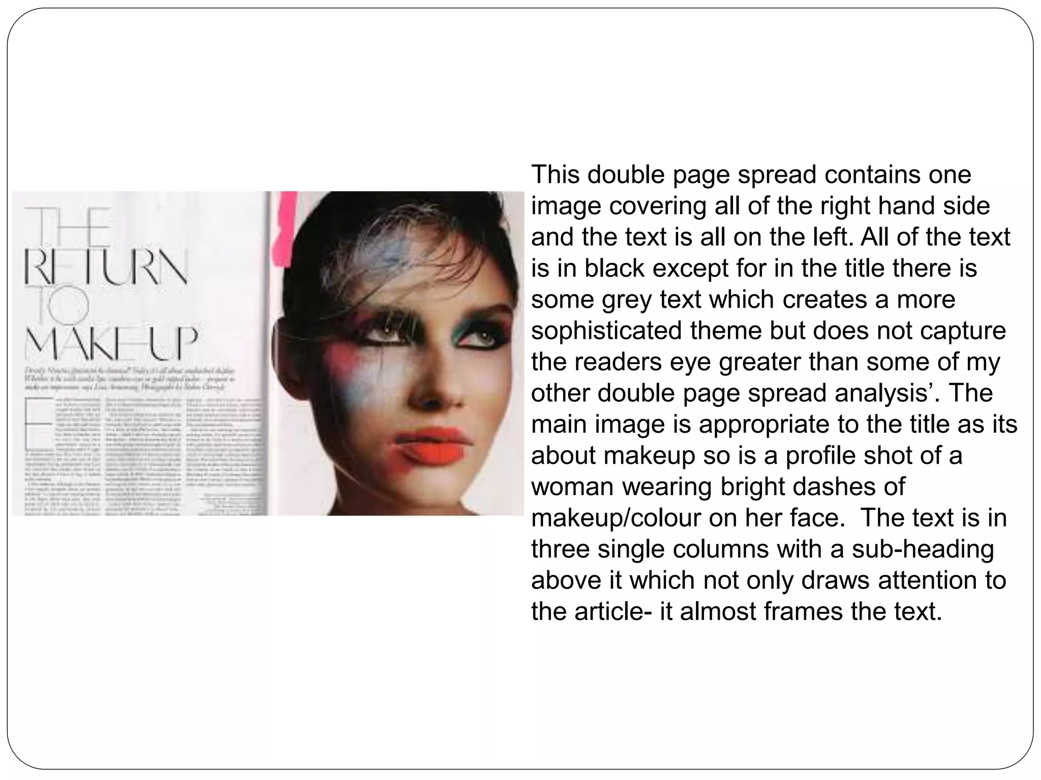
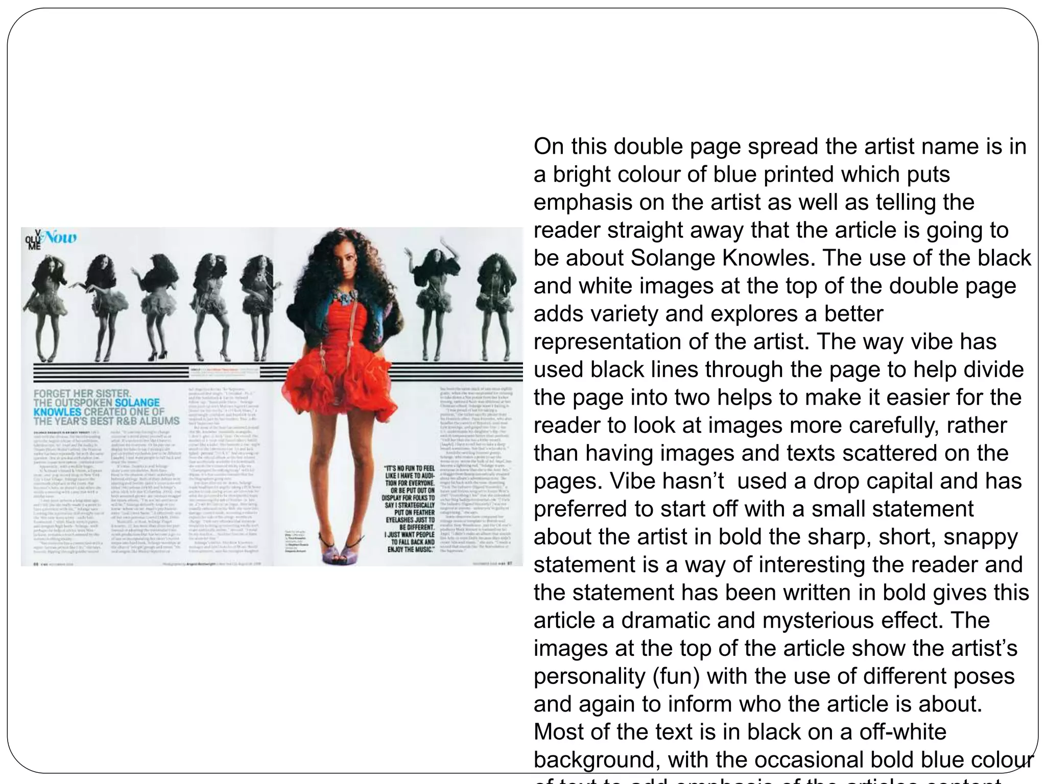
Analysis of double page spreads
This double page spread has a 
sophisticated layout with dashes of 
vibrant colours such as orange, 
pink and blue. Its text varies in 
fonts and sizes with a catch phrase 
in large font to get the topic of the 
article across by also catching the 
readers attention using a large 
sized font. There is one main 
image involving a women with 
what seems to be a trainer 
collection and the other images are 
single shots of just trainers. The 
text is in chunks next to an 
appropriate image to go with-easier 
for the reader to read and 
know what its about. Some 
pictures are overlapping for effect 
and all text is in black so its stands
This is a double page spread from 
NME. It features Sergio Pizzorno 
(Kasabian). His image takes up most 
of the two pages, asserting his status 
as musical legend and importance to 
the magazine. The white space 
behind Serge is more-or-less hidden 
with details on the wall he is stood in 
front of. He is looking directly into the 
camera with his hand against the 
wall, in a kind of posing fashion. 
Although he is posing, he looks 
casual- aligning itself with the 
general feel of this laid back and 
current magazine. Also- there is a 
sophisticated layout which suggests 
its target audience.
From this double page spread I notice that 
there is a main image and three other 
related images. Text- some in columns-others 
in quotes across the page, and a 
bold cover line. There are four main 
columns on the first page, and the second 
just features an image of him smiling on 
the photo-shoot. The page features two 
other images with his girlfriend and the 
other a shot from a film with a co-star. Both 
of these images are associated with 
captions beneath and on the cover image 
there is a quote from the actor in white. 
There is a simple grey colour scheme with 
questions in bold, and answers in a normal 
small sized font with some pink writing in 
places. There is a quote at the top of the 
page with an exclamation mark that the 
reader could not miss before turning the 
page.
The background colour of this double page 
spread is a light pink colour which suggest 
that the target audience for this article 
could be aimed at a female. There is a 
main image of a actress/singer with an 
interest in fashion which is an appropriate 
image to use for this magazines brand 
name as she resembles these things. The 
columned text is fitted around the outline of 
the models body shape as she is lying 
down- taking up the majority of the space 
from the bottom half of the double page 
spread. The colours are quite basic and 
simple too, but the overall article at a 
glance stands out as the text begins with 
an oversized 'T'. However, without the T in 
the text content the article wouldn't not be 
as attention grabbing and make come 
across as quite plain, in some ways. But 
due to the arrangement and usage this has 
been stopped. The colour scheme as a 
whole is very consistent and fits in with the 
one image used as it's really feminine 
focused and the questions are coloured in
This double page spread contains one 
image covering all of the right hand side 
and the text is all on the left. All of the text 
is in black except for in the title there is 
some grey text which creates a more 
sophisticated theme but does not capture 
the readers eye greater than some of my 
other double page spread analysis’. The 
main image is appropriate to the title as its 
about makeup so is a profile shot of a 
woman wearing bright dashes of 
makeup/colour on her face. The text is in 
three single columns with a sub-heading 
above it which not only draws attention to 
the article- it almost frames the text.
On this double page spread the artist name is in 
a bright colour of blue printed which puts 
emphasis on the artist as well as telling the 
reader straight away that the article is going to 
be about Solange Knowles. The use of the black 
and white images at the top of the double page 
adds variety and explores a better 
representation of the artist. The way vibe has 
used black lines through the page to help divide 
the page into two helps to make it easier for the 
reader to look at images more carefully, rather 
than having images and texts scattered on the 
pages. Vibe hasn’t used a drop capital and has 
preferred to start off with a small statement 
about the artist in bold the sharp, short, snappy 
statement is a way of interesting the reader and 
the statement has been written in bold gives this 
article a dramatic and mysterious effect. The 
images at the top of the article show the artist’s 
personality (fun) with the use of different poses 
and again to inform who the article is about. 
Most of the text is in black on a off-white 
background, with the occasional bold blue colour 
of text to add emphasis of the articles content.

Analysis of double page spreads

  • 1.
    Analysis of doublepage spreads
  • 2.
    This double pagespread has a sophisticated layout with dashes of vibrant colours such as orange, pink and blue. Its text varies in fonts and sizes with a catch phrase in large font to get the topic of the article across by also catching the readers attention using a large sized font. There is one main image involving a women with what seems to be a trainer collection and the other images are single shots of just trainers. The text is in chunks next to an appropriate image to go with-easier for the reader to read and know what its about. Some pictures are overlapping for effect and all text is in black so its stands
  • 3.
    This is adouble page spread from NME. It features Sergio Pizzorno (Kasabian). His image takes up most of the two pages, asserting his status as musical legend and importance to the magazine. The white space behind Serge is more-or-less hidden with details on the wall he is stood in front of. He is looking directly into the camera with his hand against the wall, in a kind of posing fashion. Although he is posing, he looks casual- aligning itself with the general feel of this laid back and current magazine. Also- there is a sophisticated layout which suggests its target audience.
  • 4.
    From this doublepage spread I notice that there is a main image and three other related images. Text- some in columns-others in quotes across the page, and a bold cover line. There are four main columns on the first page, and the second just features an image of him smiling on the photo-shoot. The page features two other images with his girlfriend and the other a shot from a film with a co-star. Both of these images are associated with captions beneath and on the cover image there is a quote from the actor in white. There is a simple grey colour scheme with questions in bold, and answers in a normal small sized font with some pink writing in places. There is a quote at the top of the page with an exclamation mark that the reader could not miss before turning the page.
  • 5.
    The background colourof this double page spread is a light pink colour which suggest that the target audience for this article could be aimed at a female. There is a main image of a actress/singer with an interest in fashion which is an appropriate image to use for this magazines brand name as she resembles these things. The columned text is fitted around the outline of the models body shape as she is lying down- taking up the majority of the space from the bottom half of the double page spread. The colours are quite basic and simple too, but the overall article at a glance stands out as the text begins with an oversized 'T'. However, without the T in the text content the article wouldn't not be as attention grabbing and make come across as quite plain, in some ways. But due to the arrangement and usage this has been stopped. The colour scheme as a whole is very consistent and fits in with the one image used as it's really feminine focused and the questions are coloured in
  • 6.
    This double pagespread contains one image covering all of the right hand side and the text is all on the left. All of the text is in black except for in the title there is some grey text which creates a more sophisticated theme but does not capture the readers eye greater than some of my other double page spread analysis’. The main image is appropriate to the title as its about makeup so is a profile shot of a woman wearing bright dashes of makeup/colour on her face. The text is in three single columns with a sub-heading above it which not only draws attention to the article- it almost frames the text.
  • 7.
    On this doublepage spread the artist name is in a bright colour of blue printed which puts emphasis on the artist as well as telling the reader straight away that the article is going to be about Solange Knowles. The use of the black and white images at the top of the double page adds variety and explores a better representation of the artist. The way vibe has used black lines through the page to help divide the page into two helps to make it easier for the reader to look at images more carefully, rather than having images and texts scattered on the pages. Vibe hasn’t used a drop capital and has preferred to start off with a small statement about the artist in bold the sharp, short, snappy statement is a way of interesting the reader and the statement has been written in bold gives this article a dramatic and mysterious effect. The images at the top of the article show the artist’s personality (fun) with the use of different poses and again to inform who the article is about. Most of the text is in black on a off-white background, with the occasional bold blue colour of text to add emphasis of the articles content.