SlideShare a Scribd company logo
1 of 6
From the images that I have
chosen, I believe this best
represents the magazine that I
was going for, it shows signs of
both indie pop and rock which is
the main features of my
magazine, this mood board shows
all the different aspects of indie
pop and rock which will
eventually make its way into my
magazine.
Proposal
Genre – The genre I have chosen to do my music magazine on is indie music. The codes and conventions used during the making of the magazine
are the target audience that I’m trying to capture, in this case the target audience that indie rock and pop would apply to would be young male
and females around the age of 15-21 who are in the class A1 which is mainly the people that listen to and purchase indie magazines. The images
that I have chosen to use for my mood board fully represents the idea that I was going for in my magazine, an indie magazine, to show what I will put
on my magazine I have put lots of indie rock and pop images which are very aesthetic, an example.
Target audience
The target audience and demographic for my magazine about indie music would be ABC1, this is mainly due to the fact that the
audience must have disposable income to spend on the actual magazine, however not being too expensive that the classes ABC1
cannot afford it. Furthermore, the age group that my main target audience would be is young male and females around the ages of
16-25, I found this age group to be suited as this is an age where music is a very important social pass time a private, therefore the
people around this age group would be more likely to buy a magazine on their preferred music genre. The psychographic of the
younger age group that would buy my magazine would mainly be individualists as the younger target audience want to be different
than other people and want to stand out, they do this by liking different kinds of music such as indie rock in this case.
My secondary target audience is older men around the ages of 40-50 with the demographic of ABC1, this age group is used for mainly
indie rock as older men who are reformers, these people are less likely to buy the actual magazine due to their lifestyle, they are more
likely to just listen to the music and maybe pick up the magazine once every now and again, they would never actually subscribe to a
magazine as they do not care enough to, however this demographic does have enough disposable income to be used
Title – The title used on the
contents page is extremely
effective as it contrasts from the
background colours to enhance it,
this further increases the readers
understanding of what the page is
actually about which is the
contents of the magazine itself,
what he magazine is going to be
featuring.
Main image – The image used for
the contents page is very effective,
it is very sexual on the position that
this woman has taken up, this may
be due t the fact of how the
media portrays women in the
current generations, furthermore
the outfit that the main image is
wearing , very revealing clothes
showing a lot of skin, this one again
links back to the fact that women
are portrayed in the media as
more of a sex symbol as they
believe that’s what people want
from the magazines when they
pick them up. The image used also
contains the colour of the skin
rather than the dull colours used in
the background of the contents
page, the fact that she is in colour
and the rest of the magazine are in
colours such as;Black,grey and
white this shows the importance of
the main image in turn increasing
the likeliness of people seeing the
image first.
Background – The background
of the image is contrasting from
the very dark colour black to the
colour of white, the colours used in
the contents page are effective in
doing their job as they have strong
connotations to classiness to this
enhances the main image used on
the contents page
Feature text – The feature text used
in the contents page is a lot smaller
than the large title and image used,
this tells the reader that this is the least
important information to read on the
page as it is the smallest and the last
that you would read, to contrast from
the background colour the use of the
black text sticks out from the
background colour of white as the two
colours are polar opposites and when
used well together are very effective in
drawing the reader in and making it
easy to read at the same time.
Sub titles – These are effective in
once again grabbing the
attention of the reader into
reading the actual text, in this
example the colour black is used
once again to contrast to the
background colour similar to the
text used , the size of the sub
headings are slightly larger than
the text used and have a different
font to make it different and more
eye-catching
Page number - the page number
is set in the bottom right of the entire
contents page, this is effective as it
makes sure people know what page
they are looking at, another key point
of the page number is that the font is
the same as the rest of the contents
page to add continuity to the font
Title – a large contents page title that’s spreads
over 3 lines, this could be use as a type of branding as
the magazine may use the same style every time for
their contents pages, the title uses the colour black to
contrast from the white and grey background, this in
turn increases the likeliness that it is to be seen first,
therefore by catching the readers attention by using
the dark colour, the reader is then aware of what the
page is trying to get across or explain to you.
Image – The image used is a picture of Kanye
west, the picture has been edited so that he
appears more grey and darker than usual, this fits in
well with the background as there are not many
vibrant colours in the entire title page, the only item
on the entire page that is coloured is the Heart
being held by a hand on the image, the Heart is
red like normally portrayed to be, this adds to effect
as it is eye-catching as it is a lighter shade of red
than the rest of the image, furthermore, the facial
expressions of Kanye show that he is either quite
angry or relaxed, it is swayed more toward relaxed
as he has his hands in his pockets, this has
connotations to him being confident or relaxed, this
further shows to the reader that he is very important,
another thing to notice about the image is the fact
that a hand is reaching over and gripping what
looks to be his heart, this could have connotations
to the fact that the hand is the music and It has
gripped his heart, this shows that he is very
passionate about music. Lastly, he is presented this
way as men are usually meant to be presented this
way, they are not allowed to smile as the media
portrays them as being cool and calm.
Sub titles – The sub title used are in black, the
same colour used as the main title, this is
effective as it contrasts from the dull colour of
white in the background, it makes the text stand
out and easy to read, the font used in the sub
titles are also very different to that of the ones
used for the main title and the actual text, it is
presented to be very classy as the font is all
curved, this shows to the reader that the
magazine is of high class and is worth the money
that is being spent on the magazine to buy,
furthermore, the font makes the text more eye-
catching as to increase the odds that is will be
found by the viewer before the text is actually
read
Feature text – Exactly the same as the
sub heading and the title, the colour used Is
black, this is mainly due to the fact that black is
very strong colour to use when a background is
a lighter shade colour or the colour white, this is
because it is so dark that reader will be able to
read and see It easily, the colour is also very
effective for the contents page itself as it goes
with the theme of the black and white image
used of Kanye west, this further increases the
readers understanding of the tone and mood of
the entire magazine.
Title – The title used on the contents
page is extremely effective as it
contrasts from the background colours
to enhance it, this further increases the
readers understanding of what the
page is actually about which is the
contents of the magazine itself, what
he magazine is going to be featuring,
the magazines use of the bright
colours such as green, blue and
orange shows that this magazine is
mainly for women, the use of the
lighter colours has connotations to
young women, which coincidentally is
the target audience for the magazine
Sub titles – These are effective in
once again grabbing the attention
of the reader into reading the actual
text, in this example the colour black
is used once again to contrast to the
background colour similar to the text
used , the size of the sub headings
are slightly larger than the text used
and have a different font to make it
different and more eye-catching, the
use of numbers in the pink colour on
the side shows that this magazine is
mainly feminine as a magazine.
Main image – The image used for the
contents page is very effective, it is very
sexual on the position that this woman
has taken up, this may be due t the fact
of how the media portrays women in the
current generations, furthermore the
outfit that the main image is wearing ,
very revealing clothes showing a lot of
skin, this one again links back to the fact
that women are portrayed in the media
as more of a sex symbol as they believe
that’s what people want from the
magazines when they pick them up. The
image used also contains the colour of
the skin rather than the dull colours used
in the background of the contents page,
the fact that she is in colour and the rest
of the magazine are in colours such
as;Black,grey and white this shows the
importance of the main image in turn
increasing the likeliness of people seeing
the image first.
Colour scheme – In the
magazine the colour scheme seems
to be… non-existent as the main
image uses black and white colours
to grab the attention of the
audience, whereas in he rest of the
magazine the use of the title in colour
does not match the image at all, in
fact it is the complete opposite, using
light a vibrant colours to draw
attention rather than the dark
colours used in the image
Blank space – There is quite a bit
of blank space on the contents
page, the way this magazine is able
to get away with using all of the
different colours on the magazine to
distract the reader from the
magazine make it s that pople mainly
jus t get drawn in by the colours used.
Page number - there is not a
page number used in the
magazine that is visible from the
magazine, this may be because
people are expected to know by
now which page

More Related Content

What's hot

Media presentation
Media presentationMedia presentation
Media presentationTaylorNC
 
Music magazine research
Music magazine researchMusic magazine research
Music magazine researchbroganlan
 
Music Magazine Survey: Analysis of results
Music Magazine Survey: Analysis of resultsMusic Magazine Survey: Analysis of results
Music Magazine Survey: Analysis of resultstashaay27
 
Analysing music magazine
Analysing music magazineAnalysing music magazine
Analysing music magazineIzzy Albutt
 
Research into existing music magazines
Research into existing music magazinesResearch into existing music magazines
Research into existing music magazinesjessicamaythorpe
 
Analyse 3 music magazines
Analyse 3 music magazinesAnalyse 3 music magazines
Analyse 3 music magazinescharliewalden95
 
Detailed analysis of music magazine
Detailed analysis of music magazineDetailed analysis of music magazine
Detailed analysis of music magazineginagoodall
 
Evaluation Of AS Media Music Magazine
Evaluation Of AS Media Music MagazineEvaluation Of AS Media Music Magazine
Evaluation Of AS Media Music Magazinelilykimngo
 
Evaluation Of AS Music Magazine
Evaluation Of AS Music MagazineEvaluation Of AS Music Magazine
Evaluation Of AS Music Magazinelilykimngo
 
Evaluation of AS Music Magazine
Evaluation of AS Music MagazineEvaluation of AS Music Magazine
Evaluation of AS Music Magazinelilykimngo
 
Evaluation Of AS Music Magazine
Evaluation Of AS Music MagazineEvaluation Of AS Music Magazine
Evaluation Of AS Music Magazinelilykimngo
 
Front covers, contents pages, double page spreads #5
Front covers, contents pages, double page spreads #5Front covers, contents pages, double page spreads #5
Front covers, contents pages, double page spreads #5QureshiSohail
 
Music Magazine Front Cover Analysis
Music Magazine Front Cover AnalysisMusic Magazine Front Cover Analysis
Music Magazine Front Cover AnalysisAliyahRaoof
 
Task 5 – deciding which genre and style
Task 5 – deciding which genre and styleTask 5 – deciding which genre and style
Task 5 – deciding which genre and styleAS Media Column D
 
Evualuation of AS Music Magazine
Evualuation of AS Music MagazineEvualuation of AS Music Magazine
Evualuation of AS Music Magazinelilykimngo
 
Analysis of three double page spreads from music magazines
Analysis of three double page spreads from music magazinesAnalysis of three double page spreads from music magazines
Analysis of three double page spreads from music magazineszoewarwood
 
Magazine analysis
Magazine analysisMagazine analysis
Magazine analysistoni lough
 

What's hot (20)

Media presentation
Media presentationMedia presentation
Media presentation
 
Music magazine research
Music magazine researchMusic magazine research
Music magazine research
 
Music Magazine Survey: Analysis of results
Music Magazine Survey: Analysis of resultsMusic Magazine Survey: Analysis of results
Music Magazine Survey: Analysis of results
 
Task 5
Task 5Task 5
Task 5
 
Task 5
Task 5Task 5
Task 5
 
Analysing music magazine
Analysing music magazineAnalysing music magazine
Analysing music magazine
 
Research into existing music magazines
Research into existing music magazinesResearch into existing music magazines
Research into existing music magazines
 
Evaluation q1
Evaluation q1Evaluation q1
Evaluation q1
 
Analyse 3 music magazines
Analyse 3 music magazinesAnalyse 3 music magazines
Analyse 3 music magazines
 
Detailed analysis of music magazine
Detailed analysis of music magazineDetailed analysis of music magazine
Detailed analysis of music magazine
 
Evaluation Of AS Media Music Magazine
Evaluation Of AS Media Music MagazineEvaluation Of AS Media Music Magazine
Evaluation Of AS Media Music Magazine
 
Evaluation Of AS Music Magazine
Evaluation Of AS Music MagazineEvaluation Of AS Music Magazine
Evaluation Of AS Music Magazine
 
Evaluation of AS Music Magazine
Evaluation of AS Music MagazineEvaluation of AS Music Magazine
Evaluation of AS Music Magazine
 
Evaluation Of AS Music Magazine
Evaluation Of AS Music MagazineEvaluation Of AS Music Magazine
Evaluation Of AS Music Magazine
 
Front covers, contents pages, double page spreads #5
Front covers, contents pages, double page spreads #5Front covers, contents pages, double page spreads #5
Front covers, contents pages, double page spreads #5
 
Music Magazine Front Cover Analysis
Music Magazine Front Cover AnalysisMusic Magazine Front Cover Analysis
Music Magazine Front Cover Analysis
 
Task 5 – deciding which genre and style
Task 5 – deciding which genre and styleTask 5 – deciding which genre and style
Task 5 – deciding which genre and style
 
Evualuation of AS Music Magazine
Evualuation of AS Music MagazineEvualuation of AS Music Magazine
Evualuation of AS Music Magazine
 
Analysis of three double page spreads from music magazines
Analysis of three double page spreads from music magazinesAnalysis of three double page spreads from music magazines
Analysis of three double page spreads from music magazines
 
Magazine analysis
Magazine analysisMagazine analysis
Magazine analysis
 

Similar to Indie Mag Contents

Tasks 1 4 and hwk 2
Tasks 1 4 and hwk 2Tasks 1 4 and hwk 2
Tasks 1 4 and hwk 2charlie__97
 
Textual Analysis
Textual Analysis Textual Analysis
Textual Analysis 048600
 
Analysing contents pages prep for blog ppt 2
Analysing  contents pages prep for blog ppt 2Analysing  contents pages prep for blog ppt 2
Analysing contents pages prep for blog ppt 2milliecleverley
 
Tasks 1 4 and hwk 1
Tasks 1 4 and hwk 1Tasks 1 4 and hwk 1
Tasks 1 4 and hwk 1charlie__1
 
How my magazine appeals to the target audience
How my magazine appeals to the target audienceHow my magazine appeals to the target audience
How my magazine appeals to the target audienceKieran Gore
 
Textual Analysis - Media Studies
Textual Analysis - Media StudiesTextual Analysis - Media Studies
Textual Analysis - Media StudiesNorah Fields
 
SIMILAR PRODUCT RESEARCH (SPR) OF 3 FEATURE ARTICLES
SIMILAR PRODUCT RESEARCH (SPR) OF 3 FEATURE ARTICLESSIMILAR PRODUCT RESEARCH (SPR) OF 3 FEATURE ARTICLES
SIMILAR PRODUCT RESEARCH (SPR) OF 3 FEATURE ARTICLESsammieharris
 
Media evaluation proper
Media evaluation properMedia evaluation proper
Media evaluation properasmediaellie
 

Similar to Indie Mag Contents (20)

Task 9
Task 9Task 9
Task 9
 
Q5
Q5Q5
Q5
 
Tasks 1 4 and hwk 2
Tasks 1 4 and hwk 2Tasks 1 4 and hwk 2
Tasks 1 4 and hwk 2
 
Textual Analysis
Textual Analysis Textual Analysis
Textual Analysis
 
Analysing contents pages prep for blog ppt 2
Analysing  contents pages prep for blog ppt 2Analysing  contents pages prep for blog ppt 2
Analysing contents pages prep for blog ppt 2
 
My evaluation
My evaluationMy evaluation
My evaluation
 
My evaluation
My evaluationMy evaluation
My evaluation
 
My evaluation
My evaluationMy evaluation
My evaluation
 
Evaluation Q5
Evaluation Q5Evaluation Q5
Evaluation Q5
 
Q5
Q5Q5
Q5
 
Brand identity
Brand identityBrand identity
Brand identity
 
Tasks 1 4 and hwk 1
Tasks 1 4 and hwk 1Tasks 1 4 and hwk 1
Tasks 1 4 and hwk 1
 
Magazine analysis
Magazine analysisMagazine analysis
Magazine analysis
 
How my magazine appeals to the target audience
How my magazine appeals to the target audienceHow my magazine appeals to the target audience
How my magazine appeals to the target audience
 
Textual Analysis - Media Studies
Textual Analysis - Media StudiesTextual Analysis - Media Studies
Textual Analysis - Media Studies
 
SIMILAR PRODUCT RESEARCH (SPR) OF 3 FEATURE ARTICLES
SIMILAR PRODUCT RESEARCH (SPR) OF 3 FEATURE ARTICLESSIMILAR PRODUCT RESEARCH (SPR) OF 3 FEATURE ARTICLES
SIMILAR PRODUCT RESEARCH (SPR) OF 3 FEATURE ARTICLES
 
Textual Analyasis
Textual AnalyasisTextual Analyasis
Textual Analyasis
 
Media evaluation proper
Media evaluation properMedia evaluation proper
Media evaluation proper
 
Question 5
Question 5Question 5
Question 5
 
Question 5
Question 5Question 5
Question 5
 

Recently uploaded

भारत-रोम व्यापार.pptx, Indo-Roman Trade,
भारत-रोम व्यापार.pptx, Indo-Roman Trade,भारत-रोम व्यापार.pptx, Indo-Roman Trade,
भारत-रोम व्यापार.pptx, Indo-Roman Trade,Virag Sontakke
 
Types of Journalistic Writing Grade 8.pptx
Types of Journalistic Writing Grade 8.pptxTypes of Journalistic Writing Grade 8.pptx
Types of Journalistic Writing Grade 8.pptxEyham Joco
 
Software Engineering Methodologies (overview)
Software Engineering Methodologies (overview)Software Engineering Methodologies (overview)
Software Engineering Methodologies (overview)eniolaolutunde
 
Framing an Appropriate Research Question 6b9b26d93da94caf993c038d9efcdedb.pdf
Framing an Appropriate Research Question 6b9b26d93da94caf993c038d9efcdedb.pdfFraming an Appropriate Research Question 6b9b26d93da94caf993c038d9efcdedb.pdf
Framing an Appropriate Research Question 6b9b26d93da94caf993c038d9efcdedb.pdfUjwalaBharambe
 
18-04-UA_REPORT_MEDIALITERAСY_INDEX-DM_23-1-final-eng.pdf
18-04-UA_REPORT_MEDIALITERAСY_INDEX-DM_23-1-final-eng.pdf18-04-UA_REPORT_MEDIALITERAСY_INDEX-DM_23-1-final-eng.pdf
18-04-UA_REPORT_MEDIALITERAСY_INDEX-DM_23-1-final-eng.pdfssuser54595a
 
Roles & Responsibilities in Pharmacovigilance
Roles & Responsibilities in PharmacovigilanceRoles & Responsibilities in Pharmacovigilance
Roles & Responsibilities in PharmacovigilanceSamikshaHamane
 
Computed Fields and api Depends in the Odoo 17
Computed Fields and api Depends in the Odoo 17Computed Fields and api Depends in the Odoo 17
Computed Fields and api Depends in the Odoo 17Celine George
 
ECONOMIC CONTEXT - PAPER 1 Q3: NEWSPAPERS.pptx
ECONOMIC CONTEXT - PAPER 1 Q3: NEWSPAPERS.pptxECONOMIC CONTEXT - PAPER 1 Q3: NEWSPAPERS.pptx
ECONOMIC CONTEXT - PAPER 1 Q3: NEWSPAPERS.pptxiammrhaywood
 
Hierarchy of management that covers different levels of management
Hierarchy of management that covers different levels of managementHierarchy of management that covers different levels of management
Hierarchy of management that covers different levels of managementmkooblal
 
Enzyme, Pharmaceutical Aids, Miscellaneous Last Part of Chapter no 5th.pdf
Enzyme, Pharmaceutical Aids, Miscellaneous Last Part of Chapter no 5th.pdfEnzyme, Pharmaceutical Aids, Miscellaneous Last Part of Chapter no 5th.pdf
Enzyme, Pharmaceutical Aids, Miscellaneous Last Part of Chapter no 5th.pdfSumit Tiwari
 
Proudly South Africa powerpoint Thorisha.pptx
Proudly South Africa powerpoint Thorisha.pptxProudly South Africa powerpoint Thorisha.pptx
Proudly South Africa powerpoint Thorisha.pptxthorishapillay1
 
Meghan Sutherland In Media Res Media Component
Meghan Sutherland In Media Res Media ComponentMeghan Sutherland In Media Res Media Component
Meghan Sutherland In Media Res Media ComponentInMediaRes1
 
Solving Puzzles Benefits Everyone (English).pptx
Solving Puzzles Benefits Everyone (English).pptxSolving Puzzles Benefits Everyone (English).pptx
Solving Puzzles Benefits Everyone (English).pptxOH TEIK BIN
 
Final demo Grade 9 for demo Plan dessert.pptx
Final demo Grade 9 for demo Plan dessert.pptxFinal demo Grade 9 for demo Plan dessert.pptx
Final demo Grade 9 for demo Plan dessert.pptxAvyJaneVismanos
 
internship ppt on smartinternz platform as salesforce developer
internship ppt on smartinternz platform as salesforce developerinternship ppt on smartinternz platform as salesforce developer
internship ppt on smartinternz platform as salesforce developerunnathinaik
 
call girls in Kamla Market (DELHI) 🔝 >༒9953330565🔝 genuine Escort Service 🔝✔️✔️
call girls in Kamla Market (DELHI) 🔝 >༒9953330565🔝 genuine Escort Service 🔝✔️✔️call girls in Kamla Market (DELHI) 🔝 >༒9953330565🔝 genuine Escort Service 🔝✔️✔️
call girls in Kamla Market (DELHI) 🔝 >༒9953330565🔝 genuine Escort Service 🔝✔️✔️9953056974 Low Rate Call Girls In Saket, Delhi NCR
 

Recently uploaded (20)

भारत-रोम व्यापार.pptx, Indo-Roman Trade,
भारत-रोम व्यापार.pptx, Indo-Roman Trade,भारत-रोम व्यापार.pptx, Indo-Roman Trade,
भारत-रोम व्यापार.pptx, Indo-Roman Trade,
 
OS-operating systems- ch04 (Threads) ...
OS-operating systems- ch04 (Threads) ...OS-operating systems- ch04 (Threads) ...
OS-operating systems- ch04 (Threads) ...
 
Types of Journalistic Writing Grade 8.pptx
Types of Journalistic Writing Grade 8.pptxTypes of Journalistic Writing Grade 8.pptx
Types of Journalistic Writing Grade 8.pptx
 
Model Call Girl in Bikash Puri Delhi reach out to us at 🔝9953056974🔝
Model Call Girl in Bikash Puri  Delhi reach out to us at 🔝9953056974🔝Model Call Girl in Bikash Puri  Delhi reach out to us at 🔝9953056974🔝
Model Call Girl in Bikash Puri Delhi reach out to us at 🔝9953056974🔝
 
Software Engineering Methodologies (overview)
Software Engineering Methodologies (overview)Software Engineering Methodologies (overview)
Software Engineering Methodologies (overview)
 
Framing an Appropriate Research Question 6b9b26d93da94caf993c038d9efcdedb.pdf
Framing an Appropriate Research Question 6b9b26d93da94caf993c038d9efcdedb.pdfFraming an Appropriate Research Question 6b9b26d93da94caf993c038d9efcdedb.pdf
Framing an Appropriate Research Question 6b9b26d93da94caf993c038d9efcdedb.pdf
 
18-04-UA_REPORT_MEDIALITERAСY_INDEX-DM_23-1-final-eng.pdf
18-04-UA_REPORT_MEDIALITERAСY_INDEX-DM_23-1-final-eng.pdf18-04-UA_REPORT_MEDIALITERAСY_INDEX-DM_23-1-final-eng.pdf
18-04-UA_REPORT_MEDIALITERAСY_INDEX-DM_23-1-final-eng.pdf
 
Roles & Responsibilities in Pharmacovigilance
Roles & Responsibilities in PharmacovigilanceRoles & Responsibilities in Pharmacovigilance
Roles & Responsibilities in Pharmacovigilance
 
Computed Fields and api Depends in the Odoo 17
Computed Fields and api Depends in the Odoo 17Computed Fields and api Depends in the Odoo 17
Computed Fields and api Depends in the Odoo 17
 
ECONOMIC CONTEXT - PAPER 1 Q3: NEWSPAPERS.pptx
ECONOMIC CONTEXT - PAPER 1 Q3: NEWSPAPERS.pptxECONOMIC CONTEXT - PAPER 1 Q3: NEWSPAPERS.pptx
ECONOMIC CONTEXT - PAPER 1 Q3: NEWSPAPERS.pptx
 
TataKelola dan KamSiber Kecerdasan Buatan v022.pdf
TataKelola dan KamSiber Kecerdasan Buatan v022.pdfTataKelola dan KamSiber Kecerdasan Buatan v022.pdf
TataKelola dan KamSiber Kecerdasan Buatan v022.pdf
 
Hierarchy of management that covers different levels of management
Hierarchy of management that covers different levels of managementHierarchy of management that covers different levels of management
Hierarchy of management that covers different levels of management
 
Enzyme, Pharmaceutical Aids, Miscellaneous Last Part of Chapter no 5th.pdf
Enzyme, Pharmaceutical Aids, Miscellaneous Last Part of Chapter no 5th.pdfEnzyme, Pharmaceutical Aids, Miscellaneous Last Part of Chapter no 5th.pdf
Enzyme, Pharmaceutical Aids, Miscellaneous Last Part of Chapter no 5th.pdf
 
Proudly South Africa powerpoint Thorisha.pptx
Proudly South Africa powerpoint Thorisha.pptxProudly South Africa powerpoint Thorisha.pptx
Proudly South Africa powerpoint Thorisha.pptx
 
Meghan Sutherland In Media Res Media Component
Meghan Sutherland In Media Res Media ComponentMeghan Sutherland In Media Res Media Component
Meghan Sutherland In Media Res Media Component
 
Solving Puzzles Benefits Everyone (English).pptx
Solving Puzzles Benefits Everyone (English).pptxSolving Puzzles Benefits Everyone (English).pptx
Solving Puzzles Benefits Everyone (English).pptx
 
Final demo Grade 9 for demo Plan dessert.pptx
Final demo Grade 9 for demo Plan dessert.pptxFinal demo Grade 9 for demo Plan dessert.pptx
Final demo Grade 9 for demo Plan dessert.pptx
 
9953330565 Low Rate Call Girls In Rohini Delhi NCR
9953330565 Low Rate Call Girls In Rohini  Delhi NCR9953330565 Low Rate Call Girls In Rohini  Delhi NCR
9953330565 Low Rate Call Girls In Rohini Delhi NCR
 
internship ppt on smartinternz platform as salesforce developer
internship ppt on smartinternz platform as salesforce developerinternship ppt on smartinternz platform as salesforce developer
internship ppt on smartinternz platform as salesforce developer
 
call girls in Kamla Market (DELHI) 🔝 >༒9953330565🔝 genuine Escort Service 🔝✔️✔️
call girls in Kamla Market (DELHI) 🔝 >༒9953330565🔝 genuine Escort Service 🔝✔️✔️call girls in Kamla Market (DELHI) 🔝 >༒9953330565🔝 genuine Escort Service 🔝✔️✔️
call girls in Kamla Market (DELHI) 🔝 >༒9953330565🔝 genuine Escort Service 🔝✔️✔️
 

Indie Mag Contents

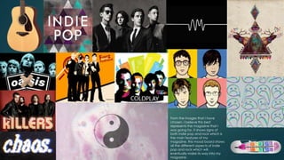
  • 1. From the images that I have chosen, I believe this best represents the magazine that I was going for, it shows signs of both indie pop and rock which is the main features of my magazine, this mood board shows all the different aspects of indie pop and rock which will eventually make its way into my magazine.
  • 2. Proposal Genre – The genre I have chosen to do my music magazine on is indie music. The codes and conventions used during the making of the magazine are the target audience that I’m trying to capture, in this case the target audience that indie rock and pop would apply to would be young male and females around the age of 15-21 who are in the class A1 which is mainly the people that listen to and purchase indie magazines. The images that I have chosen to use for my mood board fully represents the idea that I was going for in my magazine, an indie magazine, to show what I will put on my magazine I have put lots of indie rock and pop images which are very aesthetic, an example.
  • 3. Target audience The target audience and demographic for my magazine about indie music would be ABC1, this is mainly due to the fact that the audience must have disposable income to spend on the actual magazine, however not being too expensive that the classes ABC1 cannot afford it. Furthermore, the age group that my main target audience would be is young male and females around the ages of 16-25, I found this age group to be suited as this is an age where music is a very important social pass time a private, therefore the people around this age group would be more likely to buy a magazine on their preferred music genre. The psychographic of the younger age group that would buy my magazine would mainly be individualists as the younger target audience want to be different than other people and want to stand out, they do this by liking different kinds of music such as indie rock in this case. My secondary target audience is older men around the ages of 40-50 with the demographic of ABC1, this age group is used for mainly indie rock as older men who are reformers, these people are less likely to buy the actual magazine due to their lifestyle, they are more likely to just listen to the music and maybe pick up the magazine once every now and again, they would never actually subscribe to a magazine as they do not care enough to, however this demographic does have enough disposable income to be used
  • 4. Title – The title used on the contents page is extremely effective as it contrasts from the background colours to enhance it, this further increases the readers understanding of what the page is actually about which is the contents of the magazine itself, what he magazine is going to be featuring. Main image – The image used for the contents page is very effective, it is very sexual on the position that this woman has taken up, this may be due t the fact of how the media portrays women in the current generations, furthermore the outfit that the main image is wearing , very revealing clothes showing a lot of skin, this one again links back to the fact that women are portrayed in the media as more of a sex symbol as they believe that’s what people want from the magazines when they pick them up. The image used also contains the colour of the skin rather than the dull colours used in the background of the contents page, the fact that she is in colour and the rest of the magazine are in colours such as;Black,grey and white this shows the importance of the main image in turn increasing the likeliness of people seeing the image first. Background – The background of the image is contrasting from the very dark colour black to the colour of white, the colours used in the contents page are effective in doing their job as they have strong connotations to classiness to this enhances the main image used on the contents page Feature text – The feature text used in the contents page is a lot smaller than the large title and image used, this tells the reader that this is the least important information to read on the page as it is the smallest and the last that you would read, to contrast from the background colour the use of the black text sticks out from the background colour of white as the two colours are polar opposites and when used well together are very effective in drawing the reader in and making it easy to read at the same time. Sub titles – These are effective in once again grabbing the attention of the reader into reading the actual text, in this example the colour black is used once again to contrast to the background colour similar to the text used , the size of the sub headings are slightly larger than the text used and have a different font to make it different and more eye-catching Page number - the page number is set in the bottom right of the entire contents page, this is effective as it makes sure people know what page they are looking at, another key point of the page number is that the font is the same as the rest of the contents page to add continuity to the font
  • 5. Title – a large contents page title that’s spreads over 3 lines, this could be use as a type of branding as the magazine may use the same style every time for their contents pages, the title uses the colour black to contrast from the white and grey background, this in turn increases the likeliness that it is to be seen first, therefore by catching the readers attention by using the dark colour, the reader is then aware of what the page is trying to get across or explain to you. Image – The image used is a picture of Kanye west, the picture has been edited so that he appears more grey and darker than usual, this fits in well with the background as there are not many vibrant colours in the entire title page, the only item on the entire page that is coloured is the Heart being held by a hand on the image, the Heart is red like normally portrayed to be, this adds to effect as it is eye-catching as it is a lighter shade of red than the rest of the image, furthermore, the facial expressions of Kanye show that he is either quite angry or relaxed, it is swayed more toward relaxed as he has his hands in his pockets, this has connotations to him being confident or relaxed, this further shows to the reader that he is very important, another thing to notice about the image is the fact that a hand is reaching over and gripping what looks to be his heart, this could have connotations to the fact that the hand is the music and It has gripped his heart, this shows that he is very passionate about music. Lastly, he is presented this way as men are usually meant to be presented this way, they are not allowed to smile as the media portrays them as being cool and calm. Sub titles – The sub title used are in black, the same colour used as the main title, this is effective as it contrasts from the dull colour of white in the background, it makes the text stand out and easy to read, the font used in the sub titles are also very different to that of the ones used for the main title and the actual text, it is presented to be very classy as the font is all curved, this shows to the reader that the magazine is of high class and is worth the money that is being spent on the magazine to buy, furthermore, the font makes the text more eye- catching as to increase the odds that is will be found by the viewer before the text is actually read Feature text – Exactly the same as the sub heading and the title, the colour used Is black, this is mainly due to the fact that black is very strong colour to use when a background is a lighter shade colour or the colour white, this is because it is so dark that reader will be able to read and see It easily, the colour is also very effective for the contents page itself as it goes with the theme of the black and white image used of Kanye west, this further increases the readers understanding of the tone and mood of the entire magazine.
  • 6. Title – The title used on the contents page is extremely effective as it contrasts from the background colours to enhance it, this further increases the readers understanding of what the page is actually about which is the contents of the magazine itself, what he magazine is going to be featuring, the magazines use of the bright colours such as green, blue and orange shows that this magazine is mainly for women, the use of the lighter colours has connotations to young women, which coincidentally is the target audience for the magazine Sub titles – These are effective in once again grabbing the attention of the reader into reading the actual text, in this example the colour black is used once again to contrast to the background colour similar to the text used , the size of the sub headings are slightly larger than the text used and have a different font to make it different and more eye-catching, the use of numbers in the pink colour on the side shows that this magazine is mainly feminine as a magazine. Main image – The image used for the contents page is very effective, it is very sexual on the position that this woman has taken up, this may be due t the fact of how the media portrays women in the current generations, furthermore the outfit that the main image is wearing , very revealing clothes showing a lot of skin, this one again links back to the fact that women are portrayed in the media as more of a sex symbol as they believe that’s what people want from the magazines when they pick them up. The image used also contains the colour of the skin rather than the dull colours used in the background of the contents page, the fact that she is in colour and the rest of the magazine are in colours such as;Black,grey and white this shows the importance of the main image in turn increasing the likeliness of people seeing the image first. Colour scheme – In the magazine the colour scheme seems to be… non-existent as the main image uses black and white colours to grab the attention of the audience, whereas in he rest of the magazine the use of the title in colour does not match the image at all, in fact it is the complete opposite, using light a vibrant colours to draw attention rather than the dark colours used in the image Blank space – There is quite a bit of blank space on the contents page, the way this magazine is able to get away with using all of the different colours on the magazine to distract the reader from the magazine make it s that pople mainly jus t get drawn in by the colours used. Page number - there is not a page number used in the magazine that is visible from the magazine, this may be because people are expected to know by now which page