Kisan Call Centre - To harness potential of ICT in Agriculture by answer farm...
Bold, vibrant colours attract attention on NME magazine cover
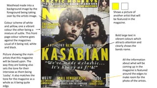
1. Bold large text in
vibrant colours which
attracts attention and
clearly shows the
bands name.
Colour scheme of white
and yellow, one a vibrant
colour the other being a
mixture of suttle. This front
page colour scheme goes
against the magazines
usual of it being red, white
and black.
Shows a picture of
another artist that will
be featured in the
magazine.
Picture showing the main
artists that this magazine
will be based upon. The
way they are looking also
sets the tone for their
interview as them being
‘cocky’. It also matches the
tone for the magazine as a
whole as it being quite
edgy.
Masthead made into a
background image by the
foreground being taking
over by the artists image.
All the information
about what will be
coming up in the
magazine is featured
around the edges to
make room for the
photo of the artists.
2. Contents to show all the
bands that will be
featured. With clear red
writing contrasted with
regular black writing to
clearly show the
difference between the
bad name and page
number.
The contents page
sticks with the whole
of the magazines
colour palette of the
mixture of the colours
red, black and white.
This is clearly shown
in the masthead.
The main contents with
the regular subheadings
followed by this editions
pages, this second
contents again uses
NME’s colour palette to
show the difference
between the page
numbers and what their
about. Also by different
fonts shown by the
subheadings being larger
and the white etched
into the black
background created by
the bar.
Again showing a
picture of the band
in which this edition
will be focused on so
the reader is again
reminded.
There is a high amount of information
on this page but the cleaver
distribution around the main picture
breaks it up into easy ‘chunks’ to read.
Also the subheadings all shown in bold
text will draw the reader to what they
actually want to read.
3. The photo is
clearly focused on
on the band which
is Kasabian to
show who the
band is and who
this DPS is based
upon. The photo is
used to introduce
the band, but it is
also used mainly
because it is a DPS
so it is possible to
do so. It has the
lead singer Tom at
the front which
clearly shows who
is the leader.
This quote shows that the band Kasabian had an
input into the making of the of the DPS but it does
also show that the interview for this was more
personal rather than a press confrence.
Tri-colour scheme of
green, black and
white.
The large black bold title
will engage the readers
attention to this DPS,
also there is a small
brief intro to the main
article about the band.
The bold ‘S’ which is in
the same font as the
title clearly shows
where the main article
will start.
The grainy image follows the style of the
article with the other image also being grainy
and having and old looking style.