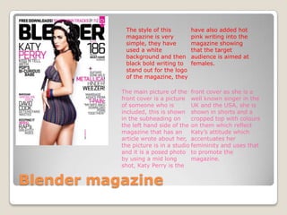
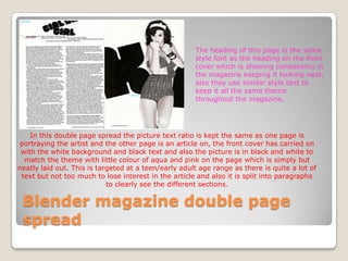
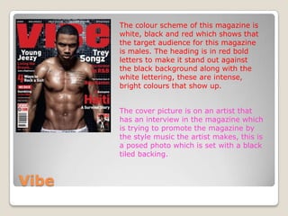
Market research
         Paris-lee ullah
The style of this        have also added hot
            magazine is very         pink writing into the
            simple, they have        magazine showing
            used a white             that the target
            background and then      audience is aimed at
            black bold writing to    females.
            stand out for the logo
            of the magazine, they

           The main picture of the front cover as she is a
           front cover is a picture well known singer in the
           of someone who is          UK and the USA, she is
           included, this is shown shown in shorts and a
           in the subheading on       cropped top with colours
           the left hand side of the on them which reflect
           magazine that has an       Katy’s attitude which
           article wrote about her, accentuates her
           the picture is in a studio femininity and uses that
           and it is a posed photo to promote the
           by using a mid long        magazine.
           shot, Katy Perry is the


Blender magazine
The heading of this page is the same
                                                      style font as the heading on the front
                                                      cover which is showing consistency in
                                                      the magazine keeping it looking neat,
                                                      also they use similar style text to
                                                      keep it all the same theme
                                                      throughout the magazine.


    In this double page spread the picture text ratio is kept the same as one page is
portraying the artist and the other page is an article on, the front cover has carried on
 with the white background and black text and also the picture is in black and white to
  match the theme with little colour of aqua and pink on the page which is simply but
neatly laid out. This is targeted at a teen/early adult age range as there is quite a lot of
 text but not too much to lose interest in the article and also it is split into paragraphs
                            to clearly see the different sections.

 Blender magazine double page
 spread
   Dennis publishing publishes around 31
    magazines based in UK and America, they
    publish a range of magazines, from blender a
    music magazine to maxim a men’s health
    magazine but they originally started with a
    kung fu magazine.
   There market varies throughout many
    magazines which focus on different ranges of
    audiences which means they have to vary
    how they publish things to fit the target
    group they are aiming magazines at.

Blender magazine publisher
The colour scheme of this magazine is
       white, black and red which shows that
       the target audience for this magazine
       is males. The heading is in red bold
       letters to make it stand out against
       the black background along with the
       white lettering, these are intense,
       bright colours that show up.


       The cover picture is on an artist that
       has an interview in the magazine which
       is trying to promote the magazine by
       the style music the artist makes, this is
       a posed photo which is set with a black
       tiled backing.


Vibe
The front page theme has
                                      been carried out into the
                                      magazine double spread pages
                                      as the pictures are in black
                                      and white and the colour
                                      scheme has stayed the same
                                      but swapped with a white
                                      background and black text but
                                      still with red writing.


In this double page spread the text to picture ratio is kept the
same as there is two pictures on each page which take up half
the page and the other half is filled with writing and again this
magazine is aimed at around the same age range of late teens
– early twenties as there is quite a lot of text to get through on
the page but is well laid out and separated into paragraphs.


Vibe

Music magazine[1]

  • 1.
    Market research Paris-lee ullah
  • 2.
    The style ofthis have also added hot magazine is very pink writing into the simple, they have magazine showing used a white that the target background and then audience is aimed at black bold writing to females. stand out for the logo of the magazine, they The main picture of the front cover as she is a front cover is a picture well known singer in the of someone who is UK and the USA, she is included, this is shown shown in shorts and a in the subheading on cropped top with colours the left hand side of the on them which reflect magazine that has an Katy’s attitude which article wrote about her, accentuates her the picture is in a studio femininity and uses that and it is a posed photo to promote the by using a mid long magazine. shot, Katy Perry is the Blender magazine
  • 3.
    The heading ofthis page is the same style font as the heading on the front cover which is showing consistency in the magazine keeping it looking neat, also they use similar style text to keep it all the same theme throughout the magazine. In this double page spread the picture text ratio is kept the same as one page is portraying the artist and the other page is an article on, the front cover has carried on with the white background and black text and also the picture is in black and white to match the theme with little colour of aqua and pink on the page which is simply but neatly laid out. This is targeted at a teen/early adult age range as there is quite a lot of text but not too much to lose interest in the article and also it is split into paragraphs to clearly see the different sections. Blender magazine double page spread
  • 4.
    Dennis publishing publishes around 31 magazines based in UK and America, they publish a range of magazines, from blender a music magazine to maxim a men’s health magazine but they originally started with a kung fu magazine.  There market varies throughout many magazines which focus on different ranges of audiences which means they have to vary how they publish things to fit the target group they are aiming magazines at. Blender magazine publisher
  • 5.
    The colour schemeof this magazine is white, black and red which shows that the target audience for this magazine is males. The heading is in red bold letters to make it stand out against the black background along with the white lettering, these are intense, bright colours that show up. The cover picture is on an artist that has an interview in the magazine which is trying to promote the magazine by the style music the artist makes, this is a posed photo which is set with a black tiled backing. Vibe
  • 6.
    The front pagetheme has been carried out into the magazine double spread pages as the pictures are in black and white and the colour scheme has stayed the same but swapped with a white background and black text but still with red writing. In this double page spread the text to picture ratio is kept the same as there is two pictures on each page which take up half the page and the other half is filled with writing and again this magazine is aimed at around the same age range of late teens – early twenties as there is quite a lot of text to get through on the page but is well laid out and separated into paragraphs. Vibe