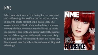
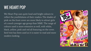
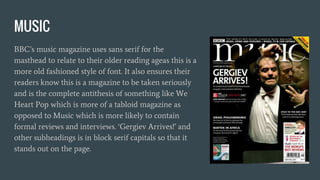
The document discusses the font and color choices of three music magazines - NME, We Heart Pop, and BBC Music. NME uses sans serif for headings and serif for the body to create contrast and a classic look, with black, white and red colors like many music magazines. We Heart Pop uses bright pinks and a wider range of colors like white, black, yellow and red to attract younger, female readers. BBC Music uses sans serif for the masthead to relate to an older audience and signify it is more serious, containing reviews and interviews unlike We Heart Pop.