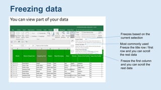
Downloaded 463 times
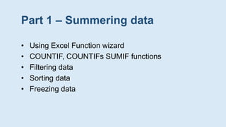

![SUMIF function to sum the values in a range that meet the criteria
specified
Syntax
SUMIF(range, criteria, [sum_range])
SUMIF Function](https://image.slidesharecdn.com/dataanalysisvisualizationusingexcel-181125110501/85/Data-Analysis-Visualization-using-MS-Excel-7-320.jpg)
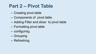
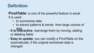
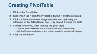
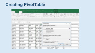
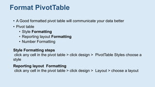
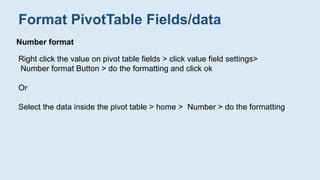
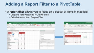
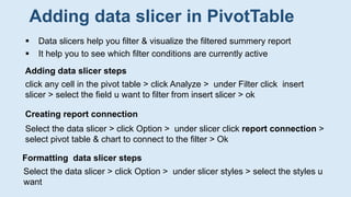

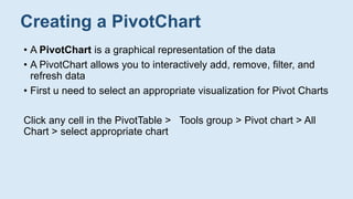
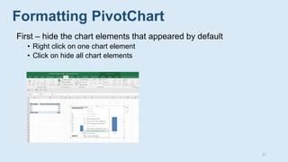
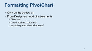
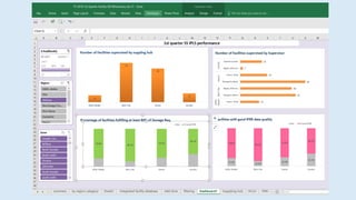
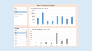


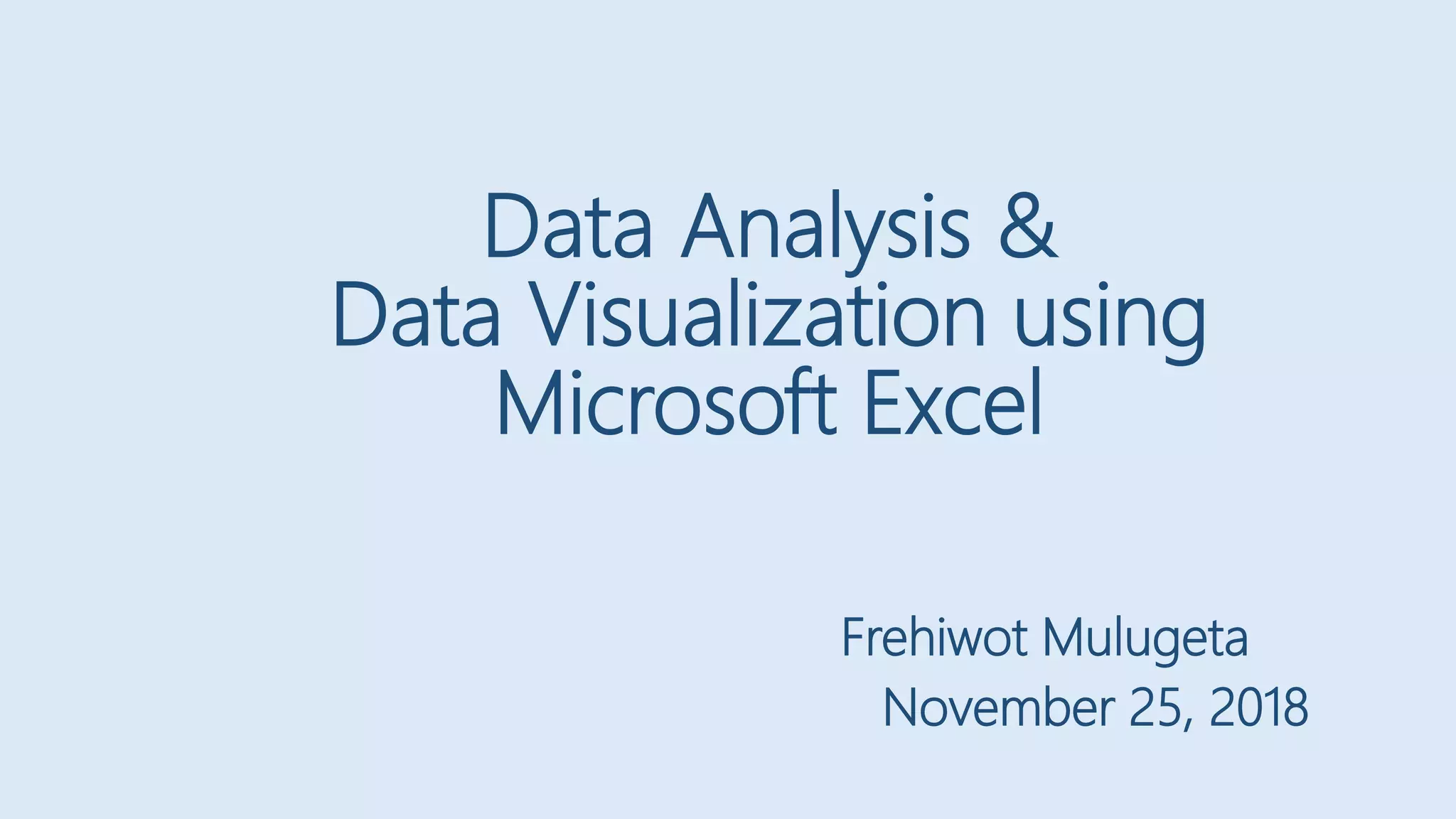
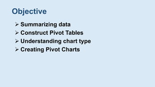
This document provides an overview of data analysis and visualization using Microsoft Excel. It covers summarizing data using functions like COUNTIF, sorting and filtering data, creating pivot tables, adding filters and slicers to pivot tables, formatting pivot tables, and creating pivot charts. The objective is to help users understand how to extract insights from data through summarization, aggregation, and visualization techniques in Excel.


