Downloaded 152 times


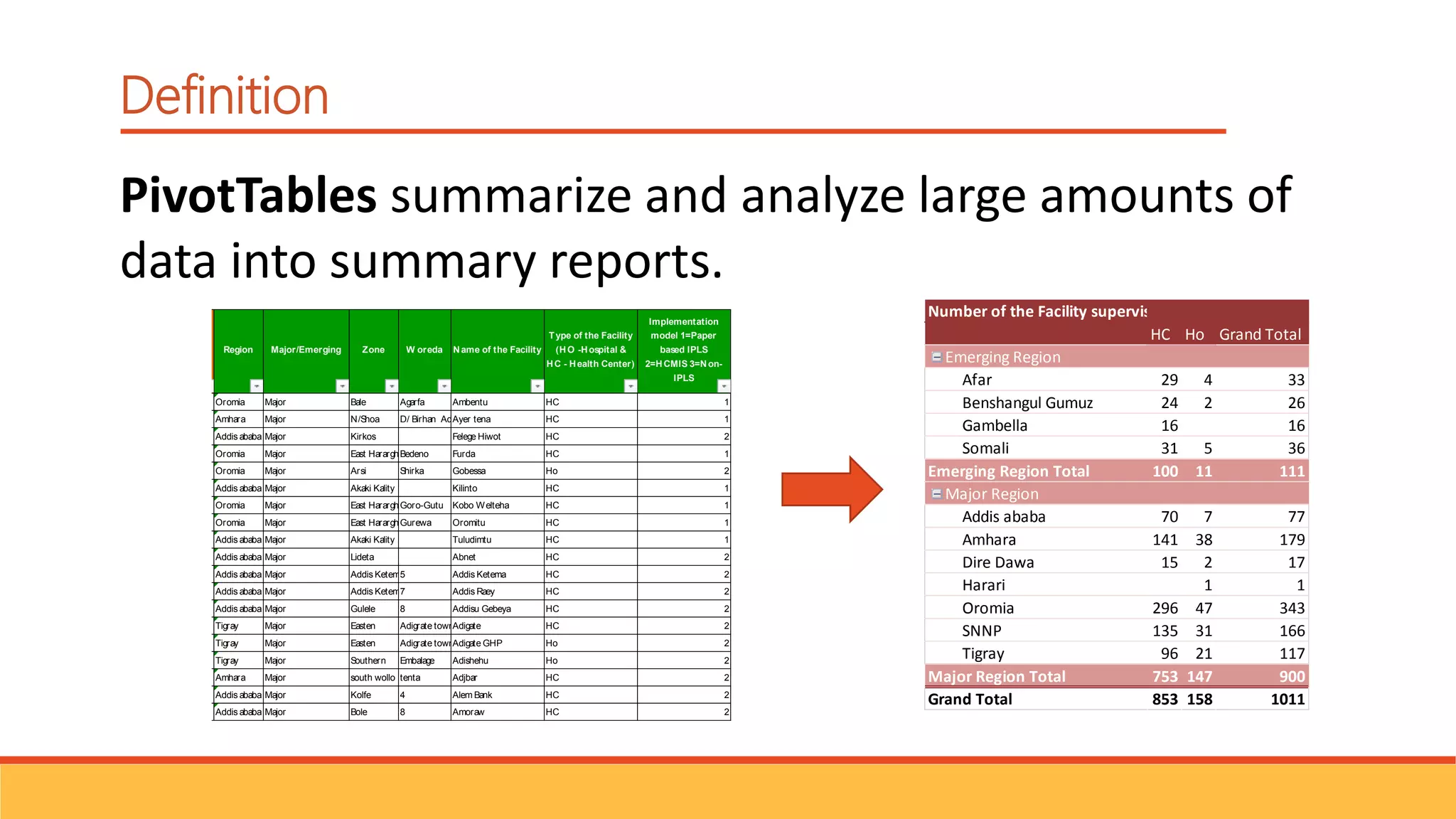
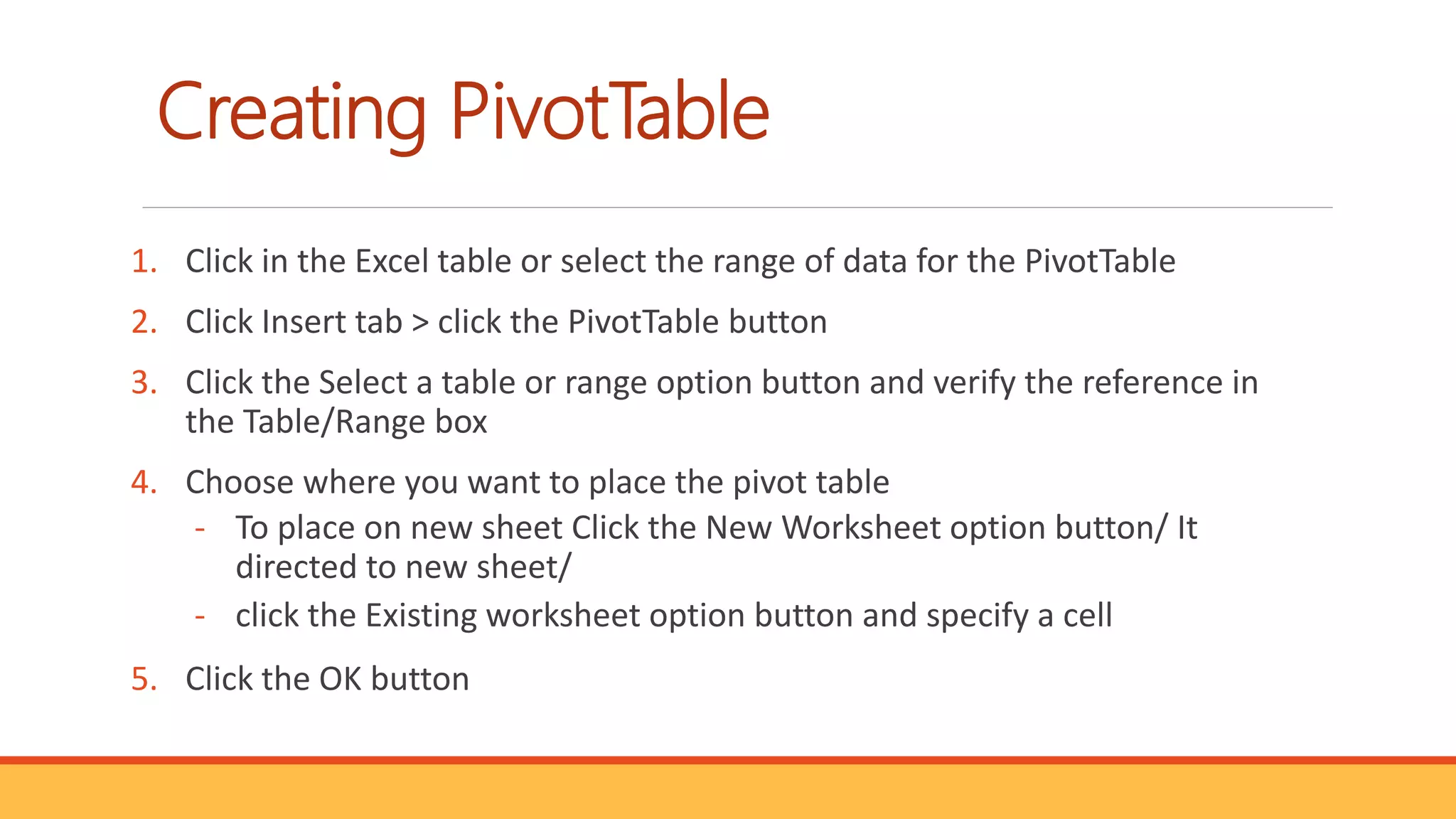
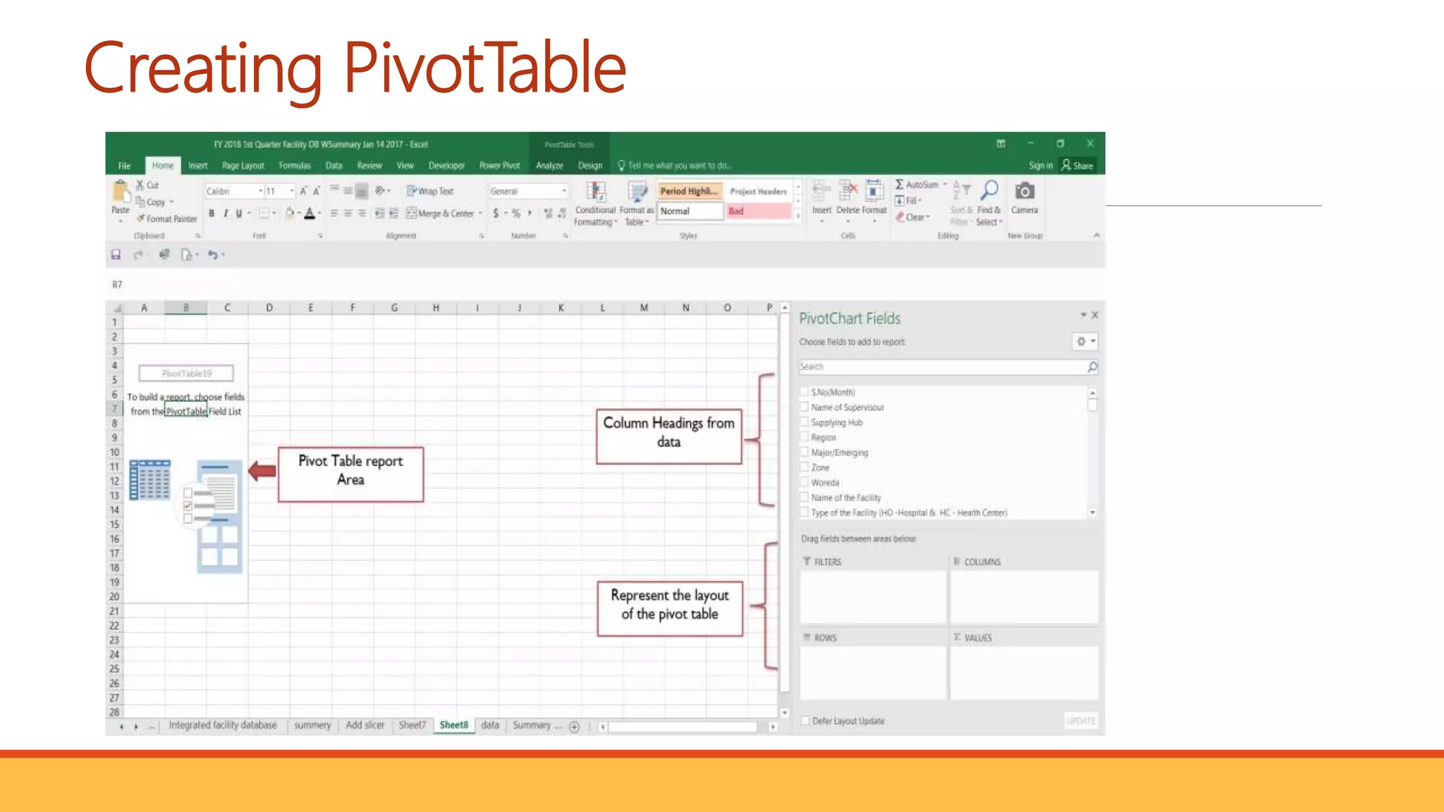
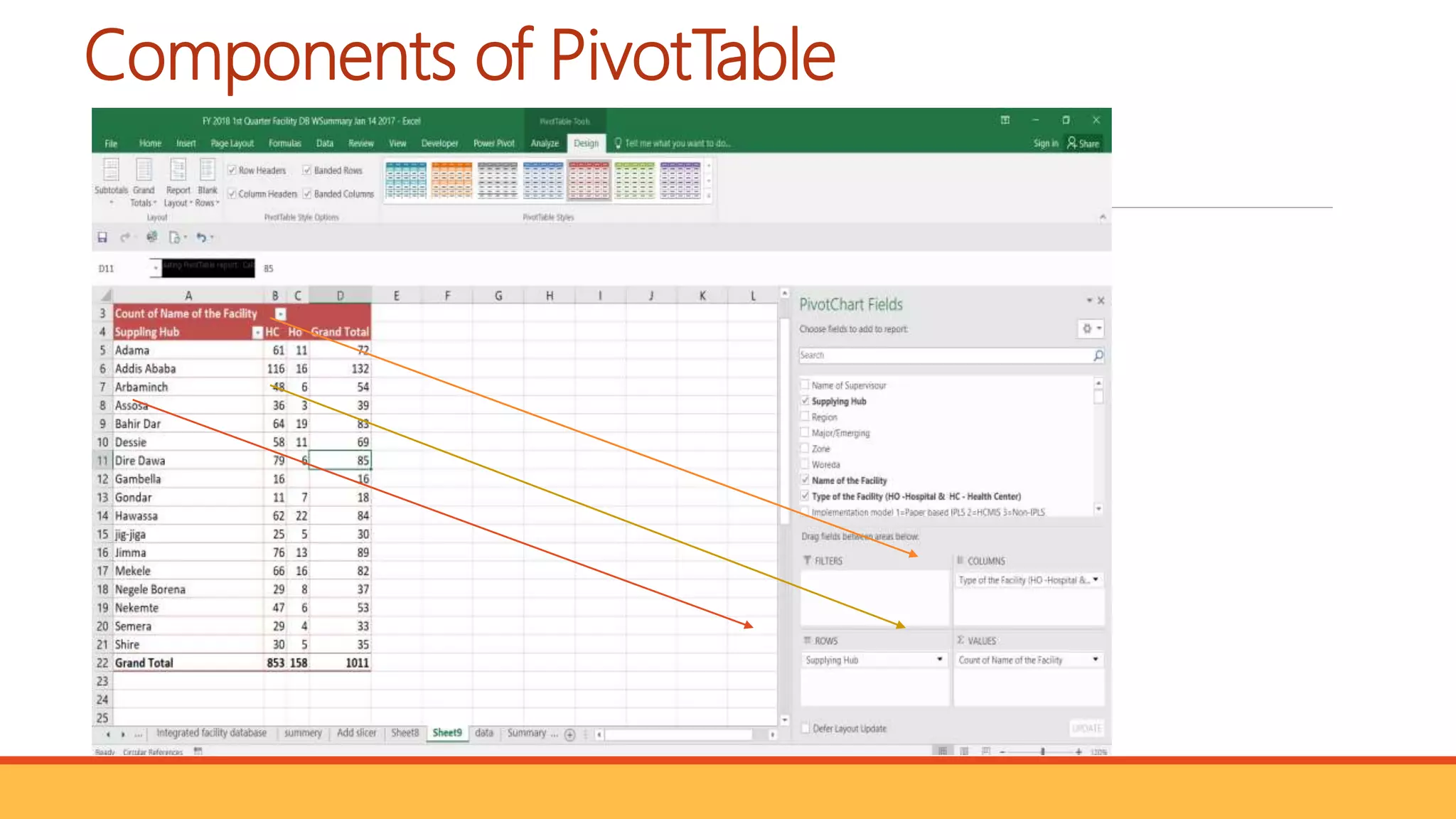
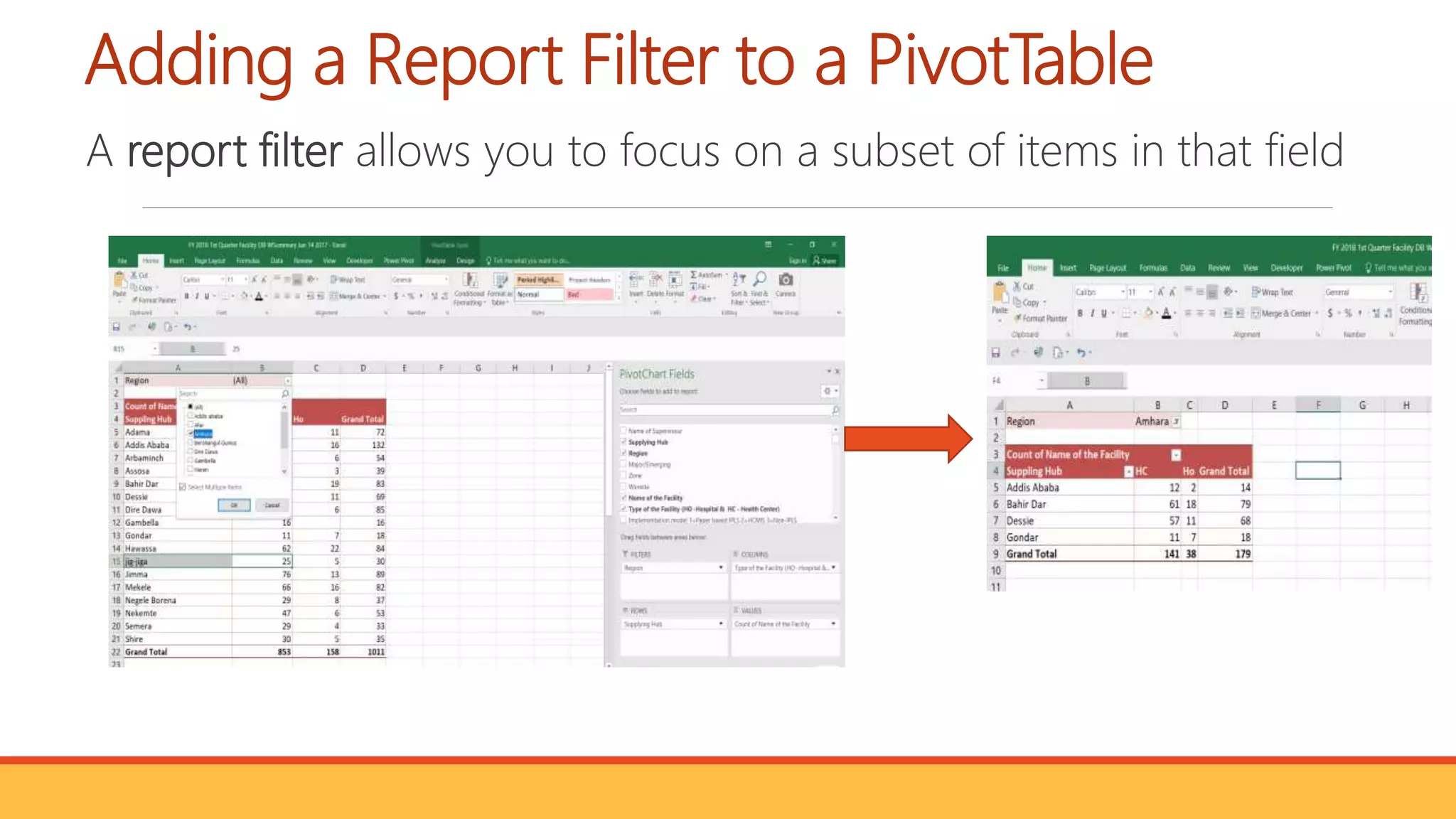


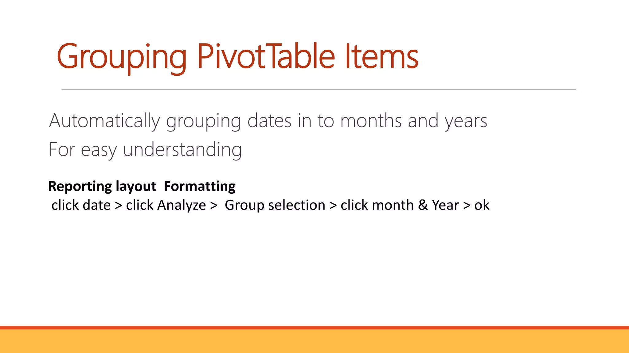
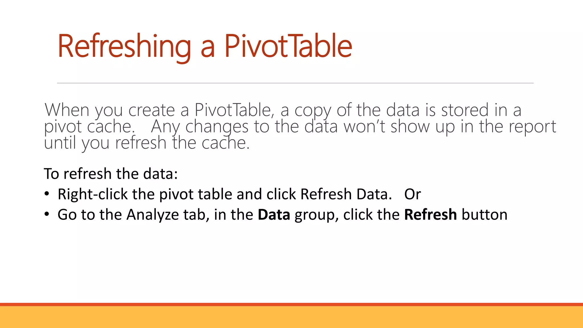


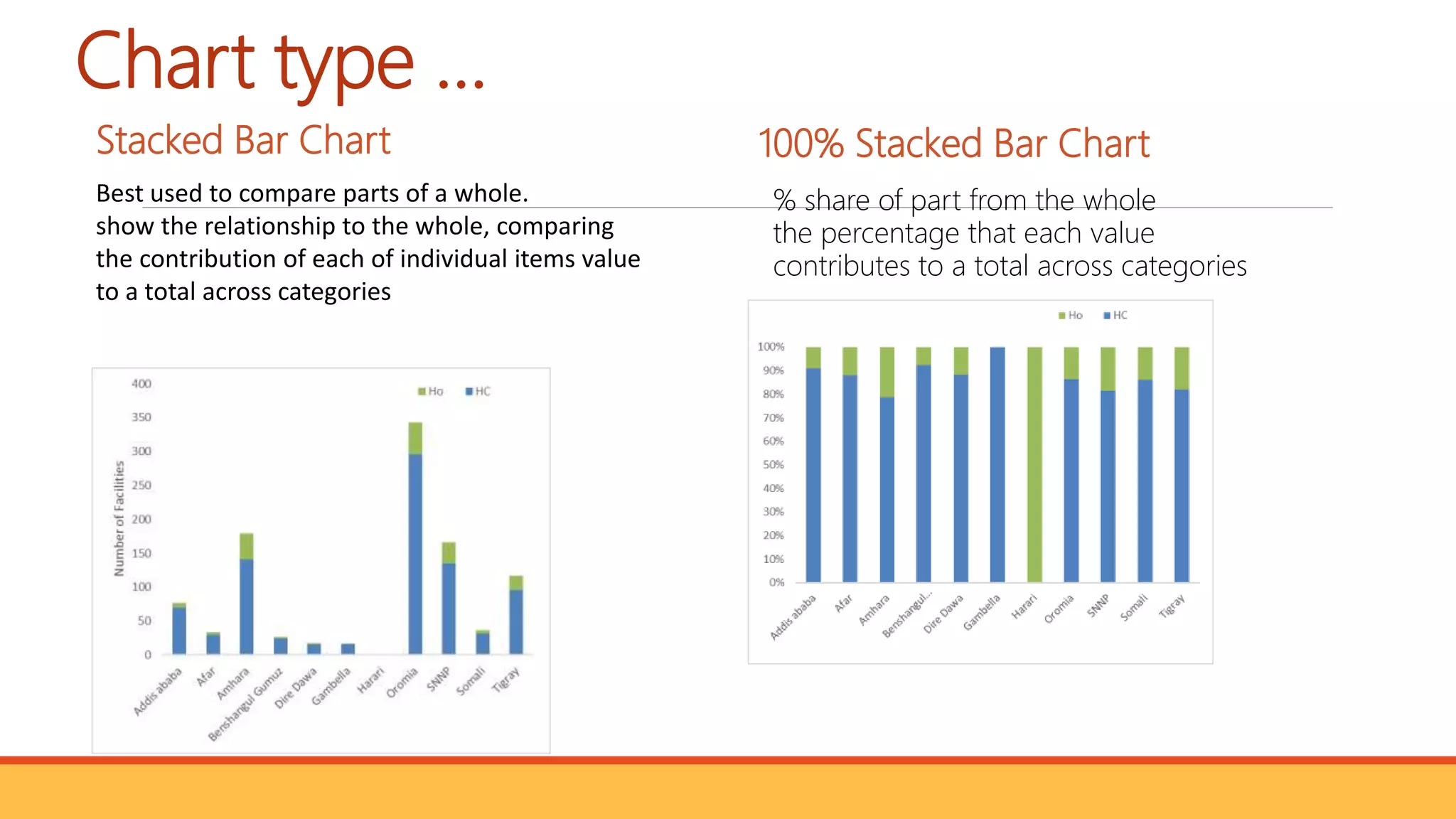

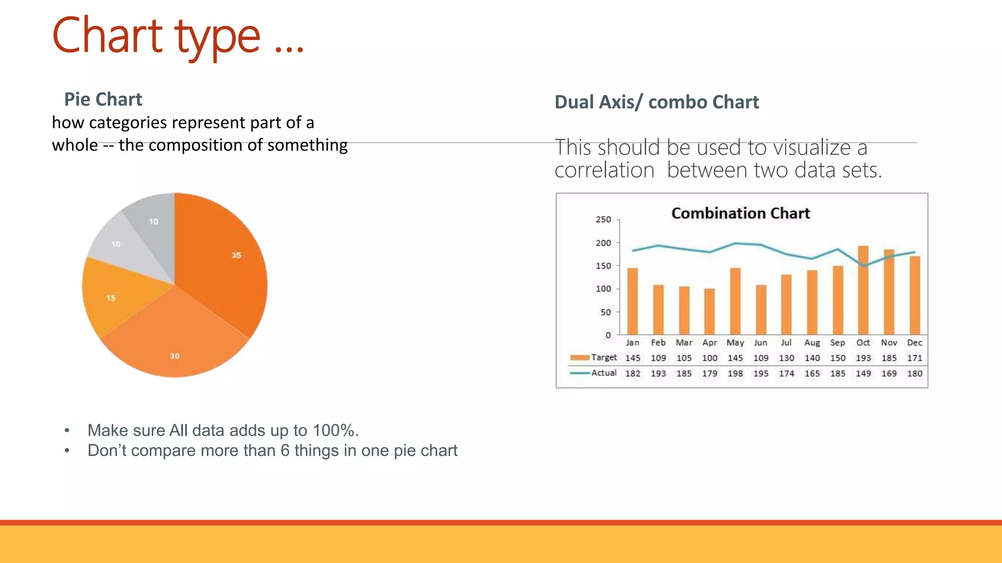
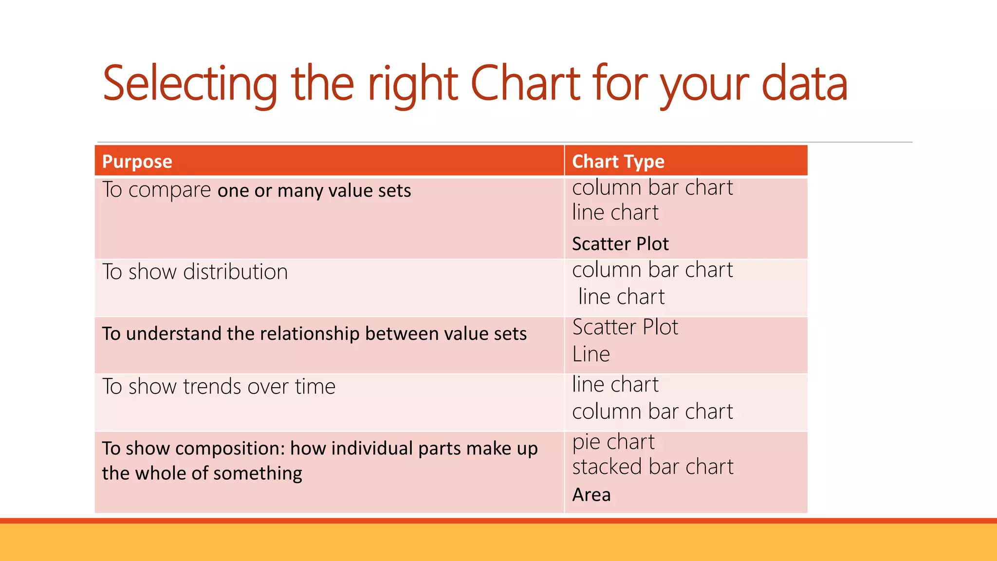
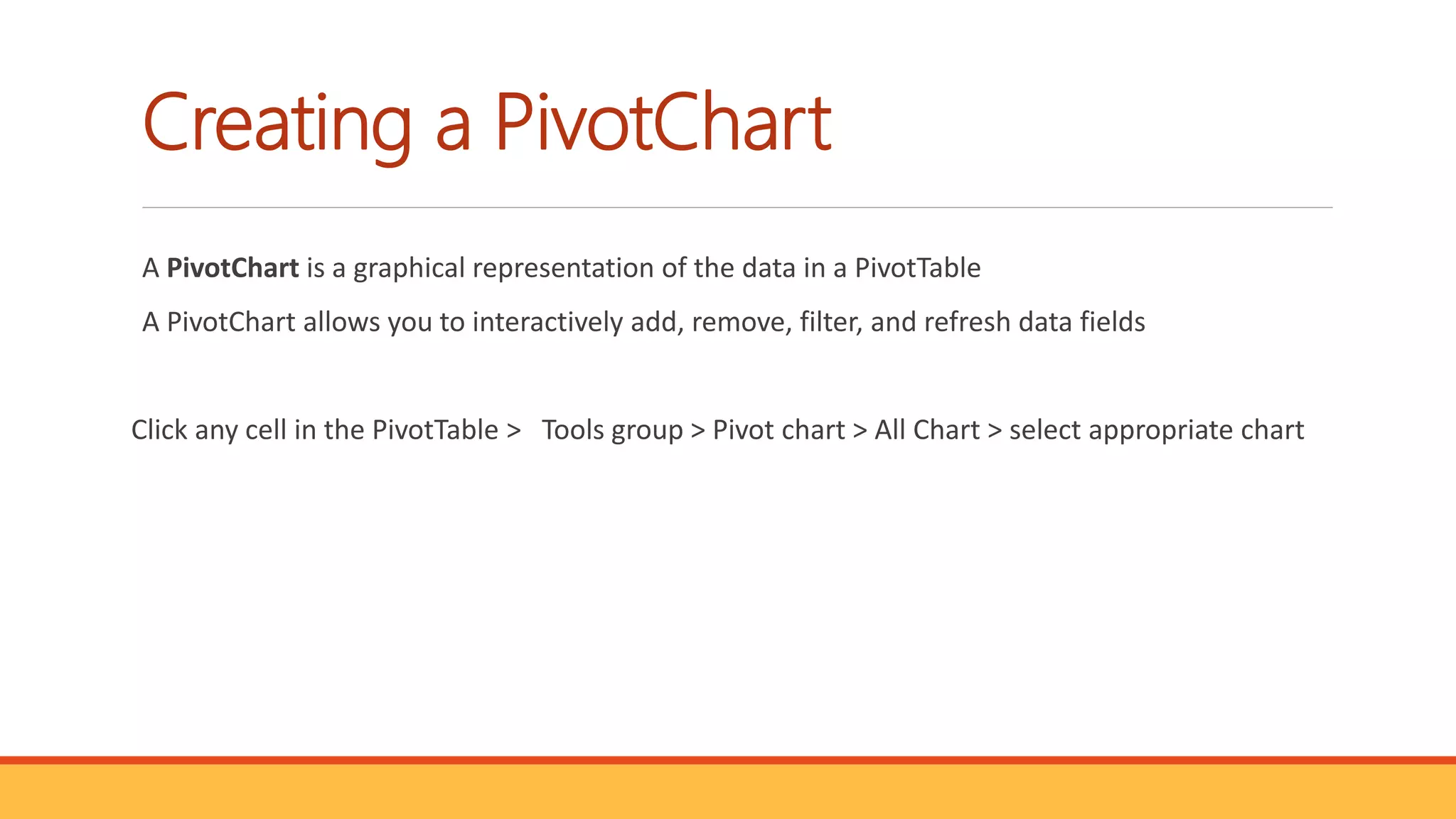

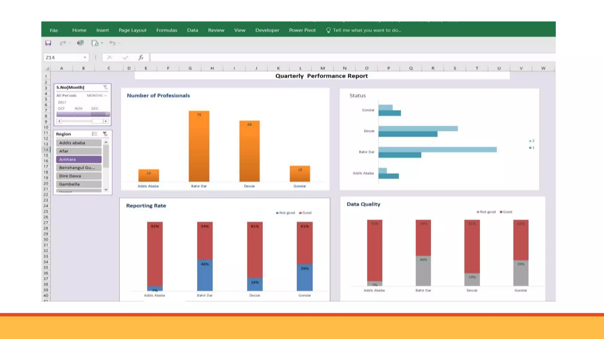

The document provides a comprehensive guide on using Microsoft Excel to create pivot tables and dashboards aimed at improving data visibility and facilitating data-driven decision making. It covers the definition, components, and advantages of pivot tables, as well as detailed instructions for creating and formatting them. Additionally, the document discusses the importance of data visualization and various chart types for performance monitoring and analyzing trends over time.


![ict_presentation_final_final_final[1].pptx](https://cdn.slidesharecdn.com/ss_thumbnails/ictpresentationfinalfinalfinal1-251230145259-2b4839bd-thumbnail.jpg?width=640&height=640&fit=bounds)


