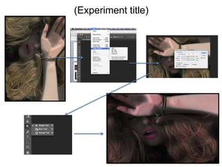
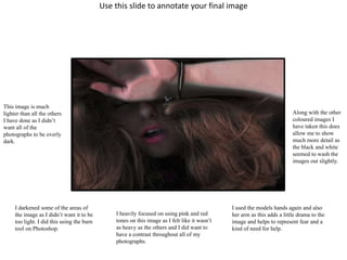
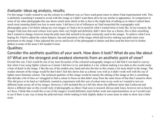
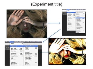
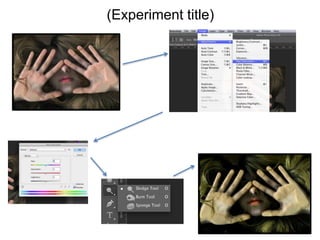
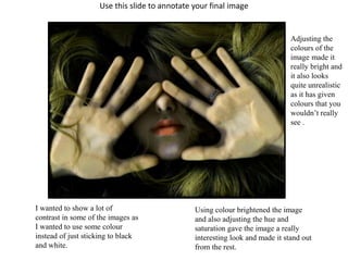
This document summarizes the process and results of an experimental photography project using colour scanography. The student focused on conveying fear through their images and experimented with different colour tones and editing techniques. This image stands out from the others through its use of bright colours, including green hues, while still maintaining detail through lighter editing. The student feels this image successfully conveys fear while differentiating itself from other works through an unusual colour palette.
The document summarizes the student's experimental photography project. They used scanography techniques and editing tools like dodge and burn to create images conveying fear. The student is happy with how the images turned out but wants to try new techniques like using objects instead of models or adding movement. They analyzed what elements worked best and discussed ways to improve areas like using more dramatic colors or focusing less on detail. The student felt their work fit the brief of experimental photography and clearly showed the theme of fear.
Development Pro-Forma finished Hannah Woollastonhannahw12
This document contains evaluations of different digital graphic narrative development tasks completed by Hannah Woollaston, including improving a panda image, creating penguin and hamster images using different tools, practicing text techniques, and creating comic book-style and illustration images. For each task, Hannah provides what she liked about her image and what she would improve if doing the task again, focusing on adding more detail, texture, interesting backgrounds, and experimenting with different tools.
This document summarizes an experimental photography project combining multiple exposure and scanography techniques. The author created images by overlaying previously taken scanography photos with other nature images in Photoshop. For one image, the author overlaid a scanography face with an image of trees and flowers, using dodging tools to highlight certain areas. The author evaluates how well their work achieved the intended ideas and references influences from scanography and double exposure styles individually. The author assesses the technical and aesthetic qualities of the works and discusses ways to potentially improve or further develop the images through additional experiments.
The document provides evaluations of different digital graphic narrative assignments, including shapes, rotoscoping, text, comic books, photography, and illustration. For the shapes task, the student liked the gradients and outlines that made the image look realistic, and would improve gaps and add more detail. For the improved shapes task, more background and eye color were liked, and smoother outlines would be improved.
The student evaluated different aspects of their digital graphic narrative project. For the shape task, they liked adding gradients and shadows to create depth, and lines to define shapes. They would choose simpler subjects next time. For the rotocope task, they liked using selection tools and layers to add detail, and would try different colors. For the text task, they enjoyed experimenting with styles and liked combining images and effects. They would try different settings and compare results. Overall, the student provided feedback on what they liked and could improve for each assignment to develop their skills.
The document provides evaluations of different digital graphic narrative development tasks including shape tasks using pandas and penguins, rotoscoping images of hamsters and fish, text techniques using different tools, creating comic book style images, photography of emotions, and an illustration of flowers. For most tasks, the evaluations note what was liked such as realistic details, use of tools, and effects created, and improvements that could be made such as adding more details, textures, interesting backgrounds or experimenting with other tools.
This document contains summaries of assignments from a digital graphic narrative development course. It includes summaries of the student's evaluations of various image creation tasks using different digital tools, such as the shape tool, rotoscope tool, and text tools. The student provides feedback on what they liked about their images and how they could be improved. It also includes a summary of their proposal for a comic book project, which outlines the story, production methods, audience, and includes a feedback section.
In the original story, Hansel and Gretel are sent into the forest by their father and stepmother, who cannot afford to feed them, but they find their way home using a trail of white pebbles that Hansel has left. However, the next time they are sent into the forest, Hansel cannot leave a trail and they become lost, eventually coming upon a house made entirely of confectionery, which belongs to an evil witch who wants to eat the children.
In a time of famine, a woodcutter fears he cannot feed his family and decides to abandon his children, Hansel and Gretel, in the forest. However, Hansel devises a plan to leave a trail of breadcrumbs to find their way home. They are later abandoned again and Gretel creates the trail. They become lost and come upon a gingerbread house belonging to an old witch who imprisons and fattens them to eat. Hansel is locked in a cage while Gretel works. Gretel tricks the witch and pushes her into the oven, escaping into the forest with Hansel.
The document summarizes the student's experimental photography project exploring themes of fear and love. It includes annotations and evaluations of 3 experiments.
In the first experiment, the student used a flip tool and created shadows to depict intertwined people and different perceptions of fear. The evaluation notes both strengths like the misty tone, and weaknesses like an annoying pattern.
The second experiment used multiple exposure to layer images at low opacity, creating a "see through" effect. In evaluation, the student notes room for improvement in realizing intentions and developing the work further.
The third and final experiment used a flip tool to create overlapping and blurred images in black and white. In evaluation, the student feels this experiment best realized the
The document provides feedback from a student on various digital graphic narrative development tasks they completed. For the shape tasks, the student likes adding shading and highlights to add detail. They would improve by adding more creative backgrounds. For rotoscoping, the student spent time on facial features and likes the details in eyes and lips. They would improve skin and clothing tones. For text, the student liked experimenting with techniques and would explore more fonts and effects. For comics, the student likes using filters to add contrast and definition. They would improve by adding more detail and realism. For photography, the student likes depth of field and colors that draw attention. They would improve angles and editing.
Here is a summary of the feedback you received:
The strengths highlighted included the clear and detailed idea generation process shown through the mind maps and mood boards. Having a parody take on an existing children's story was seen as a good approach. The target audience and production methods were well defined.
Areas suggested for further development included:
- Explaining the page dimensions and format choices in more detail. Specifically addressing line counts and placement of text/illustrations.
- Providing more character details like personalities and how they interact with the main character.
- Clarifying if the characters encountered will be friends or foes of the main character.
- Justifying the font choices in relation to the intended uses
The document describes several experiments the author conducted to develop ideas and test different elements for a magazine project. This included testing different lighting effects with gels, natural lighting with different models, fonts for the masthead and body text, and projecting photos onto a model. Through these experiments, the author gained insights into lighting techniques, font styles, and an alternative aesthetic using projections that informed design decisions for the final magazine.
The document discusses the development of a digital graphic narrative for a children's book. It includes mood boards showing inspiration for characters, settings, and fonts. The main character is a loaf of bread, and potential supporting characters are animals like a bird or dog. Settings may include a cartoon-style kitchen and forest. Fonts with serifs are chosen for readability. Images created include a friendly mole character and rotoscoped images of celebrities to explore illustration techniques. Feedback on the images notes what aspects worked well and could be improved, such as adding more texture or detail.
The document describes various experiments the author conducted with lighting, models, and fonts for a magazine project. For lighting experiments, the author tested different colored gels and natural lighting. Photos with orange gels or both blue and orange gels were considered for advertisements, while natural lighting shots could work for feature photos. Font experiments examined options for the magazine masthead and body text. The tests helped determine which elements to include in the final magazine design.
The document discusses an experimental photography project exploring multiple exposure techniques. The photographer created two images by overlaying a photo of trees onto portraits of a model. They preferred the first image in color over monochrome as the varied patterns and colors were more vibrant. They felt the second image with a pure white background was more successful than the first with patches of the overlay in assessing the qualities and evaluating opportunities for developing the techniques further.
The document contains evaluations of different digital graphic narrative projects, including a shape task, rotocope, and text-based image. For the shape task, the creator liked that the elephant image had identifiable features to help children understand, and would improve the leg shape. For the rotocope, the creator liked the simplicity while still showing full facial features, and would improve the skin color choice. For the text-based image, the creator liked the range of styles using different tools and would explore color gradients more.
The document is an evaluation by Bekki Asquith of several experimental photography projects they undertook exploring different techniques. For one project, they created a photomontage in the style of David Hockney by merging photos of different people's faces. For another, they took photos using mirrors to create reflections and patterns. They also experimented with high-speed photography capturing objects dropping into water. Overall, the evaluation assesses the technical and aesthetic qualities of the photos, how well the projects matched the brief of being experimental, and ways the work could be further improved.
The document discusses revisions made to a children's story called Little Red Riding Hood, including changing details such as the grandmother living on a farm instead of in the woods and replacing the wolf character with a fox. The revised story will be told through illustrations with a cartoony style suited for children and explore themes familiar to kids through characters like Little Red Riding Hood and her grandmother.
This document contains summaries of edits made to photographs from Paige Ward's Alice in Wonderland horror-themed photoshoot. In 3 sentences:
The document outlines various edits made to the photos, including changing them to black and white, adding filters, and adjusting brightness and contrast. Specific edits are described like adding a blue or purple tint, blurring backgrounds, and using selection tools to isolate parts of photos. The goal of the edits was to give the photos a horror or fantasy look to match the theme of the photoshoot.
This document provides details on edits made to photographs from two Alice in Wonderland-themed photo shoots. For each photograph, the original is shown alongside one or two edited versions. Edits included changing images to black and white, adding filters, adjusting brightness, contrast and colors, blurring backgrounds, and using tools to pale skin or change eye colors. The edits were aimed at enhancing the horror/fantasy theme and giving photographs a more edited, stylized look.
The document discusses the process of creating a film poster. It summarizes three potential images being considered and the editing experiments done to each one. The best image is selected and further edited on Adobe Illustrator, including adding typography. Different fonts are tested before selecting Times New Roman. Additional alterations are made, like adjusting the color, before a final poster design is completed.
The document contains evaluations from students on various digital graphic narrative assignments they completed. For an elephant image, a student liked that important features like tusks and ears made it easily identifiable as an elephant to help children understand, and that it was simple but still looked good. For the same image, the student would improve the legs to make them look more correct. For a gazelle image, a student liked its simplicity and recognizability, and would add more facial details like eyes and nose. For a panda image, a student liked its simplicity and use of color tools, and would make the panda blend with the background better.
The document discusses Amy Foster's process for creating different elements of her magazine production including a front cover, back cover, and double page spread. She describes editing photos in Photoshop, choosing fonts, arranging layouts, and using techniques like cutouts and overlays to create cohesive designs that follow a futuristic neon theme. Amy reflects on experiments she would try if given the opportunity to rework elements, such as additional photo editing approaches and making contest details more prominent.
Here is a revised version of the script that incorporates a Killer Whale and Swordfish as the main characters:
Once upon a time, in the deep blue sea not too far from you, there lived an energetic Killer Whale named Bubbles and a competitive Swordfish named Razor.
Bubbles the Killer Whale loved to swim fast and play tricks on the other sea creatures. Razor the Swordfish was always looking for a challenge to prove how tough he was.
One day, the two were arguing over who had the best habitat in the ocean. "I'm the fastest swimmer in the sea," boasted Bubbles. "No one is quicker than me!"
"Speed isn't everything
Here is a revised version of the script that incorporates a Killer Whale and Swordfish as the main characters:
Once upon a time, in the deep blue sea not too far from a coral reef, there lived an energetic Killer Whale named Bubbles and a competitive Swordfish named Razor.
Bubbles loved to swim fast and play tricks on the other sea creatures. Razor preferred to hone his skills and make sure he was the sharpest in the ocean.
One day, as Bubbles was showing off some new flips and spins, he swam up to Razor. "I'm the fastest animal in the sea," boasted Bubbles.
"Oh please," scoff
The document provides an evaluation of a student's work on various digital graphic narrative development tasks. For a puppy image, the student liked the background and shading but would improve the outline and shading. For a guinea pig image, the student liked the blending of colors but would change some details. Across tasks, the student felt skills improved and liked exploring tools, but would spend more time experimenting with settings on some projects. Areas for improvement included outlines, details, and using tools like thresholds more effectively.
Simran organized a photo shoot with Rachel as a model for her upcoming music project. Simran used fluorescent lights to evenly light the studio and avoid shadows. She took different types of shots, including close-ups of Rachel's makeup and accessories as well as wider shots showing her full outfit and pose. Simran edited the photos, adjusting brightness, saturation, and other qualities. She created a photography portfolio using some of the edited photos and titled it "Wilderness Photo Shoot by Sim K" to connect it to Rachel's new album. Simran interviewed Rachel, asking questions about her life and career, and included the responses in an article for her magazine.
Here are some methods you could employ to identify locations needed for your production:
- Review your production schedule and storyboards/scripts to determine what types of locations you will need (e.g. interior kitchen, exterior garden, office space). This will give you a starting point.
- Research locations you already have access to through friends/family/work connections. See if any of their spaces could work for your needs before looking elsewhere.
- Drive or walk around your local area scouting for potential locations that match your needs. Pay attention to exteriors as well as calling/visiting businesses to ask about interior spaces.
- Search online location databases and forums where people list available spaces. You can search by
Raster graphics are made up of pixels and have a set resolution, so they can appear distorted when resized. Vector graphics are made up of mathematical paths between points, so they can be resized without distortion. Common raster file formats include JPEG, TIFF, GIF and BMP, which vary in compression, quality and file size. Common vector file formats are PSD, AI, FLA and WMF, which allow editing layers, transparency and scaling. Files can be optimized and compressed to reduce file sizes for sharing online, but this can reduce quality. Larger files have more pixels and layers, and naming files accurately helps organization. Folders are useful for storing and organizing assets in projects.
Raster graphics use pixels to form images, so file sizes are large. When resized, raster graphics become pixelated and distorted. Vector graphics use vectors and paths defined by starting and ending points, so they are scalable without quality loss, making them suitable for logos. Common raster graphic file formats include JPEG, TIFF, GIF and BMP. JPEG is used for web and is universal but loses quality with edits. TIFF retains quality but has large file sizes. GIF is used for animations and has small file sizes but poor quality. BMP has no compression but large file sizes. Common vector graphic file formats are PSD, AI and WMF. PSD is used by artists and retains layers but needs Photoshop.
The document discusses various digital file formats for graphics, including raster graphics, vector graphics, JPEG, TIFF, PSD, AI, and 3DS.
It provides information on each file format such as what it stands for, typical uses, advantages, and disadvantages. JPEG is noted as the most common format for images used on websites due to its small file size, though it can cause loss of quality upon recompression. TIFF is described as useful for graphic design work due to its lossless compression preventing quality loss. PSD is only compatible with Photoshop but allows for layers. AI uses vector graphics making it suitable for scaling without quality loss. 3DS is an industry standard for 3D modeling.
The document discusses graphic file formats and the factors to consider when choosing one. There are many graphic formats that vary in color depth, compression, portability, and whether they support transparency. Color depth determines the number of colors an image can display, from 1-bit to 24-bit. Compression reduces file size, either losslessly by removing redundant data or lossily by altering pixels and degrading quality. Portability refers to how easily files can be opened across systems. Transparency allows parts of an image to be see-through. The best format depends on an image's intended use and priorities like quality, speed, and file size.
This document discusses the importance of providing clear instructions to players of a game and the use of algorithms within games. It defines algorithms as sets of instructions that must be carried out for things to happen in a game. The goals are to understand the need for clear instructions, know what algorithms are used for in games, and be able to create a winnable computer game. The task is to create suitable algorithms in a game to meet requirements and provide evidence of triggers, player actions, and rules to help or challenge the player.
This document discusses an investigation into how color is associated with emotions like happy and angry in photographs. The author will examine works by Hector Sos, Gillian Wearing, and Kyungwoo Chun to analyze how these artists use color in their photos to express emotions. Hector Sos creates paper masks for portraits that use color and paper details to suggest feelings. Gillian Wearing photographs people holding signs with their inner thoughts, using lack of facial expression with messages. Kyungwoo Chun uses blurred portraits and bold colors that the author thinks could emphasize emotions when combined with colored backdrops.
Digital photography lesson 6 focuses on understanding color management between devices and how devices represent color differently. It discusses how digital cameras embed color profiles related to how they represent color gamut, dynamic range, tone reproduction, white point, and shadows and highlights. Learners are tasked to research and describe the use of embedded color profiles in digital camera images, commenting on why profiles are needed, what profiles do, and how profiles are used in a color managed workflow.
Experimental Photography On going evaluationsRyan Goldsmith
This document summarizes Ryan Goldsmith's experimental photography project exploring high-speed photography of objects disturbing liquids. The summary includes:
- Ryan took photos of various objects like coins and fruit disturbing water, captured using high shutter speeds between 1/5000-1/6400 to freeze the motion.
- One photo features a coin cutting through water, showing the displacement and trail it left.
- Ryan improved a second set of photos by using better lighting to reduce noise, capturing apple and water disruption sequences.
- Technically, Ryan used high ISO 6400 and shutter speeds up to 1/8000 to freeze motion, with a shallow depth of field. Minimal post-processing was needed.
Experimental Photography Artist Research 2Jaskirt Boora
The document discusses various techniques used by photographers and students to manipulate photographs through the addition of paint, textures, stitching, burning, tearing, scratching, layering, sculpting, color adjustments, and digital manipulation. Some of the techniques mentioned include dripping paint on images, sewing photographs onto fabrics, machine stitching, transferring prints onto canvas, mixed media collages, overlaying images, constructing 3D landscapes, and using Photoshop tools like liquify to distort photos. The document also lists several artist and photographer examples for each technique as well as recommended books on photographic portraiture, curated photography collections, enhanced photography techniques, and botanical photography.
The document discusses when post-production should be used on photographs. It argues that post-production is acceptable for art as it allows artists to achieve their desired creative effects, but should be limited for factual photography. For photojournalism and documentary photography, minor adjustments for lighting may be acceptable, but extensive post-production could mislead audiences. The document concludes that minimal post-production is appropriate for factual images, while artists should have freedom to pursue their visions, and some editing may be suitable for portraits and commercial photography.
This document discusses using triggers in computer games, with a focus on door triggers. It outlines the goals of understanding trigger importance, knowing the available triggers in a chosen software, and being able to use a range of appropriate door triggers. It then discusses the different types of triggers available in Mission Maker software and instructs students to use various triggers to open and close doors, providing screenshots of the trigger types and door properties as evidence.
This document provides an overview of film and video editing techniques. It begins with an introduction to the unit and learning outcomes. It then discusses the pioneers of filmmaking in the late 19th and early 20th centuries. Examples of early films are provided and analyzed to show pioneering developments in techniques like continuity, jump cuts, and close-ups. Key characteristics of early film production like shot types and movement are also outlined. Modern auteur filmmakers like Hitchcock, Scorsese, and Tarantino are discussed. The document concludes with explanations and examples of important editing conventions and techniques like seamless cuts, continuity, montages, and transitions.
Photography Techniques- Multimedia and Scanographycloestead
Multimedia photography involves using more than one medium to create an image, such as painting over a photograph. This creates a textured collage effect. The document describes examples by artist Maureen Gubia who used paint and digital techniques over photographs. Scanography creates photographs using a photocopier by leaving the lid up while scanning to distort images of objects or people placed far from the scanner. Examples show clear images of objects on the scanner surface and blurred distortions of objects farther away.
The document discusses different types of digital graphics file formats. Raster graphics like JPEG and TIFF store images as a grid of pixels and can lose quality when resized, while vector graphics like AI use mathematical formulas to describe shapes and can be resized without quality loss. Common file formats are described along with their uses, advantages, and disadvantages. JPEG is best for photos due to small file sizes but can lose quality during compression. TIFF preserves quality but has large file sizes. PSD and AI are used for image editing but only work with certain programs. 3DS is for 3D modeling and animation but has large, complex files.
The document discusses graphic file formats and the factors to consider when choosing one. There are many graphic formats that vary in color depth, compression, portability, and whether they support transparency. Color depth determines the number of colors an image can display, from 1-bit to 24-bit. Compression reduces file size, either losslessly by removing redundant data or lossily by degrading quality. Portability refers to how easily files can be opened across systems. Transparency allows parts of an image to be see-through. The best format depends on an image's intended use and priorities like quality, speed, and file size.
The document summarizes the author's experimental photography project. They began with the intention of capturing bubbles and movement to represent fear and being "thrown in at the deep end." They were influenced by other artists' use of multiple mediums. Their process involved taking photos, editing them, and painting dots over images. They used watercolors and acrylic paint. While they achieved their theme, they felt the images could be improved with more dots or experimenting with food coloring. Overall they determined their work fulfilled the brief but could be developed further.
Further Techniques Task 3 - W/ ChangesTheJellehKed
Multiple exposure photography involves superimposing two or more photographs to create a single image. It can be done using analogue cameras by opening the shutter multiple times to expose the film more than once, or digitally by merging images together using editing software. Light writing uses a light source like a fiber optic pen to draw images in a completely dark environment that are then captured with a camera. High speed photography freezes or records very fast moving objects or processes using specialized cameras capable of framing rates of hundreds to millions of frames per second. Post production techniques for these methods may include changing colors, opacity, adding effects, sharpening, or cropping images.
The document summarizes the process of creating a trio of experimental photographs based on the theme of life and death. For the first photo, the model's face was painted before being photographed to portray death as dark. Issues arose in connecting the photos due to inconsistent angles and scales. The second photo aimed to portray death positively and used pastels and acrylic paints. Dark filters made details hard to see. The third photo depicted hands reaching to leave meaning ambiguous and used pastels on reprinted photo paper with Photoshop editing.
Chloe created an experimental photography piece exploring themes of fear and being "thrown in at the deep end". For her second experiment, she photographed a model using a slow shutter speed to capture movement. She then painted watercolors and dotted acrylic paint over the image. While some colors were distorted due to the materials reacting, Chloe was happy with how the final image conveyed her theme through the model's haziness and the shapes and colors used. She discussed how her work was influenced by other artists and evaluated both the aesthetic and technical qualities of her piece.
The document summarizes four photo shoots taken by the author for their magazine. For each shoot, they chose young models around the same age as their target audience. They describe improvising shots without needed props. For editing, they used Photoshop to increase saturation and brightness, blur backgrounds, change colors, and remove backgrounds. Their goal was to prepare photos that fit their magazine's Christmas theme and genre of music charts.
The photographer intended to create scary images for a magazine through unsettling portrayals of models. One image featured a model with scary teeth and eyes to look "demonic" and "undead". Another aimed for a more subtle scare through a blue tint and dark lighting to imply a feeling of being watched. A third was meant as an advertisement poster for a drink but did not achieve the intended scary and dark theme, appearing too bright instead. The final photo used color changes to contrast a model's face with the background and show the difference between human and zombie, fulfilling the photographer's goal of an abstract catchy advertisement image.
The photographer intended to create scary and undead images to advertise a zombie energy drink. For one photo, they made the model look demonic with scary teeth and eyes to achieve an undead look. They were pleased with the result but wanted to add more details. For another photo, they aimed for a more subtle scare using a blue tint and dark lighting to create an eerie feeling of being watched, which they felt they accomplished. They would have liked to experiment with more effects. They felt a third photo was too bright and not scary enough to fit the theme.
This document provides an evaluation of three images created by Marie for a project on portraying emotions. For the first image, Marie experimented with layering smoke in Photoshop and settled on blending modes and opacity levels to create realistic-looking smoke. The second image used watercolors painted directly onto a printed image to add smoke, with the water reacting with the ink to create unexpected effects. The third image was an accident caused by too much water, but Marie liked the damaged film effect it created. Overall, Marie learned techniques for incorporating smoke and is pleased with how the images convey emptiness and the dominating nature of emotions.
The student created a photography exhibition exploring portrait and macro genres. They began by researching inspiration online and practicing different photography techniques outdoors. Images were edited in Photoshop, including using the auto color and HDR toning tools. The exhibition included portraits and close-up macro shots that were well received by peers. Feedback was positive about the quality of images and editing, though some noted the macro shots did not fully fit the portrait theme. Overall the project expanded the student's photography skills and knowledge of genres.
The document describes the student's work on various digital graphic narrative development tasks in their class. For the shape task, they liked adding shading to create shadows and highlights, and thought the outcome was good for their first try. For the rotoscope task, they were pleased with the facial features and used color range to add details. Areas for improvement included adding more detailed backgrounds and defining features more clearly.
The document discusses the author's experiments with photography tutorials, lighting techniques, and photo editing in Photoshop. They found tutorials helpful for learning lighting positioning but struggled to replicate the exact setups. Through trial and error, they improved at creating shadows, depth, and different exposures. Photoshop experiments included adjusting lighting, converting images to black and white, adding gothic elements like bruising effects, and blending background elements. The author aims to apply these skills to create an effective horror-style final project involving a DVD cover and poster.
An ant named Bina comes across a caterpillar trapped in its chrysalis and mocks it for being unable to move, unaware that it will soon emerge as a beautiful butterfly. A few days later, Bina sees the same butterfly and realizes it was the caterpillar, which reminds Bina that appearances can be deceiving and not to judge based on outward looks alone.
The student created a photography exhibition to showcase different techniques they learned. They began by researching inspiration online and practicing various photography genres. They focused on portraits but also included macros. The student used Canon DSLR cameras, tripods, and editing software to produce high quality images. Through the project, the student learned new editing skills like HDR toning and evaluating their work. They were pleased with capturing interpretations of other photographers and improving their skills, but would spend more time planning and trying another genre for future projects.
The document discusses an evaluation of photographs taken for a final photography project. The photographer took abstract, landscape, and portrait pictures with a Canon 600D using factory settings. The photos were then edited in Adobe Photoshop CS5, using tools like vibrant and color correction to enhance colors and bring the pictures to life. Through this project, the photographer learned new skills like camera angles and how lighting affects photographs. Examples are given of editing done to two photos to make one seem darker and enhance colors and clouds in another. The evaluation notes strengths in standing out details and personality in the photos but weaknesses in theme consistency. The photographer was pleased overall but would include more landscapes and precise editing for future projects.
The document discusses the author's experiments with multiple exposure photography. They tried layering images of roses with geese, trains with train tracks, and birds. They aimed to overlay similar images at different sizes so they blended together while still being distinct. The author took influence from photographer Jerry Ueslmann and found their own images lacked vibrancy compared to examples they found online. They discuss technical aspects like exposure that impacted the success of overlays. The author considers images of hands holding plants and animals among their most successful, as the subjects stand out clearly. They conclude some experiments were more successful than others and they would benefit from collecting a wider variety of photos to experiment with in the future.
1) The document describes experiments editing photos in Photoshop, including overlaying photos, adjusting lighting and colors, and blending backgrounds.
2) Reflections on the experiments note elements to include in final products like overlaying photos, using blur tools to blend images realistically, and considering appropriate designs and color schemes for different audiences.
3) Another experiment describes designing a magazine-style ad by cutting out a subject, placing on an inverted background, and adding matching colored text.
The document summarizes three experiments in experimental photography conducted by Shania Carter. In the first experiment, Carter used flip tools and opacity levels in photographs of people to create a sense of reflection and movement. Feedback noted room for improvement in realizing intentions. The second experiment used multiple exposures and black and white photographs with layered images to represent fear and love. Feedback again noted room to better realize intentions. The third and final experiment used flip tools and editing techniques like levels and curves to create a powerful black and white image representing same sex love and fear through repetitive faces and movement between images. Carter felt this final image best realized the goals of representing fear through experimental photography.
Adele Rolf conducted experiments editing two photos to practice skills for a final product. In the first photo, levels and contrast tools were used to deepen grass and blossom colors and make the image brighter. The second photo aimed to show tree bark detail; contrast and levels tools brightened the image and made pink blossoms stand out against the bark. Reflection notes confidence grew from learning new Photoshop tools and techniques like subtle color overlays. Elements from the experiments, such as using levels tools to subtly alter photos' feels, will be incorporated into the final product.
The document provides a summary of Celina Smith's final major project (FMP) evaluation. It discusses the strengths and weaknesses of the research, planning, time management, technical qualities, aesthetic qualities, and audience appeal aspects of the project. Peer feedback praised the variety of subjects and treatments used, while noting that some text accompanying the photos could have provided more context. Areas for improvement included having clearer focus in some photos and using brighter colors instead of solely black and white. Celina agreed that including more descriptive text could have helped the audience but disagreed with needing clearer focus or more color.
The document provides feedback on a student's digital graphic narrative development tasks. For their shape task, the student likes that they added shading to create shadows and highlights, making the image more eye-catching. They would improve by adding more detail and a creative background. For their rotoscope task, the student spent time on facial features and likes the lips and eyes. They would improve skin and clothing colors. For their text task, the student experimented with text techniques and likes using color and drop shadows. They would experiment with more fonts. For their comic, the student likes the contrasting colors and abstract qualities. They would add more definition and make images more abstract.
The document provides an evaluation of a student's work on several digital graphic narrative development tasks including shaping images, rotoscoping, working with text, creating comic book style images, photography, and illustration. For each task, the student discusses what they liked about their work, such as using different tools, and aspects they would improve if doing the task again, such as adding more detail or changing effects.
1. The National Union of Journalists (NUJ) created guidelines for journalists to follow when writing about sensitive topics to avoid causing offense. This was in response to past misrepresentation of certain groups.
2. The NUJ guidelines cover reporting on topics like terrorism, race, asylum/immigration, and disability. Journalists are expected to present information factually and avoid biased opinions that could upset people.
3. The NUJ also has a code of practice that journalists must follow, including upholding media freedom and accuracy. Members can refuse assignments that breach the code while still having union support.
The National Union of Journalists (NUJ) created guidelines to help journalists write appropriately about sensitive topics without causing offense. The NUJ guidelines were developed in response to misrepresentations of certain groups in media. Journalists must follow the NUJ code, which includes 12 rules like ensuring information is accurate, avoiding plagiarism, and not intruding into people's private lives. The guidelines aim to prevent biased or factually incorrect reporting that could sway opinions or upset readers.
The document discusses various camera settings that control different aspects of photographs, including aperture, shutter speed, ISO, white balance, and post-processing tools. It explains that aperture controls depth of field, shutter speed determines how movement is rendered, ISO adjusts light sensitivity, and white balance ensures accurate color. Lower F-numbers, faster shutter speeds, higher ISO, and manual white balance can impact image quality. Examples demonstrate how adjusting these settings changes the look of photos.
The document discusses different types of digital graphics including raster graphics, vector graphics, JPEG, TIFF, PSD, AI, and 3DS file formats. Raster graphics are made up of pixels that can become distorted when resized, while vector graphics are resolution-independent shapes that can be resized without quality loss. JPEG is commonly used for photos due to its small file size but quality degrades with multiple edits. TIFF allows for lossless compression but results in large file sizes. PSD preserves layers and transparency but can only be opened in Photoshop. AI and 3DS graphics can be scaled without quality loss but require specific software to open.
The document discusses several key camera settings that impact photographs:
- Aperture controls depth of field - a wide aperture blurs the background while a narrow aperture keeps more in focus. It is measured by f-numbers, with lower numbers having a wider aperture.
- Shutter speed determines how long the shutter is open, impacting motion and light. Faster speeds freeze motion while slower speeds blur it.
- ISO makes the sensor more or less sensitive to light, with higher numbers letting in more light but potentially adding noise.
- White balance helps the camera determine colors by registering what is white in the scene.
This document discusses improvements to a social action organization including a new adult membership form page, final poster, and new fonts and character.
The document discusses plans for a poster and membership form for an organization aimed at raising awareness of ocean pollution. The poster will use a cartoon style to appeal to children while also including photography of the sea to engage adults. Bright colors will be used to attract attention. The membership form will include the organization's logo, details about its work, facts about pollution impacts, and pricing on the front and back. Merchandise ideas will also be tested and developed for both child and adult audiences.
The document discusses plans for a poster and membership form for an organization aimed at raising awareness of ocean pollution. For the poster, the goal is to appeal to both children and adults with a cartoon style and images of the sea. Bright colors will be used to attract attention and promote an upcoming beach cleanup. The membership form will include the organization's logo, details about its mission and activities, facts about pollution harms, and pricing for different levels of membership. Merchandise ideas are also being developed to engage both younger and older audiences in the organization's cause.
The document discusses plans for a poster and membership form for an organization aimed at raising awareness of ocean pollution. For the poster, the goal is to appeal to both children and adults with a cartoon style and images of the sea. Bright colors will be used to attract attention and promote an upcoming beach cleanup. The membership form will include the organization's logo, details about its mission and activities, facts about pollution impacts, and pricing for different levels of membership. Final merchandise designs will be tested and tailored for both younger and older audiences.
The document discusses three ideas for mood boards for an anti-littering campaign. The first idea features cartoon sea creatures to gently convey the message to both children and adults. The second idea uses dull imagery to realistically portray the destruction litter causes beaches visited by adults. The third idea incorporates a familiar cartoon character like SpongeBob to make beach cleaning exciting and appeal to children. Accompanying texts and logos would further each campaign's message and branding. Merchandise like hoodies are also proposed to promote the organization.
The document discusses branding and logos used by several environmental organizations, including Surfers Against Sewage, NRDC, WWF, and Trees for Cities. For each organization, 1-2 campaigns or pieces of merchandise are described in terms of imagery, intended audience, and purpose. The branding aims to raise awareness of environmental issues in an eye-catching way through shocking imagery and clear messaging. Logos incorporate symbolic imagery related to each organization's mission in an identifiable but not overly bold design.
Surfers Against Sewage (SAS) is a UK-based non-profit formed in 1990 by surfers in Cornwall to address water pollution through advocacy and education. SAS campaigns to improve UK ocean water quality by reducing sewage overflows and litter. They organize beach cleanups and have educated thousands about pollution's impacts. Key issues SAS addresses are the 31,000 annual sewer overflows contaminating water and doubling of marine litter over 15 years. SAS aims to mobilize thousands of volunteers annually to continue cleaning beaches and informing communities about ocean health issues.
The National Union of Journalists (NUJ) created guidelines to prevent misrepresentation and ensure factual, unbiased reporting. The NUJ guidelines address sensitive topics like terrorism, race, and disability. Journalists who are NUJ members must follow the guidelines and NUJ code of practice when writing. The code aims to uphold media freedom and prevent harmful, inaccurate, unfair or discriminatory information. It also protects journalists' sources and allows them to refuse assignments that breach the code.
The summaries provide an overview of various documents related to Jennifer Lawrence, including magazine interviews, news articles, and a Wikipedia page. The Marie Claire interview discusses Lawrence's personal life and filming of the Hunger Games movies. The Vogue interview has a humorous tone and focuses on Lawrence's personality and stories from film sets. The Telegraph article talks about Lawrence struggling with fame and her work on American Hustle. The People article summarizes Lawrence's response after nude photos of her were leaked online without consent. A David Letterman interview shows Lawrence's funny personality while discussing her career and personal life. Her Wikipedia page provides biographical details and an overview of her career progression and major roles. Fan questionnaires reveal favorite roles, films, and
The document summarizes three case studies:
1) An NHS anti-smoking campaign used shocking imagery and facts to persuade people to quit smoking and show the health damage caused by smoking.
2) A YMCA campaign featured an image of a homeless girl to raise awareness of youth homelessness and encourage donations to help young people find housing.
3) An Australian media group called Youthworx Media uses colorful graphics and videos on its website to provide media education and experience to young people.
Zara portrays itself as a high-end brand through clean, simple advertisements that focus on the quality of the brand rather than price. Missguided targets teens and young adults with colorful, Polaroid-style ads that prominently feature prices to draw in customers. Yves Saint Laurent uses minimalist ads with only the brand name displayed large to portray an image of wealth and luxury. H&M targets young audiences with simplistic ads on a white background that prominently feature prices to highlight affordability.
This marketing presentation outlines a campaign to promote an up-and-coming indie/rock artist named Henry-Maitland-Clark. The objectives are to establish his image and target audience, and sell 2500-3000 albums for his first full release. The target audience is 20-25 year old fans of bands like Hozier, Imagine Dragons, and Kodaline. The campaign will use various social media platforms, radio play, TV appearances, and merchandise to build awareness and fans. The goal is to position Henry as a talented new artist and sell enough albums to kickstart his music career.
LAND USE LAND COVER AND NDVI OF MIRZAPUR DISTRICT, UPRAHUL
This Dissertation explores the particular circumstances of Mirzapur, a region located in the
core of India. Mirzapur, with its varied terrains and abundant biodiversity, offers an optimal
environment for investigating the changes in vegetation cover dynamics. Our study utilizes
advanced technologies such as GIS (Geographic Information Systems) and Remote sensing to
analyze the transformations that have taken place over the course of a decade.
The complex relationship between human activities and the environment has been the focus
of extensive research and worry. As the global community grapples with swift urbanization,
population expansion, and economic progress, the effects on natural ecosystems are becoming
more evident. A crucial element of this impact is the alteration of vegetation cover, which plays a
significant role in maintaining the ecological equilibrium of our planet.Land serves as the foundation for all human activities and provides the necessary materials for
these activities. As the most crucial natural resource, its utilization by humans results in different
'Land uses,' which are determined by both human activities and the physical characteristics of the
land.
The utilization of land is impacted by human needs and environmental factors. In countries
like India, rapid population growth and the emphasis on extensive resource exploitation can lead
to significant land degradation, adversely affecting the region's land cover.
Therefore, human intervention has significantly influenced land use patterns over many
centuries, evolving its structure over time and space. In the present era, these changes have
accelerated due to factors such as agriculture and urbanization. Information regarding land use and
cover is essential for various planning and management tasks related to the Earth's surface,
providing crucial environmental data for scientific, resource management, policy purposes, and
diverse human activities.
Accurate understanding of land use and cover is imperative for the development planning
of any area. Consequently, a wide range of professionals, including earth system scientists, land
and water managers, and urban planners, are interested in obtaining data on land use and cover
changes, conversion trends, and other related patterns. The spatial dimensions of land use and
cover support policymakers and scientists in making well-informed decisions, as alterations in
these patterns indicate shifts in economic and social conditions. Monitoring such changes with the
help of Advanced technologies like Remote Sensing and Geographic Information Systems is
crucial for coordinated efforts across different administrative levels. Advanced technologies like
Remote Sensing and Geographic Information Systems
9
Changes in vegetation cover refer to variations in the distribution, composition, and overall
structure of plant communities across different temporal and spatial scales. These changes can
occur natural.
it describes the bony anatomy including the femoral head , acetabulum, labrum . also discusses the capsule , ligaments . muscle that act on the hip joint and the range of motion are outlined. factors affecting hip joint stability and weight transmission through the joint are summarized.
This presentation includes basic of PCOS their pathology and treatment and also Ayurveda correlation of PCOS and Ayurvedic line of treatment mentioned in classics.
ISO/IEC 27001, ISO/IEC 42001, and GDPR: Best Practices for Implementation and...PECB
Denis is a dynamic and results-driven Chief Information Officer (CIO) with a distinguished career spanning information systems analysis and technical project management. With a proven track record of spearheading the design and delivery of cutting-edge Information Management solutions, he has consistently elevated business operations, streamlined reporting functions, and maximized process efficiency.
Certified as an ISO/IEC 27001: Information Security Management Systems (ISMS) Lead Implementer, Data Protection Officer, and Cyber Risks Analyst, Denis brings a heightened focus on data security, privacy, and cyber resilience to every endeavor.
His expertise extends across a diverse spectrum of reporting, database, and web development applications, underpinned by an exceptional grasp of data storage and virtualization technologies. His proficiency in application testing, database administration, and data cleansing ensures seamless execution of complex projects.
What sets Denis apart is his comprehensive understanding of Business and Systems Analysis technologies, honed through involvement in all phases of the Software Development Lifecycle (SDLC). From meticulous requirements gathering to precise analysis, innovative design, rigorous development, thorough testing, and successful implementation, he has consistently delivered exceptional results.
Throughout his career, he has taken on multifaceted roles, from leading technical project management teams to owning solutions that drive operational excellence. His conscientious and proactive approach is unwavering, whether he is working independently or collaboratively within a team. His ability to connect with colleagues on a personal level underscores his commitment to fostering a harmonious and productive workplace environment.
Date: May 29, 2024
Tags: Information Security, ISO/IEC 27001, ISO/IEC 42001, Artificial Intelligence, GDPR
-------------------------------------------------------------------------------
Find out more about ISO training and certification services
Training: ISO/IEC 27001 Information Security Management System - EN | PECB
ISO/IEC 42001 Artificial Intelligence Management System - EN | PECB
General Data Protection Regulation (GDPR) - Training Courses - EN | PECB
Webinars: https://pecb.com/webinars
Article: https://pecb.com/article
-------------------------------------------------------------------------------
For more information about PECB:
Website: https://pecb.com/
LinkedIn: https://www.linkedin.com/company/pecb/
Facebook: https://www.facebook.com/PECBInternational/
Slideshare: http://www.slideshare.net/PECBCERTIFICATION
How to Add Chatter in the odoo 17 ERP ModuleCeline George
In Odoo, the chatter is like a chat tool that helps you work together on records. You can leave notes and track things, making it easier to talk with your team and partners. Inside chatter, all communication history, activity, and changes will be displayed.
A workshop hosted by the South African Journal of Science aimed at postgraduate students and early career researchers with little or no experience in writing and publishing journal articles.
3. Use this slide to annotate your final image
I heavily focused on using pink and red
tones on this image as I felt like it wasn’t
as heavy as the others and I did want to
have a contrast throughout all of my
photographs.
I darkened some of the areas of
the image as I didn’t want it to be
too light. I did this using the burn
tool on Photoshop.
I used the models hands again and also
her arm as this adds a little drama to the
image and helps to represent fear and a
kind of need for help.
This image is much
lighter than all the others
I have done as I didn’t
want all of the
photographs to be overly
dark.
Along with the other
coloured images I
have taken this does
allow me to show
much more detail as
the black and white
seemed to wash the
images out slightly.
4. Evaluate: ideas eg analysis, results;
For this image I really wanted to use the colours in a different way as I have used green tones in others I had experimented with. This
is definitely something I wanted to avoid with this image as I didn’t want them all to be too similar in appearance. In comparison to
some of my other photographs this one shows much more detail as this is due to the slight lack of editing as in others I edited them
much more meaning detail was lost in some areas. I did have a lot of influences as I had researched the scanography style
photography quite a lot before taking my own images so I had a lot in mind for what I wanted mine to look like. In my research, the
images I had seen that used colours were quite often very bright and definitely didn’t show fear as a theme, this is then something
that I wanted to change, however keep the pink tones that seemed to be quite commonly used in the images. To achieve what I was
hoping for, I had to adjust the colour balance, hue and saturation of the image which did involve making sure pink tones were
prominent in the image. I then adjusted the curves and levels of the photograph to darken and then used the burn tool to further
darken in some of the areas I felt needed it most.
Qualities:
Consider the aesthetic qualities of your work. How does it look? What do you like about
it? What are the strongest and weakest elements from an aesthetic point of view?
Overall this one, I feel would be one of my least favourites of the coloured scanography images as I did find it was hard to convey
fear when I was using lighter colours as it meant I did have to try and darken it a lot, without making it too dark as this would create
a lack of detail in the image. I like the use of the models arm, hand and also the hair as this creates a lot more detail in the image. The
weaker element of the image would be that I don’t feel this shows fear as a theme very well as it didn’t work well with the use of
lighter more feminine colours. The technical qualities of this image would be mainly the editing of the image as this is something
that did take a bit of time as I struggled to find a colour to focus on that didn’t stray from the main focus of fear that I aimed to show.
This did prove to be hard as I definitely wanted to experiment with this sort of colour tone in my work as I wanted to test out
different looks across all of my images. However, I still included this as I felt this shows the different styles that I achieved and
shows a different take on this overall style of photography as others I had seen in research did use pink tones, however not as heavily
as I have. I think that overall this is one of the images I would definitely need further work and experimentation on as I would want
to see if there is any way to keep the pink/red tones whilst making it look slightly darker in some areas in order to show fear a little
more.
4
5. How could you improve your work? Could you develop your work further with
additional work? What would you try to achieve with this? Could you undertake further
experiments? If so, what would they be?
I definitely feel that I could improve this photograph in particular as this is one that I liked the least out of the coloured scanography
images. I feel that this one really doesn’t show fear as much as I wanted it too as the pink/red tones used made it look a little too
feminine in my opinion. I think that if I was to add to this photo and adjust and change parts I would definitely focus on adjusting the
colour I have used in editing. I think it needs to only have a slight hint of pink tones through the image as I find this style of having it
really heavily coloured a little too distracting from the main theme of fear I had wanted to portray. I would also really like to do some
further experiments with this kind of colour on my images as I also found that the positioning of the model and also the facial
expression should show fear in a really obvious way in order to really get that theme across. I feel that I could potentially change the
positioning of the model if I was to do it again and also not use such a heavy colour filter over the image. I would then also adjust the
darkness of the image as this would make it fit a little more in to the fear theme I had chosen.
This image is quite heavily focused on the models hair as I wanted to achieve much more shape and lines in the image and felt this
was a good way to really highlight this aspect. I tried to draw attention from the face with the use of the hair and also the arm
covering it slightly around the eyes. I really liked this idea, however if I repeated this, I would definitely change the facial expression
to show fear in a more obvious way. The lines and details of the face aren’t as clear on this image as the colour seemed to take away
some of this detail and also the use of the dodge tool on Photoshop as I used this on the face to highlight some areas slightly. This
photograph definitely shows contrast from my others as in the others I either used a black and white filter or I chose to stick to more
green tones in the scanography photos where colour was added.
I do think that this image fits in with the brief we were given as it does use experimental photography and I have also tried to
experiment further by adding colour and testing out different tones and levels with this image. This one doesn’t match the theme of
fear as well as I would have liked due to the facial expression and possibly the position of the model, this could be easily improved
and changed as if I had to repeat this, I would have to possibly research more in to showing fear. Or possibly include some form of
object/prop to help show fear in the image. I did see one image when researching scanography that had a girl holding a note in her
hand reading ‘help’ which is really dramatised and definitely showed fear in the image. This was also combined with the use of a
black and white filter and lots of darkening in some areas which overall worked really well.
5
7. Use this slide to annotate your final image
This one is really
different and definitely
stands out from the
others due to the
brightness and bold
colours I have used.
I really wanted to
achieve the look of a
bright flash for this
image as I felt that it
would work really well
and make it a little
different from the other
styles I had gone for.
This is extremely
saturated as I wanted the
colours to be really bold
and vibrant to make them
stand out.
The positioning of the
model worked well here
as it meant I was able to
really brighten the hands
showing contrast to the
darkness of the
background and parts of
the hair.
I also made some areas
of the image really dark
so that the only think
showing up is her face
and hair instead of part
of her body as well.
8. Evaluate: ideas eg analysis, results;
I feel that this image is quite noticeably different to the others I have edited as this one is really overexposed and bright giving the
impression of a bright light being shone on to the model. My intentions for this image were to make the lighting and brightness of the
image much different to the others as I had previously kept all the other images fairly dark and not let too much light in. Although I
did want the image to be very bright, I also didn’t want it to overpower which I think I may have done slightly. I did still want to
keep some areas of the photograph very dark which is something I definitely stuck to in the editing process as I had changed the
levels and also used the burn tool to really darken and get much more detail in to the areas I wanted darker. In comparison to the
others I do feel I have made this one stand out due to the brightness of the photograph. When I was first researching this style of
photography I didn’t see many that used a lot of light and also used a lot of colour as they tended to be one or the other which is why
I wanted to experiment doing both to one of my images to see if I felt it worked or not. I definitely think that this image needs to be
improved as I’m still not sure on the lighting of the image. I feel that I have used slightly too much light for this image as although
this is something I had wanted I still think that it maybe just looks over exposed instead. However, I am still glad I have tried this
style of using both a lot of colour and also light as this is something I had initially wanted to experiment with to test if it would be
something I liked.
Qualities:
The overall look of the image is very bright and it is obvious at first look that a lot of heavy editing has been done to this image. I
personally feel that the lighting and brightness of the image could be made better and corrected slightly so that it is still bright, yet
doesn’t overpower a lot of the detail and focus of the image. Along with the brightness adjustment I had made when editing, I also
changed the colour on the image as I had definitely wanted to use a lot of colour as I had found that if the brightness was too high on
black and white it washed out the whole image and you were left with very little detail. I adjusted the colour using the ‘colour
balance’ option of Photoshop and also changing the saturation to a very high setting to bring out all the bright colours that were
originally in the image. I like the colours most on this image as I feel that it does draw a lot of attention to it and although they may
distract from the theme of fear for the image, I do like the vibrancy overall. The weakest element of this image would be the lighting
and brightness of the image as I feel it overpowers the image too much and takes too much focus from the theme of fear. This is
something I would definitely adjust if I was to edit this image again. The strongest element in my opinion would be the actual
positioning of the model as I liked the use of hands and also some of her arm as it does add drama to the image and helps to show
fear. I also like the hair as this became quite a main focus on this image as it spread across the scanner adding lots of detail, shape
and lines to the image making it much more interesting. The technical qualities are definitely the editing of this image as this took a
lot of testing and experimenting with the colour to achieve the look I had wanted. To do this I used the colour balance and also the
hue and saturation tools to adjust and change until I liked the final look of the colours in the photograph. I feel that the colour has
been done well as this is the look I had wanted to achieve as I wanted it to be very bold and vibrant. If I was to repeat the editing
process for this image I would definitely adjust the lighting and brightness as this is the thing that weakened the overall look of the
photograph as I just feel that it looks really overexposed and I’m also not sure that using a lot of light and also lots of bold colour
works well together.
8
9. How could you improve your work? Could you develop your work further with
additional work? What would you try to achieve with this? Could you undertake further
experiments? If so, what would they be?
I could definitely improve this image by changing the brightness I had originally used as I feel it is too much and looks far too
overexposed. I also feel that I should have either used a lot of light or used a lot of colour, however I experimented with using both as
this is something I had wanted to see on one of my images. I think that the changing of the lighting would definitely improve this
image overall and this is something I would adjust. However I had wanted to experiment with doing this so I am happy with the
testing of this image. I think that if I was to experiment further it would be to possibly lower the saturation of the image slightly to
see if this would work better with the lighting that is already there as this may make it look much less over exposed. I really like the
use of hair in this image as I feel that it creates much more detail in the image making it a lot more interesting overall. The hair has
quite a lot of detail still visible which is interesting as a lot of the edits in other images had created a loss of detail in some areas.
However, in this image you are able to see the different lines and it creates shapes and patterns by the way it has been laid out across
the scanner. This is definitely something that I had wanted to incorporate as you can see throughout all of my photographs as hair is a
main focus on a lot of them. To ensure that detail was kept in this image I did use the levels and curves tools on Photoshop to adjust
the dark and lightness of the image as I had made some areas really dark as this was the best way to keep some of the details in areas
of the hair and face.
The colours are also a main focus for this image as I had wanted to make them really bold and vibrant as in my other coloured
scanography images I still kept the colours fairly muted and not too much of a main focus in the image. In the others I also ensured
that when adjusting the colours I had kept to the darker scale colours, for example, in some I used greens and reds which kept the
images quite dark. I’m not too sure whether I like this style of vibrant colours for the theme I had chosen as it does appear to distract
from the theme of fear, as bright colours and ‘fear’ don’t stereotypically go together. However, this is definitely something I had
wanted to experiment with.
I think that overall this image fits in to parts of the brief as I have still used an experimental style of photography as I used
scanography, however I don’t necessarily think that it fits with the theme of fear I had initially chosen to show in my images. I do
think that aspects of the image match the theme, for example the darkness of some areas and also the positioning of the model and
use of her hands. However this compared with the bright colours may contradict and take focus away from the ‘fear’ aspect of the
photograph.
9
11. Use this slide to annotate your final image
I wanted to show a lot of
contrast in some of the images as
I wanted to use some colour
instead of just sticking to black
and white.
Adjusting the
colours of the
image made it
really bright and
it also looks
quite unrealistic
as it has given
colours that you
wouldn’t really
see .
Using colour brightened the image
and also adjusting the hue and
saturation gave the image a really
interesting look and made it stand out
from the rest.
12. Evaluate: ideas eg analysis, results;
I feel that I have achieved what I wanted with this image as I had wanted to make some of them a little different, such as adding
colour and using hands to show fear as a running theme through my work. I feel that this one does stand out from some of the others
as I have added a lot more colour to the image in comparison to the others I edited. I also added some more green to the image when
editing as I felt this helped to convey fear quite well as I had tested a lot of different colours on this image. I really wanted this image
to be a little different as this shows more detail of the model, as the others I took were heavily edited and some were washed out by
using the different tools on Photoshop. I felt that this did mean a loss of detail in the image, however this one is really clear and
shows all detail in the face and hands of the model. From researching this style of photography at the start of this project I did find
that there were lots using black and white edits and also if colour was used, it tended to be really bright which I just felt distracted
from the ‘fear’ aspect of my photographs. To make my photographs different from the ones I had seen I wanted to use colour,
however really darken some parts of the image so that ‘fear’ was still a fairly obvious theme. I also then edited the colour to make
this darker also and chose to focus on green as this seemed to darken the colours and make it look really unusual and different from
other scanography photographs I had previously seen. Overall, in comparison to my other photographs, I feel that this edit actually
worked really well as it is a little different, however it does still link with the fear theme I had chosen to incorporate in my
photography.
Qualities:
The overall look of this image I feel has worked really well as I still wanted to achieve the theme ‘fear’ in to the image, however still
use colour instead of making them all in a black and white edit. This meant that I had to play around with the colours for a while in
order to achieve what I was aiming for. I like that even though colour has been used, it still isn’t too bright as I feel this would have
took the element of fear out of the image. I also like the detail of the image as on some of the others the black and white edit, along
with the other tools on Photoshop, I felt like it washed out the images and meant that there was a loss of detail in some. This did
work well on some but I didn’t want this to happen on all of my images, especially the ones where colour was used. I think that the
strongest element of this image in particular would be the actual positioning of the model as this is different from the rest even
though in quite a few hands were used as a kind of prop. This one is a little different as it covers the eyes making it look a little
strange and distorted in a way. The hair also is an aspect I really liked as it has been laid out on the scanner which I feel has worked
really well. The weakest element, I feel is the lack of any other props as I had originally planned on using other objects and things
my photography as after initially doing my research at the start I had seen many scanography images using objects which I really
liked.
The technical qualities of this image include a lot of heavy editing to achieve it’s final look. This meant using Photoshop as a way to
try out different edits and tools to see what I liked best and what I thought worked well when incorporating fear as the theme. I think
the edit on this image could definitely be improved as I had wanted to use colour, however it did over saturate slightly which could
possibly be corrected or changed in some way. As I didn’t use a camera to achieve this photography and used a scanner instead, this
meant that I had to practice a little beforehand as this is a style of photography I have never done before. I did lots of research in to
this style and found what I liked best and what I felt would work best overall with my theme. To edit this image I adjusted the colour
balance and tested many different types until I was happy with the final look. I then changed the saturation of the image and finally
12
13. How could you improve your work? Could you develop your work further with
additional work? What would you try to achieve with this? Could you undertake further
experiments? If so, what would they be?
I could improve my work by adjusting the saturation of the image slightly as it did create very strange colours that wouldn’t naturally
be there. I would do this by looking in to the editing stage more as I had to work quite quickly in order to complete the editing of all
of my images, this meant that I didn’t have the time to go over each image and adjust anything that I didn’t like or spend a lot of time
looking at what looks best for each of my photographs. I would really like to take on further experiments as I had originally planned
to use the multiple exposure style as well as scanography as I had really wanted to merge the two styles as I had liked the look of
them both. This is definitely something I would have liked to experiment with to see if I liked the two styles blended together,
however, due to time restraints this isn’t something that could be possible to do at the moment.
I really wanted the theme of fear to be made as obvious as possible as this is something that I found could be easier using the style of
scanography. To achieve this I decided to use the models facial expressions and also the use of her hands to make this theme really
prominent in the images. I think that this image in particular has worked really well using those aspects as I wanted to hide the eyes
with the use of the models hands as this just made it stand out from the other photographs and also helped when creating the idea of
fear. The shapes and lines of the hair is also something that stands out in this image as it has been positioned in a way that makes it
spread out across the scanner giving this a lot of detail. The colour is quite heavily focused on greens and yellow as when adjusting
the colour balance in the editing stage I did find that this end of the colour scale worked really well. I would, however have liked to
further experiment with the colours to see what works best.
I feel that this image does fulfil the brief that we were set as it does show fear with the use of colour, darkness in the image and also
the actual positioning of the model. I made sure that the use of hands was fairly prominent in this image as I felt that it worked really
well in others I had experimented with and also from research on scanography I did find that a lot of them used hands and/or objects.
Both the hands pressed against the scanner helped to convey fear as it is putting across the idea of needing help. The colours were
chosen as I felt this was quite interesting and also allowed me to use colour without it being too bright which may contrast too much
from the theme I had chosen. I also wanted to create quite a dark image as I had used this in all of my images. I feel that darkening
some of the areas helps to create the theme and make it much more prominent. The brief had requested the use of experimental
photography, I definitely stuck to the brief here as I had picked scanography. I had picked this as I had wanted to do a style of
photography that I had never used before and this looked really interesting and also looked as though it would work well with the
theme of fear.
13