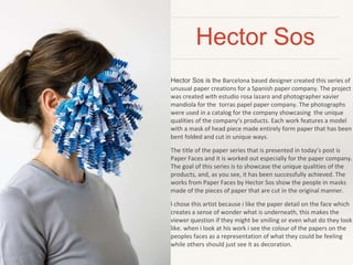
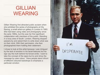
This document discusses an investigation into how color is associated with emotions like happy and angry in photographs. The author will examine works by Hector Sos, Gillian Wearing, and Kyungwoo Chun to analyze how these artists use color in their photos to express emotions. Hector Sos creates paper masks for portraits that use color and paper details to suggest feelings. Gillian Wearing photographs people holding signs with their inner thoughts, using lack of facial expression with messages. Kyungwoo Chun uses blurred portraits and bold colors that the author thinks could emphasize emotions when combined with colored backdrops.
'Now I see what you mean: an experiment in photography-as-research' Kevin McLean
Presentation given at ESOMAR Congress, Dublin, September 27-30, 2015. Written and presented by Kevin McLean and Dr Nick Coates, with Fiona Hall of Akzo Nobel.
1. BY LAUREN SHEEHAN
Photography
Coursework
Assessment
How people associate colour with the
emotions of happy and angry within
the photographic image?
2. What do I want to investigate?
In this essay my intentions are to explore the emotions, happy and angry within
the photographic image. I will be examining how some people link colour to the
expression of happiness and anger by exploring their use within photography as
an art medium.
Colours can make us feel happy or angry… they can make us feel hungry or
relaxed, as a designer for example it’s important to understand the psychological
effects colours might have on an average person, or your client’s target
audience. Colour plays an important role in brand identity — it draws consumers
to products, stirs emotions and has a huge impact on brand recognition. Through
this essay I will be taking a closer look at how colour impacts our emotions and
behaviors by comparing and contrasting the work of Hector Sos, Daniele Buetti
and Arnolf Rainer.
3. Hector Sos
Hector Sos is the Barcelona based designer created this series of
unusual paper creations for a Spanish paper company. The project
was created with estudio rosa lazaro and photographer xavier
mandiola for the torras papel paper company. The photographs
were used in a catalog for the company showcasing the unique
qualities of the company’s products. Each work features a model
with a mask of head piece made entirely form paper that has been
bent folded and cut in unique ways.
The title of the paper series that is presented in today’s post is
Paper Faces and it is worked out especially for the paper company.
The goal of this series is to showcase the unique qualities of the
products, and, as you see, it has been successfully achieved. The
works from Paper Faces by Hector Sos show the people in masks
made of the pieces of paper that are cut in the original manner.
I chose this artist because i like the paper detail on the face which
creates a sense of wonder what is underneath, this makes the
viewer question if they might be smiling or even what do they look
like. when i look at his work i see the colour of the papers on the
peoples faces as a representation of what they could be feeling
while others should just see it as decoration.
4. GILLIAN
WEARING
Gillian Wearing first attracted public acclaim when
she exhibited this series of photographs at City
Racing, a small artist-run gallery in London in 1993.
She had been using video and photography since
the early 1990s, but this was her first significant
collaboration with members of the public. Standing
in a busy area of South London, Wearing stopped
passers-by and asked them to write down what was
on their mind. With their permission, she then
photographed them holding their statement.
I chose to look at this artist because i was intrigued
by the lack of emotion in his facial features but his
sign say the truth behind his forced smile. I want to
take the concept of the signs but try and show the
message by uses colour. Have people stand infront
of different coloured backdrops to emphasis a
particular emotion
5. Kyungwoo Chun
❖ Kyungwoo Chun was born (1969) in Seoul. After
his first study of Photography in Korea (1992) he
moved to Germany, where he studied and started
to work on his art projects in Europe. He has
become known for his poetically blurred
photographic portraits in a very unconventional
way of dealing with time and space.
❖ I chose to look at Chun because of his strong use
of bold colour in his photograph, which appealed to
me. When I look at his work I was thinking of using
his blur technique by having my subjects shake
there heads and have the coloured backdrop or
clothing show what they might be feeling.