Digital Graphics
Emily Monsey
Raster Graphics
Raster graphics are bitmaps which are made up
of millions of tiny pixels. These pixels record
the colour information of that area of the
image.
When resizing the image, this can cause
distortion of the pixels. For example, when
enlarging the image the image becomes
blurred and of a lower quality. This is because
bitmap images have a fixed resolution.
Vector Graphics
Vector graphics are made up of vectors (or
paths/strokes). Vectors have start and end points
which have curves, points and angles between
them. The path can become a line, square, curve
or triangle shape. Vectors have no loss in
definition which means they can be enlarged or
minimised without becoming pixelated which
makes this a great graphic to use for companies.
For example, it can be small to fit on a business
card or enlarged for a billboard and not loose
definition.
JPEG
Stands For Joint photographic experts group
Used For Photographs and web formats. For
example, photographs on Facebook are
saved as a JPEG.
Advantage A JPEG is a small sized format which
means it can be used on most technology
e.g phones, computers etc. This can be an
advantage due to the fact that images can
be saved on to any technology.
Disadvantage It looses quality when its been edited
multiple times due to the compression
and recompression each time its edited.
For example, if the image is opened and
closed many times the image looses
quality and wont be as sharp as it was
originally.
TIFF
Stands For Tagged Image file format
Used For Desktop publishing and popular with
graphic designers.
Advantage It allows you to save multiple documents
on to a single TIFF file. It also doesn’t loose
quality and stays sharp and of a high
quality after being compressed as a TIFF
file has the option of Lossless
compression.
Disadvantage Due to being very high quality this causes
the file to be very big and takes up a lot of
storage.
PSD
Stands For Photoshop Document
Used For Image manipulation and used on images
for the front cover of magazines.
Advantage It can save multiple layers and page
formatting information, it also supports
transparency. It doesn’t use compression
meaning the image doesn’t loose quality
and stays sharp.
Disadvantage As the file is a Photoshop document, the
image can only be opened in Photoshop.
For example, if a PSD image is sent to
somebody who doesn’t have Photoshop
they will be unable to view the image.
AI
Stands For Adobe illustrator art
Used For Used to create logos and graphics to
represent companies
Advantage It can be scaled big and small as vectors
have no loss in definition. Also unlike some
other file types when the image is
magnified it doesn’t become blurry or
pixelated.
Disadvantage It is a limited software meaning that you
would have to have adobe illustrator to
open any image from it. So if the image is
sent to anyone who doesn’t have adobe
illustrator they would be unable to open
the image.
3DS
Stands For 3D Studio
Used For 3D Studio is used for modelling animation
and rendering. It is also used to create 3D
characters, environments, animations and
gaming.
Advantage 3D Studio is a flexible programme which
allows you to save files on different
software programmes and is a powerful
software to have.
Disadvantage 3D Studio takes up a lot of room as it’s a
huge file and it can be found really difficult
to use and takes a lot of practise to master
the programme.
Rotoscope
Shape task
Logo Creation
Text task
T-shirt Design
Favourite designs
Original mind map
Final ideas mind map
Final idea- use a quote to show an iconic image:
“Give a girl the right shoes and she can
conquer the world”
“Being normal is
boring!”
“I don’t mind living in a
man’s world, as long as I get
“Imperfection is beauty,
Madness is genius,
and it’s better to be absolutely
ridiculous than absolutely boring”
“A wise girl kisses but doesn’t love,
listens but doesn’t believe, and
leaves before she is left”
“We should all start to live
“Millions
of people
live their
entire
lives
without
finding
themselve
s. But it is
Proposal
Dimensions
2400 by 3200 pixels
Content
The t-shirt I am going to design is going to have an image of Marilyn Monroe created out
of her most famous quotes. I am going to ensure that the image I use is iconic so it can
easily be recognised as Marilyn. The quotes are going to be done in a girly/feminine font
to match her character and are going to out line her face and shade in her key features. I
will use my chosen image of her and then write the quotes in different layers on
Photoshop, I will then have to warp each layer of writing to shape her face.
Export Format
PNG
Advantages; Compatible with red bubble, can save transparency & lowered opacity.
Disadvantages; larger file size than similar formats such as JPEG.
Proposal
Deadline
1st October
Monday Tuesday Wednesday
MONDAY-Planning my
t-shirt making sure it’s
ready for next day
TUESDAY-Starting to
design my idea on
Photoshop, get enough
done so I can finish it
for Wednesday.
WEDNESDAY-To finish
off my final idea for my
t-shirt
Schedule
Audience
The target audience for my product is going to be mainly aimed at females as
it is going to include lots of quotes, some including quotes that girls would
understand more, but could be classed as unisex. The age range will probably
start from 16+ as there isn't any thing that would classify it to a particular age
but people of a younger age may not know who Marilyn Monroe is and also
might not access the site redbubble.
Digital Flat plan
“Imperfection is
beauty,
Madness is
genius,
And it’s better to
be absolutely
ridiculous than
absolutely
boring”
Marilyn
Monroe’s
face will be
made up of
her own
quotes.
I will use several
different fonts to
add contrast and
to help shape her
facial features.
I will use this
iconic image so
that it will be
easily recognised
as Marilyn
Monroe.
Peer Evaluation
What are the strengths of the final image?
• They both have a lot of detail within the images and used different
skills in their final image. It has had a lot of thought put into them
and really good final design. I like the look of both the designs and
they are both excellent. I like how the quotes have been warped
around the face of Marilyn Monroe picture as it is something
different and has worked really well.
What could be developed if the image was repeated?
Try to use different skills, e.g. rotoscoping on the Marilyn Monroe
design to present the image in a different way but overall both really
good designs.
Peer Evaluation
What are the strengths of the final image?
• The Marilyn Monroe image is an excellent piece of work, as the quotes fit perfectly to the
structure of the facial features, I like how the quotes are all her own. This has worked really
well and used a great skill to do.
• I like the other image with the Disney quotes as Disney is a personal favourite and can go to a
wider target audience as it has different characters and quotes and a lot of fonts are used.
What could be developed if the image was
repeated?
Try not to let the words over lap as it makes it difficult to read
Use colour or different skills to make it more brightly interesting
The other image, take more time with the characters as they are simple
Peer Evaluation
What are the strengths of the final image?
Marilyn monroe
• I really like this image and how the face is made out of quotes. Its really got the actual shape of her face and you can tell
who it is which I think is really good. The font for the quotes works really well.
What could be developed if the image was
repeated?
• I really like the image how it is so I wouldn’t change anything
T-shirt evaluation
Does your final product reflect your
original intentions?
All my planning has included Marilyn Monroe as I knew I wanted to
use her face on my design as I wanted to use a celebrity and felt that
her photos were the most iconic and could easily be recognised. Also
from doing research on redbubble.com I had seen that many of the
designs included celebrities, this showed interest in this area so I
thought it may be a good idea to include a celebrity in my design. I
also knew from the research that people had used lots of different
skills and tools to create their design and my favourite way of
creating someone's face was how people had used words to create
their face shape and features. My digital flat plan didn’t reflect my
design exactly as I didn’t have the time to create what I wanted my
final design to look like, therefore I simply used an image of Marilyn
Monroe from the internet and put one of her quotes of the top of the
image. I used the same image for the digital flat plan as I did for my
final design and also used that quote along with many others I had
found.
“Imperfection is
beauty,
Madness is
genius,
And it’s better to
be absolutely
ridiculous than
absolutely boring”
Digital Flat plan
Final design
Is your product suitable for your
audience?
My target audience was people of 16 years and upwards, mainly based at females
but would be classed as unisex. I think that my product is definitely suitable for
the chosen audience as I stuck to my initial idea and made sure that It fit in with
the target audience I had selected. I had originally said in my proposal that the
design was going to be unisex but as I started to create my design I realised that
many of the quotes that I was going to be using were aimed at females and that
they were the target audience of her quotes. Therefore the design may be classed
as more of a female based product. I had also said in my proposal that I wanted
my design to be for 16 year olds and upwards as I felt that from this age you
understand who Marilyn Monroe is and also are more likely to access the site at
this age. I feel that I have stuck to this age range as I didn’t include any quotes
that a person of this age wouldn’t understand and made sure I used a suitable
image.
Audience
The target audience for my product is going to be mainly aimed at females as it is going to
include lots of quotes, some including quotes that girls would understand more, but could be
classed as unisex. The age range will probably start from 16+ as there isn't any thing that
would classify it to a particular age but people of a younger age may not know who Marilyn
Monroe is and also might not access the site redbubble.
What do you like/dislike about the
techniques you have used?
I really like the idea of shaping the text to fit her face and to show her facial
features, I had to rasterize each part of the text and then warp them to shape the
face. I knew this would take a lot of time but felt that it would pay off and would
end up looking very professional. However this technique proved to be very
difficult as I had to shape each individual bit of text to shape her face. This
ended up being hard to curve the text whilst still understanding what it actually
says, resulting in some of the text on my final design being extremely hard to
read. This was very hard to shape the smaller features such as her eyes rather
than the easier parts like her actual face shape.
This area is easier to read as it
was just the curve of her face
so I was able to fit a full
sentence in.
Can’t really read writing around the eyes as I
had to layer the text to make the eyes stand
out.
What do you like/dislike about how
your final product looks?
I was quite happy with how my design turned out in the end but still
felt that it was quite uneven around the edges of the face and some
of the smaller features. This was due to the fact that I had to warp
each piece of text which left some parts of the text not as rounded as
I would of liked. Some of the text also became very hard to read due
to the warping of the quotes this occurred especially on the eyes and
lips as they were smaller areas and I needed to show detail in them,
therefore I needed to squash quite a lot of text in to one small area.
Apart from some of the faults I have mentioned overall I was happy
with how It looked as you can tell exactly who it is and some of the
quotes can be read easily. I would of liked to maybe of changed the
colours of the texts to make it stand out more and look different
from some of the designs I had found on red bubble.
Slight fault here as
the text couldn’t be
warped in to more of
a rounded shape.
Really clustered around the eyes
as I needed them to be defined
Why did you include the content you
used?
I used the image of Marilyn Monroe as I found that it was very
iconic and as I wanted to create her face out of text I felt that I
needed to use an image that many people would recognise. I decided
that all the fonts that I would use should be girly and feminine to
represent her character, I also thought that using these fonts
matched the quotes very well. I varied the size of the fonts to show
the facial features better and to highlight the key features of her face,
I thought the difference in the fonts and the size of the text also
contrasted well and helped to develop her face. I kept the text black
as I had originally thought it may look too busy and cramped if I
used bright colour as well however I now think that maybe adding
some colour in certain areas of her face may have worked effectively.
“Give a girl the right shoes and she can
conquer the world”
“A wise girl kisses but doesn’t
love, listens but doesn’t
believe, and leaves before she
is left”
“Millions of
people live their
entire lives
without finding
These types of images that I found on
red bubble inspired the design I created
as I found them very interesting and
different from a lot of other designs I
had seen.
I felt that all of these fonts
represented Marilyn
Monroe’s feminine character
very well. Instead of doing
quite a harsh bold font I felt
that these would match the
quotes also.
Final idea- use a quote to show an iconic image:
“Give a girl the right shoes and she can
conquer the world”
“Being normal is
boring!”
“I don’t mind living in a
man’s world, as long as I get
“Imperfection is beauty,
Madness is genius,
and it’s better to be absolutely
ridiculous than absolutely boring”
“A wise girl kisses but doesn’t love,
listens but doesn’t believe, and
leaves before she is left”
“We should all start to live
“Millions
of people
live their
entire
lives
without
finding
themselve
s. But it is
What style have you employed in your
products?
My influences for the design were mainly from looking at other peoples designs
on red bubble as I found a lot of them very interesting and unique. I have not
really seen many designs like this before and felt that it was a really good and
skilled way of changing a celebrities photo in to something really different. The
visual style of my work is text based, I created the whole image out of her
different quotes and warped them to shape her face and her features. I chose not
to use rotoscoping or any other tool as I felt that this particular design had to be
different and I had already seen lots of designs that had used rotoscoping. I also
think that this design works best with text rather than any other tool as I think it
may have lost some of it’s individuality. This product does exist as I had got the
idea from other peoples existing products but I thought that I would change
mine a little by using a different style of text. I used a text that I felt reflected her
personality as I used a really feminine font and made sure that it wasn’t really
bold or large font. The font used in the other designs I saw were all the same
and were really bold and harsh, I felt that I should do mine differently and less
harsh on her face. I chose to do a text based product as I think it is very
interesting and a lot more detailed than just an image, I think It also works
effectively and enables you to show character through the font and writing.
I really wanted to
create a design similar
to these after doing
research on red
bubble. I found these
designs really
interesting as it was
only text that created
the face. I felt that
these ones were more
defined than mine as
they chose to use
larger font and a more
fuller font, I decided
to make mine with a
much smaller font to
make a more feminine
look to her face and
not so harsh.
What were the strengths and weaknesses
of the pre-production and planning
The research before planning was really useful to me as it helped me
to generate some new and unique ideas, I felt that it allowed me to
use some of the different aspects of other peoples work and make it
my own. The research also gave me a chance to see what designs
were popular so I could do maybe a similar design or for example; if
it was a line from a programme I could of chosen to do another
memorable quote from that same programme. The weaknesses from
the research would be that after seeing other peoples work it showed
a lot of designs that had already been done. The planning helped to
develop my idea and also to improve on it and make it better and
more creative. I felt that the mind maps were a good idea as it
allowed you to branch out from one idea to several other ideas. For
example; I originally knew that I wanted to use a celebrity in my
design and the mind maps and planning helped me to generate
more ideas and then the research helped me choose how I was going
to include text.
At first I created a mind map
of all the possible idea that I
had thought of and that I
could maybe include
somewhere in my final
design...
…I then created my second
mind map all based on my final
idea after doing some research
on red bubble.
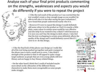
Analyse each of your final print products commenting
on the strengths, weaknesses and aspects you would
do differently if you were to repeat the project
+ I like the end result of this product as I was worried that the
text wouldn’t create a clear enough image so you wouldn’t be
able to tell who it is but after seeing the peer evaluations I
have found that people understood exactly who it is.
- However if I were to repeat this design I would definitely
add some colour in to the product as I feel it is maybe a little
plain, some colour in certain areas would be very effective
and also help if you wanted to buy a black T-shirt because as
it is now you can’t buy the design in dark colours. I also feel
that the text overlapping in certain areas definitely affects the
quality of the deisgn and I would defiately correct this if I
were to re- do this design.
+ I like the final look of this phone case design as I really like
all of the text being mashed up together and quite cramped as
the phone case is such a small area to cover. I also think I
strength of the product is that it will appeal to quite a large
target audience as people that are even young adults still love
Disney and are happy to buy Disney related things.
- On the other hand I think that I could of included maybe
more detail on the silhouettes of the different Disney
characters to make them more recognisable as some people
make struggle.
+ I feel that the strength for this product would be
the font I chose and also the image clipping behind
some of the words. I also think that the font relates
quite well to the lyrics and also to the band as I
tried to use a similar font to what ‘imagine dragons’
use in their posters and other designs. The clipping
mask of the images also worked quite well as I tried
to connect the word to the image.
- The weakness of this design would be that people
who don’t know the band wouldn’t know what
these words man or where I have got them from. I
also think that the cross on the word ‘saints’ maybe
stands out too much and I could of put a different
effect on it to make it less bold around the outline
as I meant it to be as the letter ‘T’.
Peer Feedback
The overall feedback I received from people was mainly positive, I
was informed that my design was “an excellent piece of work, as the
quotes fit perfectly to the structure of the facial features, I like how
the quotes are all her own”. Some of the criticism of my design was
that I should “Try not to let the words over lap as it makes it
difficult to read”.
I don’t disagree with the feedback as I definitely agree with the
criticism that I had as it can be very difficult to read some of the text.
It is found especially difficult in some of the smaller areas eg. Lips,
eyes. I also agree that it did turn out quite well and a lot better than I
had first expected, mainly because of the key features being
highlighted which unfortunately resulted in the text being cramped.
New T-Shirt Design

Digital graphics

  • 1.
  • 2.
    Raster Graphics Raster graphicsare bitmaps which are made up of millions of tiny pixels. These pixels record the colour information of that area of the image. When resizing the image, this can cause distortion of the pixels. For example, when enlarging the image the image becomes blurred and of a lower quality. This is because bitmap images have a fixed resolution.
  • 3.
    Vector Graphics Vector graphicsare made up of vectors (or paths/strokes). Vectors have start and end points which have curves, points and angles between them. The path can become a line, square, curve or triangle shape. Vectors have no loss in definition which means they can be enlarged or minimised without becoming pixelated which makes this a great graphic to use for companies. For example, it can be small to fit on a business card or enlarged for a billboard and not loose definition.
  • 4.
    JPEG Stands For Jointphotographic experts group Used For Photographs and web formats. For example, photographs on Facebook are saved as a JPEG. Advantage A JPEG is a small sized format which means it can be used on most technology e.g phones, computers etc. This can be an advantage due to the fact that images can be saved on to any technology. Disadvantage It looses quality when its been edited multiple times due to the compression and recompression each time its edited. For example, if the image is opened and closed many times the image looses quality and wont be as sharp as it was originally.
  • 5.
    TIFF Stands For TaggedImage file format Used For Desktop publishing and popular with graphic designers. Advantage It allows you to save multiple documents on to a single TIFF file. It also doesn’t loose quality and stays sharp and of a high quality after being compressed as a TIFF file has the option of Lossless compression. Disadvantage Due to being very high quality this causes the file to be very big and takes up a lot of storage.
  • 6.
    PSD Stands For PhotoshopDocument Used For Image manipulation and used on images for the front cover of magazines. Advantage It can save multiple layers and page formatting information, it also supports transparency. It doesn’t use compression meaning the image doesn’t loose quality and stays sharp. Disadvantage As the file is a Photoshop document, the image can only be opened in Photoshop. For example, if a PSD image is sent to somebody who doesn’t have Photoshop they will be unable to view the image.
  • 7.
    AI Stands For Adobeillustrator art Used For Used to create logos and graphics to represent companies Advantage It can be scaled big and small as vectors have no loss in definition. Also unlike some other file types when the image is magnified it doesn’t become blurry or pixelated. Disadvantage It is a limited software meaning that you would have to have adobe illustrator to open any image from it. So if the image is sent to anyone who doesn’t have adobe illustrator they would be unable to open the image.
  • 8.
    3DS Stands For 3DStudio Used For 3D Studio is used for modelling animation and rendering. It is also used to create 3D characters, environments, animations and gaming. Advantage 3D Studio is a flexible programme which allows you to save files on different software programmes and is a powerful software to have. Disadvantage 3D Studio takes up a lot of room as it’s a huge file and it can be found really difficult to use and takes a lot of practise to master the programme.
  • 9.
  • 11.
  • 12.
  • 13.
  • 14.
  • 15.
  • 16.
  • 17.
  • 18.
    Final idea- usea quote to show an iconic image: “Give a girl the right shoes and she can conquer the world” “Being normal is boring!” “I don’t mind living in a man’s world, as long as I get “Imperfection is beauty, Madness is genius, and it’s better to be absolutely ridiculous than absolutely boring” “A wise girl kisses but doesn’t love, listens but doesn’t believe, and leaves before she is left” “We should all start to live “Millions of people live their entire lives without finding themselve s. But it is
  • 19.
    Proposal Dimensions 2400 by 3200pixels Content The t-shirt I am going to design is going to have an image of Marilyn Monroe created out of her most famous quotes. I am going to ensure that the image I use is iconic so it can easily be recognised as Marilyn. The quotes are going to be done in a girly/feminine font to match her character and are going to out line her face and shade in her key features. I will use my chosen image of her and then write the quotes in different layers on Photoshop, I will then have to warp each layer of writing to shape her face. Export Format PNG Advantages; Compatible with red bubble, can save transparency & lowered opacity. Disadvantages; larger file size than similar formats such as JPEG.
  • 20.
    Proposal Deadline 1st October Monday TuesdayWednesday MONDAY-Planning my t-shirt making sure it’s ready for next day TUESDAY-Starting to design my idea on Photoshop, get enough done so I can finish it for Wednesday. WEDNESDAY-To finish off my final idea for my t-shirt Schedule Audience The target audience for my product is going to be mainly aimed at females as it is going to include lots of quotes, some including quotes that girls would understand more, but could be classed as unisex. The age range will probably start from 16+ as there isn't any thing that would classify it to a particular age but people of a younger age may not know who Marilyn Monroe is and also might not access the site redbubble.
  • 21.
    Digital Flat plan “Imperfectionis beauty, Madness is genius, And it’s better to be absolutely ridiculous than absolutely boring” Marilyn Monroe’s face will be made up of her own quotes. I will use several different fonts to add contrast and to help shape her facial features. I will use this iconic image so that it will be easily recognised as Marilyn Monroe.
  • 22.
    Peer Evaluation What arethe strengths of the final image? • They both have a lot of detail within the images and used different skills in their final image. It has had a lot of thought put into them and really good final design. I like the look of both the designs and they are both excellent. I like how the quotes have been warped around the face of Marilyn Monroe picture as it is something different and has worked really well. What could be developed if the image was repeated? Try to use different skills, e.g. rotoscoping on the Marilyn Monroe design to present the image in a different way but overall both really good designs.
  • 23.
    Peer Evaluation What arethe strengths of the final image? • The Marilyn Monroe image is an excellent piece of work, as the quotes fit perfectly to the structure of the facial features, I like how the quotes are all her own. This has worked really well and used a great skill to do. • I like the other image with the Disney quotes as Disney is a personal favourite and can go to a wider target audience as it has different characters and quotes and a lot of fonts are used. What could be developed if the image was repeated? Try not to let the words over lap as it makes it difficult to read Use colour or different skills to make it more brightly interesting The other image, take more time with the characters as they are simple
  • 24.
    Peer Evaluation What arethe strengths of the final image? Marilyn monroe • I really like this image and how the face is made out of quotes. Its really got the actual shape of her face and you can tell who it is which I think is really good. The font for the quotes works really well. What could be developed if the image was repeated? • I really like the image how it is so I wouldn’t change anything
  • 25.
  • 26.
    Does your finalproduct reflect your original intentions? All my planning has included Marilyn Monroe as I knew I wanted to use her face on my design as I wanted to use a celebrity and felt that her photos were the most iconic and could easily be recognised. Also from doing research on redbubble.com I had seen that many of the designs included celebrities, this showed interest in this area so I thought it may be a good idea to include a celebrity in my design. I also knew from the research that people had used lots of different skills and tools to create their design and my favourite way of creating someone's face was how people had used words to create their face shape and features. My digital flat plan didn’t reflect my design exactly as I didn’t have the time to create what I wanted my final design to look like, therefore I simply used an image of Marilyn Monroe from the internet and put one of her quotes of the top of the image. I used the same image for the digital flat plan as I did for my final design and also used that quote along with many others I had found.
  • 27.
    “Imperfection is beauty, Madness is genius, Andit’s better to be absolutely ridiculous than absolutely boring” Digital Flat plan Final design
  • 28.
    Is your productsuitable for your audience? My target audience was people of 16 years and upwards, mainly based at females but would be classed as unisex. I think that my product is definitely suitable for the chosen audience as I stuck to my initial idea and made sure that It fit in with the target audience I had selected. I had originally said in my proposal that the design was going to be unisex but as I started to create my design I realised that many of the quotes that I was going to be using were aimed at females and that they were the target audience of her quotes. Therefore the design may be classed as more of a female based product. I had also said in my proposal that I wanted my design to be for 16 year olds and upwards as I felt that from this age you understand who Marilyn Monroe is and also are more likely to access the site at this age. I feel that I have stuck to this age range as I didn’t include any quotes that a person of this age wouldn’t understand and made sure I used a suitable image. Audience The target audience for my product is going to be mainly aimed at females as it is going to include lots of quotes, some including quotes that girls would understand more, but could be classed as unisex. The age range will probably start from 16+ as there isn't any thing that would classify it to a particular age but people of a younger age may not know who Marilyn Monroe is and also might not access the site redbubble.
  • 29.
    What do youlike/dislike about the techniques you have used? I really like the idea of shaping the text to fit her face and to show her facial features, I had to rasterize each part of the text and then warp them to shape the face. I knew this would take a lot of time but felt that it would pay off and would end up looking very professional. However this technique proved to be very difficult as I had to shape each individual bit of text to shape her face. This ended up being hard to curve the text whilst still understanding what it actually says, resulting in some of the text on my final design being extremely hard to read. This was very hard to shape the smaller features such as her eyes rather than the easier parts like her actual face shape. This area is easier to read as it was just the curve of her face so I was able to fit a full sentence in. Can’t really read writing around the eyes as I had to layer the text to make the eyes stand out.
  • 30.
    What do youlike/dislike about how your final product looks? I was quite happy with how my design turned out in the end but still felt that it was quite uneven around the edges of the face and some of the smaller features. This was due to the fact that I had to warp each piece of text which left some parts of the text not as rounded as I would of liked. Some of the text also became very hard to read due to the warping of the quotes this occurred especially on the eyes and lips as they were smaller areas and I needed to show detail in them, therefore I needed to squash quite a lot of text in to one small area. Apart from some of the faults I have mentioned overall I was happy with how It looked as you can tell exactly who it is and some of the quotes can be read easily. I would of liked to maybe of changed the colours of the texts to make it stand out more and look different from some of the designs I had found on red bubble.
  • 31.
    Slight fault hereas the text couldn’t be warped in to more of a rounded shape. Really clustered around the eyes as I needed them to be defined
  • 32.
    Why did youinclude the content you used? I used the image of Marilyn Monroe as I found that it was very iconic and as I wanted to create her face out of text I felt that I needed to use an image that many people would recognise. I decided that all the fonts that I would use should be girly and feminine to represent her character, I also thought that using these fonts matched the quotes very well. I varied the size of the fonts to show the facial features better and to highlight the key features of her face, I thought the difference in the fonts and the size of the text also contrasted well and helped to develop her face. I kept the text black as I had originally thought it may look too busy and cramped if I used bright colour as well however I now think that maybe adding some colour in certain areas of her face may have worked effectively.
  • 33.
    “Give a girlthe right shoes and she can conquer the world” “A wise girl kisses but doesn’t love, listens but doesn’t believe, and leaves before she is left” “Millions of people live their entire lives without finding These types of images that I found on red bubble inspired the design I created as I found them very interesting and different from a lot of other designs I had seen. I felt that all of these fonts represented Marilyn Monroe’s feminine character very well. Instead of doing quite a harsh bold font I felt that these would match the quotes also.
  • 34.
    Final idea- usea quote to show an iconic image: “Give a girl the right shoes and she can conquer the world” “Being normal is boring!” “I don’t mind living in a man’s world, as long as I get “Imperfection is beauty, Madness is genius, and it’s better to be absolutely ridiculous than absolutely boring” “A wise girl kisses but doesn’t love, listens but doesn’t believe, and leaves before she is left” “We should all start to live “Millions of people live their entire lives without finding themselve s. But it is
  • 35.
    What style haveyou employed in your products? My influences for the design were mainly from looking at other peoples designs on red bubble as I found a lot of them very interesting and unique. I have not really seen many designs like this before and felt that it was a really good and skilled way of changing a celebrities photo in to something really different. The visual style of my work is text based, I created the whole image out of her different quotes and warped them to shape her face and her features. I chose not to use rotoscoping or any other tool as I felt that this particular design had to be different and I had already seen lots of designs that had used rotoscoping. I also think that this design works best with text rather than any other tool as I think it may have lost some of it’s individuality. This product does exist as I had got the idea from other peoples existing products but I thought that I would change mine a little by using a different style of text. I used a text that I felt reflected her personality as I used a really feminine font and made sure that it wasn’t really bold or large font. The font used in the other designs I saw were all the same and were really bold and harsh, I felt that I should do mine differently and less harsh on her face. I chose to do a text based product as I think it is very interesting and a lot more detailed than just an image, I think It also works effectively and enables you to show character through the font and writing.
  • 36.
    I really wantedto create a design similar to these after doing research on red bubble. I found these designs really interesting as it was only text that created the face. I felt that these ones were more defined than mine as they chose to use larger font and a more fuller font, I decided to make mine with a much smaller font to make a more feminine look to her face and not so harsh.
  • 37.
    What were thestrengths and weaknesses of the pre-production and planning The research before planning was really useful to me as it helped me to generate some new and unique ideas, I felt that it allowed me to use some of the different aspects of other peoples work and make it my own. The research also gave me a chance to see what designs were popular so I could do maybe a similar design or for example; if it was a line from a programme I could of chosen to do another memorable quote from that same programme. The weaknesses from the research would be that after seeing other peoples work it showed a lot of designs that had already been done. The planning helped to develop my idea and also to improve on it and make it better and more creative. I felt that the mind maps were a good idea as it allowed you to branch out from one idea to several other ideas. For example; I originally knew that I wanted to use a celebrity in my design and the mind maps and planning helped me to generate more ideas and then the research helped me choose how I was going to include text.
  • 38.
    At first Icreated a mind map of all the possible idea that I had thought of and that I could maybe include somewhere in my final design... …I then created my second mind map all based on my final idea after doing some research on red bubble.
  • 39.
    Analyse each ofyour final print products commenting on the strengths, weaknesses and aspects you would do differently if you were to repeat the project + I like the end result of this product as I was worried that the text wouldn’t create a clear enough image so you wouldn’t be able to tell who it is but after seeing the peer evaluations I have found that people understood exactly who it is. - However if I were to repeat this design I would definitely add some colour in to the product as I feel it is maybe a little plain, some colour in certain areas would be very effective and also help if you wanted to buy a black T-shirt because as it is now you can’t buy the design in dark colours. I also feel that the text overlapping in certain areas definitely affects the quality of the deisgn and I would defiately correct this if I were to re- do this design. + I like the final look of this phone case design as I really like all of the text being mashed up together and quite cramped as the phone case is such a small area to cover. I also think I strength of the product is that it will appeal to quite a large target audience as people that are even young adults still love Disney and are happy to buy Disney related things. - On the other hand I think that I could of included maybe more detail on the silhouettes of the different Disney characters to make them more recognisable as some people make struggle.
  • 40.
    + I feelthat the strength for this product would be the font I chose and also the image clipping behind some of the words. I also think that the font relates quite well to the lyrics and also to the band as I tried to use a similar font to what ‘imagine dragons’ use in their posters and other designs. The clipping mask of the images also worked quite well as I tried to connect the word to the image. - The weakness of this design would be that people who don’t know the band wouldn’t know what these words man or where I have got them from. I also think that the cross on the word ‘saints’ maybe stands out too much and I could of put a different effect on it to make it less bold around the outline as I meant it to be as the letter ‘T’.
  • 41.
    Peer Feedback The overallfeedback I received from people was mainly positive, I was informed that my design was “an excellent piece of work, as the quotes fit perfectly to the structure of the facial features, I like how the quotes are all her own”. Some of the criticism of my design was that I should “Try not to let the words over lap as it makes it difficult to read”. I don’t disagree with the feedback as I definitely agree with the criticism that I had as it can be very difficult to read some of the text. It is found especially difficult in some of the smaller areas eg. Lips, eyes. I also agree that it did turn out quite well and a lot better than I had first expected, mainly because of the key features being highlighted which unfortunately resulted in the text being cramped.
  • 42.