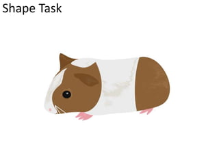
Digital Graphic Narrative 
Development 
Amy Addison
Shape Task
Shape Task
Evaluation 
What did you like about your image? 
The thing I liked most about my image of the puppy is the background including the sky, grass and clouds as well as the shading (stroke) 
used to create a sense of lighting. 
I prefer the clouds in my background as I used a tool called drop shadow which essentially creates shadows behind the cloud making them 
appear as 3D instead of being a 2D image and looking as if they are coming off the paper/screen. 
I quite like the way I used the stroke tool which creates two or more different colours within a shape. I used this subtly on the dog with two 
colours to create shading to give an idea where the light source is coming from. 
I think my skills have improved a lot on the image of the guinea pig using the shapes. It’s a lot better than the puppy as this is a full body 
shot and includes all the detail. I quite like how the two different body colours are blended in together/don’t have any gaps and it looks as 
realistic as a cartoon animal can get. I quite like how well the colour range works to create detail making the animal look as if it has fur. 
What would you improve if you did it again? 
For the image of the puppy I would improve the outline of the animal due to it only being a medium close up image therefore having no 
legs, paws or a tail. Although the animal looks like a dog it would look better if the whole subject was there creating a better overall picture. 
I would also try to improve on the way I used the stroke tool to create the shading on the dog. I quite liked the way I did it but if I were to do 
it again it could be in to a lot more depth and detail creating a more realistic look. 
The detail on the face, mainly the eyes could have had a lot more detail added to them. This would include some lines to create definition. 
If I were to re do the guinea pig image I would change the ears especially the one towards the top of the image simply because it looks out 
of place, as if it shouldn’t be there. I would change the way it’s feet/claws are placed as they look out of place also. I would like to improve 
on the colour overlay that I used as this makes it all one colour and next time us the gradient overlay which blends two colours as one so a 
light brown to a darker brown vice versa to create a more realistic look.
Rotoscope
Evaluation 
What did you like about your image? 
I slowly started using the magnetic lasso tool on the image of the love bird. I used this on the beak as it was an awkward 
shape therefore this tool made it a lot easier to complete. I quite like how easy it goes around shapes and is a fast method. 
What would you improve if you did it again? 
As much as I think this is a really quick method to complete work faster I find it quite difficult to use. Instead of creating an 
animal with different shapes, warping them together and making sure they all match, this magnetic lasso tool is 
complicated. I find that going around different areas of an animal and trying to get them all to fit together and blend 
without creating any gaps and obvious use of this tool is quite challenging. 
I find that when using the magnetic lasso tool it creates sharp edges which creates a harsh look and doesn’t blend in well 
where as the shapes are smooth and create a kind look blending in nicely with the other shape, this can be seen in the 
image of the love bird.
Text Based
Text Based
Evaluation 
What did you like about your image? 
I like how simple it is to create some complex pieces of work. An example of this is crating the name with a picture inside it. It looks 
confusing but it’s relatively simple to do. There are a lot of different settings/tools that are used when creating these different types of text 
but when knowing where they are and what they do helps create the style you want quicker. 
I like how the character tool works with how spacious or how cramped the text can go. This helps a lot instead of messing about with 
different fonts and trying to get the correct size. 
The things I liked most about exploring through these different tools were the layers and the clipping mask. 
I found the layers quite interesting as you can do so much to a piece of text to make it interesting by simply looking through the options 
available on the layer styles. 
I also found the clipping mask fascinating as I didn’t know it was so simple to complete and it looks good. 
What would you improve if you did it again? 
I think the only thing I would improve on would be to take more time messing around with settings to find the certain text I’m wanting to 
use, an example would be the layer styles as there are so many different things we can do to change the overall text. 
I would also look for a more visual image to use when creating a clipping mask as the one I used didn’t really fill up a lot of the text.
Comic Book
Comic Book
Comic Book
Comic Book
Evaluation 
What did you like about your image? 
After the first image I realised it was quite an easy/simple task to do. I create four different images but In my opinion the first 
image of Cara Delevigne the model looks better than the rest. I think this is due to the fact that this image is a lot lighter than 
the rest therefore being able to see more definition. I also changed around the cut-out in the filter gallery more that I had with 
the rest of the images. As this was my first image I didn’t want to go too abstract with this so it is very in the middle, quite 
comic yet at the same time very realistic. This is a god mixture. The last image I did of the band ‘Catfish and the bottlemen’ also 
went really well and as I’ve had a look around at the different styles I could use e.g. in the filter gallery and the layer pallet I 
decided to make the picture look very unrealistic and abstract. I think it gives it an eyrie look yet at the same time quite 
extraordinary. 
What would you improve if you did it again? 
The only thing I wasn’t too keen on when dong this task was the threshold. I understood that it made the image have more or 
less shadows, creating a darker or lighter image but I think the image looked just fine without this. I think the filter gallery using 
the cut-out and the different styles on the layer pallet were enough. It creates just enough of a comic look without the 
threshold. The second image I did which is of the chart singer Ed Sheeran Has a very light threshold and I think this makes the 
over all picture look a little displeasing and not as good as the others I have created. I didn’t want to have a really dark 
threshold as there would be limited detail on his face.
Photography 
Happy Excitement 
Lonely Sad
Evaluation 
What did you like about your image? 
This project took a while to start as we were struggling to find anyone who would model the four different emotions as non 
of us were too keen on doing this. Eventually I asked a friend if she would and she agreed. We got more photographs than 
what we wanted which was great. After seeing the photographs we had on the camera we decided we would take a few 
more just to be safe and have a range on different types of pictures. A friend in the group had a great idea to take a picture 
of a picture through the application Snapchat on phones. We thought this as the majority of people use this now and it 
seemed like a great idea, would appeal to people and is quite artistic. I prefer the the idea of the Snapchat as it’s artistic but 
I think the emotions my friend used worked really well therefore I have used three images of my friend and the one using 
Snapchat. 
What would you improve if you did it again? 
If I were to do this again I think we should have planned out previous to taking the photographs who would like to model 
the four emotions as we figured out 5 minutes in to the project that no one in the group wanted to be in the photographs. I 
would try and improve how the focus was in the first few photos. The first few of my friend were very blurry and I couldn’t 
seem to focus on her very well but the Snapchat ones are much better. The pictures that are blurry are also quite bright and 
I think we should have taken the In a lower lit part of the building.
Illustration
Evaluation 
What did you like about your image? 
To find inspiration and ideas of what I could draw I searched on Google drawings of animals and came across a cat. I thought 
this would have been quite a simple image to draw. I realised that I could not copy an exact cat so I gathered detail and facial 
features from a handful of other images and created my own drawing of a cats face. I quite like how well I drew the eyes and 
the outline of the face including the ears has gone quite well. I think the eyes, ears and nose are my favourite aspects of the 
cats face. I quite like that the drawing is in black and white helping it stand out due to shading but In my opinion the shading 
could have one a lot better. 
What would you improve if you did it again? 
If I were to redraw my picture I would change the way I did the shading. It can look good on parts but certain pieces of the 
face look a little dull and don’t have much detail due to the shading being poor. I think I would add the body of the cat to make 
it a full body image instead of just the head. The whole image looks a little boring just because of this fact of the cat not 
having a body and if it did have a body it would add much more interest to it.
Initial Ideas
Mood board of inspiration
Idea Generation
Mood board of chosen idea
Proposal 
Dimensions 
(number of pages and page size) 
Export Format 
Advantages: 
Disadvantages: 
Story Overview 
(Provide an outline of your story)
Production Methods 
(Explain the methods you are going to use to produce your pages. Show us the 
thinking behind your decisions for a more detail response) 
Audience 
(Think about who you are targeting as your audience. Consider age, gender, class, 
location and other characteristics which could define your audience.) 
Deadline
What are the strengths of the proposal? What areas of the proposal need further work? 
What are the strengths of the idea generation? What areas of idea generation could have been 
further developed?
What are the strengths of the proposal? What areas of the proposal need further work? 
What are the strengths of the idea generation? What areas of idea generation could have been 
further developed?
What are the strengths of the proposal? What areas of the proposal need further work? 
What are the strengths of the idea generation? What areas of idea generation could have been 
further developed?
Feedback Summary 
Sum up your feedback. 
Which parts of your feedback do you agree with and why? 
Which parts of your feedback do you disagree with and why?
Storyboards
Storyboards
Storyboards
Original Script 
Original Script goes here with link to where it came from
Original Script 
Original Script goes here with link to where it came from
Final Script 
Final script goes here.
Digital Flat Plans

Development pro forma

  • 1.
    Digital Graphic Narrative Development Amy Addison
  • 2.
  • 3.
  • 4.
    Evaluation What didyou like about your image? The thing I liked most about my image of the puppy is the background including the sky, grass and clouds as well as the shading (stroke) used to create a sense of lighting. I prefer the clouds in my background as I used a tool called drop shadow which essentially creates shadows behind the cloud making them appear as 3D instead of being a 2D image and looking as if they are coming off the paper/screen. I quite like the way I used the stroke tool which creates two or more different colours within a shape. I used this subtly on the dog with two colours to create shading to give an idea where the light source is coming from. I think my skills have improved a lot on the image of the guinea pig using the shapes. It’s a lot better than the puppy as this is a full body shot and includes all the detail. I quite like how the two different body colours are blended in together/don’t have any gaps and it looks as realistic as a cartoon animal can get. I quite like how well the colour range works to create detail making the animal look as if it has fur. What would you improve if you did it again? For the image of the puppy I would improve the outline of the animal due to it only being a medium close up image therefore having no legs, paws or a tail. Although the animal looks like a dog it would look better if the whole subject was there creating a better overall picture. I would also try to improve on the way I used the stroke tool to create the shading on the dog. I quite liked the way I did it but if I were to do it again it could be in to a lot more depth and detail creating a more realistic look. The detail on the face, mainly the eyes could have had a lot more detail added to them. This would include some lines to create definition. If I were to re do the guinea pig image I would change the ears especially the one towards the top of the image simply because it looks out of place, as if it shouldn’t be there. I would change the way it’s feet/claws are placed as they look out of place also. I would like to improve on the colour overlay that I used as this makes it all one colour and next time us the gradient overlay which blends two colours as one so a light brown to a darker brown vice versa to create a more realistic look.
  • 5.
  • 6.
    Evaluation What didyou like about your image? I slowly started using the magnetic lasso tool on the image of the love bird. I used this on the beak as it was an awkward shape therefore this tool made it a lot easier to complete. I quite like how easy it goes around shapes and is a fast method. What would you improve if you did it again? As much as I think this is a really quick method to complete work faster I find it quite difficult to use. Instead of creating an animal with different shapes, warping them together and making sure they all match, this magnetic lasso tool is complicated. I find that going around different areas of an animal and trying to get them all to fit together and blend without creating any gaps and obvious use of this tool is quite challenging. I find that when using the magnetic lasso tool it creates sharp edges which creates a harsh look and doesn’t blend in well where as the shapes are smooth and create a kind look blending in nicely with the other shape, this can be seen in the image of the love bird.
  • 7.
  • 8.
  • 9.
    Evaluation What didyou like about your image? I like how simple it is to create some complex pieces of work. An example of this is crating the name with a picture inside it. It looks confusing but it’s relatively simple to do. There are a lot of different settings/tools that are used when creating these different types of text but when knowing where they are and what they do helps create the style you want quicker. I like how the character tool works with how spacious or how cramped the text can go. This helps a lot instead of messing about with different fonts and trying to get the correct size. The things I liked most about exploring through these different tools were the layers and the clipping mask. I found the layers quite interesting as you can do so much to a piece of text to make it interesting by simply looking through the options available on the layer styles. I also found the clipping mask fascinating as I didn’t know it was so simple to complete and it looks good. What would you improve if you did it again? I think the only thing I would improve on would be to take more time messing around with settings to find the certain text I’m wanting to use, an example would be the layer styles as there are so many different things we can do to change the overall text. I would also look for a more visual image to use when creating a clipping mask as the one I used didn’t really fill up a lot of the text.
  • 10.
  • 11.
  • 12.
  • 13.
  • 14.
    Evaluation What didyou like about your image? After the first image I realised it was quite an easy/simple task to do. I create four different images but In my opinion the first image of Cara Delevigne the model looks better than the rest. I think this is due to the fact that this image is a lot lighter than the rest therefore being able to see more definition. I also changed around the cut-out in the filter gallery more that I had with the rest of the images. As this was my first image I didn’t want to go too abstract with this so it is very in the middle, quite comic yet at the same time very realistic. This is a god mixture. The last image I did of the band ‘Catfish and the bottlemen’ also went really well and as I’ve had a look around at the different styles I could use e.g. in the filter gallery and the layer pallet I decided to make the picture look very unrealistic and abstract. I think it gives it an eyrie look yet at the same time quite extraordinary. What would you improve if you did it again? The only thing I wasn’t too keen on when dong this task was the threshold. I understood that it made the image have more or less shadows, creating a darker or lighter image but I think the image looked just fine without this. I think the filter gallery using the cut-out and the different styles on the layer pallet were enough. It creates just enough of a comic look without the threshold. The second image I did which is of the chart singer Ed Sheeran Has a very light threshold and I think this makes the over all picture look a little displeasing and not as good as the others I have created. I didn’t want to have a really dark threshold as there would be limited detail on his face.
  • 15.
  • 16.
    Evaluation What didyou like about your image? This project took a while to start as we were struggling to find anyone who would model the four different emotions as non of us were too keen on doing this. Eventually I asked a friend if she would and she agreed. We got more photographs than what we wanted which was great. After seeing the photographs we had on the camera we decided we would take a few more just to be safe and have a range on different types of pictures. A friend in the group had a great idea to take a picture of a picture through the application Snapchat on phones. We thought this as the majority of people use this now and it seemed like a great idea, would appeal to people and is quite artistic. I prefer the the idea of the Snapchat as it’s artistic but I think the emotions my friend used worked really well therefore I have used three images of my friend and the one using Snapchat. What would you improve if you did it again? If I were to do this again I think we should have planned out previous to taking the photographs who would like to model the four emotions as we figured out 5 minutes in to the project that no one in the group wanted to be in the photographs. I would try and improve how the focus was in the first few photos. The first few of my friend were very blurry and I couldn’t seem to focus on her very well but the Snapchat ones are much better. The pictures that are blurry are also quite bright and I think we should have taken the In a lower lit part of the building.
  • 17.
  • 18.
    Evaluation What didyou like about your image? To find inspiration and ideas of what I could draw I searched on Google drawings of animals and came across a cat. I thought this would have been quite a simple image to draw. I realised that I could not copy an exact cat so I gathered detail and facial features from a handful of other images and created my own drawing of a cats face. I quite like how well I drew the eyes and the outline of the face including the ears has gone quite well. I think the eyes, ears and nose are my favourite aspects of the cats face. I quite like that the drawing is in black and white helping it stand out due to shading but In my opinion the shading could have one a lot better. What would you improve if you did it again? If I were to redraw my picture I would change the way I did the shading. It can look good on parts but certain pieces of the face look a little dull and don’t have much detail due to the shading being poor. I think I would add the body of the cat to make it a full body image instead of just the head. The whole image looks a little boring just because of this fact of the cat not having a body and if it did have a body it would add much more interest to it.
  • 19.
  • 20.
    Mood board ofinspiration
  • 21.
  • 22.
    Mood board ofchosen idea
  • 23.
    Proposal Dimensions (numberof pages and page size) Export Format Advantages: Disadvantages: Story Overview (Provide an outline of your story)
  • 24.
    Production Methods (Explainthe methods you are going to use to produce your pages. Show us the thinking behind your decisions for a more detail response) Audience (Think about who you are targeting as your audience. Consider age, gender, class, location and other characteristics which could define your audience.) Deadline
  • 25.
    What are thestrengths of the proposal? What areas of the proposal need further work? What are the strengths of the idea generation? What areas of idea generation could have been further developed?
  • 26.
    What are thestrengths of the proposal? What areas of the proposal need further work? What are the strengths of the idea generation? What areas of idea generation could have been further developed?
  • 27.
    What are thestrengths of the proposal? What areas of the proposal need further work? What are the strengths of the idea generation? What areas of idea generation could have been further developed?
  • 28.
    Feedback Summary Sumup your feedback. Which parts of your feedback do you agree with and why? Which parts of your feedback do you disagree with and why?
  • 29.
  • 30.
  • 31.
  • 32.
    Original Script OriginalScript goes here with link to where it came from
  • 33.
    Original Script OriginalScript goes here with link to where it came from
  • 34.
    Final Script Finalscript goes here.
  • 35.