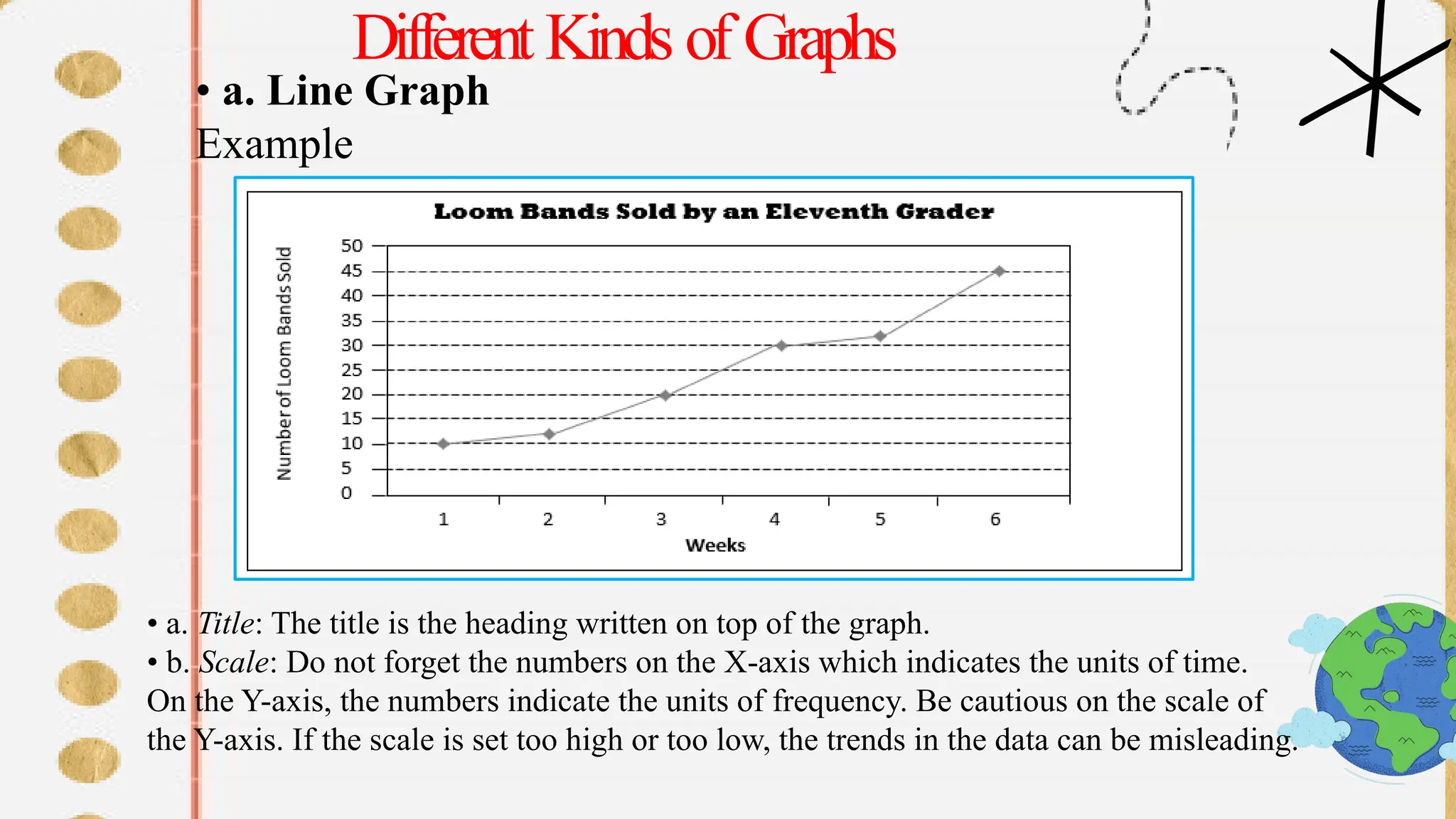
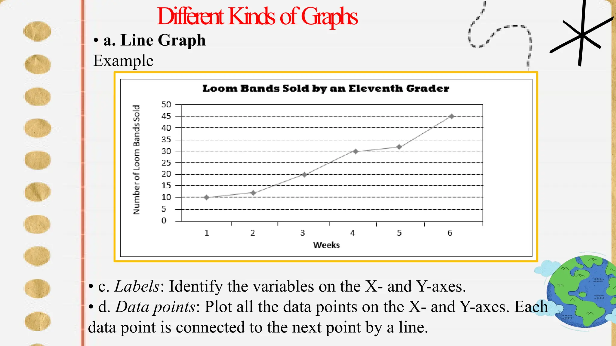
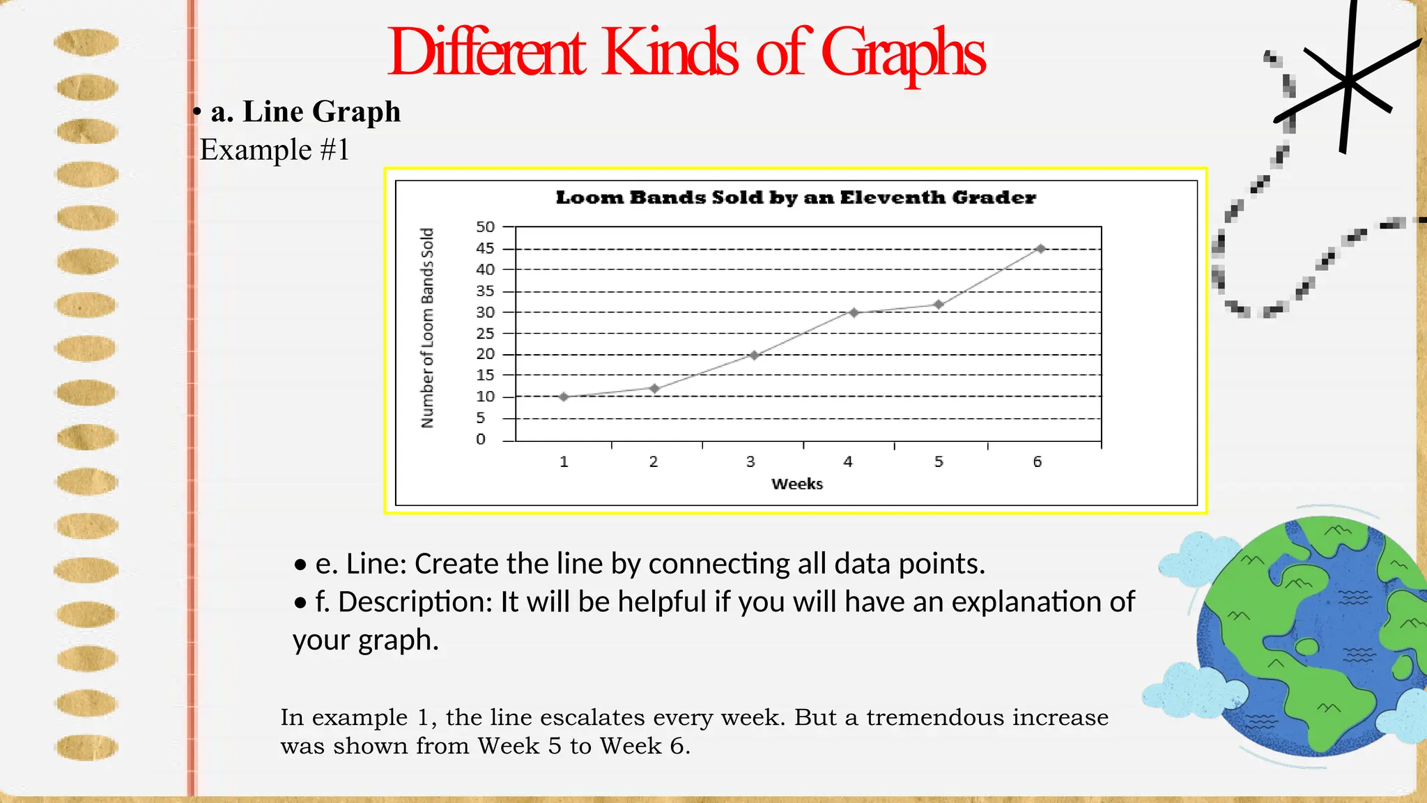
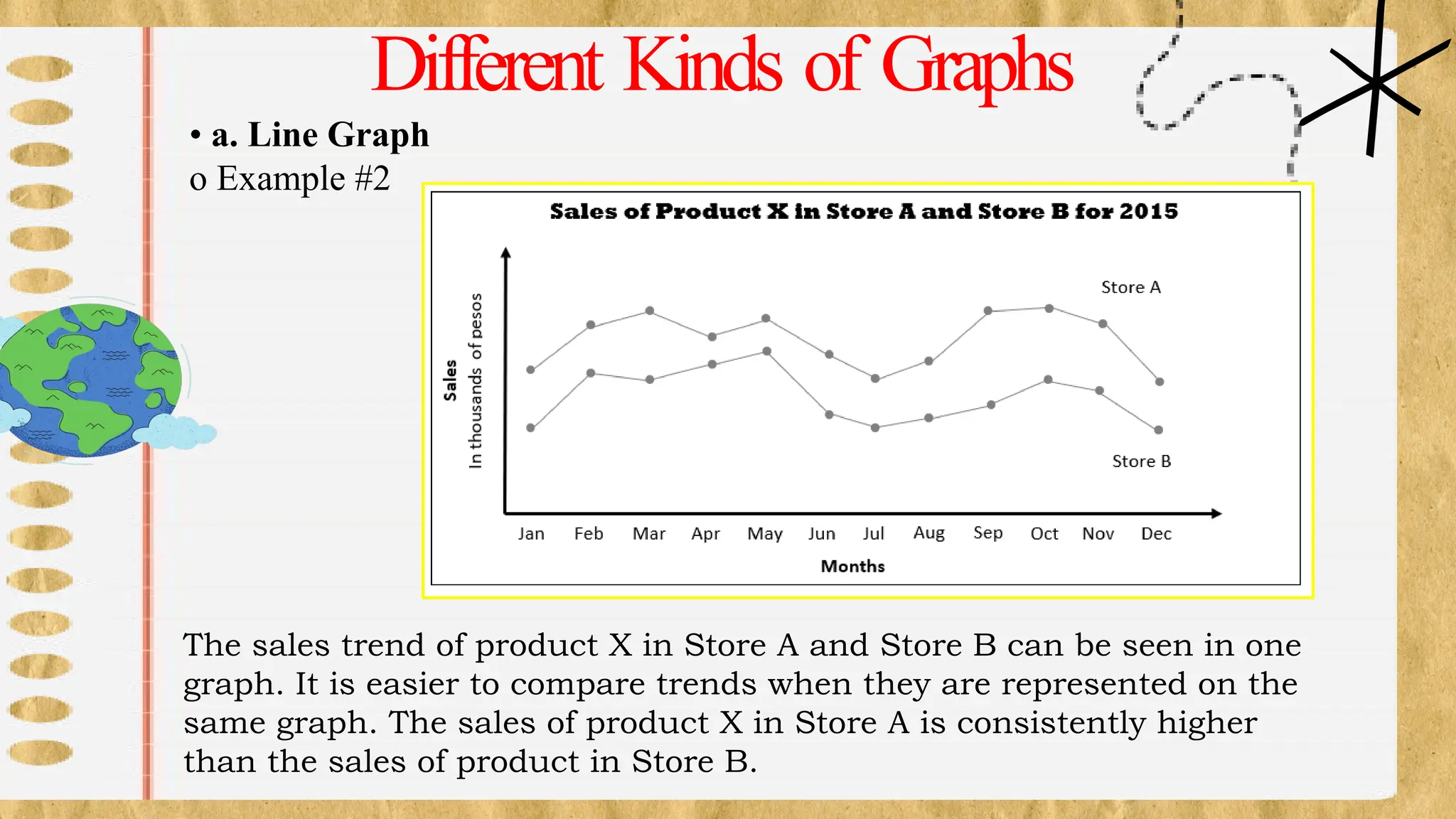
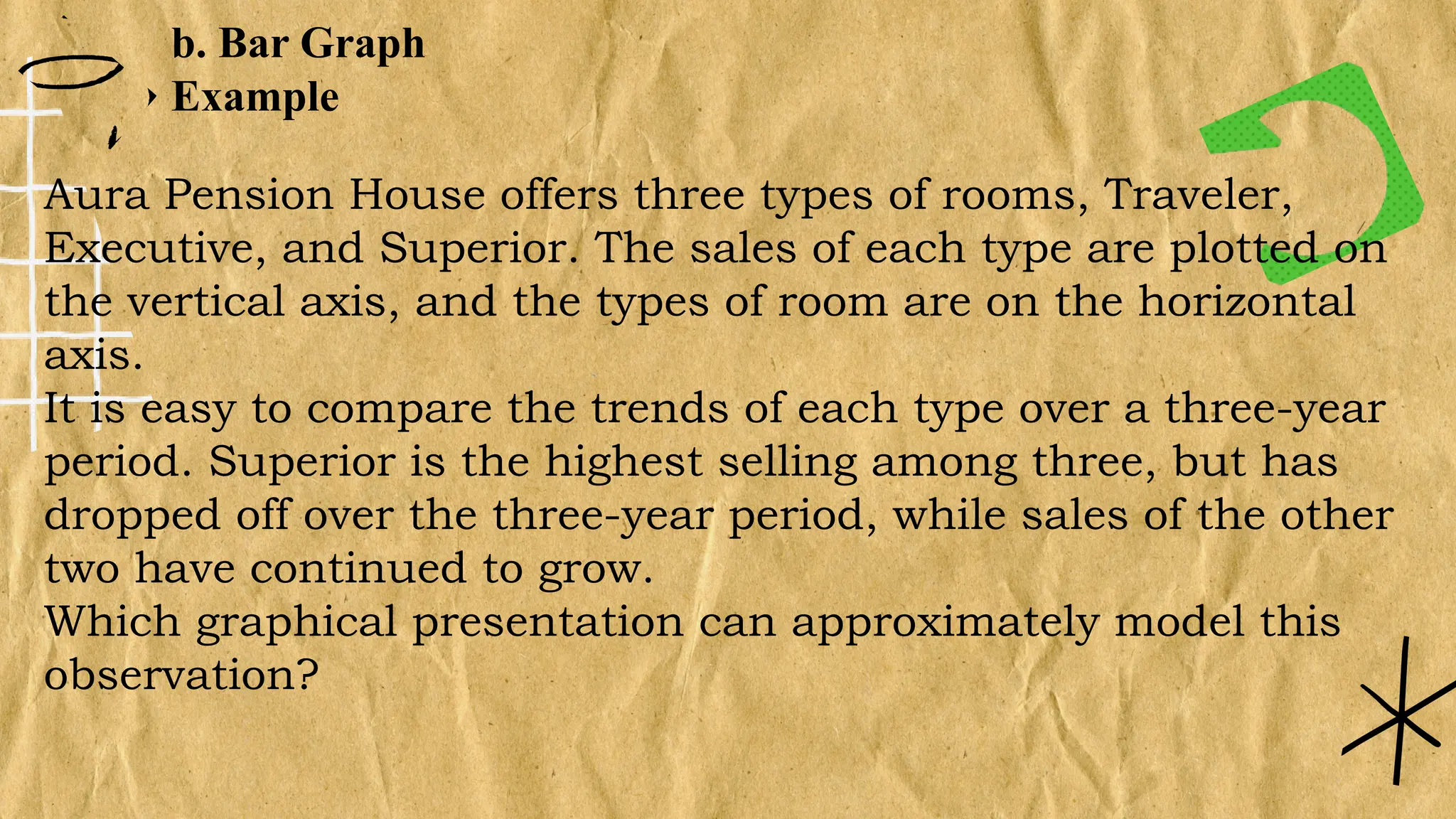
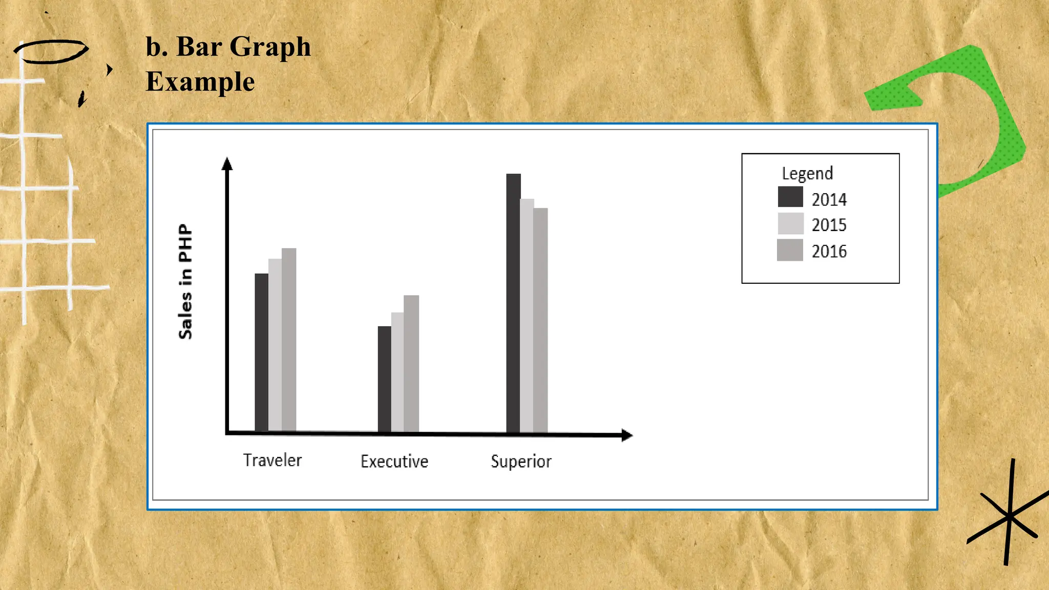
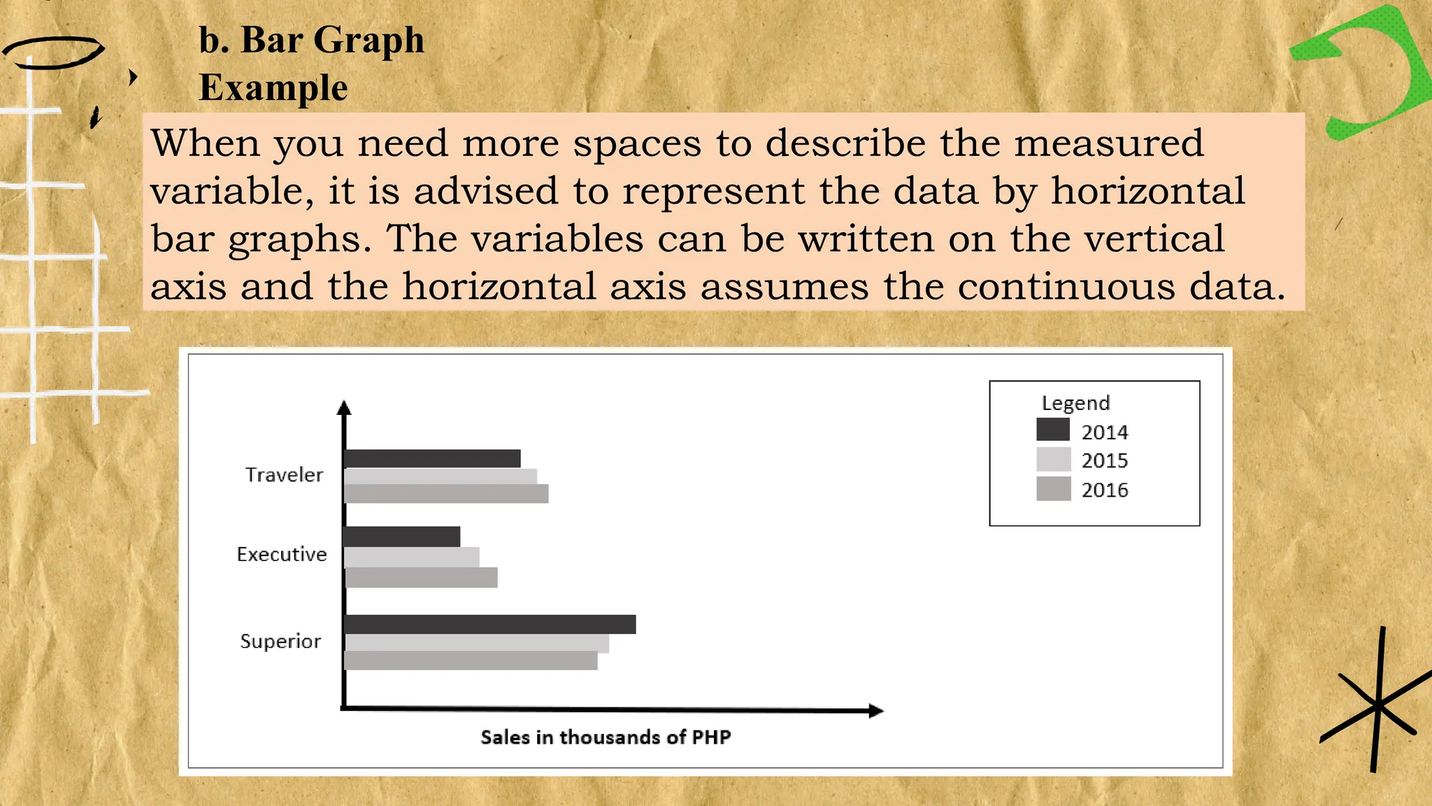
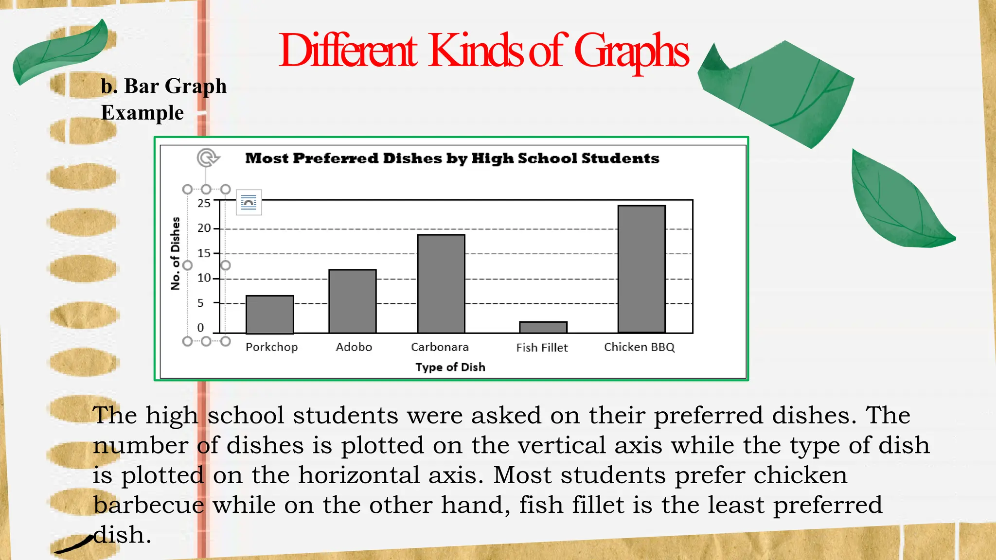
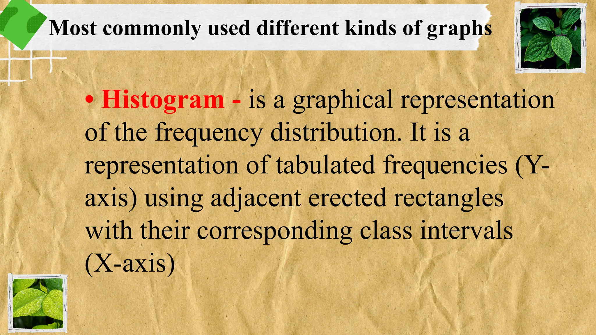
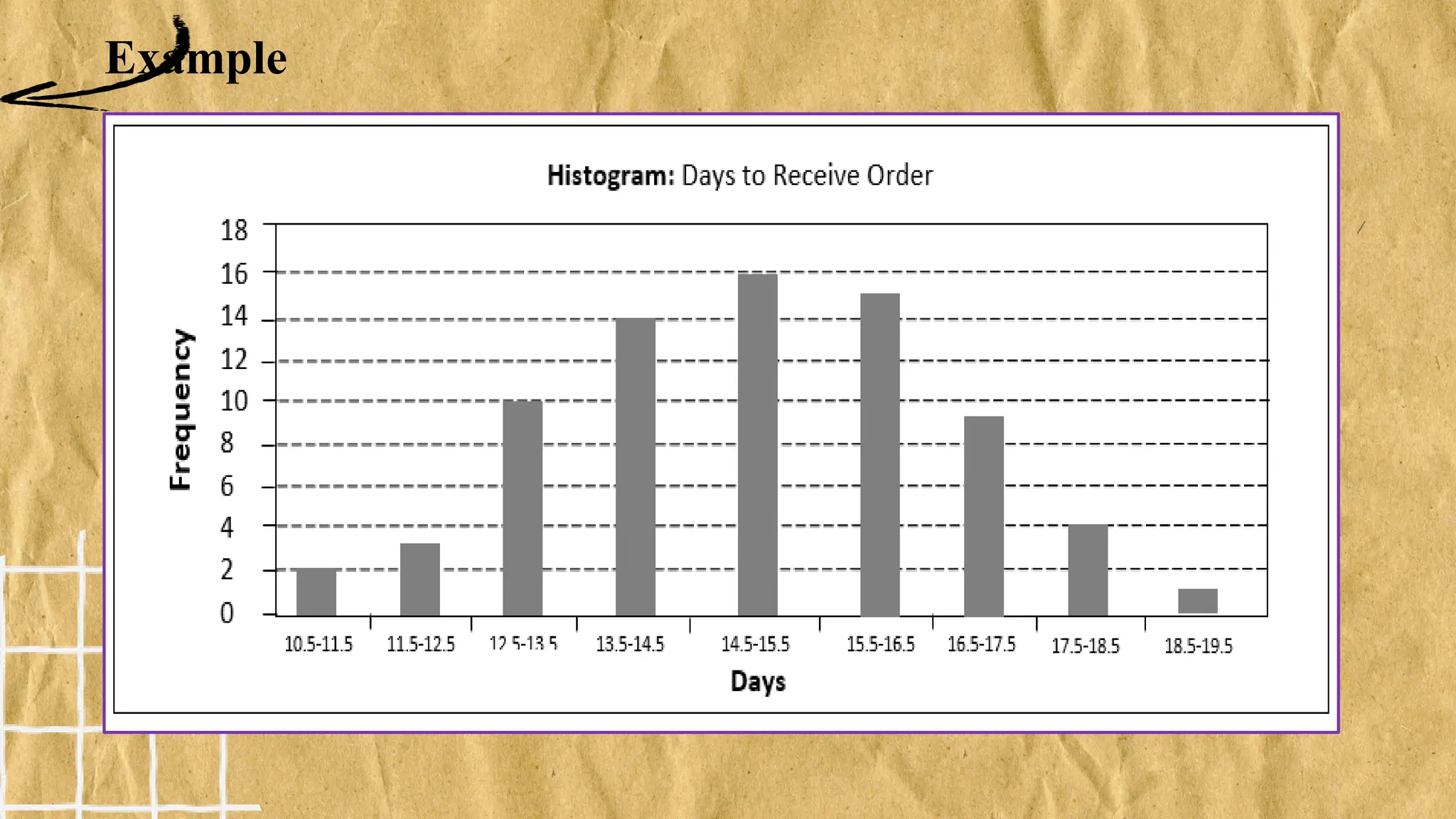
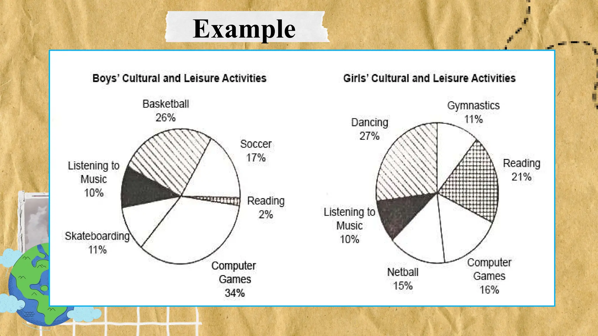
Kinds of Graphs for
Data Presentation
• A graph is an alternative way to present data.
It involves a lot of communication power.
• A quick look of these graphs may enable the
reader to have an instant and meaningful
picture of the vast amount of data.
KindsofGraphsforDataPresentation
Different data call for different graphs. The
graphs may all look brilliant, but is it the
right graph for the data? In this lesson, we
will learn how to compare and contrast
different graphs and determine which type
of graph is appropriate for representing a
given set of data presented.
KindsofGraphsforDataPresentation
Definition of Graph
• It is an alternative way to present data.
• It involves a lot of communication power.
• In businesses, it is used to help them
convey information and to make sense of
data.
• It always describes something about
business
• Line graph - uses line segments to connect
data points. It is useful in showing the trends
or in determining relationships between two
variables. It can also be applied if the
variable plotted along the X-axis (horizontal
line) is related to time (year, month, day,
clock time)
Most commonly used different kinds of graphs
Different Kinds of Graphs
• a. Line Graph
Example
• a. Title: The title is the heading written on top of the graph.
• b. Scale: Do not forget the numbers on the X-axis which indicates the units of time.
On the Y-axis, the numbers indicate the units of frequency. Be cautious on the scale of
the Y-axis. If the scale is set too high or too low, the trends in the data can be misleading.
DifferentKindsofGraphs
• a. Line Graph
Example
• c. Labels: Identify the variables on the X- and Y-axes.
• d. Data points: Plot all the data points on the X- and Y-axes. Each
data point is connected to the next point by a line.
Different Kinds of Graphs
• a. Line Graph
Example #1
• e. Line: Create the line by connecting all data points.
• f. Description: It will be helpful if you will have an explanation of
your graph.
In example 1, the line escalates every week. But a tremendous increase
was shown from Week 5 to Week 6.
Different Kinds of Graphs
• a. Line Graph
o Example #2
The sales trend of product X in Store A and Store B can be seen in one
graph. It is easier to compare trends when they are represented on the
same graph. The sales of product X in Store A is consistently higher
than the sales of product in Store B.
• Bar graph - uses rectangles erected on
the horizontal axis to summarize a set of
quantitative data. Here, the height of the
bar represents the measured value or
frequency; that is. The higher or taller the
bar, the greater the value.
Most commonly used different kinds of graphs
b. Bar Graph
Example
Aura Pension House offers three types of rooms, Traveler,
Executive, and Superior. The sales of each type are plotted on
the vertical axis, and the types of room are on the horizontal
axis.
It is easy to compare the trends of each type over a three-year
period. Superior is the highest selling among three, but has
dropped off over the three-year period, while sales of the other
two have continued to grow.
Which graphical presentation can approximately model this
observation?
b. Bar Graph
Example
b. Bar Graph
Example
When you need more spaces to describe the measured
variable, it is advised to represent the data by horizontal
bar graphs. The variables can be written on the vertical
axis and the horizontal axis assumes the continuous data.
b. Bar Graph
Example
Different Kindsof Graphs
The high school students were asked on their preferred dishes. The
number of dishes is plotted on the vertical axis while the type of dish
is plotted on the horizontal axis. Most students prefer chicken
barbecue while on the other hand, fish fillet is the least preferred
dish.
• Histogram - is a graphical representation
of the frequency distribution. It is a
representation of tabulated frequencies (Y-
axis) using adjacent erected rectangles
with their corresponding class intervals
(X-axis)
Most commonly used different kinds of graphs
Example
• Pie graph - is also called a circle graph. It is
circle with the wedges or sectors to show
how much of the whole each part makes up.
Each slice of the pie is written as a
percentage. To get the measure of each sector in
the chart, we compute the following:
amount of item over the total amount of all items
multiplied by 360°.
Most commonly used different kinds of graphs
Different Kinds of Graphs
d. Pie graph is also called a circle graph. It is a circle
with the wedges or sectors to
show how much of the whole each part makes up.
Each slice of the pie is written as
percentage.
Example
Thankyou!
www.reallygreatsite.com

5. KINDS OF GRAPHS FOR DATA PRESENTATION.pptx

  • 1.
    Kinds of Graphsfor Data Presentation
  • 2.
    • A graphis an alternative way to present data. It involves a lot of communication power. • A quick look of these graphs may enable the reader to have an instant and meaningful picture of the vast amount of data. KindsofGraphsforDataPresentation
  • 3.
    Different data callfor different graphs. The graphs may all look brilliant, but is it the right graph for the data? In this lesson, we will learn how to compare and contrast different graphs and determine which type of graph is appropriate for representing a given set of data presented. KindsofGraphsforDataPresentation
  • 4.
    Definition of Graph •It is an alternative way to present data. • It involves a lot of communication power. • In businesses, it is used to help them convey information and to make sense of data. • It always describes something about business
  • 5.
    • Line graph- uses line segments to connect data points. It is useful in showing the trends or in determining relationships between two variables. It can also be applied if the variable plotted along the X-axis (horizontal line) is related to time (year, month, day, clock time) Most commonly used different kinds of graphs
  • 6.
    Different Kinds ofGraphs • a. Line Graph Example • a. Title: The title is the heading written on top of the graph. • b. Scale: Do not forget the numbers on the X-axis which indicates the units of time. On the Y-axis, the numbers indicate the units of frequency. Be cautious on the scale of the Y-axis. If the scale is set too high or too low, the trends in the data can be misleading.
  • 7.
    DifferentKindsofGraphs • a. LineGraph Example • c. Labels: Identify the variables on the X- and Y-axes. • d. Data points: Plot all the data points on the X- and Y-axes. Each data point is connected to the next point by a line.
  • 8.
    Different Kinds ofGraphs • a. Line Graph Example #1 • e. Line: Create the line by connecting all data points. • f. Description: It will be helpful if you will have an explanation of your graph. In example 1, the line escalates every week. But a tremendous increase was shown from Week 5 to Week 6.
  • 9.
    Different Kinds ofGraphs • a. Line Graph o Example #2 The sales trend of product X in Store A and Store B can be seen in one graph. It is easier to compare trends when they are represented on the same graph. The sales of product X in Store A is consistently higher than the sales of product in Store B.
  • 10.
    • Bar graph- uses rectangles erected on the horizontal axis to summarize a set of quantitative data. Here, the height of the bar represents the measured value or frequency; that is. The higher or taller the bar, the greater the value. Most commonly used different kinds of graphs
  • 11.
    b. Bar Graph Example AuraPension House offers three types of rooms, Traveler, Executive, and Superior. The sales of each type are plotted on the vertical axis, and the types of room are on the horizontal axis. It is easy to compare the trends of each type over a three-year period. Superior is the highest selling among three, but has dropped off over the three-year period, while sales of the other two have continued to grow. Which graphical presentation can approximately model this observation?
  • 12.
  • 13.
    b. Bar Graph Example Whenyou need more spaces to describe the measured variable, it is advised to represent the data by horizontal bar graphs. The variables can be written on the vertical axis and the horizontal axis assumes the continuous data.
  • 14.
    b. Bar Graph Example DifferentKindsof Graphs The high school students were asked on their preferred dishes. The number of dishes is plotted on the vertical axis while the type of dish is plotted on the horizontal axis. Most students prefer chicken barbecue while on the other hand, fish fillet is the least preferred dish.
  • 15.
    • Histogram -is a graphical representation of the frequency distribution. It is a representation of tabulated frequencies (Y- axis) using adjacent erected rectangles with their corresponding class intervals (X-axis) Most commonly used different kinds of graphs
  • 16.
  • 17.
    • Pie graph- is also called a circle graph. It is circle with the wedges or sectors to show how much of the whole each part makes up. Each slice of the pie is written as a percentage. To get the measure of each sector in the chart, we compute the following: amount of item over the total amount of all items multiplied by 360°. Most commonly used different kinds of graphs
  • 18.
    Different Kinds ofGraphs d. Pie graph is also called a circle graph. It is a circle with the wedges or sectors to show how much of the whole each part makes up. Each slice of the pie is written as percentage.
  • 19.
  • 20.