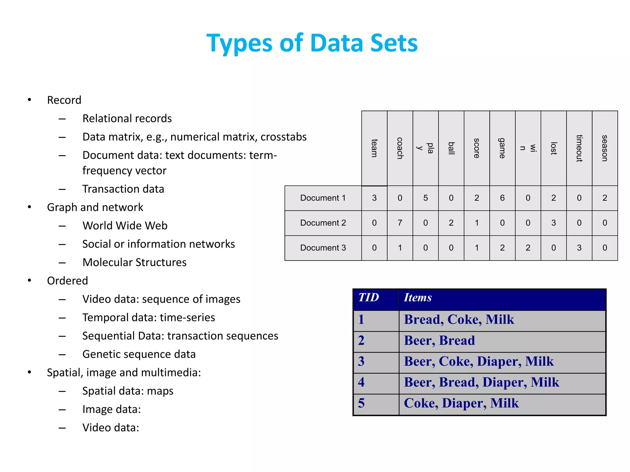
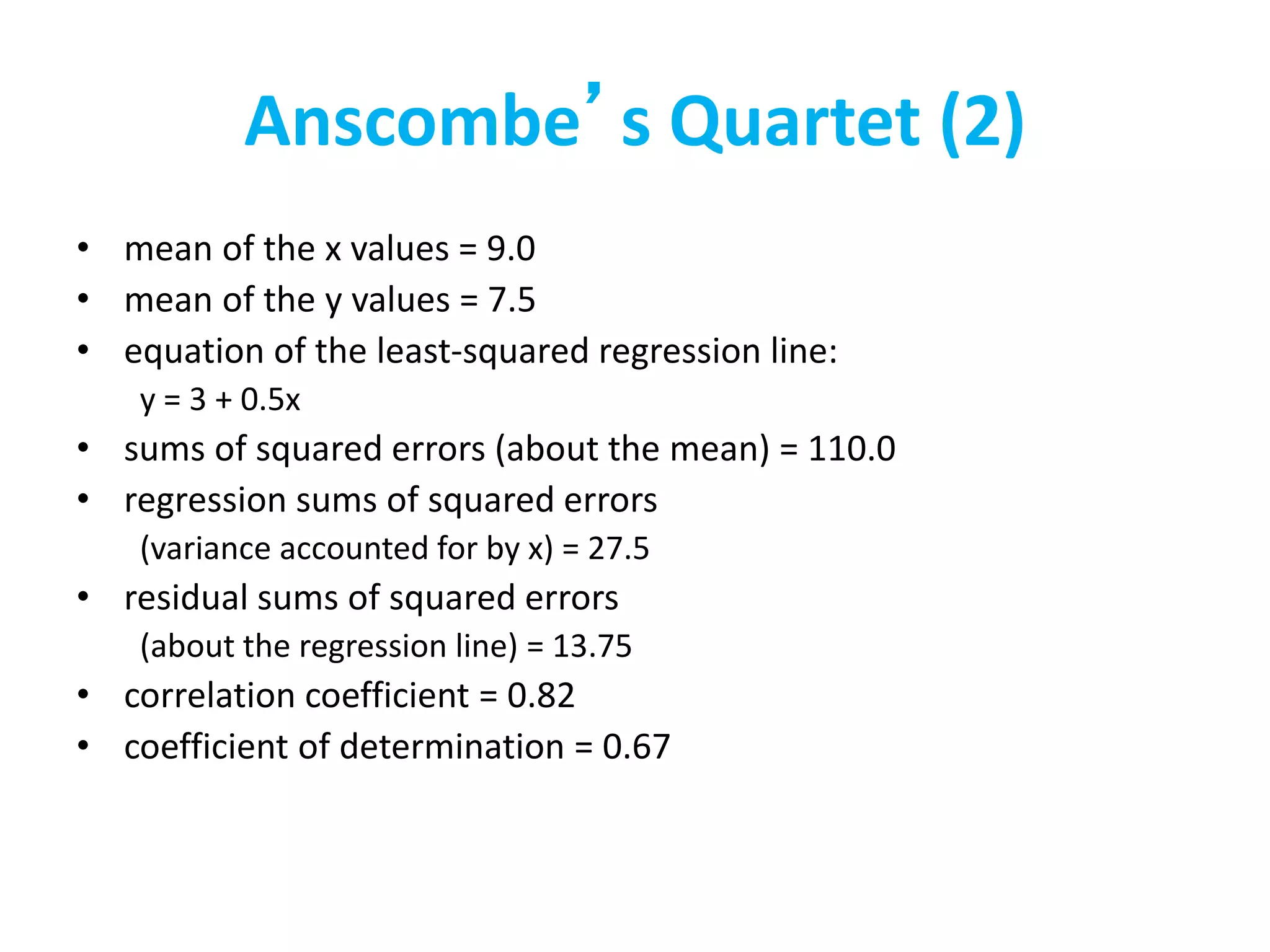
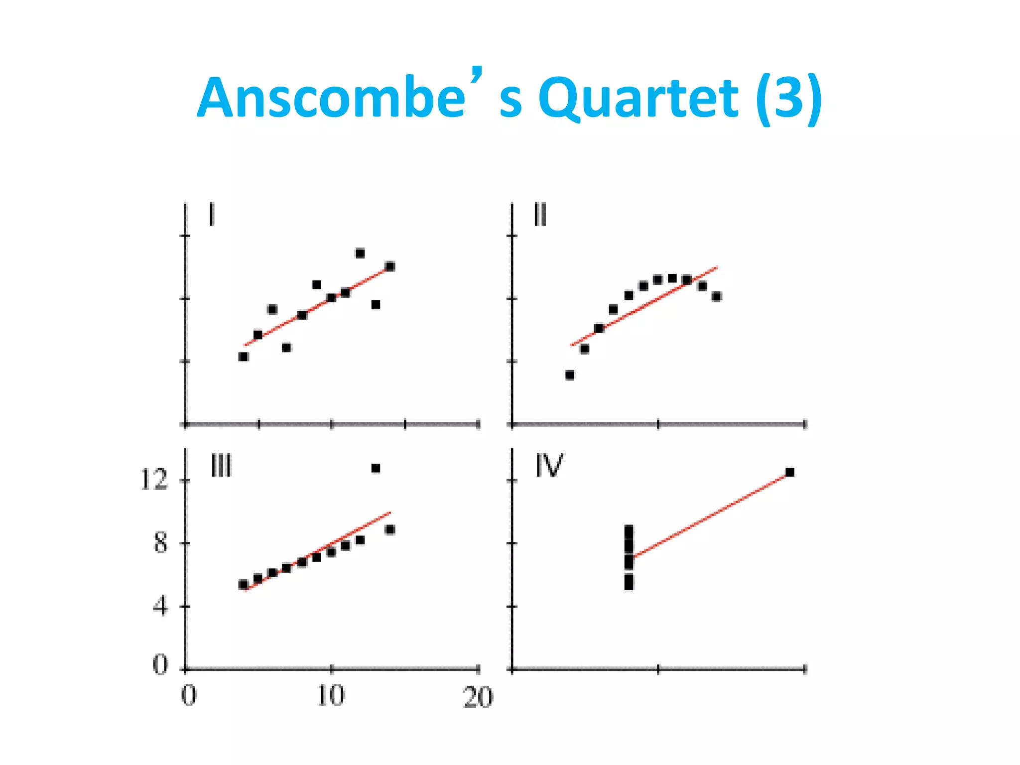
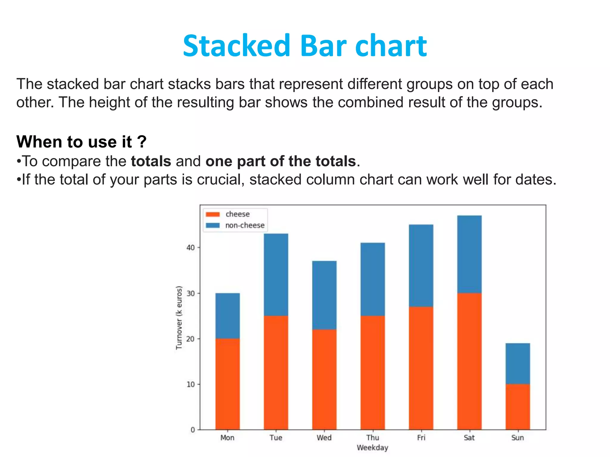
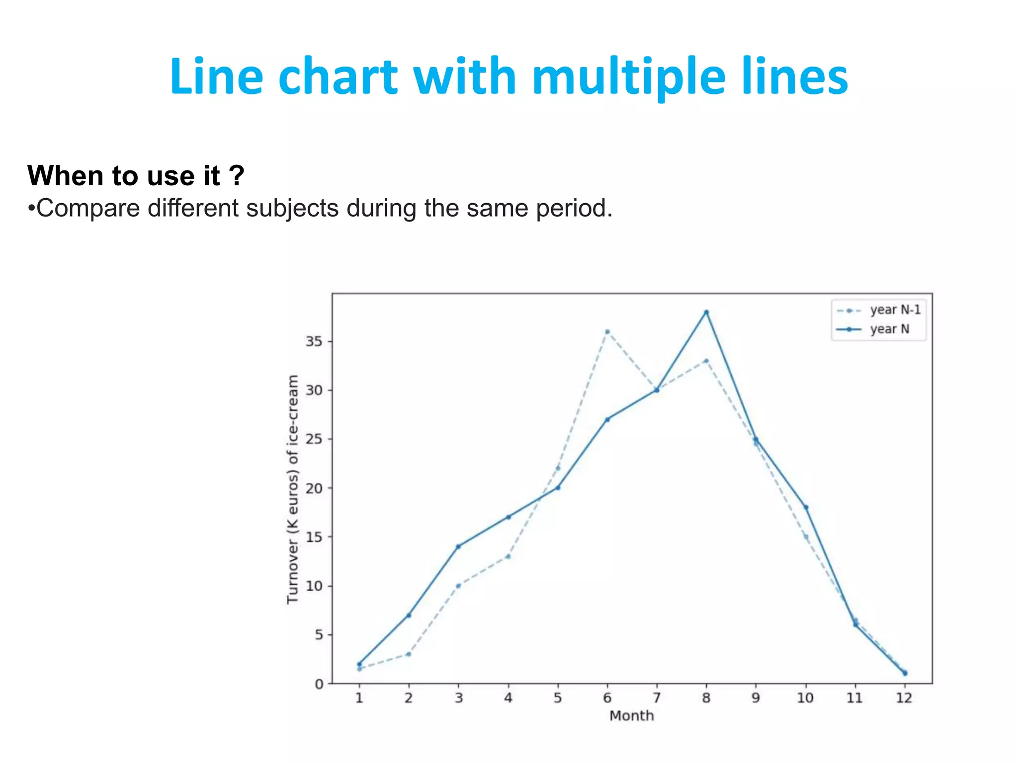
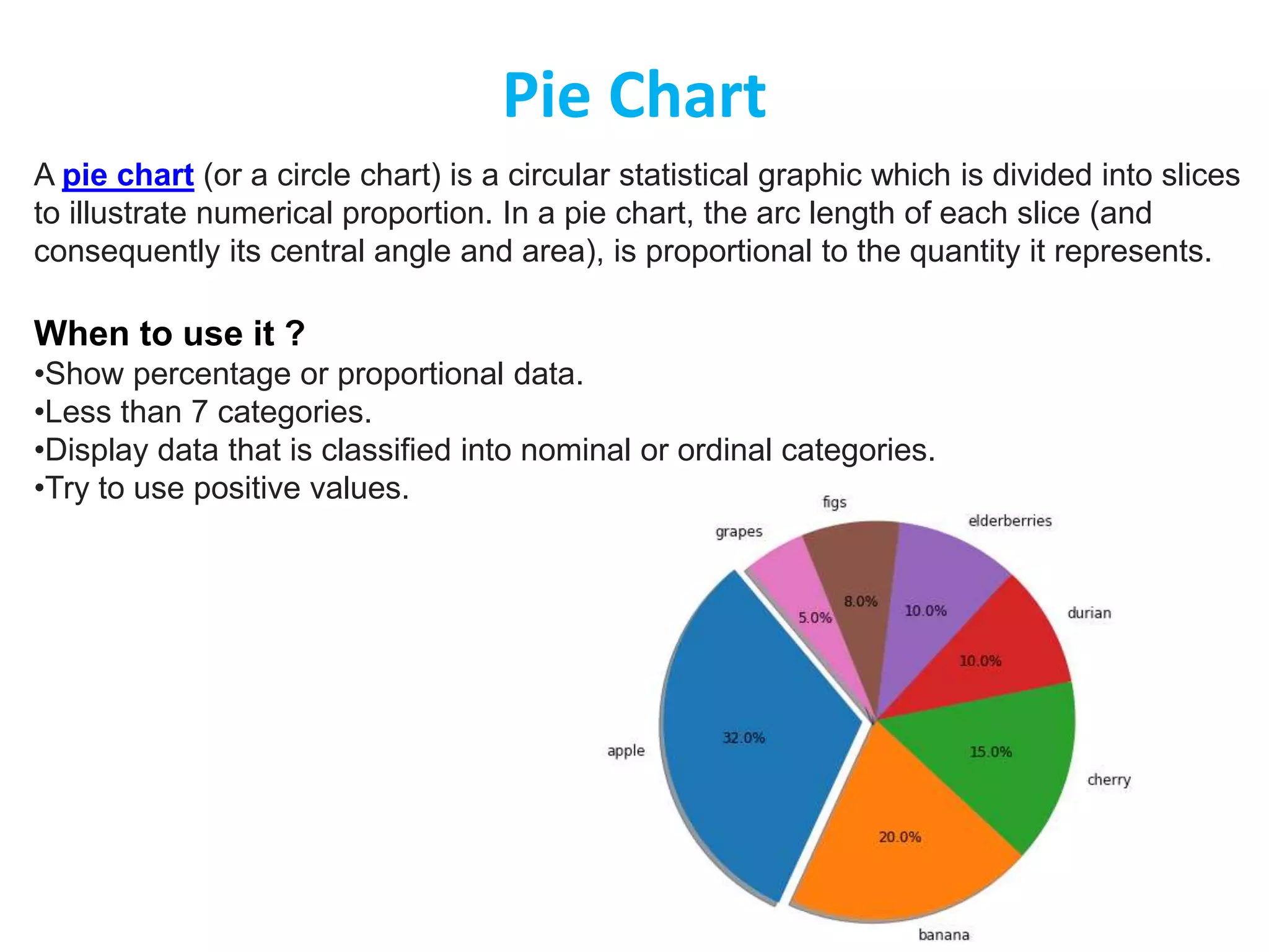
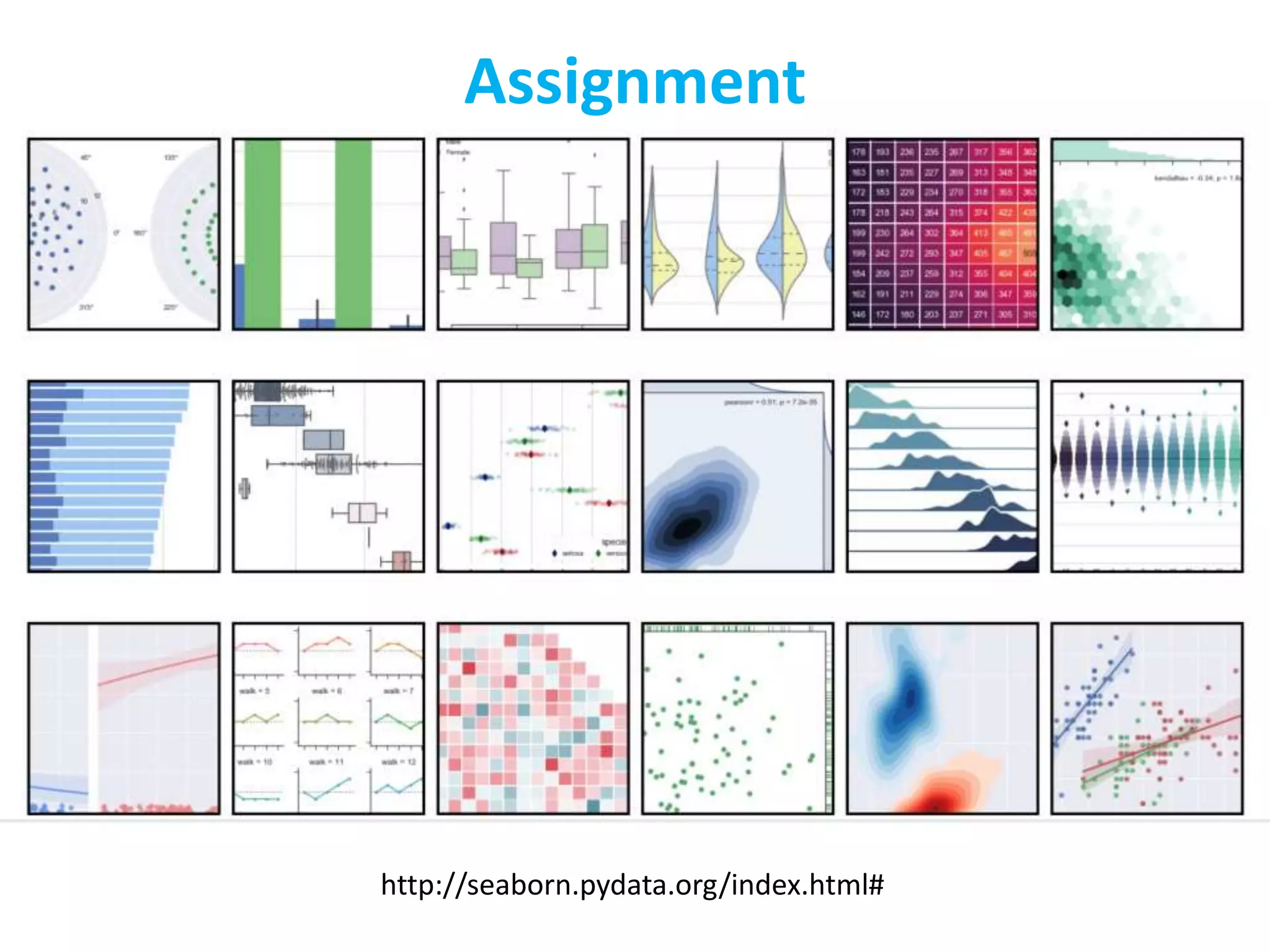
The document discusses different types of data sets that can be analyzed in data science. It describes record, graph and network, ordered, spatial, image and multimedia data. It then discusses key concepts related to data sets including data objects, attributes, attribute types (nominal, binary, numeric), and characteristics of data sets like dimensionality and sparsity. The document also lists some repositories for finding publicly available data sets and outlines strategies for getting data like being provided data, downloading data, or scraping data from the web. Finally, it introduces the topic of data visualization.


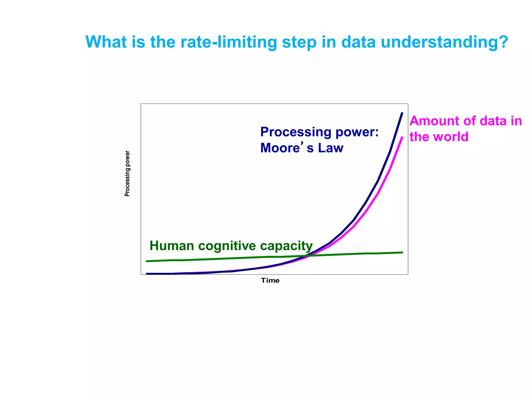
![Other reasons?
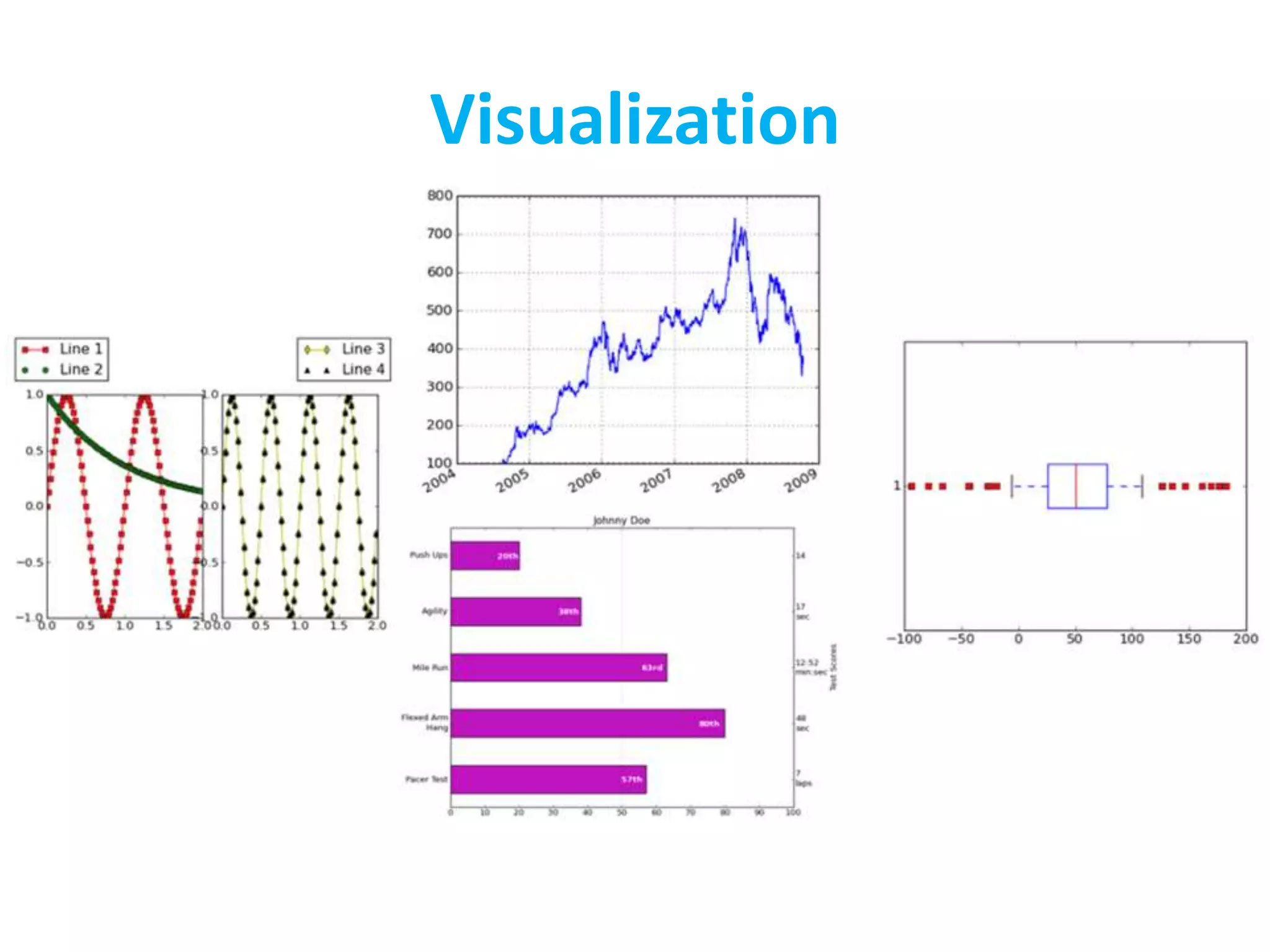
• Visualization is the highest bandwidth channel
into the human brain [Palmer 99]
• The visual cortex is the largest system in the
human brain; it’s wasteful not to make use of it.
• As data volumes grow, visualization becomes a
necessity rather than a luxury.
– “A picture is worth a thousand words”](https://image.slidesharecdn.com/lec3-220328012929/75/Lec-3-pptx-20-2048.jpg)


![[DSC Europe 25] Dragan Vucic - Building the Learning Organization - How AI Tr...](https://cdn.slidesharecdn.com/ss_thumbnails/8brigo2sbu6qur6gxrra-7-251205085715-6ae07d24-thumbnail.jpg?width=640&height=640&fit=bounds)


![[DSC Europe 25] Goran Obradovic - The Rise of Sovereign AI: Building the Regi...](https://cdn.slidesharecdn.com/ss_thumbnails/7nw2xxixrxqdxvrb5wca-6-251205085714-ab09a2ac-thumbnail.jpg?width=640&height=640&fit=bounds)


![[DSC Europe 25] Boris Perkovic - Lost in performance.pptx](https://cdn.slidesharecdn.com/ss_thumbnails/uq5hrp7vsuahqkxzifux-1-251204082258-fd2ee09d-thumbnail.jpg?width=640&height=640&fit=bounds)


