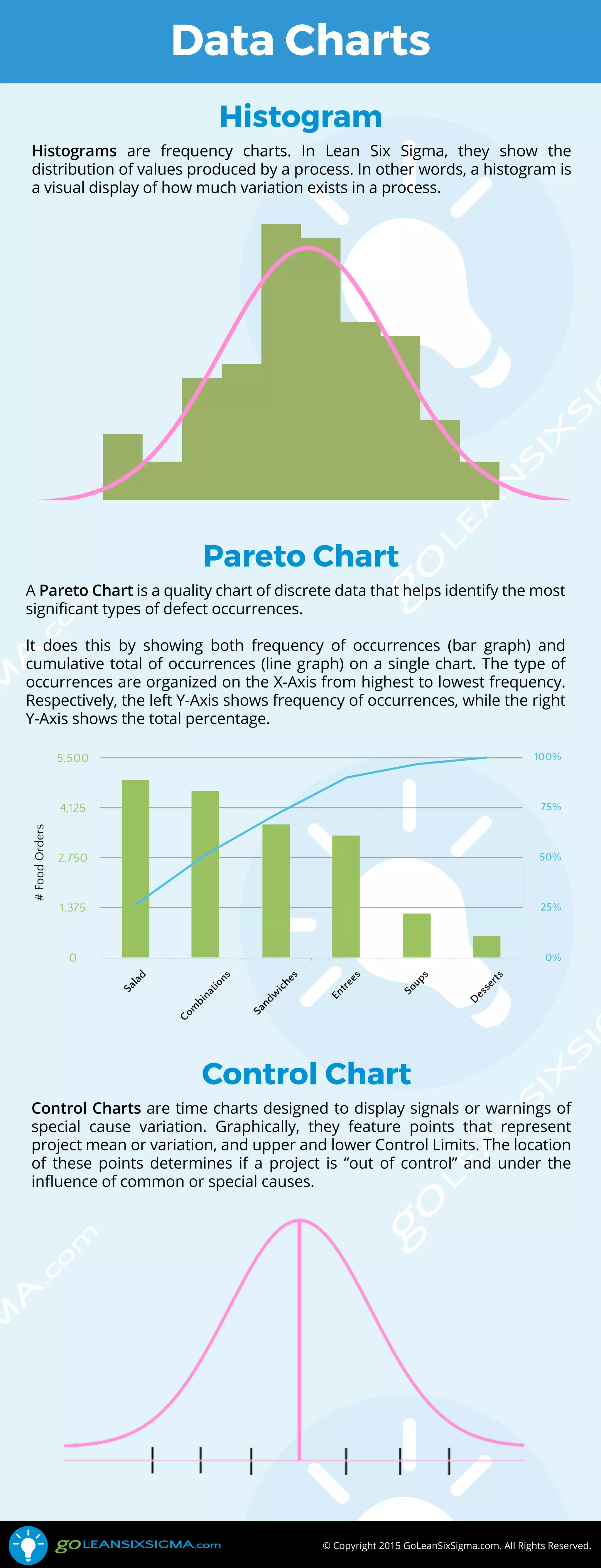
© Copyright 2015 GoLeanSixSigma.com. All Rights Reserved.
Data Charts
Histograms are frequency charts. In Lean Six Sigma, they show the
distribution of values produced by a process. In other words, a histogram is
a visual display of how much variation exists in a process.
Histogram
A Pareto Chart is a quality chart of discrete data that helps identify the most
significant types of defect occurrences.
It does this by showing both frequency of occurrences (bar graph) and
cumulative total of occurrences (line graph) on a single chart. The type of
occurrences are organized on the X-Axis from highest to lowest frequency.
Respectively, the left Y-Axis shows frequency of occurrences, while the right
Y-Axis shows the total percentage.
Pareto Chart
Control Charts are time charts designed to display signals or warnings of
special cause variation. Graphically, they feature points that represent
project mean or variation, and upper and lower Control Limits. The location
of these points determines if a project is “out of control” and under the
influence of common or special causes.
Control Chart

Data Charts: Histogram, Pareto Chart, Control Chart

  • 1.
    © Copyright 2015GoLeanSixSigma.com. All Rights Reserved. Data Charts Histograms are frequency charts. In Lean Six Sigma, they show the distribution of values produced by a process. In other words, a histogram is a visual display of how much variation exists in a process. Histogram A Pareto Chart is a quality chart of discrete data that helps identify the most significant types of defect occurrences. It does this by showing both frequency of occurrences (bar graph) and cumulative total of occurrences (line graph) on a single chart. The type of occurrences are organized on the X-Axis from highest to lowest frequency. Respectively, the left Y-Axis shows frequency of occurrences, while the right Y-Axis shows the total percentage. Pareto Chart Control Charts are time charts designed to display signals or warnings of special cause variation. Graphically, they feature points that represent project mean or variation, and upper and lower Control Limits. The location of these points determines if a project is “out of control” and under the influence of common or special causes. Control Chart