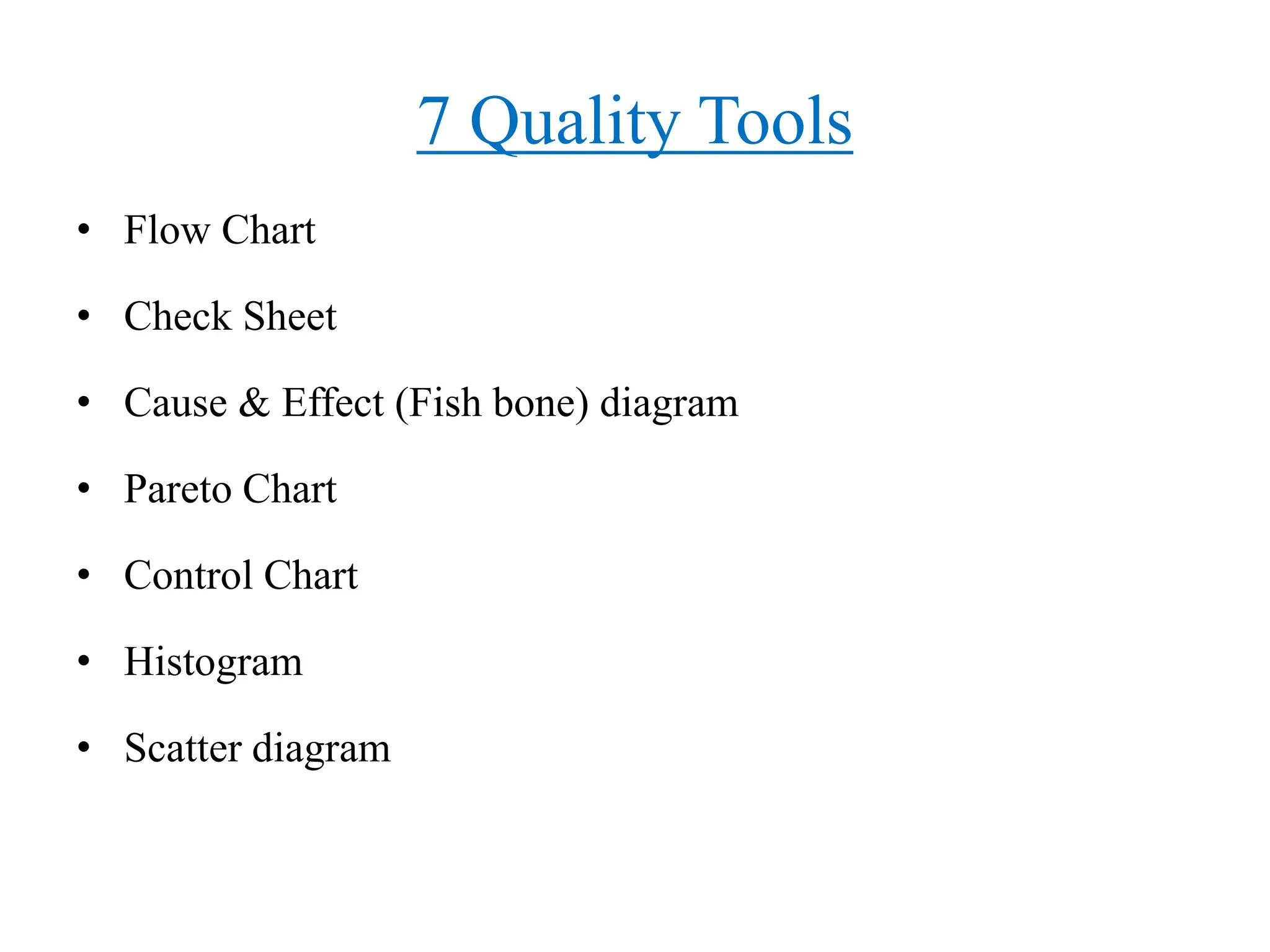
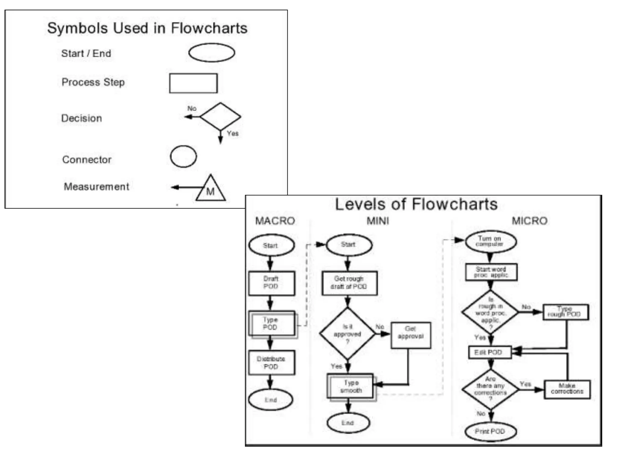
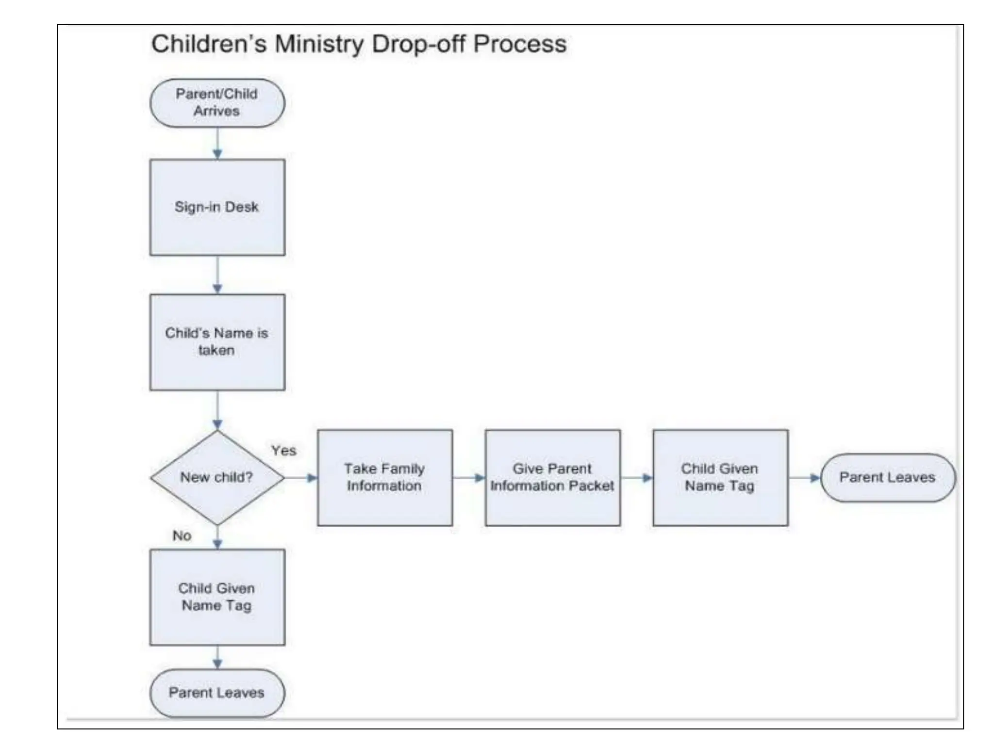
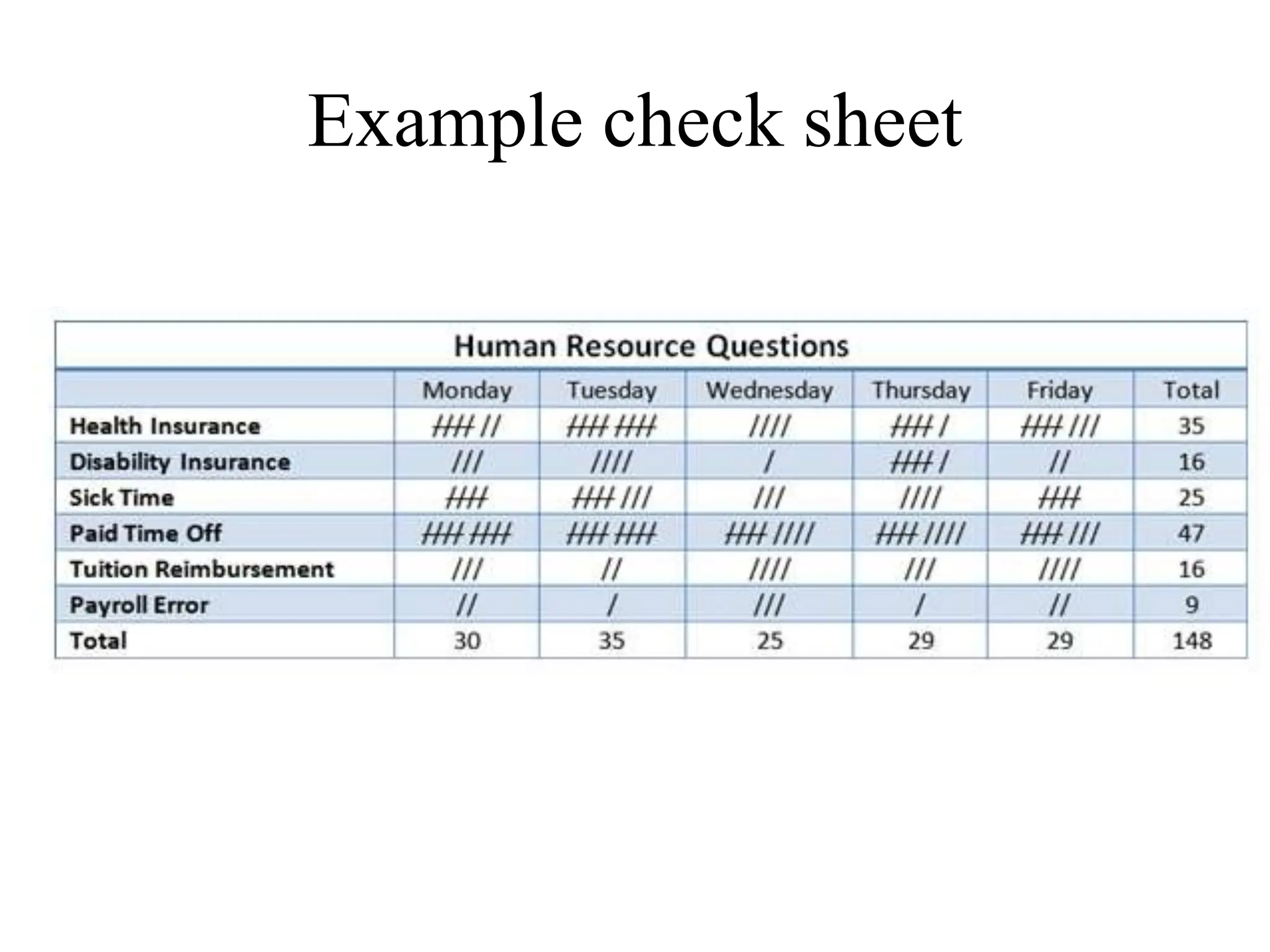
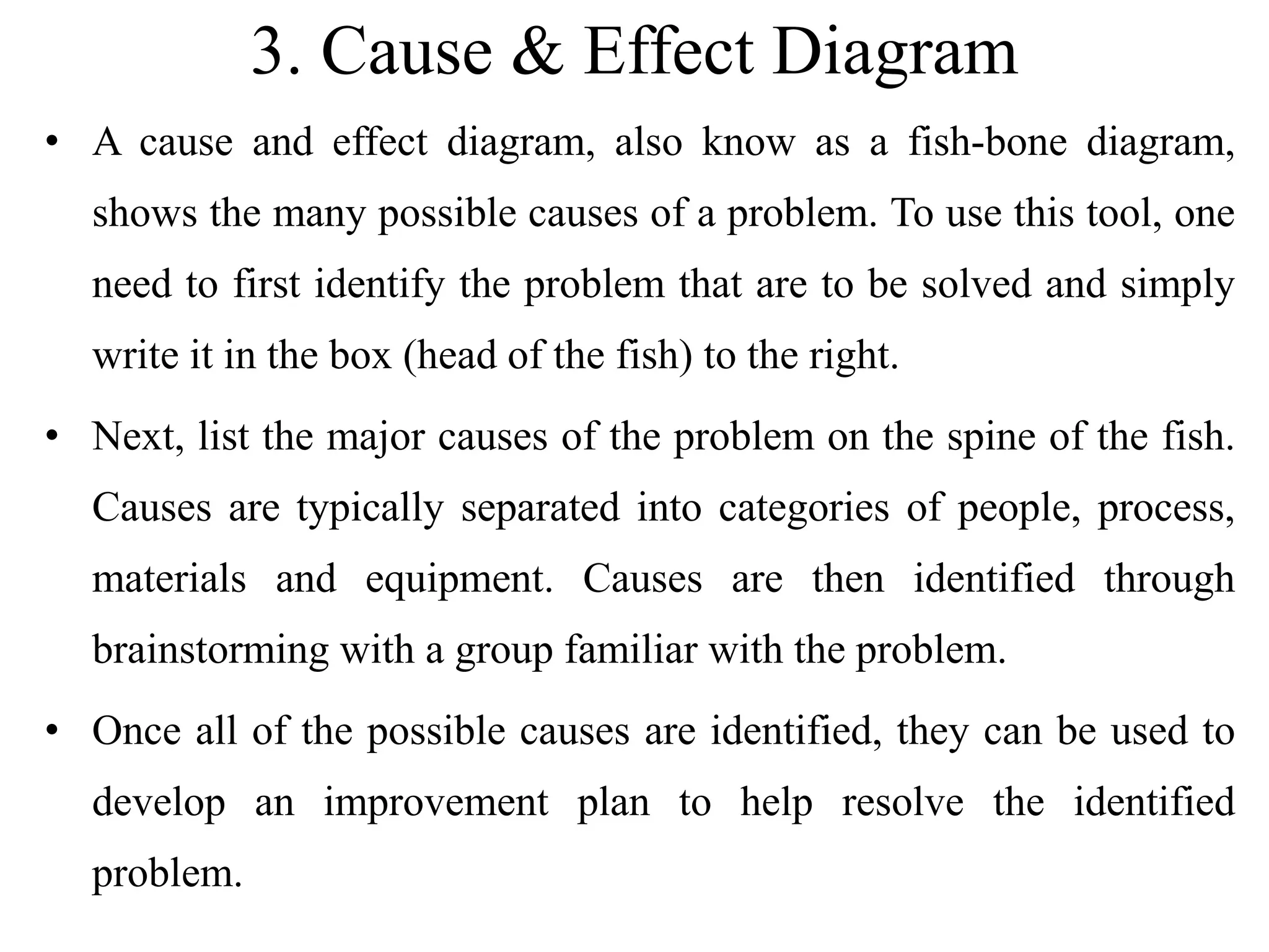
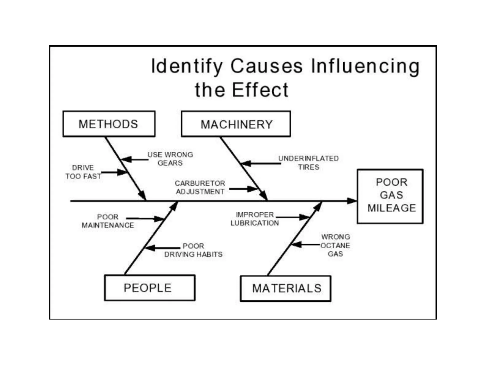
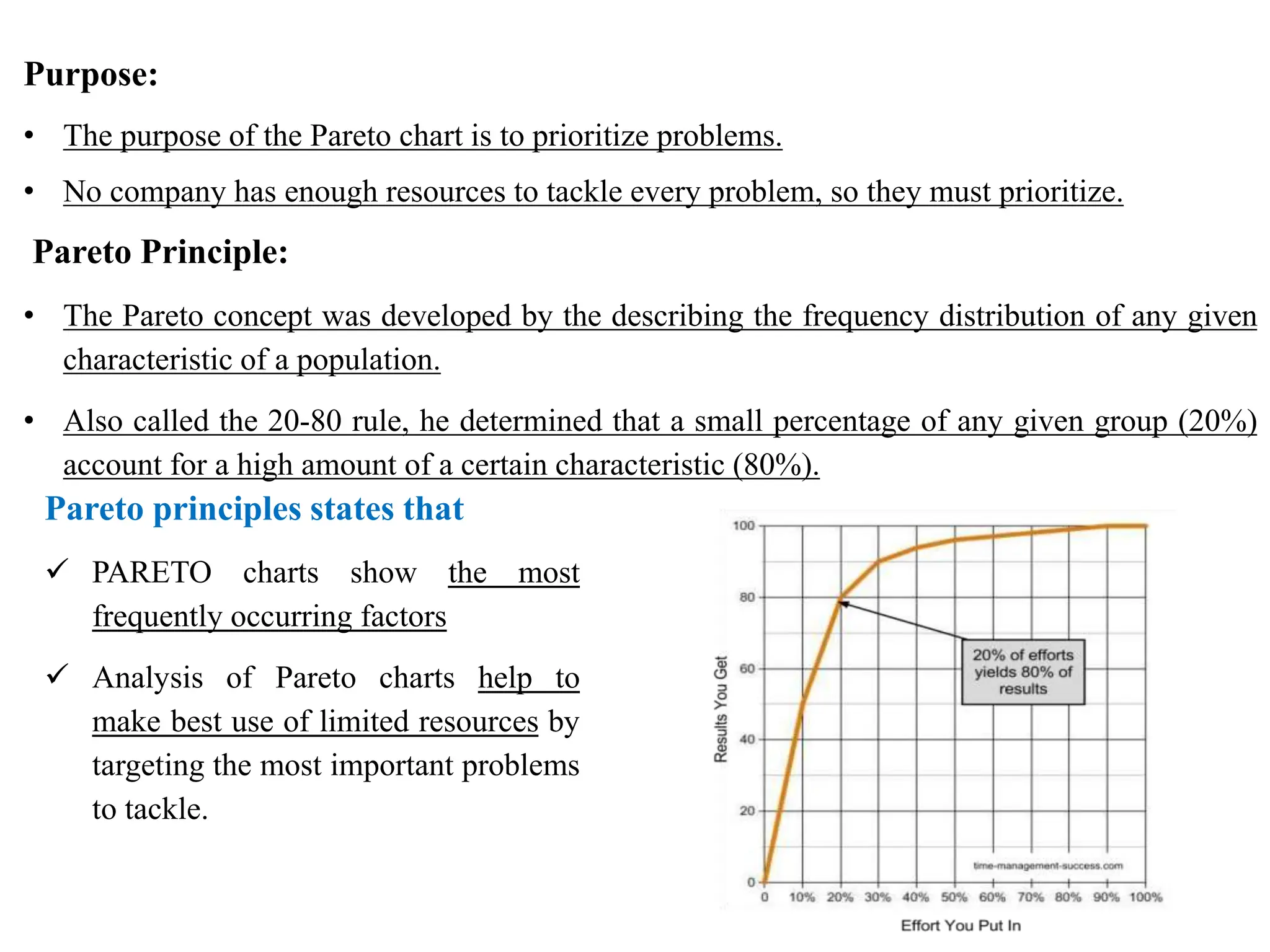
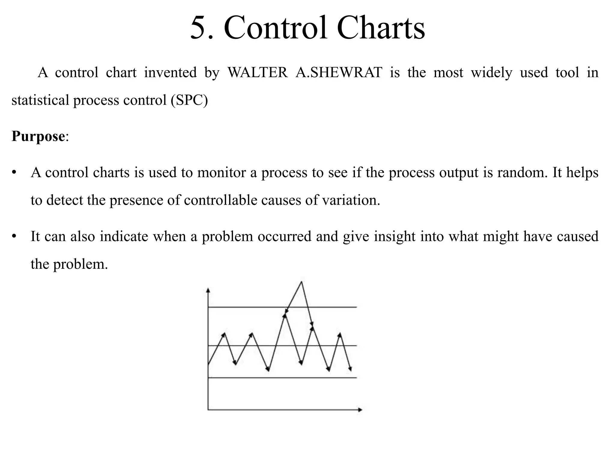
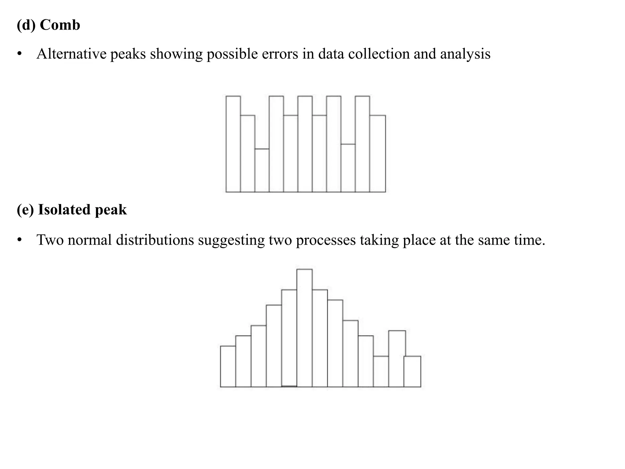
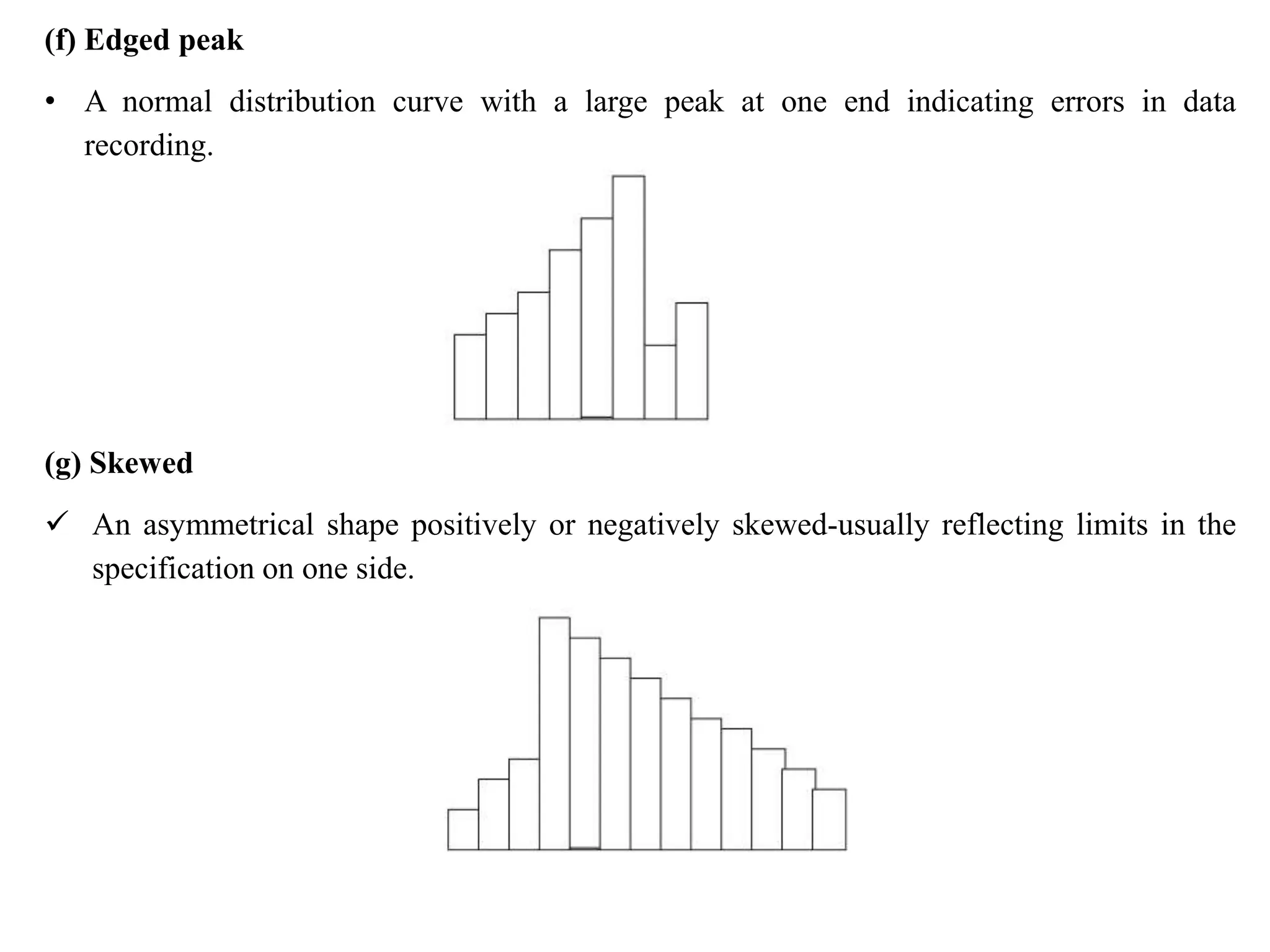
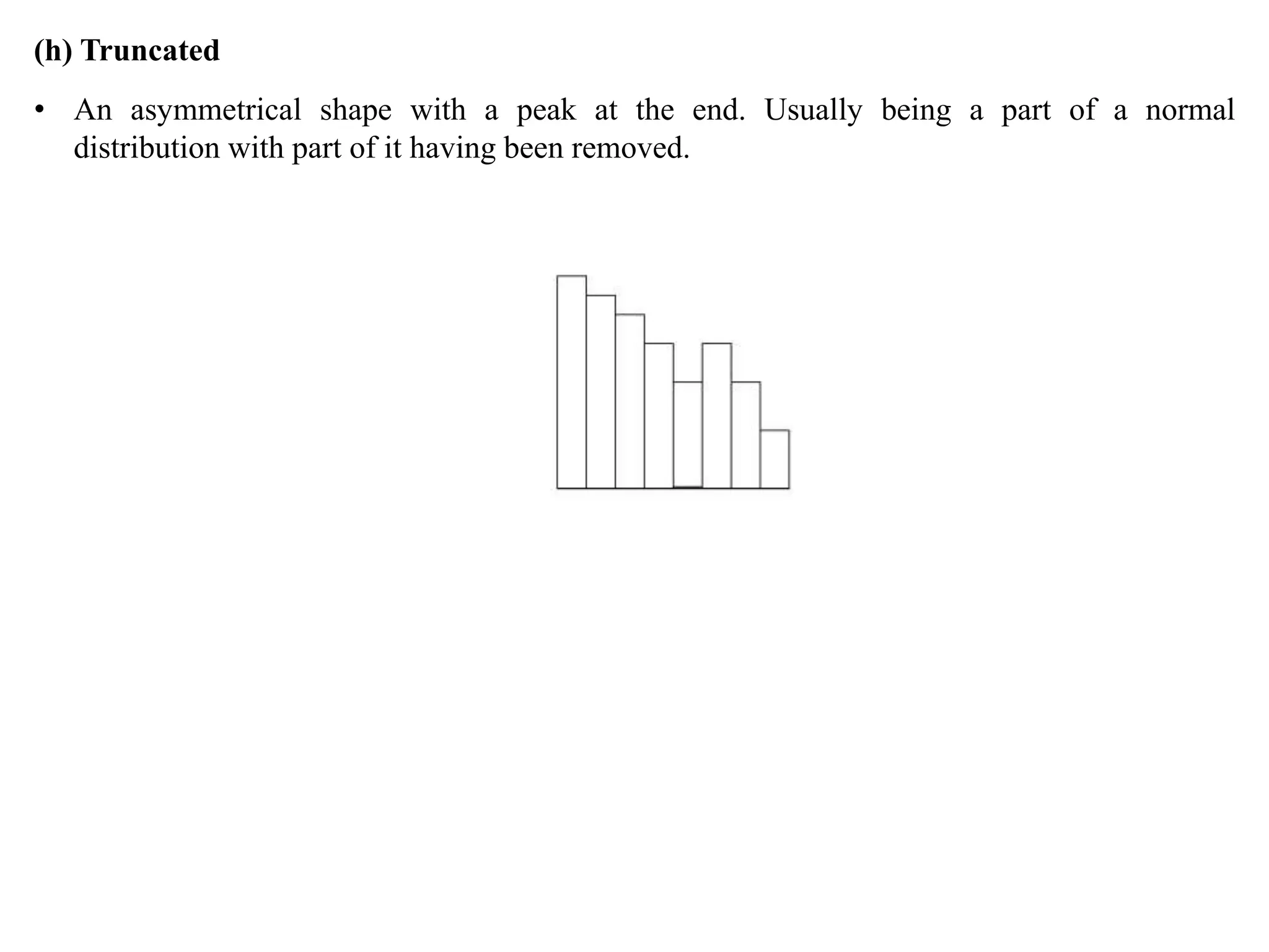
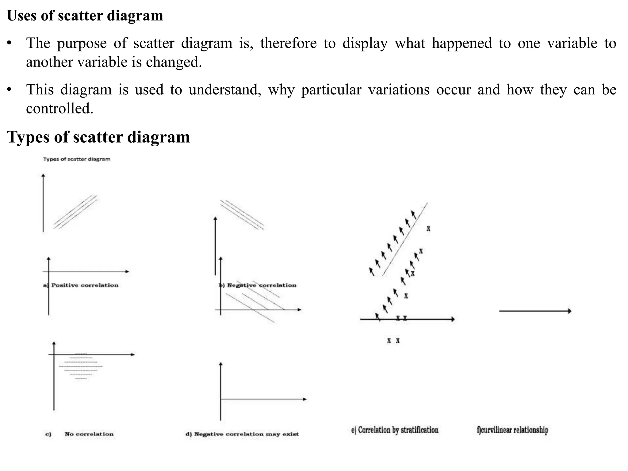
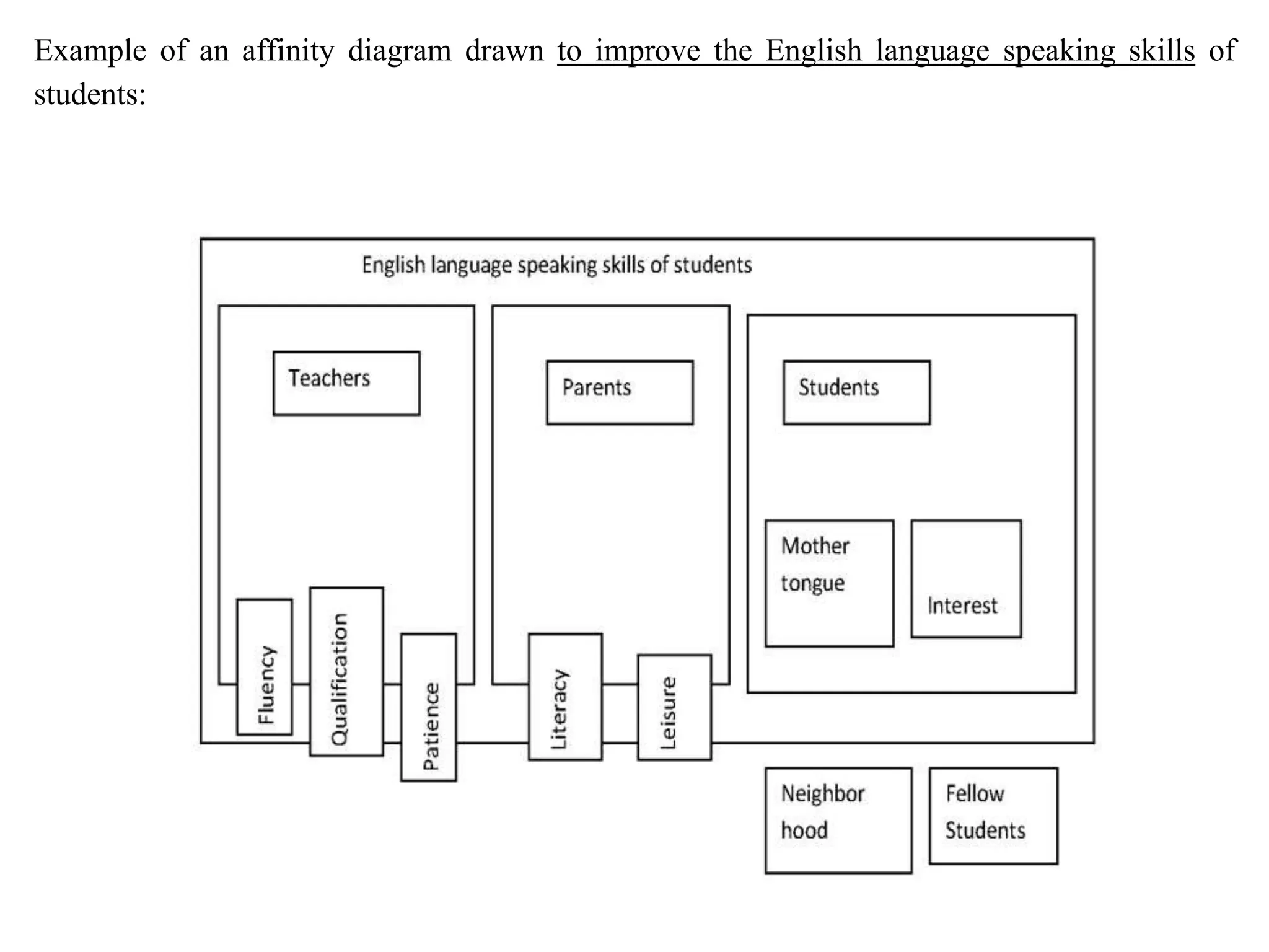
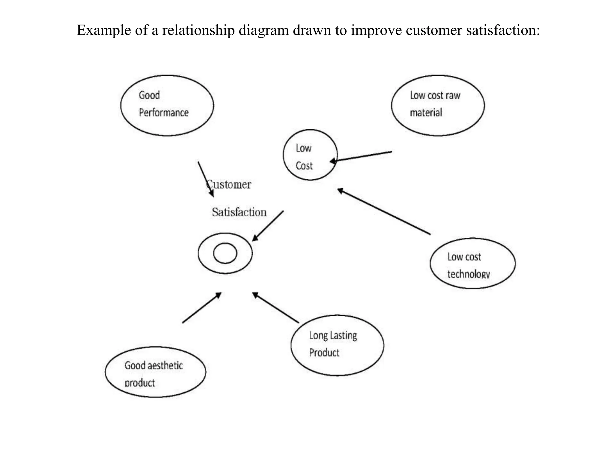
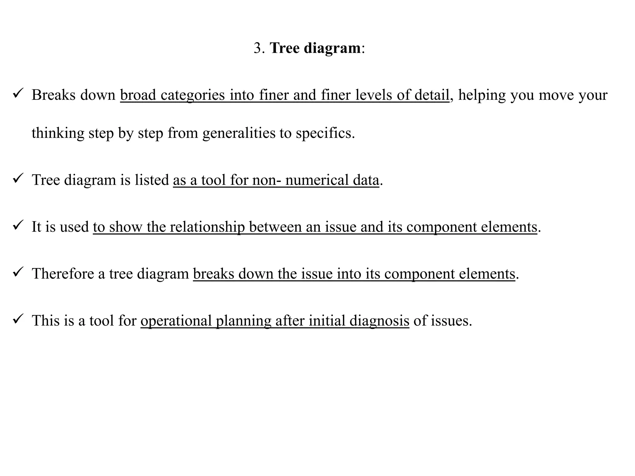
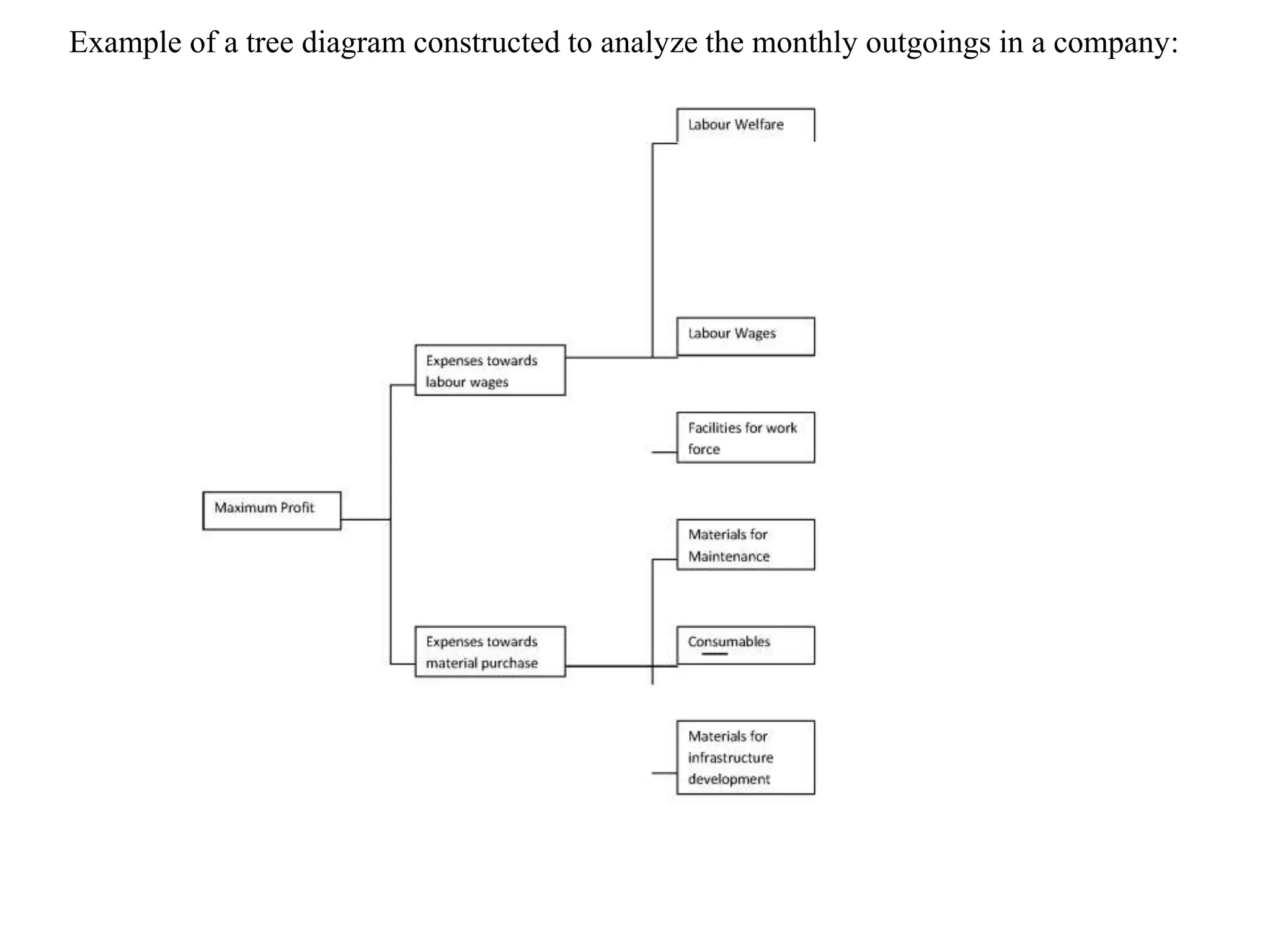
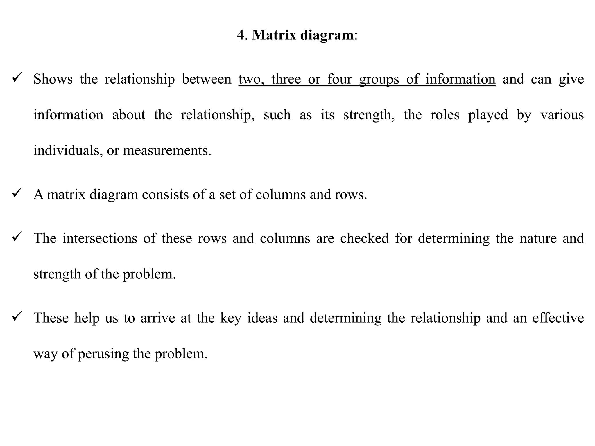
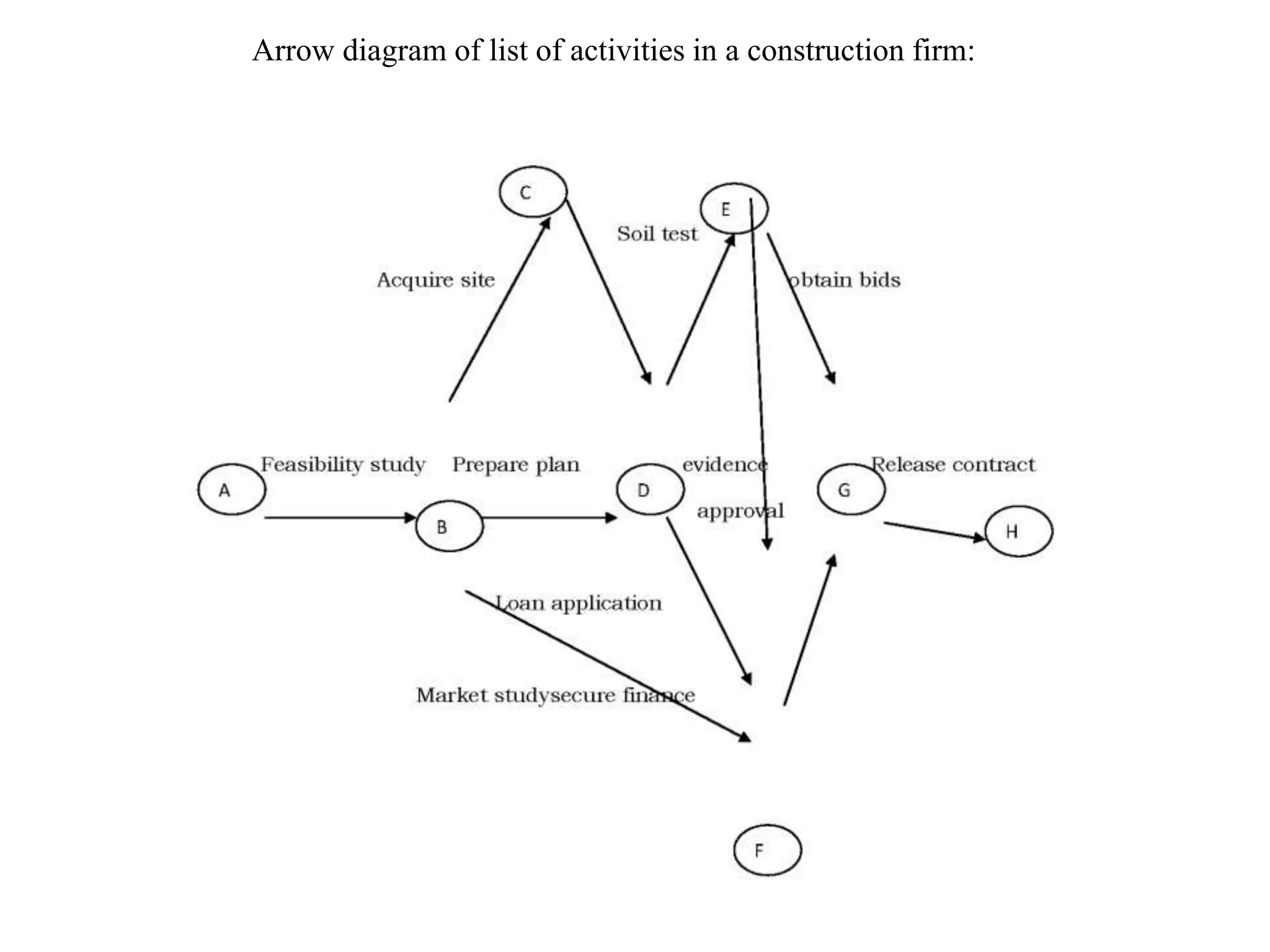
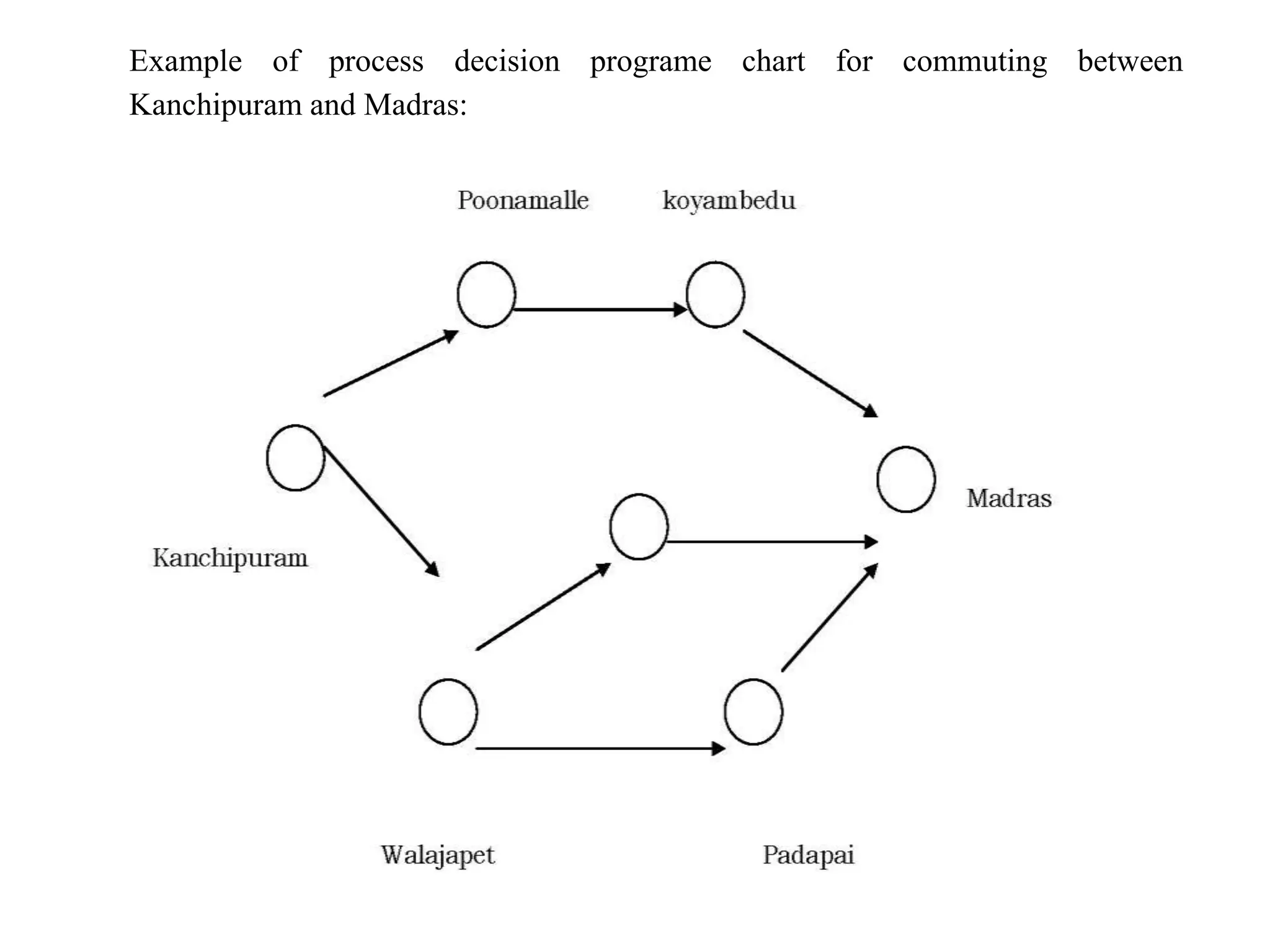
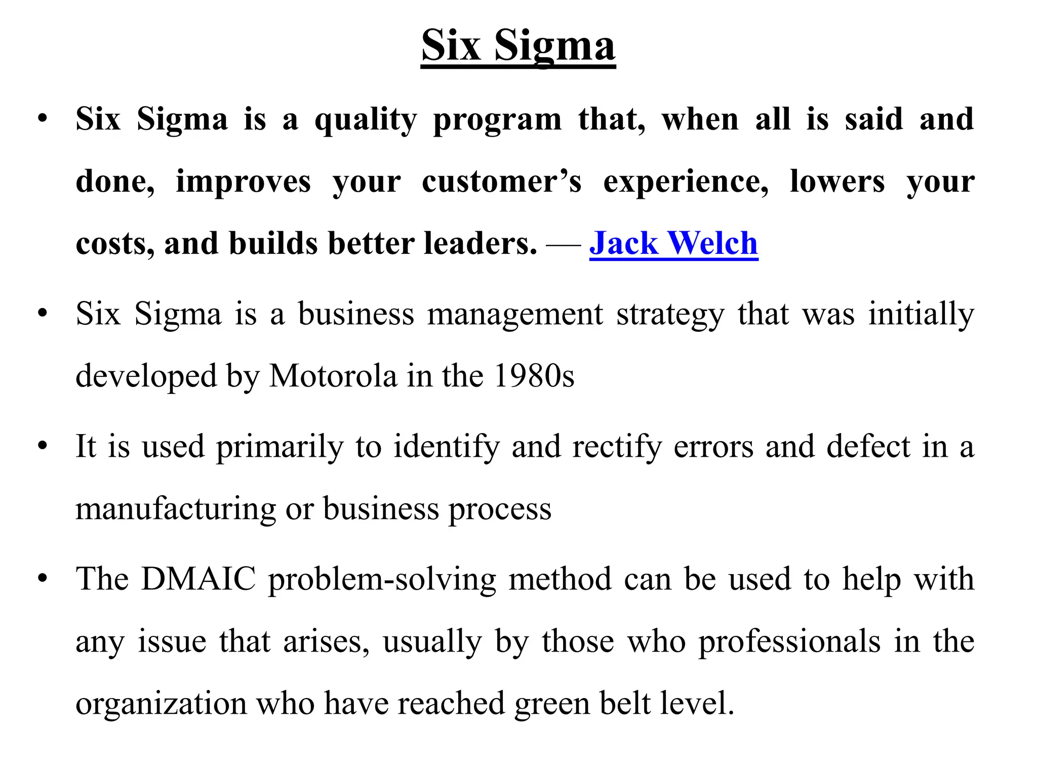
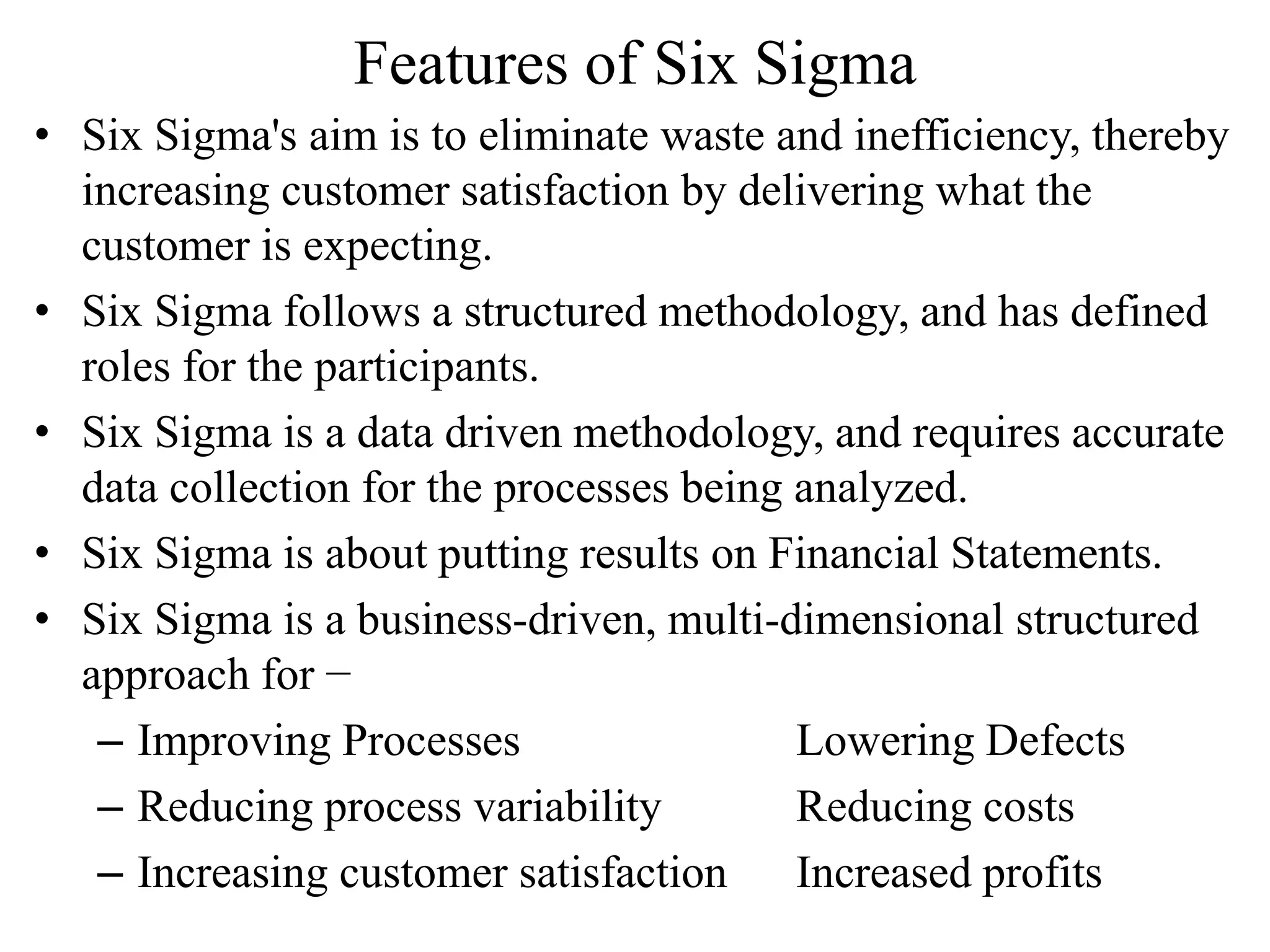
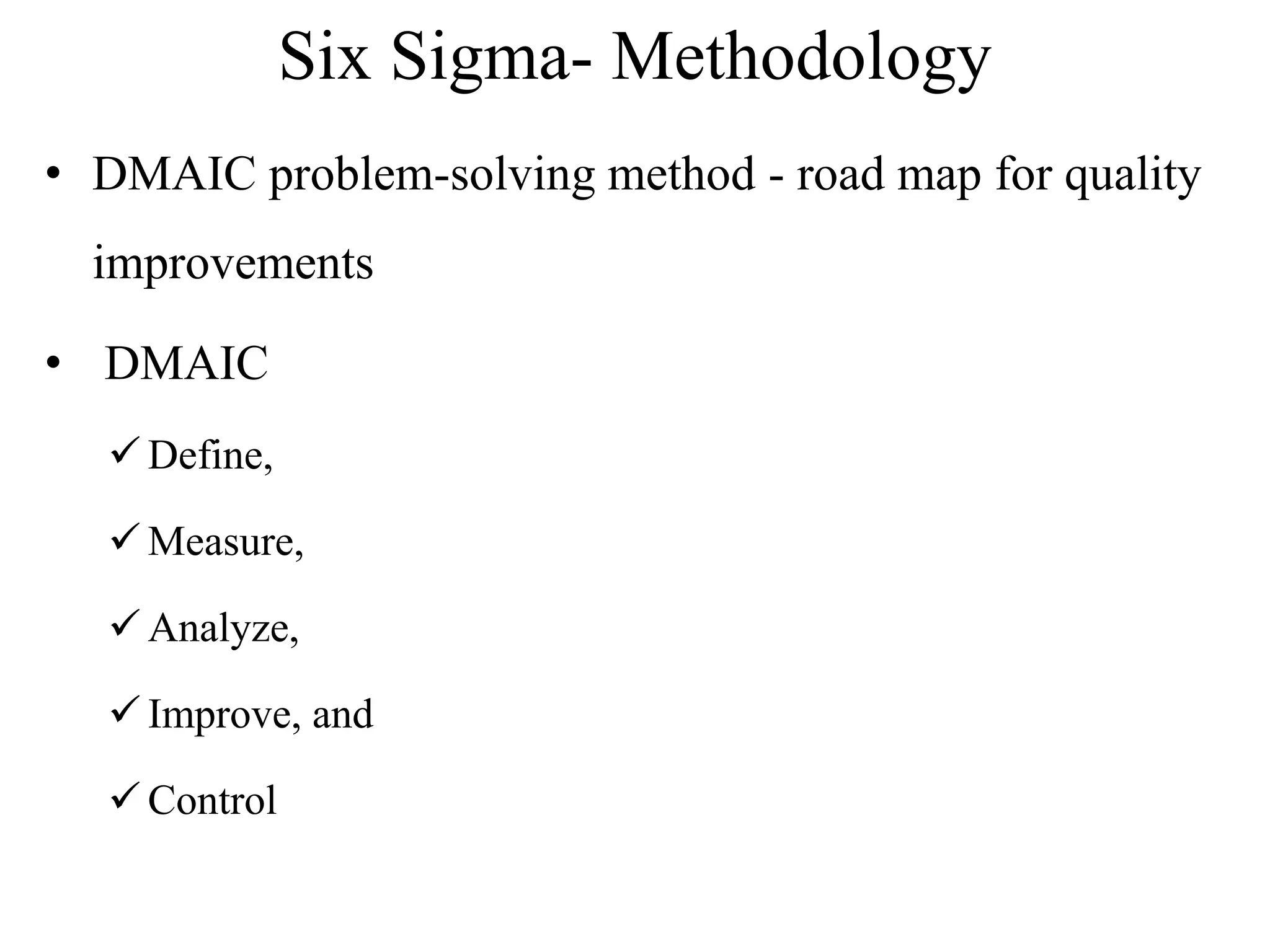
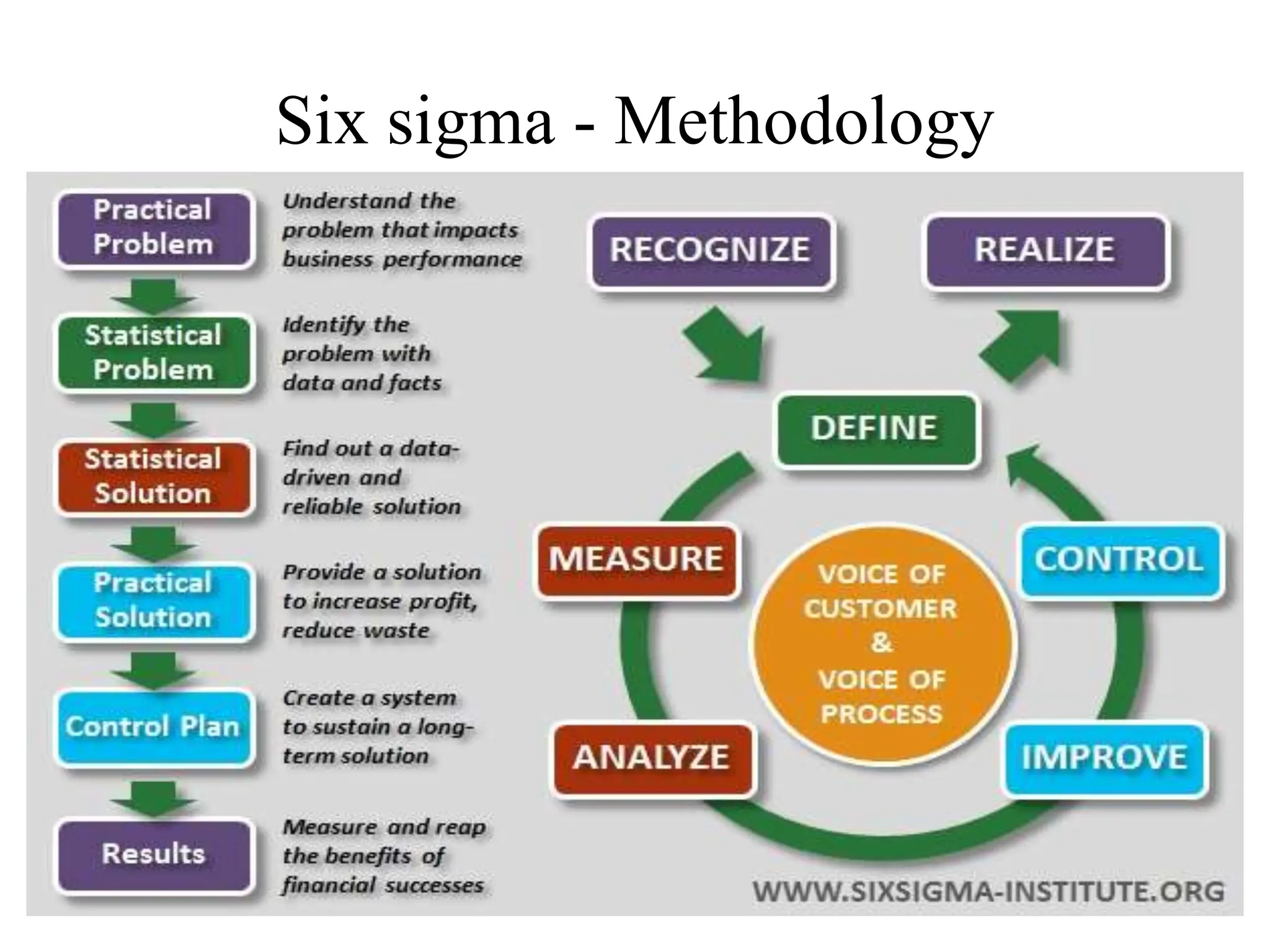
2. UNIT III - TQM TOOLS AND TECHNIQUES I
The seven traditional tools of quality - New management
tools - Six sigma: Concepts, Methodology, applications to
manufacturing, service sector including IT - Bench marking -
Reason to bench mark, Bench marking process - FMEA - Stages,
Types.
3. Quality tools
• More specific tools which can be applied to solving problems
in improving quality in organizations, manufacturing, or even
in individual processes.
• They were first emphasized by Kaoru Ishikawa, professor of
engineering at Tokyo University and father of “ Quality
Circles”.
5. 1. Flow Chart
• Organizational Structures
• Used to document work process flows
• This tool is used when trying to determine where the bottlenecks
or breakdowns are in work processes
• Flowcharts are also used to show changes in a process when
improvements are made or to show a new work flow process.
6.
7.
8. 2. Check sheet
• A check sheet is a basic quality tool that is used to collect data. A
check sheet might be used to track the number of times a certain
incident happens.
• As an example, a human resource department may track the
number of questions by employees, per category, per day. In this
particular check sheet the tools shows the total number of
questions received by the human resources department.
• This information helps that department identify opportunities to
proactively share information with employees in an effort to
reduce the numbers of questions asked.
10. 3. Cause & Effect Diagram
• A cause and effect diagram, also know as a fish-bone diagram,
shows the many possible causes of a problem. To use this tool, one
need to first identify the problem that are to be solved and simply
write it in the box (head of the fish) to the right.
• Next, list the major causes of the problem on the spine of the fish.
Causes are typically separated into categories of people, process,
materials and equipment. Causes are then identified through
brainstorming with a group familiar with the problem.
• Once all of the possible causes are identified, they can be used to
develop an improvement plan to help resolve the identified
problem.
11.
12. 4. Pareto Chart
• The main function of Pareto analysis is to discover the causes of
events and to quantify the relative frequency of when these events
occur.
• The technique was named after Vilfredo Pareto, an economist at the
turn of the 20th Century.
• Pareto theorized that 80 percent of the wealth in Italy derived from
the richest 20 percent of the population.
• Italian economist Vilfredo Pareto shows on a bar graph which
factors are more significant.
• This method helps to find the vital few contributing maximum
impact.
13. Purpose:
• The purpose of the Pareto chart is to prioritize problems.
• No company has enough resources to tackle every problem, so they must prioritize.
Pareto Principle:
• The Pareto concept was developed by the describing the frequency distribution of any given
characteristic of a population.
• Also called the 20-80 rule, he determined that a small percentage of any given group (20%)
account for a high amount of a certain characteristic (80%).
Pareto principles states that
PARETO charts show the most
frequently occurring factors
Analysis of Pareto charts help to
make best use of limited resources by
targeting the most important problems
to tackle.
14. Steps involved in constructing a Pareto Chart:
1. Identify the problem or the improvement area to be studied
2. Identify the data to be collected and the basis on which the comparison is to be carried
out
3. Identify the time period of the study
4. Collect the required amount of data
5. Find out the frequency of occurrence in each category. This gives the height of each
bars
6. Arrange the categories in descending order. Find out the percentage that each category
contributes to the total value
7. Scale the x and y axis. The categories of problem are placed in descending order in the
x axis, from left to right. The basis on which comparison is made is placed on the y axis
8. Now draw the bars on the charts. After drawing the bars, draw the cumulative percentage
line starting from the first bar
9. Now label the chart
15. 5. Control Charts
A control chart invented by WALTER A.SHEWRAT is the most widely used tool in
statistical process control (SPC)
Purpose:
• A control charts is used to monitor a process to see if the process output is random. It helps
to detect the presence of controllable causes of variation.
• It can also indicate when a problem occurred and give insight into what might have caused
the problem.
16. • A control chart is a graph that displays data taken over time and variations of this
data.
• The control chart is based on a series of random samples taken at regular intervals.
• The chart consists of three horizontal lines that remain constant over time: a
centerline, a lower control limit (LCL), and on upper control limit (UCL).
• The center is usually set at normal design value. The UCL and LCL are generally set
at +_3 standard deviations of the sample means.
• If a sample drawn from the process lies inside these (UCL and LCL) limits, it means
the process is in control.
• On the other hand, if the sample lies outside these limits, then the process is said to be
out of control. So appropriate corrective action is necessary to eliminate the condition.
17. Types of control charts:
The two basic control charts are:
(a) Control charts for variable-for measurable data such as time, length, temperature,
weight, pressure etc.
(b) Control charts for characteristics-for quantifiable data such as number of defects in a
glass bottle (air bubbles), typing error in report, etc.
Uses of control charts
• The purpose of a control chart is to identify when the processes has gone out of
statistical control, thus signaling the need for some corrective action to be taken.
18. 6. Histograms
• A histogram is a graph that displays the distribution of data.
• A histogram is also known as ‘frequency distribution diagram‘.
• It is constructed from the data collected in a frequency table.
• A frequency table is a chart that divides the range of data into several equal sections to
compare the frequency of occurrence in each section.
Uses of histogram:
• A histogram is used to show clearly where the most frequently occurring values are
located and the data is distributed.
• It is also a tool for determining the maximum results.
• It enables the analyst to quickly visualize the features of a complete set of data.
19. Purpose:
• To determine the spread or variation of a set of data points in a graphical form.
• It is always a desire to produce things that are equal to their design values.
Types of histograms and their interpretations
The following patterns are very useful in the analysis of data.
(a) Bell-shaped histogram
• Symmetrical shape with a peak in middle representing a normal distribution.
20. (b) Double-peaked histogram
• Two normal distribution with two peaks in middle indicating more than one distribution at
work.
(C) Plateau
• Flat top, no distinct peak and tails indicating more than one distribution at work
21. (d) Comb
• Alternative peaks showing possible errors in data collection and analysis
(e) Isolated peak
• Two normal distributions suggesting two processes taking place at the same time.
22. (f) Edged peak
• A normal distribution curve with a large peak at one end indicating errors in data
recording.
(g) Skewed
An asymmetrical shape positively or negatively skewed-usually reflecting limits in the
specification on one side.
23. (h) Truncated
• An asymmetrical shape with a peak at the end. Usually being a part of a normal
distribution with part of it having been removed.
24. 7. Scatter diagram
Scatter Diagrams
• Scatter diagram is a graph that shows the degree and direction of relationship between
two variables.
• It can be useful in deciding whether there is a correlation between any two variables.
• Relationship between the temperature and the number of errors committed per hour.
• High values of temperature correspond to high number of errors and vice versa.
• Higher values of speed correspond to low noise and vice versa.
• The higher the correlation between the two variables, the lesser will be the scatter the
points will tend to line up.
• On the other hand, if there were little or no relationship between two variables, the
points would be completely scattered.
25. Uses of scatter diagram
• The purpose of scatter diagram is, therefore to display what happened to one variable to
another variable is changed.
• This diagram is used to understand, why particular variations occur and how they can be
controlled.
Types of scatter diagram
26. NEW MANAGEMENT TOOLS
Seven New Management and Planning Tools
• In 1976, the Union of Japanese Scientists and Engineers (JUSE) saw the need for tools to
promote innovation, communicate information and successfully plan major projects.
• A team researched and developed the seven new quality control tools, often called the seven
management and planning (MP) tools, or simply the seven management tools. Not all the
tools were new, but their collection and promotion were.
• The seven MP tools, listed in an order that moves from abstract analysis to detailed planning,
are:
1. Affinity diagram:
The affinity diagram, also known as KJ method, gets the name from its inventor, Kawakita
Jiro
Organizes a large number of ideas into their natural relationships.
In affinity diagrams large volumes of data is gathered and organized.
Ideas, opinions, and facts relating to a problem are grouped.
Its applications are to organize into groups a large number of ideas, opinions about a
particular topic.
27. Example of an affinity diagram drawn to improve the English language speaking skills of
students:
28. 2. Inter Relations diagram:
Shows cause-and-effect relationships and helps you analyze the natural links between
different aspects of a complex situation.
The relationship between causative factors and then main issue is established.
This tool helps us in identifying the relationship between different factors, which cause
a problem or issue.
It also helps in determining the interrelationship between these factors.
This tool is used to identify the major causes, which help in solving a problem on the
basis of logical analysis and linkage of causes associated with the problem.
29. Example of a relationship diagram drawn to improve customer satisfaction:
30. 3. Tree diagram:
Breaks down broad categories into finer and finer levels of detail, helping you move your
thinking step by step from generalities to specifics.
Tree diagram is listed as a tool for non- numerical data.
It is used to show the relationship between an issue and its component elements.
Therefore a tree diagram breaks down the issue into its component elements.
This is a tool for operational planning after initial diagnosis of issues.
31. Example of a tree diagram constructed to analyze the monthly outgoings in a company:
32. 4. Matrix diagram:
Shows the relationship between two, three or four groups of information and can give
information about the relationship, such as its strength, the roles played by various
individuals, or measurements.
A matrix diagram consists of a set of columns and rows.
The intersections of these rows and columns are checked for determining the nature and
strength of the problem.
These help us to arrive at the key ideas and determining the relationship and an effective
way of perusing the problem.
33. 5. Matrix data analysis
a complex mathematical technique for analyzing matrices, often replaced in this list by
the similar prioritization matrix.
One of the most rigorous, careful and time-consuming of decision-making tools, a
prioritization matrix is an L-shaped matrix that uses pairwise comparisons of a list of
options to a set of criteria in order to choose the best option(s).
34. 6. Arrow diagram:
Shows the required order of tasks in a project or process, the best schedule for the entire
project, and potential scheduling and resource problems and their solutions.
Arrow diagram is tool to plan the most appropriate schedule for the completion of a
complete task and its related sub-task.
It projects likely completion time and monitors all sub tasks adherence to necessary
schedule. The total work or task is sub- broken down to sub tasks or activities.
The sub tasks and the total work is linked by arrows and a diagram is constructed to depict
the activities.
36. 7. Process decision program chart (PDPC)
Systematically identifies what might go wrong in a plan under development.
It is method, which maps out conceivable events and contingencies that can occur in any
implementation plan along with appropriate counter measures.
This tool is used to plan each possible chain of events that need to occur when the
problem or goal is unfamiliar one. This is a qualitative tool.
Thus PDPC is useful whenever uncertainty exists in a proposed implementation plan.
37. Example of process decision programe chart for commuting between
Kanchipuram and Madras:
38. Six Sigma
• Six Sigma is a quality program that, when all is said and
done, improves your customer’s experience, lowers your
costs, and builds better leaders. — Jack Welch
• Six Sigma is a business management strategy that was initially
developed by Motorola in the 1980s
• It is used primarily to identify and rectify errors and defect in a
manufacturing or business process
• The DMAIC problem-solving method can be used to help with
any issue that arises, usually by those who professionals in the
organization who have reached green belt level.
39. Features of Six Sigma
• Six Sigma's aim is to eliminate waste and inefficiency, thereby
increasing customer satisfaction by delivering what the
customer is expecting.
• Six Sigma follows a structured methodology, and has defined
roles for the participants.
• Six Sigma is a data driven methodology, and requires accurate
data collection for the processes being analyzed.
• Six Sigma is about putting results on Financial Statements.
• Six Sigma is a business-driven, multi-dimensional structured
approach for −
– Improving Processes Lowering Defects
– Reducing process variability Reducing costs
– Increasing customer satisfaction Increased profits
40. Six Sigma- Methodology
• DMAIC problem-solving method - road map for quality
improvements
• DMAIC
Define,
Measure,
Analyze,
Improve, and
Control
42. • Define – It is important in Six Sigma to define the
problem or project goals. The more specific the
problem is defined the greater the chance of obtaining
measurements and then successfully completing the
project or solving the problem. The definition should
describe the issue accurately with numeric
representation. For example, “damaged finished
goods from the production line have increased 17
percent in the last three months”. The definition of
the problem or project should not be vague such as
“quality has fallen.” As part of the definition stage,
the scope of the project, or issue should be defined as
well as the business processes involved
43. • Measure – When the project or problem has been defined then
there need to be decisions made on additional measurement that
is required to quantify the problem. For example, if the
definition of the problem is “damaged finished goods from the
production line have increased 17 percent in the last three
months,” then additional measurements may be needed to look
at what finished goods are damaged, when are they damaged,
the level of damage, etc.
• Analyze – Once the measuring stage has defined the addition
measurements, the data is then collected and analyzed. At this
point, it is possible to determine whether the problem is valid or
whether it is a random event that does not have a specific cause
that can be corrected. The data that has been collected can be
used as a base level to compare against measurements after the
project has been completed to ascertain the success of the
project.
44. • Improve – After measurements have been taken and analyzed, then
possible solutions can be developed. Test data can be created and pilot
studies launched to find which of the solutions offers the best
improvements to the issue when compared against the original
measurements taken. The team should also look at the results to
ensure that there are no unanticipated consequences to the selected
solution. When the most appropriate solution is selected, then the team
can develop an implementation plan and a timeline for the completion
of the project.
• Control – After the implementation of the solution or project there
requires a number of controls to be put in place so that measurements
can be taken to confirm that the solution is still valid and to prevent
recurrence. The control measurements can be scheduled for specific
dates, e.g. monthly, daily, and yearly, etc. The solution should also be
well documented and any other related process documentation
updated.
45. Benefits of Six Sigma
• Six Sigma offers six major benefits that attract companies −
• Generates sustained success
• Sets a performance goal for everyone
• Enhances value to customers
• Accelerates the rate of improvement
• Promotes learning and cross-pollination
• Executes strategic change