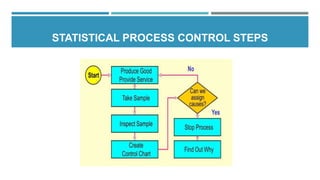
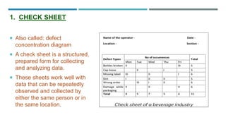
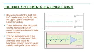
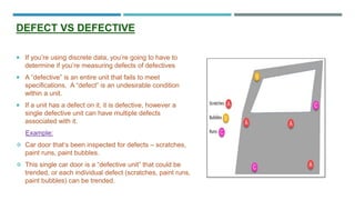
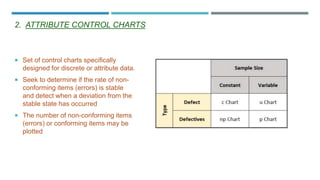
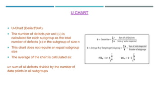
Statistical Process Control,Control Chart and Process Capability
1. STATISTICAL PROCESS CONTROL
DEPARTMENT OF PHARMACEUTICAL CHEMISTRY AND QUALITY ASSURANCE
L.M. COLLEGE OF PHARMACY, AHMEDABAD
Prepared By:
Shah Vaidehi Dipesh
M.Pharm Sem 1
2. TABLE OF CONTENTS
Introduction
5M’s of spc
Statistical process control steps
Process variability
Tools for spc
Control chart
Process Capability
Advantages of Spc Implementation
Disadvantages of spc implementation
Application of spc
Reference
3. INTRODUCTION
Statistical Process Control (SPC) is a procedure for open or closed loop control of manufacturing
processes based on statistical methods. This procedure helps in monitoring the process
behavior. It is a standard method for visualizing and controlling processes on the basis of
measurements of randomly selected samples.
• Deals with collection, summarization ,
analysis and drawing information from the
data
Statistics
• Converts input resources into the desired
output with a combination of people,
materials, methods, machines and
measurements
Process
• System, policies and procedures in place
the overall output meets the requirement
Control
4. The main objective of SPC is to ensure that the planned process output is achieved and the related
customer requirements are fulfilled.
An SPC chart is nothing more than a time-ordered graph of your process data. When these data are
plotted using statistical software, the resulting graph outlines the expected extent of variation of the
data. Since the expected range is known, anything outside of that is considered a special occurrence
that needs investigation and correction.
SPC charts can be used to monitor either your process X or your process Y (inputs or output), or both.
In the long run, SPC charts can help bring down rejects and rework, boosting productivity.
5. 5M’S OF SPC
The 5M’s of SPC i.e. man, machine, material, method and milieu are the primary groups of input.
Each “M” can be subdivided, e.g. milieu (environment) in temperature, vibration, humidity,
contamination, lighting, etc.
Man
• The Man does
not set the
machine
consistently or
thereafter works
without
concentration;
causes
fluctuations, in
readings.
Machine
• The Machine is
subjected to
temperature
fluctuations,
clearance in
guides and
bearings and
also to joints
and vibrations-
all of this can
lead to deviation
in dimension
more or less.
Material
• The Material
can have non-
homogeneous
composition,
inconsistent
hardness,
internal stresses
etc.
Method
• The Method for
the components
that are being
manufactured
can be wrong.
In this case, it
would be
judicious, that
components are
manufactured
with another
method.
Milieu
• The Milieu
(Environment)
may differ from
time to time and
place to place.
7. PROCESS VARIABILITY
Process variability is the variation that occurs during the manufacturing process.
It is important to have a measure of the data dispersion or spread.
SPC is exist because variation is exist.
8. TOOLS FOR SPC
SPC 7
basic
tools
Scatter
diagram/chart
Cause and effect
or fishbone
diagram
Control chart
Pareto chart
Histogram
Run chart
Check sheet
9. Also called: defect
concentration diagram
A check sheet is a structured,
prepared form for collecting
and analyzing data.
These sheets work well with
data that can be repeatedly
observed and collected by
either the same person or in
the same location.
1. CHECK SHEET
10. The Fishbone Diagram, also known
as the Ishikawa Diagram, is a visual
technique for problem-
solving invented by Kaoru Ishikawa,
a Japanese quality control expert.
In manufacturing, the Fishbone
Diagram is an effective technique
for causal analysis.
The Fishbone Diagram is usually
read from left to right and consists of
bones, indicating possible causes of
a problem, connected to a spine
leading into the fish’s head, which
symbolizes the defect or problem.
2. FISHBONE/CAUSE AND EFFECT DIAGRAM
11. A Pareto chart is a bar graph. The lengths
of the bars represent frequency or cost
(time or money), and are arranged with
longest bars on the left and the shortest to
the right.
Pareto charts are based on Pareto’s law,
also called the 80/20 rule , which says that
20% of inputs drive 80% of results.
In quality control, Pareto charts are useful
to find the defects to prioritize in order to
observe the greatest overall improvement.
3. PARETO CHART
12. The scatter diagram graphs pairs of
numerical data, with one variable on
each axis, to look for a relationship
between them.
In a scatter correlation diagram, if all
the points stretch in one line, then
the correlation is perfect and is in
unity.
However, if the scatter points are
widely scattered throughout the line,
then the correlation is said to be low.
If the scatter points rest near a line or
on a line, then the correlation is said
to be linear.
4. SCATTER DIAGRAM
13. The histogram is a bar chart showing a
distribution of variable quantities or
characteristics.
Normally, one individual would be the
Highest and one the Lowest, with a
cluster of individuals bunched around the
average weight.
In manufacturing, the histogram can
rapidly identify the nature of quality
problems in a process by the shape of
the distribution as well as the width of the
distribution.
5. HISTOGRAM
14. The run chart shows the history and
pattern of variation. It is plot of data
points in time sequence, connected by a
line.
Its primary use is in determining trends
over time. The analyst should indicate on
the chart whether up is good or down is
good.
This tool is used at the beginning of the
change process to see what the problems
are.
It is also used at the end (or check) part
of the change process to see whether the
change made has resulted in a
permanent process improvement.
6. RUN CHART
15. 7. CONTROL CHARTS
Control charts is a graph used in
production control to determine
whether quality and manufacturing
processes are being controlled
under stable conditions.
The hourly status is arranged on
the graph, and the occurrence of
abnormalities is judged based on
the presence of data that differs
from the conventional trend or
deviates from the control limit line.
16. CONTROL CHART
Control chart is the most successful statistical process control tool, developed by Walter
Andrew Shewhart in early 1920s. Control charts may be used to monitor a process to
determine whether or not the process is in statistical control, to evaluate a process and
determine normal statistical control parameters and to identify area of improvement in process.
Control charts attempt to differentiate between the types of process variation:
• It is intrinsic to the process and will always be
presents. It is also known as Chance cause variation.
Common cause
variation:
• Special cause variation stems from external source
and shows that the process is out of statistical
control. It is also known as assignable cause
variation or Out of Statistical Control.
Special cause
variation:
17. Below is a basic control chart, with
its 3 key elements, the Center Line,
the Upper Control Limit and the
Lower Control Limit
These 3 elements allow the control
chart to distinguish between
common cause variation and special
cause variation.
The truly special elements of the
control charts are the control limits,
and these limits create the
boundaries between common cause
variation and special cause variation.
THE THREE KEY ELEMENTS OF A CONTROL CHART
18. Typically, these control limits are set at +/- 3
standard deviations away from the average
value (center of the process).
Thus, if your process is stable (not changing
over time), then 99.73% of your population
should fall within the control limits.
19. When creating a control chart, the first factor you must consider is which variable within
your process will be controlled, and what type of data is available for that process
variable
SELECTION OF VARIABLES
Continuous Data : Discrete data :
Any data set that can be measured
across a wide scale and can be
reduced to finer & finer results.
The height of the table is 38.2840
inches. Some examples are weight,
volume, time, length, and speed.
Any data that is limited to a specific range of data and cannot
be more precise. Discrete data usually involves whole integers
(1, 2, 3, 4); or can often simply be pass/fail or good/bad
assessments.
Discrete data includes things like the number of defects per lot,
Pass/Fail data, True/False data, the count conforming/non-
conforming product, the number of defectives per Lot, etc.
You may also see discrete data called attribute data or counted
data.
The term continuous data is used
interchangeably with the term
variable data.
20. DEFECT VS DEFECTIVE
If you’re using discrete data, you’re going to have to
determine if you’re measuring defects of defectives
A “defective” is an entire unit that fails to meet
specifications. A “defect” is an undesirable condition
within a unit.
If a unit has a defect on it, it is defective, however a
single defective unit can have multiple defects
associated with it.
Example:
Car door that’s been inspected for defects – scratches,
paint runs, paint bubbles.
This single car door is a “defective unit” that could be
trended, or each individual defect (scratches, paint runs,
paint bubbles) can be trended.
22. 1. VARIABLE CONTROL CHARTS
The 3 Most Common Variable Control
Charts include the X-bar & R Chart, the
X-Bar & S chart and the I-MR chart.
Variable control charts always work in
pairs, with the first chart monitoring the
process average, and the second chart
monitoring the process variability.
For example, the X-bar chart & The
Individuals (I) Chart is also a
representation of the central tendency of
your process.
Similarly, the R (Range) Chart, S
(Standard Deviation) Chart and the MR
(Moving Range) Chart all reflect the
variability in your process.
Rational sub-group size is a single value (1)
• use the I-MR (Individual and Moving Range) Chart.
Rational sub-group size is between 2 – 10
• use the X-Bar and R Chart
Rational sub-group size is greater than 10
• use the X-Bar and S Chart
How to Choose the Right Variable Control Chart:
When deciding which control chart to use, the one factor
to consider is the sample size of the rational sub-group.
24. X-BAR & R CHARTS
The X-bar and R chart is the workhorse of
control charts.
This control chart should be used anytime
your rational subgroup size (n) is between 2 &
9, (2 < n < 9).
The first chart is the X-bar chart, which
monitors the subgroup mean of your process.
The second chart is the R chart, where R
stands for Range.
The Range of a data set is one way to
estimate the variability or spread associated
with a process.
25.
26. X BAR & S CHARTS
When the subgroup sample size (n) gets larger
than 10 samples, the range of the sub-group
becomes a less reliable estimate of the processes
variability and the sub-groups standard
deviation becomes a more representative
parameter of variation.
In switching from the Range to the Standard
Deviation this control chart becomes more
effective at detecting smaller levels of special
cause variation within the data.
The drawback in this switch from the range to the
standard deviation is that it is more difficult to
implement and maintain due to the calculations
required for the standard deviation value.
27.
28. 2. ATTRIBUTE CONTROL CHARTS
Set of control charts specifically
designed for discrete or attribute data.
Seek to determine if the rate of non-
conforming items (errors) is stable
and detect when a deviation from the
stable state has occurred
The number of non-conforming items
(errors) or conforming items may be
plotted
29. C CHART
C-Charts (Count of Defects)
The c-chart should be utilized when trending
the number of defects per unit when your
sample size is constant.
The c stands for “Count” as we’re simply
counting the number of defects per inspection.
The average of the chart is calculated as:
c = sum of all defects divided by the number of
subgroup
30.
31. U CHART
U-Chart (Defect/Unit)
The number of defects per unit (u) is
calculated for each subgroup as the total
number of defects (c) in the subgroup of size n
This chart does not require an equal subgroup
size
The average of the chart is calculated as:
u= sum of all defects divided by the number of
data points in all subgroups
32.
33. P CHART
P-Charts (Percentage of Defectives)
The percentage of defectives are
calculated for each subgroup
This chart does not require an equal
subgroup size
The average of the chart is calculated as:
p = sum of all defectives divided by the
number of data points in all subgroups
34.
35. NP CHARTS
Np-Charts (Count of Defectives)
Number of defectives is plotted on the
control chart
This chart does require an equal
subgroup size
The average of the chart is calculated as:
Np = sum of all defectives divided by the
total number of data points in all subgroups
36.
37. PROCESS CAPABILITY
Process Capability (Cp, Cpk, Pp, Ppk)
is a relatively simple statistical measure
which provides an estimate on the level
of process outputs which will be within
permitted specification limits.
It provides a comparison between the
output of a process versus the process
specifications.
The process capability measure
therefore allows comparison between
desired levels of process capability and
the actual performance levels of a
process.
38. Process Capability = +3σ or -3σ ( a
total of 6σ) Where, σ shows the
standard deviation of Process under a
state of statistical control.
Following are widely used four indices
to measure process capability and
process performance:
Cp: Process Capability
Cpk: Process capability index
Pp: Process Performance
Ppk: Process performance index
39. What Is Cpk?
Cpk is the “Capability Index”. It is a measure of the capability of a process to provide output
that is within the process specification limits. The Cpk formula, applies an estimate of sigma,
which details the potential of a process to meet specifications. The Cpk formula, includes
reference to the process mean.
Where Cpk = 1, then 99.73% of all data points will reside within the specification limits, i.e.
99.73% of outputs from a process will be within specification.
The meaning of Cpk =1.
40. What Is Cp?
Cp is a measure of the potential of a process to provide output which is within upper and lower
specification limits.
The Cp measure does not take into account the centering of the process, so while Cp may indicate a
potential to operate within the specifications, due to poor centering, the actual output may be skewed with
resultant outputs outside of specification.
As the Cp measure increases, the spread of the process output decreases, which is normally seen as
positive. With variation decrease, the process output becomes increasingly homogeneous.
Where the Cp and Cpk values are equal, then the process is centered between the specifications, where
not equal, then the greater the gap between the two values, the greater the shift in the process mean from
the nominal mean.
41.
42.
43. What Is Ppk?
The Ppk measure provides information on how well a process is actually performing versus
the process specifications.
The Ppk measure also includes the centering of the process outputs versus specifications.
Note: The Ppk uses the actual process sigma, rather than an estimate of sigma, which is
used for Cpk, therefore Ppk is used to measure actual past performance, whereas Cpk is
used to measure future performance, future process capability.
As per Cpk, if Ppk = 1, then 99.73% of all data points will reside within the specification limits.
44. What Is Pp?
Pp is a measure of the actual performance of a process in providing output which is within
upper and lower specification limits.
The Pp measure does not take into account the centering of the process and only provides a
measure of the level of process spread or variation within the process
The Pp measure should be used in conjunction with the Ppk measure in order to understand
how a process is performing in terms of spread / variation and how well the process is
centered between specification limits.
As the Pp measure increases, the spread of the process output decreases.
Where the Pp and Ppk values are equal, then the process is centered between the
specifications, where not equal, then the greater the gap between the two values, the greater
the shift in the process mean from the nominal mean.
45.
46. INTERPRETING THE CAPABILITY INDEX
Capability index > 2.0 “Excellent”. At “6 sigma” level.
Capability index of 1.34 – 2.0 “Good”
Capability index of 1.00-1.33 “Need Control”
Capability index < 1.00 “Not Capable”
47. ADVANTAGES OF SPC IMPLEMENTATION
• It could improve process performance by reducing product variability
• Improves production efficiency by decreasing scrap and rework
• Leads to higher quality product by reducing: variability and defects
• Improving their overall business competitiveness
• Minimize rework
• Minimize lost of sales
• Maintain a desired degree of conformance to design
• Eliminate any unnecessary quality checks
• Reduce the percentage of defective parts purchased from vendors
• Reduce returns from customers
48. DISADVANTAGES OF SPC IMPLEMENTATION
Time Requirements
While the emphasis of statistical process control is on early detection, implementing the
system in a manufacturing set up can take a long time. Additionally, the process of monitoring
and filling out charts is time consuming. Since the system has to be integrated into an existing
framework, training of personnel is required which takes time.
Cost Considerations
Statistical process control is also an expensive affair and requires that a company signs a
contract with a service provider and invests in training resources and materials.
Quality Measurements
A problem with statistical process control is that it detects when there is non-conformance in
the process protocol, but it does not say how many products may be defective up until that point.
49. APPLICATION OF SPC
.
It can be used in various industries for improving the quality of the product and helps in lowering
the product costs as it provides a better product and/or service.
The application of SPC involves
three main sets of activities:
1. The first is understanding
the process. This is achieved by
business process mapping
2. The second is measuring
the sources of variation assisted
by the use of control charts.
3. The third is eliminating
assignable (special) sources of
variation.
50. REFERENCE
Y. Anjaneyulu , R.Marayya. Quality Assurance and Quality Management in Pharmaceutical
Industry . Aditya Offset Process(1) Pvt. Ltd. : PharmaMed Press; 2009.
Leonard A. Doty. Statistical Process Control. Second Edition. 200 Madison Avenue, New
York: INDUSTRIAL PRESS INC; 1996.
Parkash V, Kumar D, Rajoria R. Statistical process control. International Journal of Research
in Engineering and Technology. 2013;2(8):70-2.
https://cqeacademy.com/cqe-body-of-knowledge/quantitative-methods-tools/statistical-
process-control-spc/
https://www.researchgate.net/publication/263559764_Statistical_Process_Control