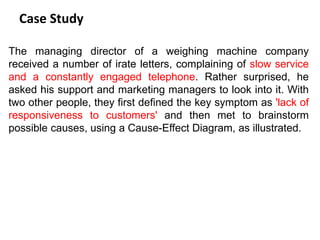
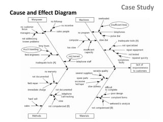
Download to read offline
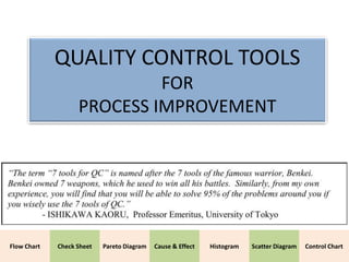
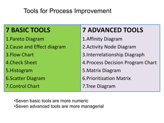
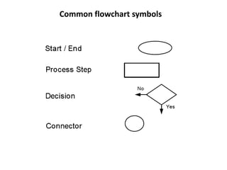
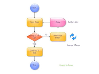
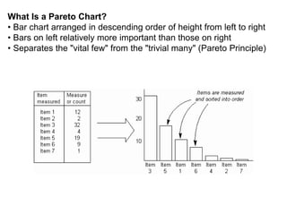
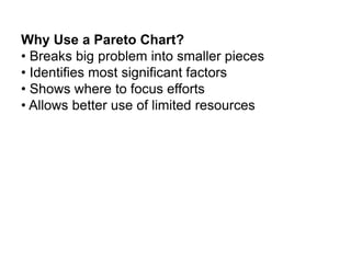
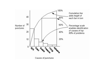
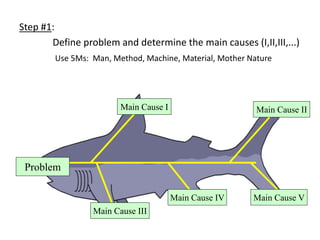

The document describes various quality control tools that can be used for process improvement. It lists 7 basic tools - Pareto diagram, cause and effect diagram, flow chart, check sheet, histogram, scatter diagram, and control chart. These are more numeric tools. It also lists 7 advanced tools - affinity diagram, activity node diagram, interrelationship diagraph, process decision program chart, matrix diagram, prioritization matrix, and tree diagram. These are described as being more managerial tools. Each tool is then described in more detail with examples on how and when they should be used.


![7 qc tools[1] to print](https://cdn.slidesharecdn.com/ss_thumbnails/7qctools1toprint-191017092858-thumbnail.jpg?width=640&height=640&fit=bounds)


