Downloaded 125 times
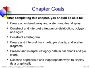
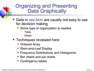
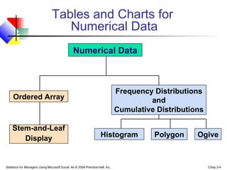


This document provides an overview of techniques for presenting numerical data in tables and charts. It discusses ordered arrays, stem-and-leaf displays, frequency distributions, histograms, polygons, ogives, bar charts, pie charts, and scatter diagrams. The chapter goals are to teach how to create and interpret these various data presentation methods using Microsoft Excel. Examples are provided for frequency distributions, histograms, polygons, and ogives to illustrate how to construct and make sense of these graphical representations of quantitative data.