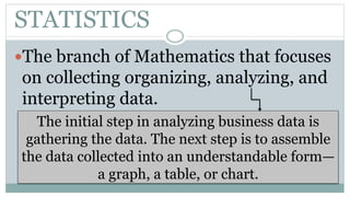
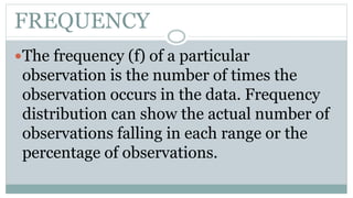
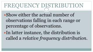
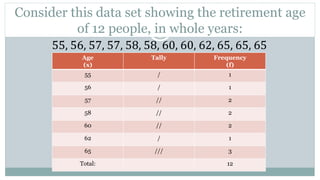
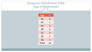
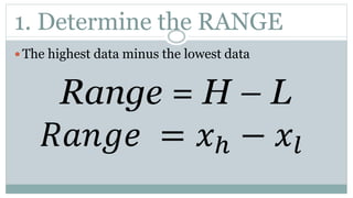
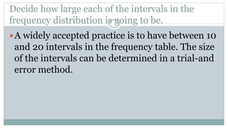
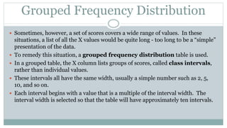
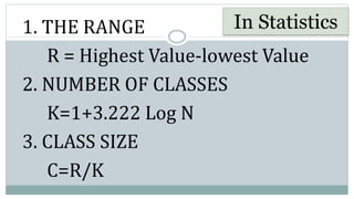
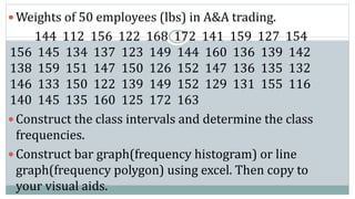
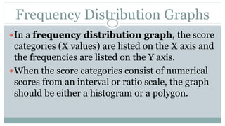
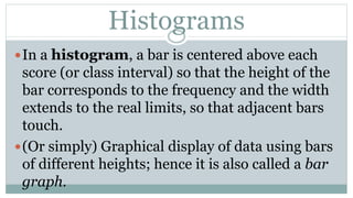
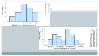
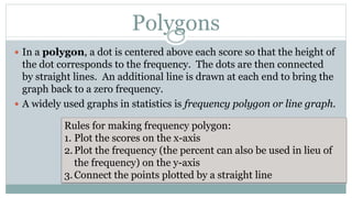
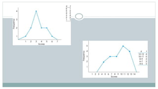
Presentation
and Analysis of
Business Data
BUSINESS DATA
Data
 the plural of the latin word “datum”, meaning a thing
given.
 Factual information in raw or unorganized form.
STATISTICS
The branch of Mathematics that focuses
on collecting organizing, analyzing, and
interpreting data.
The initial step in analyzing business data is
gathering the data. The next step is to assemble
the data collected into an understandable form—
a graph, a table, or chart.
FREQUENCY
The frequency (f) of a particular
observation is the number of times the
observation occurs in the data. Frequency
distribution can show the actual number of
observations falling in each range or the
percentage of observations.
FREQUENCY DISTRIBUTION
Show either the actual number of
observations falling in each range or
percentage of observations.
In latter instance, the distribution is
called a relative frequency distribution.
Consider this data set showing the retirement age
of 12 people, in whole years:
55, 56, 57, 57, 58, 58, 60, 60, 62, 65, 65, 65
Age
(x)
Tally Frequency
(f)
55 / 1
56 / 1
57 // 2
58 // 2
60 // 2
62 / 1
65 /// 3
Total: 12
Frequency Distribution Table
(Age of Retirement)
Age f
65 3
62 1
60 2
58 2
57 2
56 1
55 1
Total 12
1. Determine the RANGE
 The highest data minus the lowest data
Range = H – L
𝑅𝑎𝑛𝑔𝑒 = 𝑥ℎ − 𝑥𝑙
Decide how large each of the intervals in the
frequency distribution is going to be.
A widely accepted practice is to have between 10
and 20 intervals in the frequency table. The size
of the intervals can be determined in a trial-and
error method.
Grouped Frequency Distribution
 Sometimes, however, a set of scores covers a wide range of values. In these
situations, a list of all the X values would be quite long - too long to be a “simple”
presentation of the data.
 To remedy this situation, a grouped frequency distribution table is used.
 In a grouped table, the X column lists groups of scores, called class intervals,
rather than individual values.
 These intervals all have the same width, usually a simple number such as 2, 5,
10, and so on.
 Each interval begins with a value that is a multiple of the interval width. The
interval width is selected so that the table will have approximately ten intervals.
1. THE RANGE
R = Highest Value-lowest Value
2. NUMBER OF CLASSES
K=1+3.222 Log N
3. CLASS SIZE
C=R/K
In Statistics
 Weights of 50 employees (lbs) in A&A trading.
144 112 156 122 168 172 141 159 127 154
156 145 134 137 123 149 144 160 136 139 142
138 159 151 147 150 126 152 147 136 135 132
146 133 150 122 139 149 152 129 131 155 116
140 145 135 160 125 172 163
 Construct the class intervals and determine the class
frequencies.
 Construct bar graph(frequency histogram) or line
graph(frequency polygon) using excel. Then copy to
your visual aids.
Frequency Distribution Graphs
In a frequency distribution graph, the score
categories (X values) are listed on the X axis and
the frequencies are listed on the Y axis.
When the score categories consist of numerical
scores from an interval or ratio scale, the graph
should be either a histogram or a polygon.
Histograms
In a histogram, a bar is centered above each
score (or class interval) so that the height of the
bar corresponds to the frequency and the width
extends to the real limits, so that adjacent bars
touch.
(Or simply) Graphical display of data using bars
of different heights; hence it is also called a bar
graph.
Polygons
 In a polygon, a dot is centered above each score so that the height of
the dot corresponds to the frequency. The dots are then connected
by straight lines. An additional line is drawn at each end to bring the
graph back to a zero frequency.
 A widely used graphs in statistics is frequency polygon or line graph.
Rules for making frequency polygon:
1. Plot the scores on the x-axis
2.Plot the frequency (the percent can also be used in lieu of
the frequency) on the y-axis
3.Connect the points plotted by a straight line
Presentation and-analysis-of-business-data

Presentation and-analysis-of-business-data

  • 1.
  • 2.
    BUSINESS DATA Data  theplural of the latin word “datum”, meaning a thing given.  Factual information in raw or unorganized form.
  • 3.
    STATISTICS The branch ofMathematics that focuses on collecting organizing, analyzing, and interpreting data. The initial step in analyzing business data is gathering the data. The next step is to assemble the data collected into an understandable form— a graph, a table, or chart.
  • 4.
    FREQUENCY The frequency (f)of a particular observation is the number of times the observation occurs in the data. Frequency distribution can show the actual number of observations falling in each range or the percentage of observations.
  • 5.
    FREQUENCY DISTRIBUTION Show eitherthe actual number of observations falling in each range or percentage of observations. In latter instance, the distribution is called a relative frequency distribution.
  • 6.
    Consider this dataset showing the retirement age of 12 people, in whole years: 55, 56, 57, 57, 58, 58, 60, 60, 62, 65, 65, 65 Age (x) Tally Frequency (f) 55 / 1 56 / 1 57 // 2 58 // 2 60 // 2 62 / 1 65 /// 3 Total: 12
  • 7.
    Frequency Distribution Table (Ageof Retirement) Age f 65 3 62 1 60 2 58 2 57 2 56 1 55 1 Total 12
  • 8.
    1. Determine theRANGE  The highest data minus the lowest data Range = H – L 𝑅𝑎𝑛𝑔𝑒 = 𝑥ℎ − 𝑥𝑙
  • 9.
    Decide how largeeach of the intervals in the frequency distribution is going to be. A widely accepted practice is to have between 10 and 20 intervals in the frequency table. The size of the intervals can be determined in a trial-and error method.
  • 10.
    Grouped Frequency Distribution Sometimes, however, a set of scores covers a wide range of values. In these situations, a list of all the X values would be quite long - too long to be a “simple” presentation of the data.  To remedy this situation, a grouped frequency distribution table is used.  In a grouped table, the X column lists groups of scores, called class intervals, rather than individual values.  These intervals all have the same width, usually a simple number such as 2, 5, 10, and so on.  Each interval begins with a value that is a multiple of the interval width. The interval width is selected so that the table will have approximately ten intervals.
  • 11.
    1. THE RANGE R= Highest Value-lowest Value 2. NUMBER OF CLASSES K=1+3.222 Log N 3. CLASS SIZE C=R/K In Statistics
  • 12.
     Weights of50 employees (lbs) in A&A trading. 144 112 156 122 168 172 141 159 127 154 156 145 134 137 123 149 144 160 136 139 142 138 159 151 147 150 126 152 147 136 135 132 146 133 150 122 139 149 152 129 131 155 116 140 145 135 160 125 172 163  Construct the class intervals and determine the class frequencies.  Construct bar graph(frequency histogram) or line graph(frequency polygon) using excel. Then copy to your visual aids.
  • 13.
    Frequency Distribution Graphs Ina frequency distribution graph, the score categories (X values) are listed on the X axis and the frequencies are listed on the Y axis. When the score categories consist of numerical scores from an interval or ratio scale, the graph should be either a histogram or a polygon.
  • 14.
    Histograms In a histogram,a bar is centered above each score (or class interval) so that the height of the bar corresponds to the frequency and the width extends to the real limits, so that adjacent bars touch. (Or simply) Graphical display of data using bars of different heights; hence it is also called a bar graph.
  • 16.
    Polygons  In apolygon, a dot is centered above each score so that the height of the dot corresponds to the frequency. The dots are then connected by straight lines. An additional line is drawn at each end to bring the graph back to a zero frequency.  A widely used graphs in statistics is frequency polygon or line graph. Rules for making frequency polygon: 1. Plot the scores on the x-axis 2.Plot the frequency (the percent can also be used in lieu of the frequency) on the y-axis 3.Connect the points plotted by a straight line