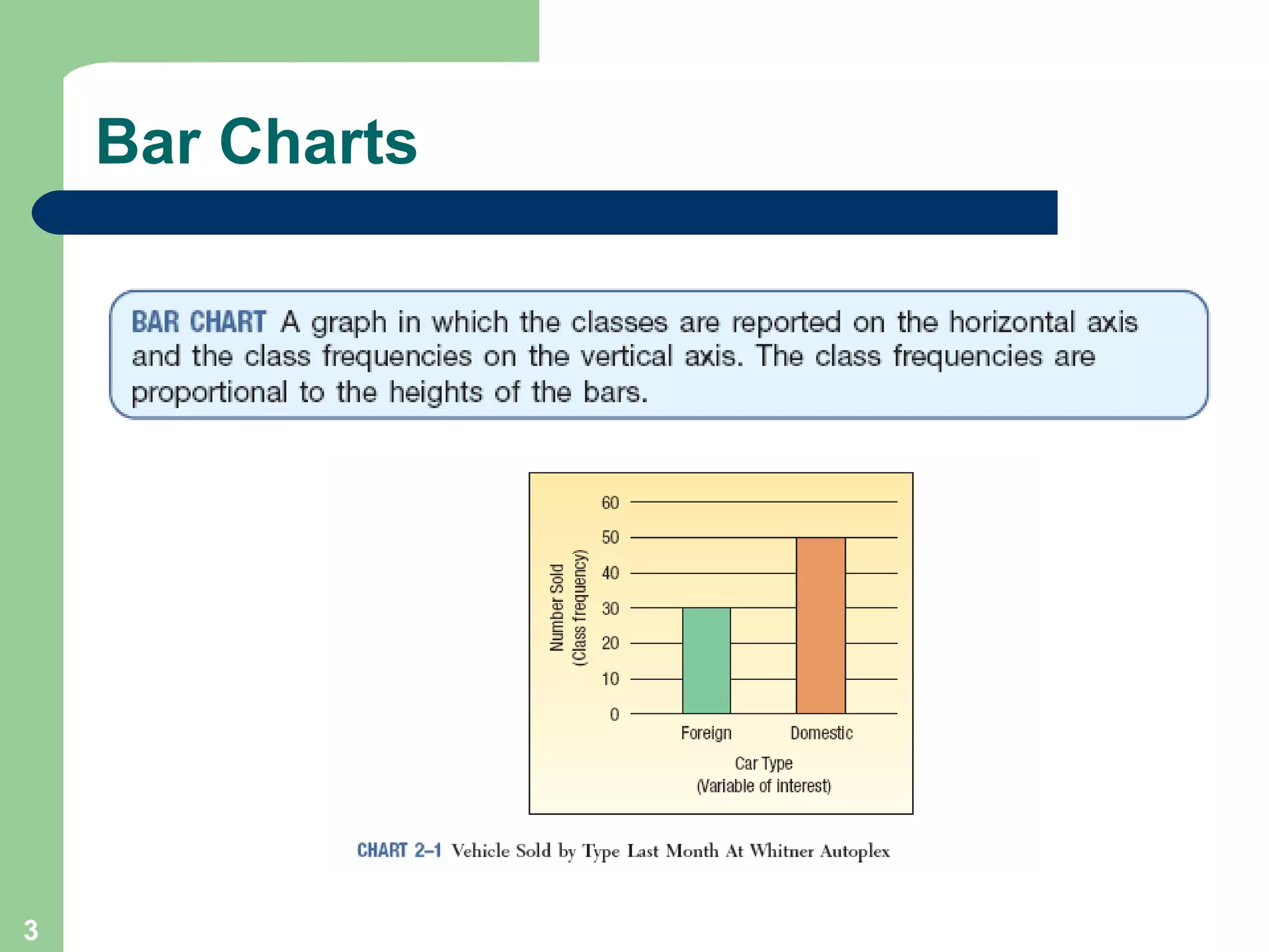
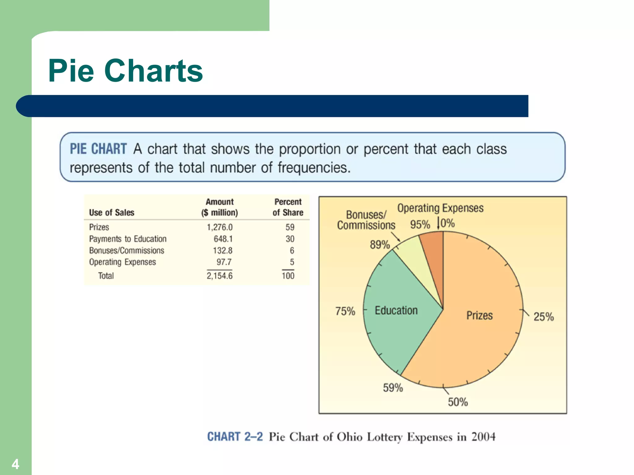
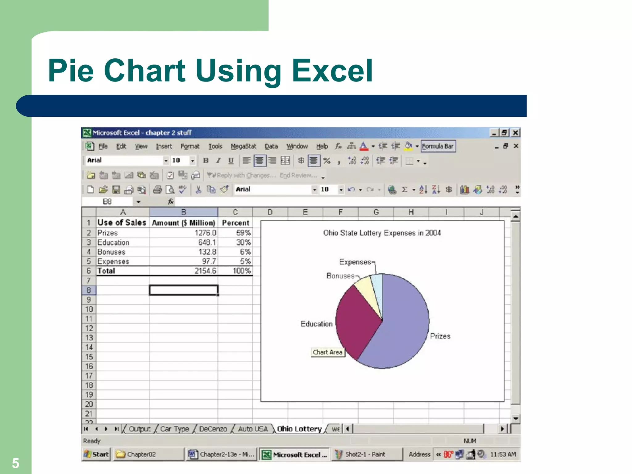
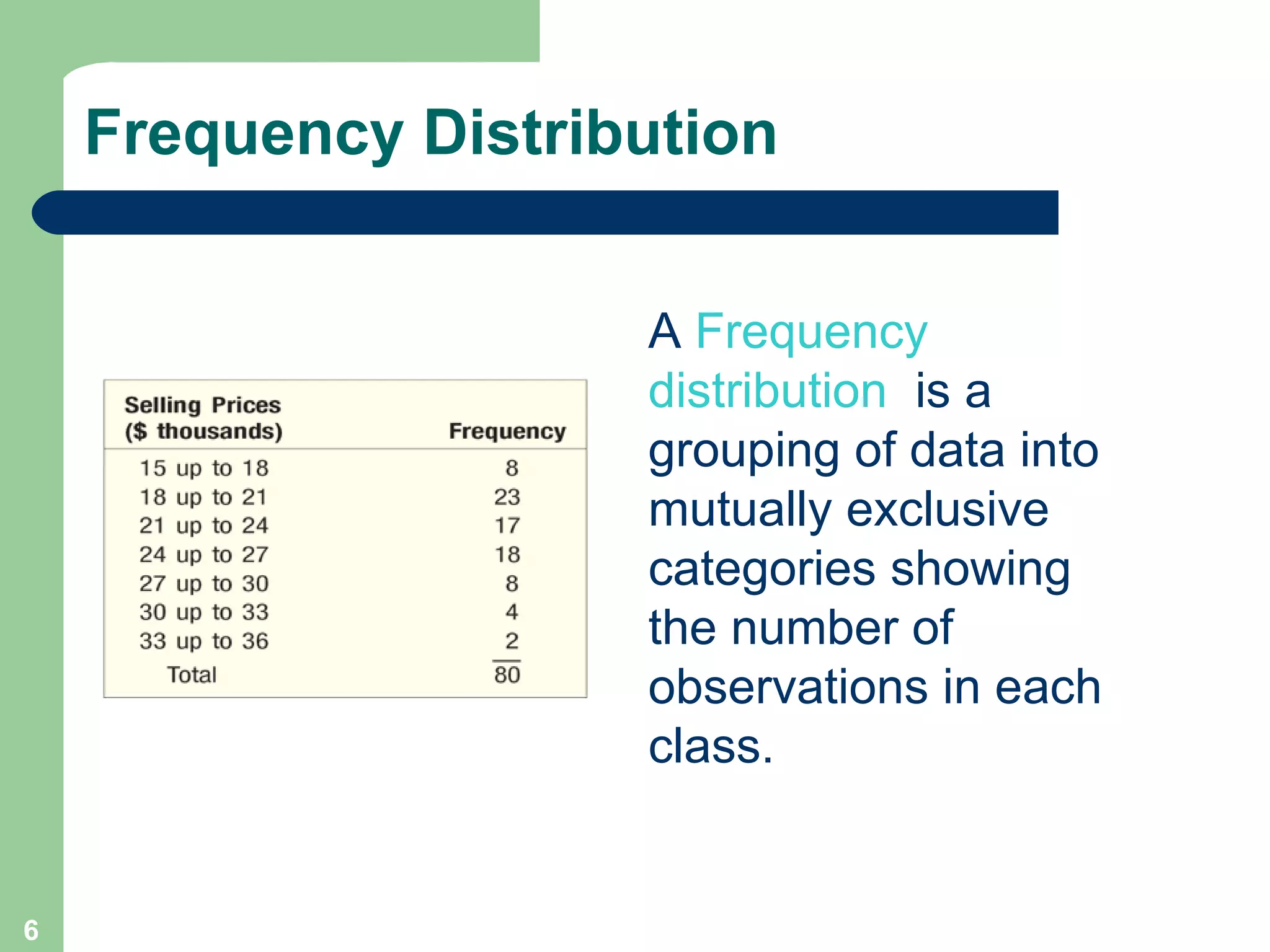
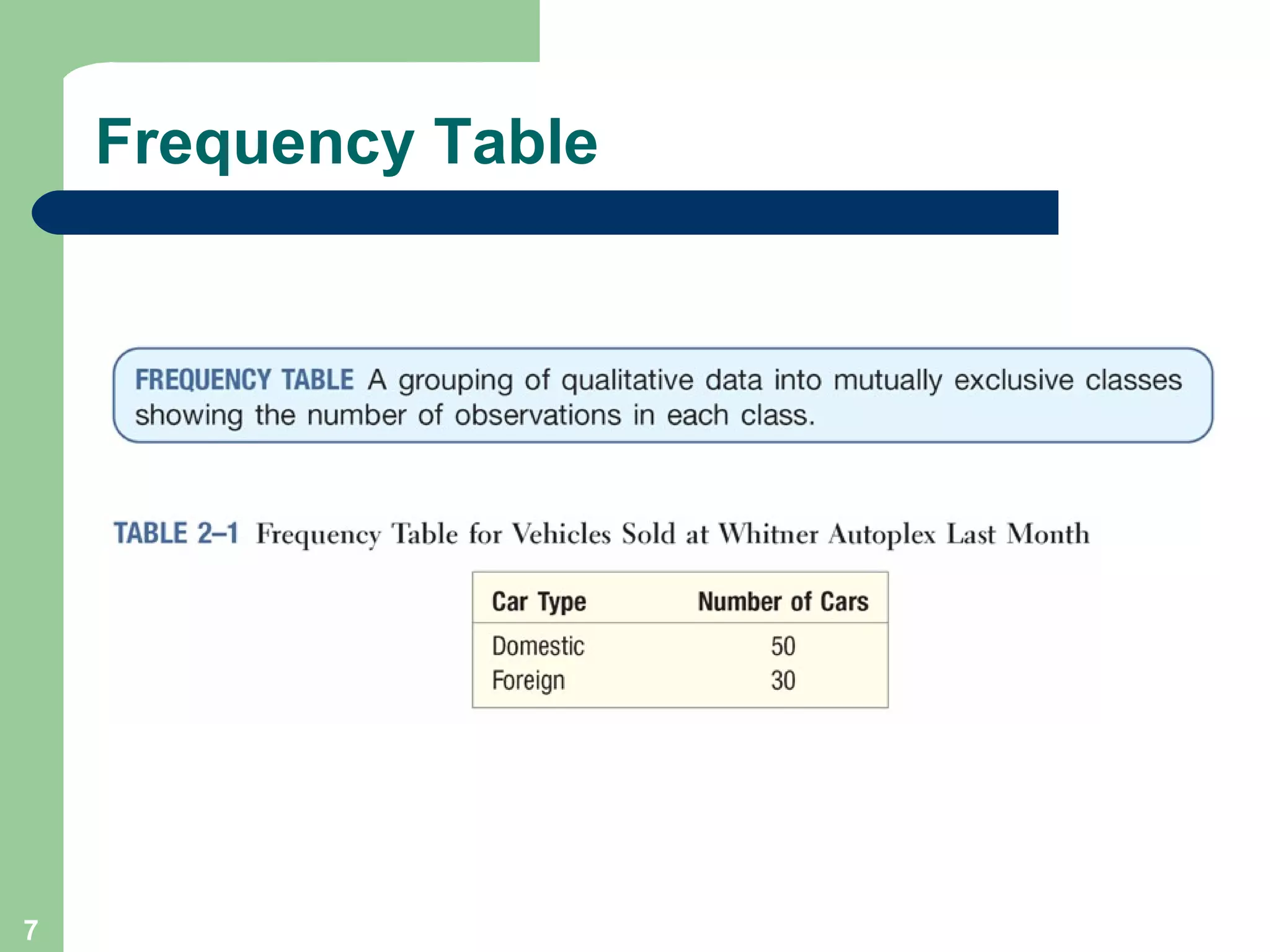
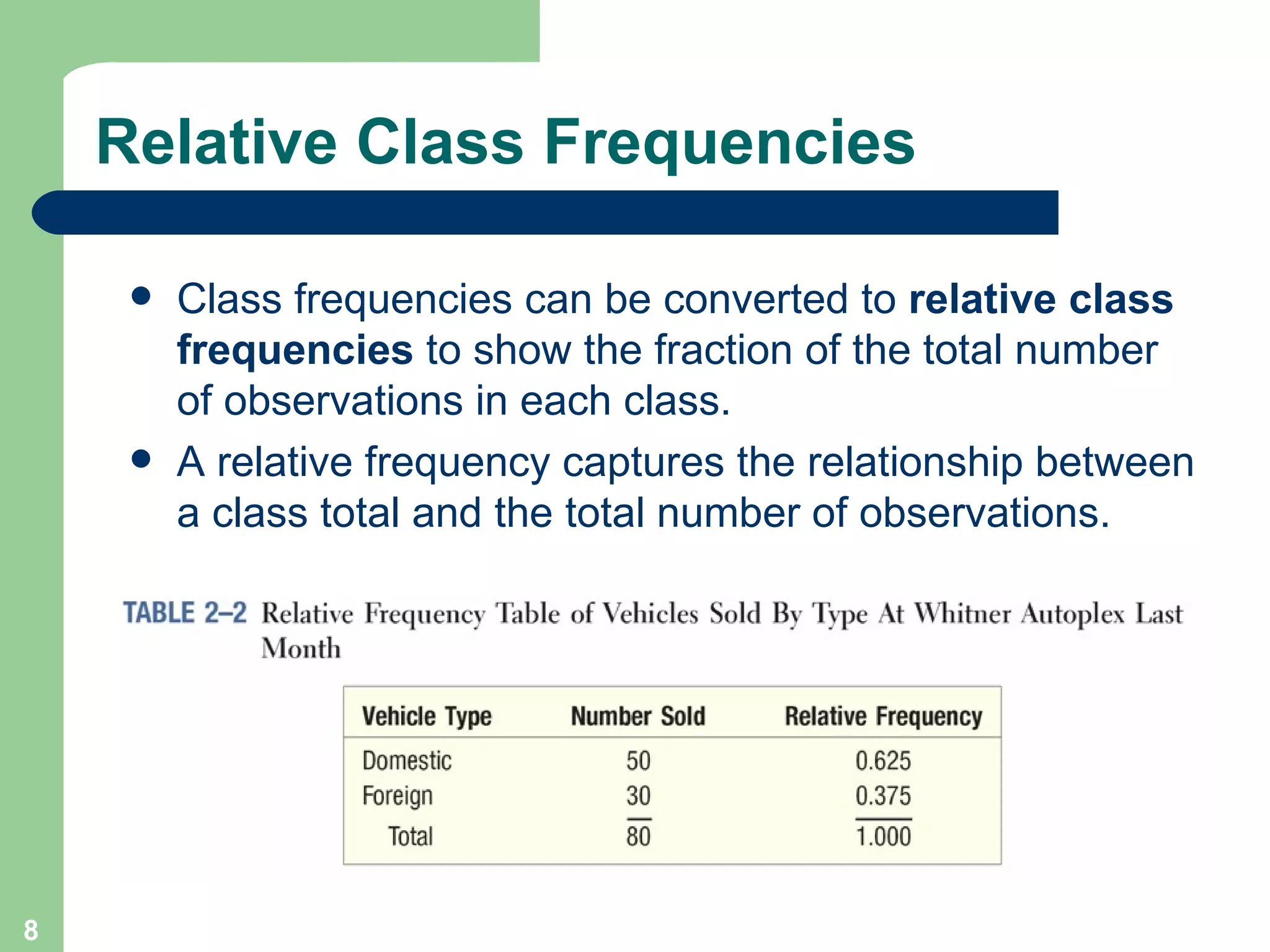
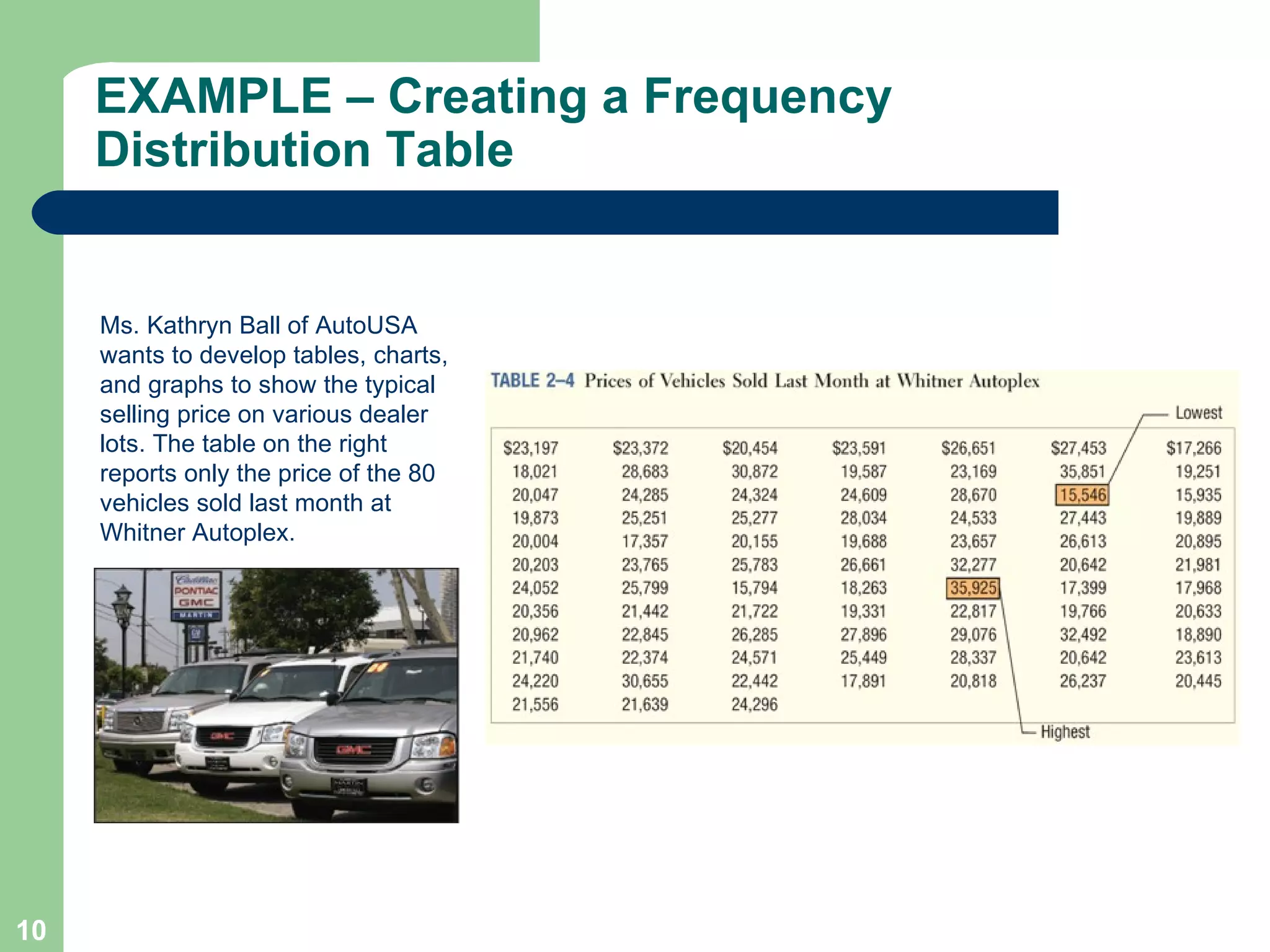
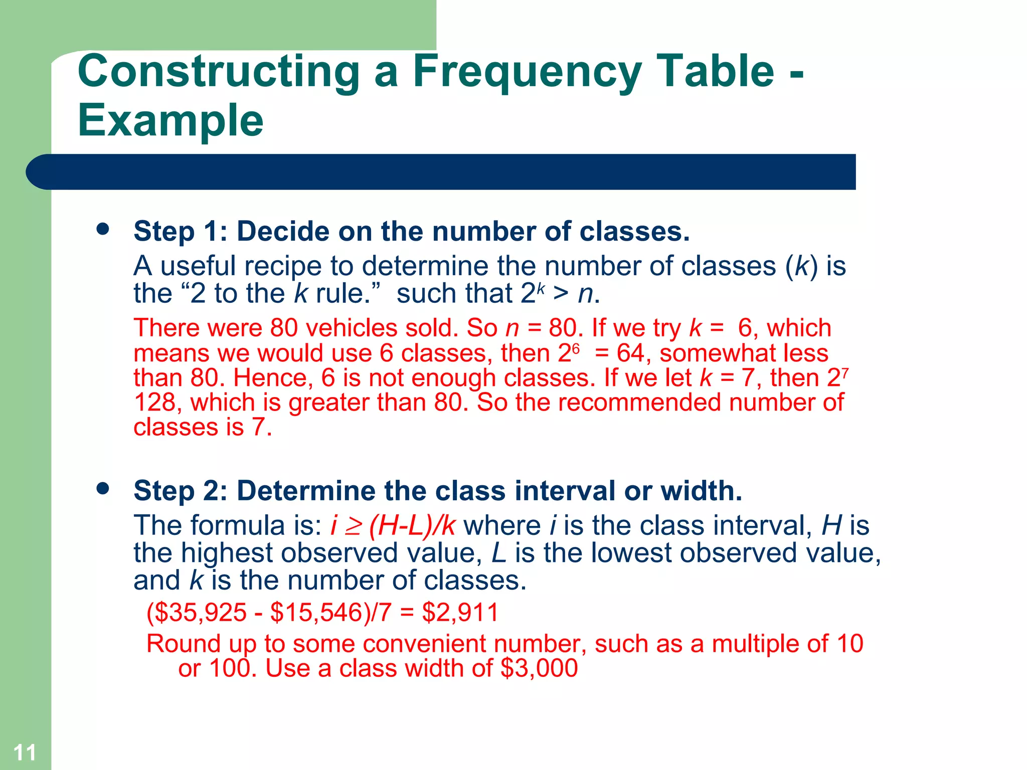
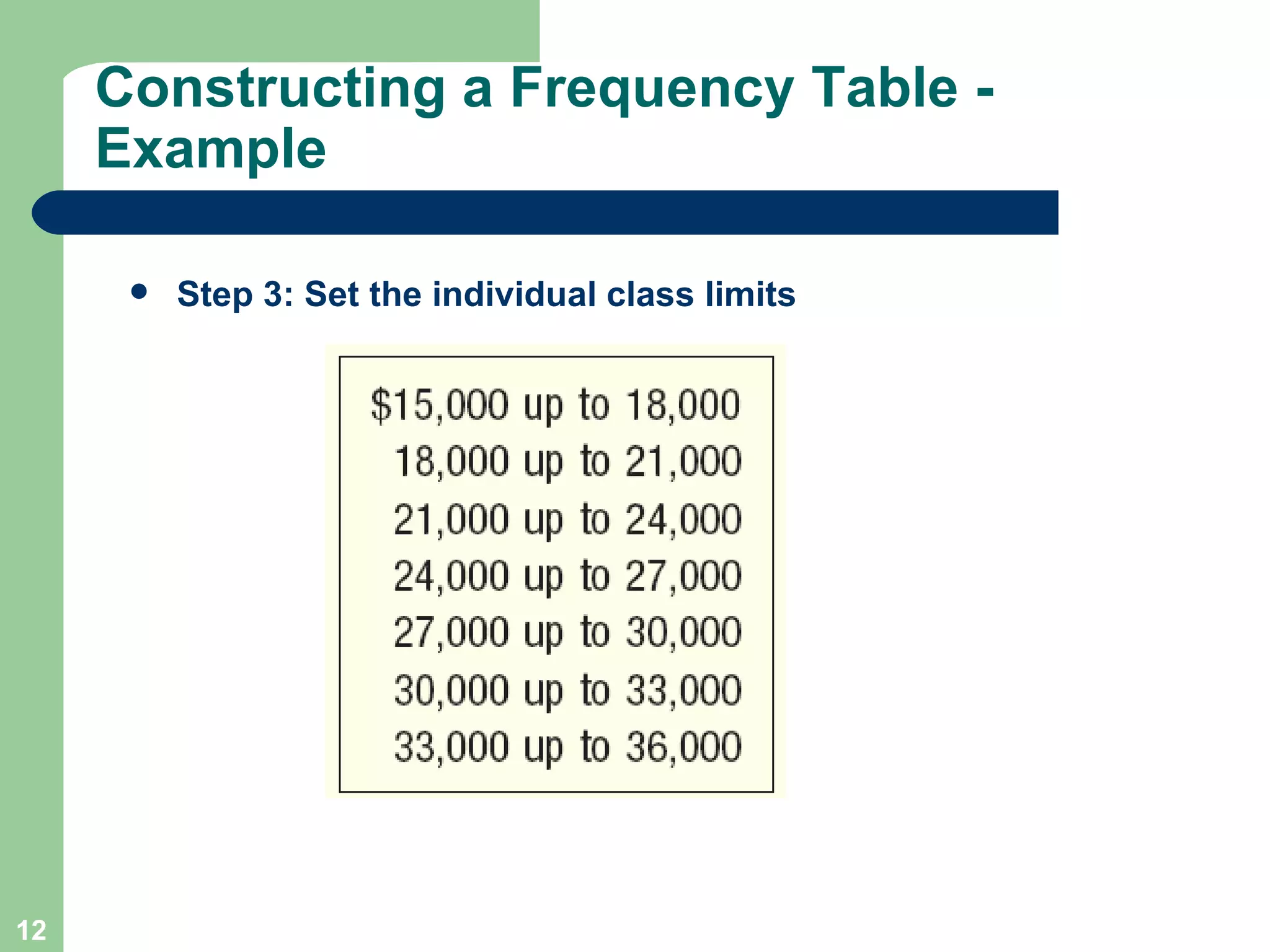
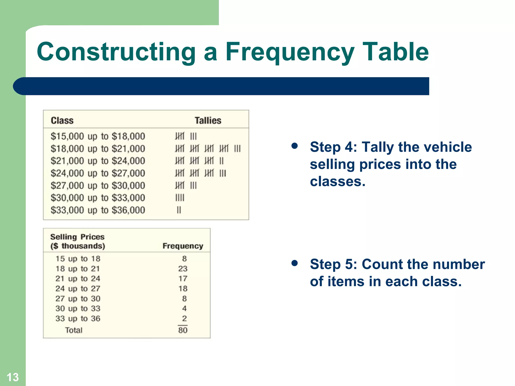
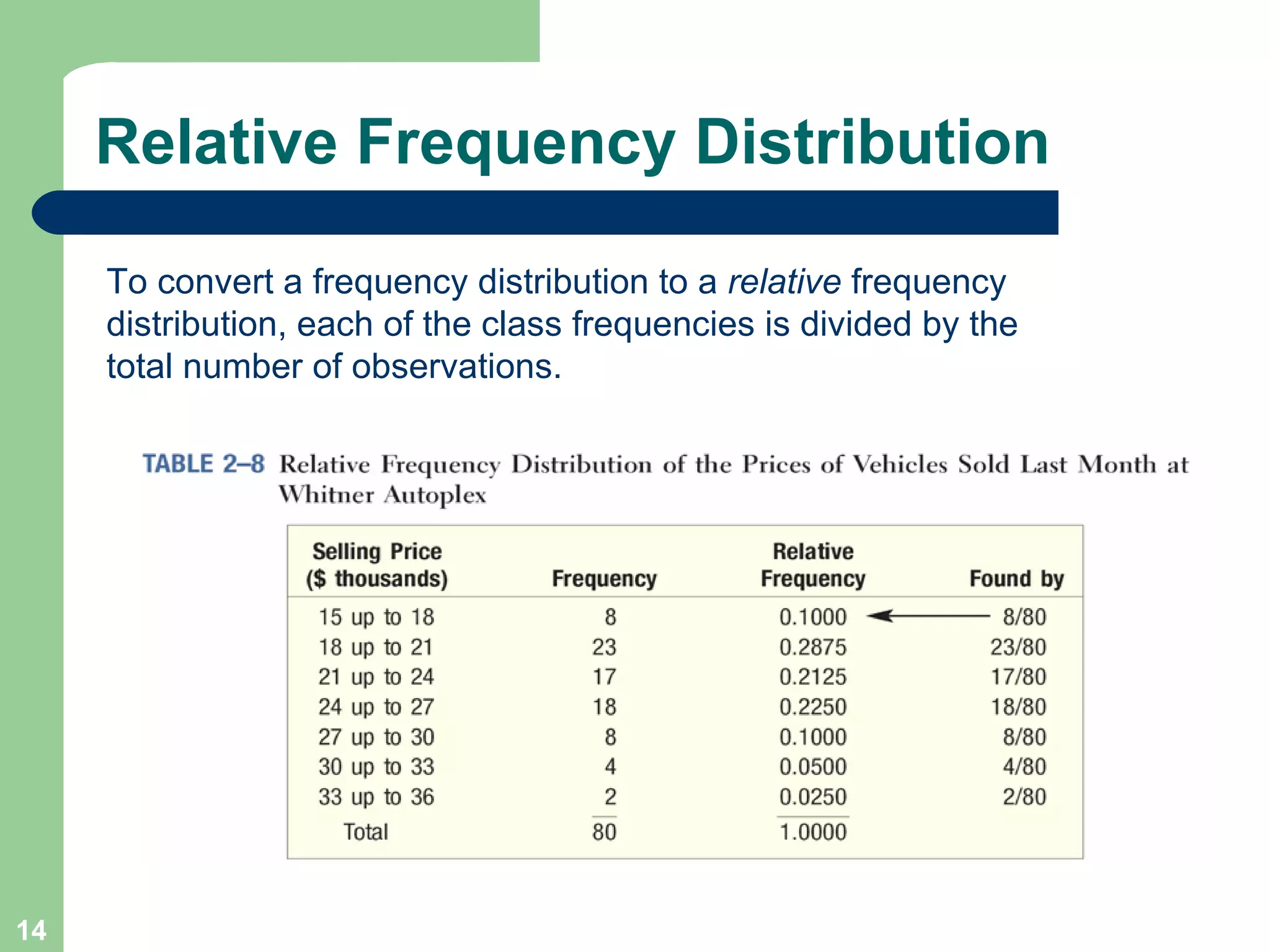
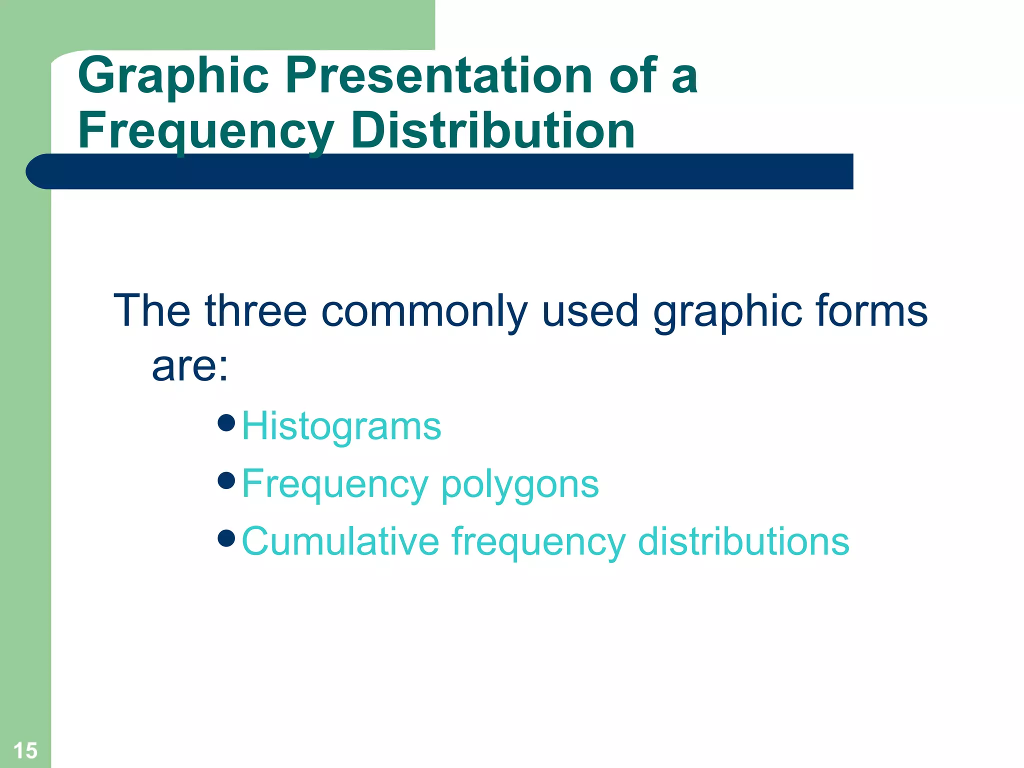
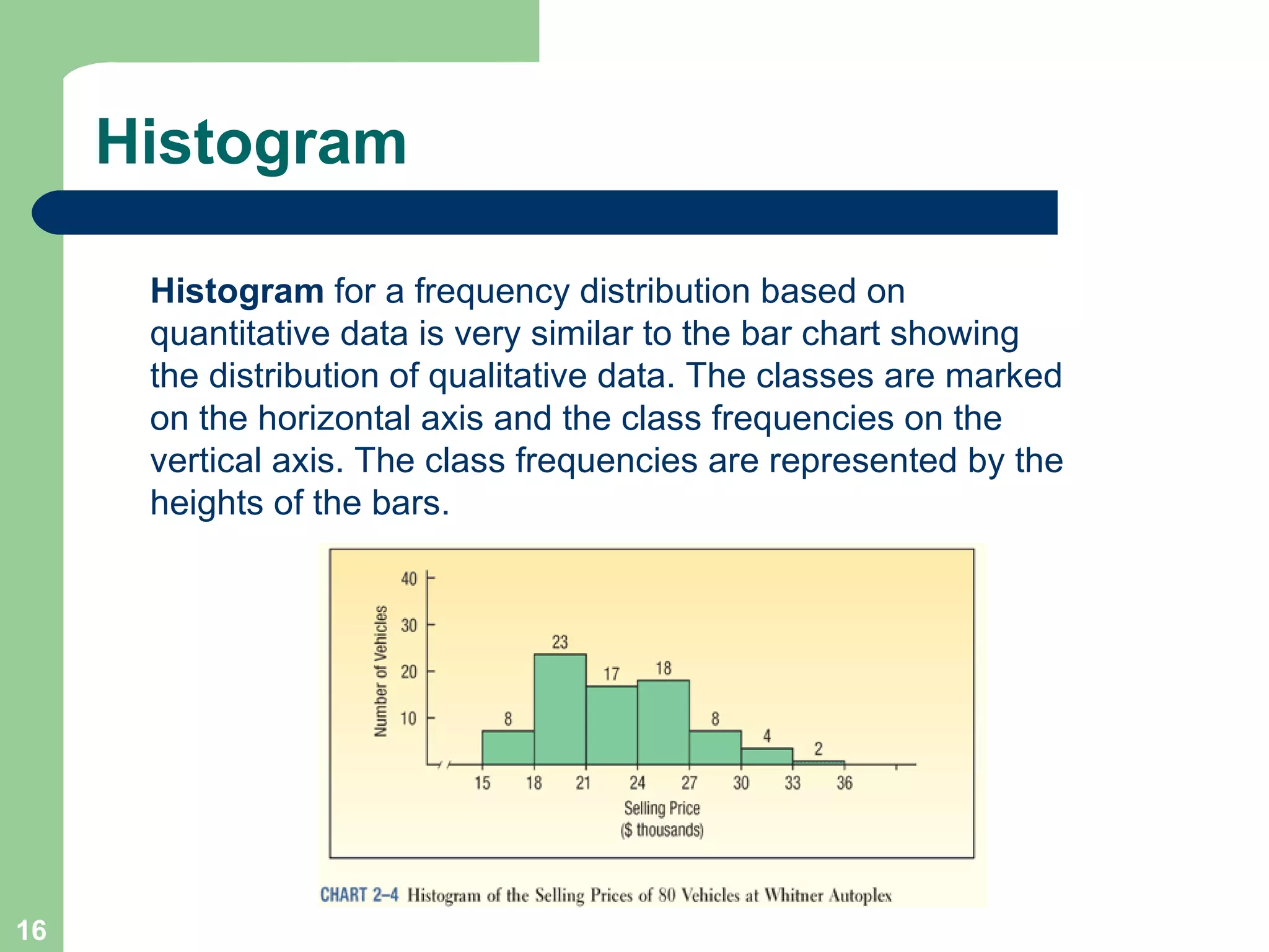
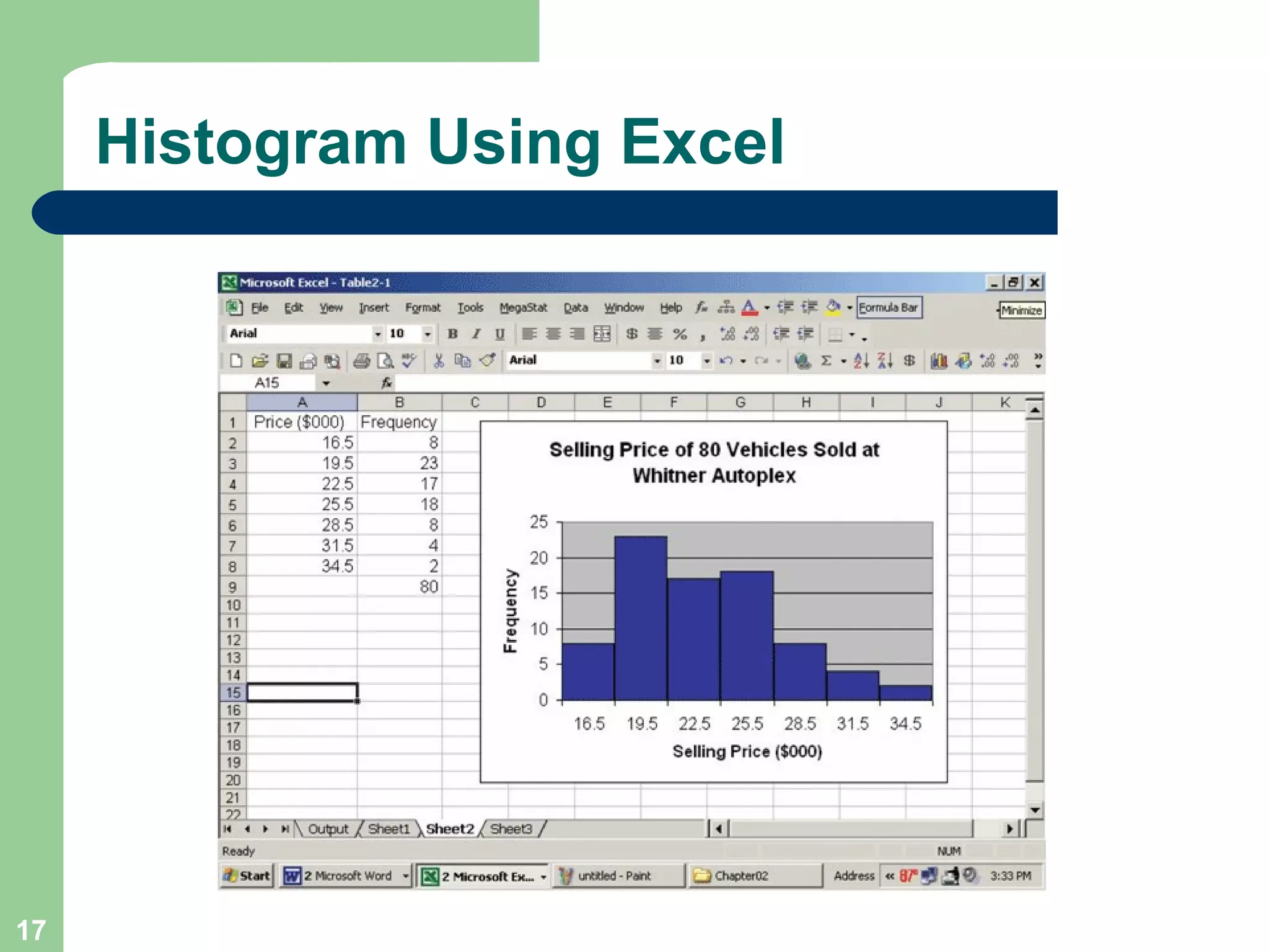
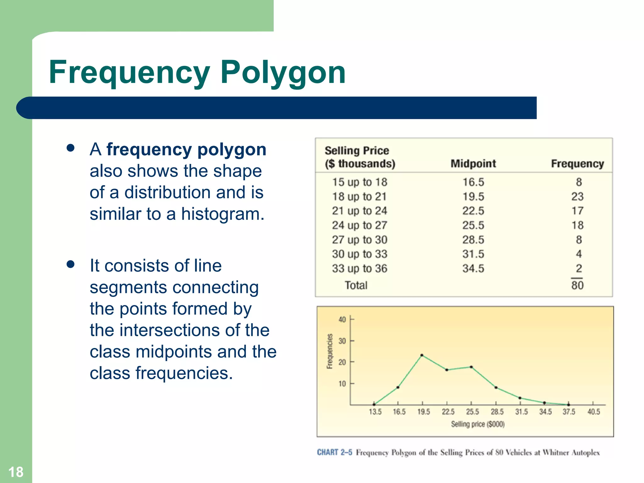
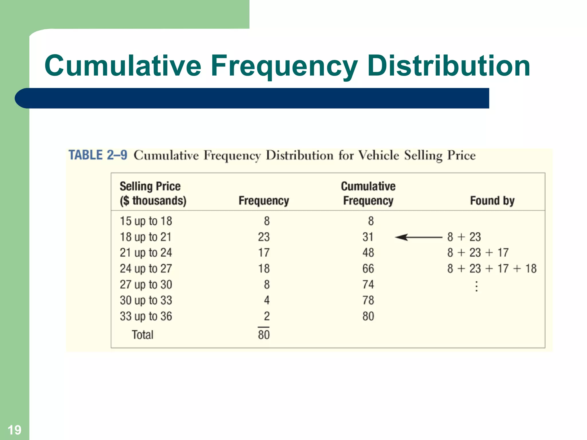
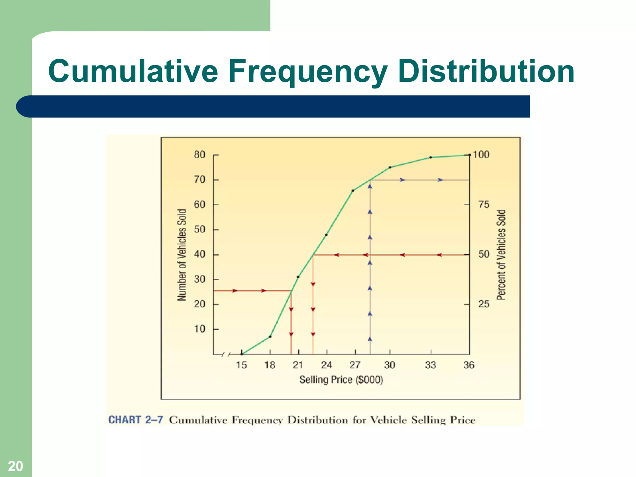
Describing Data: Frequency Tables, Frequency Distributions, and Graphic Presentation Chapter 2
GOALS Organize qualitative data into a frequency table. Present a frequency table as a bar chart or a pie chart. Organize quantitative data into a frequency distribution. Present a frequency distribution for quantitative data using histograms, frequency polygons, and cumulative frequency polygons.
Bar Charts
Pie Charts
Pie Chart Using Excel
Frequency Distribution A  Frequency distribution   is a grouping of data into mutually exclusive categories showing the number of observations in each class.
Frequency Table
Relative Class Frequencies Class frequencies can be converted to  relative class frequencies  to show the fraction of the total number of observations in each class.  A relative frequency captures the relationship between a class total and the total number of observations.
Frequency Distribution Class midpoint:  A point that divides a class into two equal parts.  This is the average of the upper and lower class limits.  Class frequency:   The number of observations in each class. Class interval:   The class interval is obtained by subtracting the lower limit of a class from the lower limit of the next class.
EXAMPLE – Creating a Frequency Distribution Table Ms. Kathryn Ball of AutoUSA wants to develop tables, charts, and graphs to show the typical selling price on various dealer lots. The table on the right reports only the price of the 80 vehicles sold last month at Whitner Autoplex.
Constructing a Frequency Table - Example Step 1: Decide on the number of classes.  A useful recipe to determine the number of classes ( k ) is the “2 to the  k  rule.”  such that 2 k   >  n . There were 80 vehicles sold. So  n =  80. If we try  k =  6, which means we would use 6 classes, then 2 6   = 64, somewhat less than 80. Hence, 6 is not enough classes. If we let  k =  7, then 2 7   128, which is greater than 80. So the recommended number of classes is 7. Step 2: Determine the class interval or width.  The formula is:  i    (H-L)/k  where  i  is the class interval,  H  is the highest observed value,  L  is the lowest observed value, and  k  is the number of classes. ($35,925 - $15,546)/7 = $2,911 Round up to some convenient number, such as a multiple of 10 or 100. Use a class width of $3,000
Step 3: Set the individual class limits Constructing a Frequency Table - Example
Step 4: Tally the vehicle selling prices into the classes. Step 5: Count the number of items in each class. Constructing a Frequency Table
Relative Frequency Distribution To convert a frequency distribution to a  relative  frequency distribution, each of the class frequencies is divided by the total number of observations.
Graphic Presentation of a Frequency Distribution The three commonly used graphic forms are: Histograms Frequency polygons Cumulative frequency distributions
Histogram Histogram  for a frequency distribution based on quantitative data is very similar to the bar chart showing the distribution of qualitative data. The classes are marked on the horizontal axis and the class frequencies on the vertical axis. The class frequencies are represented by the heights of the bars.
Histogram Using Excel
Frequency Polygon A  frequency polygon  also shows the shape of a distribution and is similar to a histogram. It consists of line segments connecting the points formed by the intersections of the class midpoints and the class frequencies.
Cumulative Frequency Distribution
End of Chapter 2

Chapter 02

  • 1.
    Describing Data: FrequencyTables, Frequency Distributions, and Graphic Presentation Chapter 2
  • 2.
    GOALS Organize qualitativedata into a frequency table. Present a frequency table as a bar chart or a pie chart. Organize quantitative data into a frequency distribution. Present a frequency distribution for quantitative data using histograms, frequency polygons, and cumulative frequency polygons.
  • 3.
  • 4.
  • 5.
  • 6.
    Frequency Distribution A Frequency distribution is a grouping of data into mutually exclusive categories showing the number of observations in each class.
  • 7.
  • 8.
    Relative Class FrequenciesClass frequencies can be converted to relative class frequencies to show the fraction of the total number of observations in each class. A relative frequency captures the relationship between a class total and the total number of observations.
  • 9.
    Frequency Distribution Classmidpoint: A point that divides a class into two equal parts. This is the average of the upper and lower class limits. Class frequency: The number of observations in each class. Class interval: The class interval is obtained by subtracting the lower limit of a class from the lower limit of the next class.
  • 10.
    EXAMPLE – Creatinga Frequency Distribution Table Ms. Kathryn Ball of AutoUSA wants to develop tables, charts, and graphs to show the typical selling price on various dealer lots. The table on the right reports only the price of the 80 vehicles sold last month at Whitner Autoplex.
  • 11.
    Constructing a FrequencyTable - Example Step 1: Decide on the number of classes. A useful recipe to determine the number of classes ( k ) is the “2 to the k rule.” such that 2 k > n . There were 80 vehicles sold. So n = 80. If we try k = 6, which means we would use 6 classes, then 2 6 = 64, somewhat less than 80. Hence, 6 is not enough classes. If we let k = 7, then 2 7 128, which is greater than 80. So the recommended number of classes is 7. Step 2: Determine the class interval or width. The formula is: i  (H-L)/k where i is the class interval, H is the highest observed value, L is the lowest observed value, and k is the number of classes. ($35,925 - $15,546)/7 = $2,911 Round up to some convenient number, such as a multiple of 10 or 100. Use a class width of $3,000
  • 12.
    Step 3: Setthe individual class limits Constructing a Frequency Table - Example
  • 13.
    Step 4: Tallythe vehicle selling prices into the classes. Step 5: Count the number of items in each class. Constructing a Frequency Table
  • 14.
    Relative Frequency DistributionTo convert a frequency distribution to a relative frequency distribution, each of the class frequencies is divided by the total number of observations.
  • 15.
    Graphic Presentation ofa Frequency Distribution The three commonly used graphic forms are: Histograms Frequency polygons Cumulative frequency distributions
  • 16.
    Histogram Histogram for a frequency distribution based on quantitative data is very similar to the bar chart showing the distribution of qualitative data. The classes are marked on the horizontal axis and the class frequencies on the vertical axis. The class frequencies are represented by the heights of the bars.
  • 17.
  • 18.
    Frequency Polygon A frequency polygon also shows the shape of a distribution and is similar to a histogram. It consists of line segments connecting the points formed by the intersections of the class midpoints and the class frequencies.
  • 19.
  • 20.
  • 21.