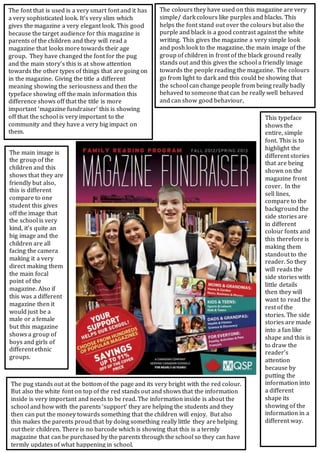
1. The colours they have used on this magazine are very
simple/ dark colours like purples and blacks. This
helps the font stand out over the colours but also the
purple and black is a good contrast against the white
writing. This gives the magazine a very simple look
and posh look to the magazine, the main image of the
group of children in front of the black ground really
stands out and this gives the school a friendly image
towards the people reading the magazine. The colours
go from light to dark and this could be showing that
the school can change people from being really badly
behaved to someone that can be really well behaved
and can show good behaviour,
The main image is
the group of the
children and this
shows that they are
friendly but also,
this is different
compare to one
student this gives
off the image that
the school is very
kind, it’s quite an
big image and the
children are all
facing the camera
making it a very
direct making them
the main focal
point of the
magazine. Also if
this was a different
magazine then it
would just be a
male or a female
but this magazine
shows a group of
boys and girls of
different ethnic
groups.
This typeface
shows the
entire, simple
font. This is to
highlight the
different stories
that are being
shown on the
magazine front
cover. In the
sell lines,
compare to the
background the
side stories are
in different
colour fonts and
this therefore is
making them
standout to the
reader. So they
will reads the
side stories with
little details
then they will
want to read the
rest of the
stories. The side
stories are made
into a fan like
shape and this is
to draw the
reader’s
attention
because by
putting the
information into
a different
shape its
showing of the
information in a
different way.
The pug stands out at the bottom of the page and its very bright with the red colour.
But also the white font on top of the red stands out and shows that the information
inside is very important and needs to be read. The information inside is about the
school and how with the parents ‘support’ they are helping the students and they
then can put the money towards something that the children will enjoy. But also
this makes the parents proud that by doing something really little they are helping
out their children. There is no barcode which is showing that this is a termly
magazine that can be purchased by the parents through the school so they can have
termly updates of what happening in school.
The font that is used is a very smart font and it has
a very sophisticated look. It’s very slim which
gives the magazine a very elegant look. This good
because the target audience for this magazine is
parents of the children and they will read a
magazine that looks more towards their age
group. They have changed the font for the pug
and the main story’s this is at show attention
towards the other types of things that are going on
in the magazine. Giving the title a different
meaning showing the seriousness and then the
typeface showing off the main information this
difference shows off that the title is more
important ‘magazine fundraiser’ this is showing
off that the school is very important to the
community and they have a very big impact on
them.