
Recommended
More Related Content
What's hot
What's hot (19)
Viewers also liked
Viewers also liked (18)
Similar to School magazine annalasyse
Similar to School magazine annalasyse (20)
Recently uploaded
Recently uploaded (20)
School magazine annalasyse
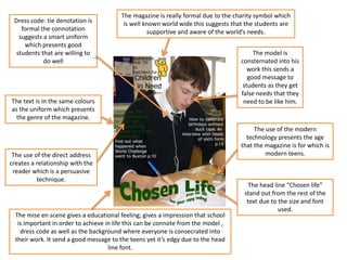
- 1. Dress code: tie denotation is formal the connotation suggests a smart uniform which presents good students that are willing to do well The head line “Chosen life” stand out from the rest of the text due to the size and font used. The text is in the same colours as the uniform which presents the genre of the magazine. The magazine is really formal due to the charity symbol which is well known world wide this suggests that the students are supportive and aware of the world’s needs. The model is consternated into his work this sends a good message to students as they get false needs that they need to be like him. The use of the modern technology presents the age that the magazine is for which is modern teens.The use of the direct address creates a relationship with the reader which is a persuasive technique. The mise en scene gives a educational feeling; gives a impression that school is important in order to achieve in life this can be connote from the model , dress code as well as the background where everyone is consecrated into their work. It send a good message to the teens yet it’s edgy due to the head line font.
- 2. The head line stands out from the background yet it creates a nice contrast as the colour yellow is used more than once. The colour yellow is for happy people. Mostly warm and friendly, yellow usually works best as a companion to other colours. Yellow is a symbol of joy and delight which is a good association with a school magazine. The direct gaze shows the model’s confidence and it creates a positive relationship with the readers at the same time it creates a false needs of “I WANT TO GO TO THIS SCHOOL”. The models smile creates a positive atmosphere which is encouraging for other students. Website link shows that the magazine is aware of modern technology meaning that people can access the information online too. The date suggests that the magazine is annual newsletter. The cover lines suggest that the audience are teens ages 11+ however, the are some information for a parents too. Dress code is really formal which suggest the genre (school magazine). Barcode suggest that the magazine is for sell.
- 3. The head line informs that the magazine is for parents this can be infer from the language technique of direct address : “choosing a school for your child”. The models of the magazine are from multi ethnic backgrounds which makes the magazine more reliable and convincing. The direct gaze shows that the children are confident in what they are doing which encourages the parents to buy the magazine as it creates a false needs of wanting their children to be like them. The colour red symbolises warning so the connotation of this could be that it warns parents about the importance of school. The colours contrast nicely with each other Barcode presents that the magazine is for sell
- 4. The head line font is stereotypically associated with a school team. This idea has been used in movies such as “Old School”. The heal line stands out from the rest of the image due to the bold font and the black colour which makes the magazine look formal (present the genre) however the blue filter behind it makes the font edgy which suggests it’s for modern audience. The date suggests it’s a monthly edition. The model uses the direct address which presents self- confidence. However, the other eye is hidden under the models hair the connotation of this could be that the model has two sides which makes the magazine more mysterious and thrilling to read. The price shows that the magazine is not necessary in a good condition OR this is done on purpose to address the target audience. The mise en scene gives an impression of casualty which creates a sense of false needs by suggesting that the hard work is not that much important for achievement OR again it’s just to make the target audience more interested into “school” magazine. The colour stand out which makes the magazine eye catchy and more engaging. The orange outlines the important information which informs the reader more easily of what’s inside.
- 5. The mise en scene is minimalistic; this makes the magazine quite simple and formal. The head line looks really artistic but at the same time its very simple it look like it was drawn (maybe by a student?). The direct gaze suggest that the model is confident and pound of his results. The GSCE book suggests the age group that the magazine is for probably 11-18 as it not only talk about GSCE’s but A-level too. The website show that the magazine is aware of social media. The background is simplistic but it shows the books behind the model the denotation of this could be school. However, the background look a little like from a children 3+ cartoon. The dress code is casual which presents modern teens.
- 6. The contents page looks simple however, it’s well detailed The colours makes nice contrast between each other and thy give a formal impression The page references are eye catchy due to the size and type of font used The images are simple with both models having a direct gaze suggesting they are confident in what they are doingThe use of mise en scene gives an impression it’s a teenagers magazine The information given on the contents page are detailed but not too detailedThe colours (purple) are feminine suggesting that the magazine is for female?
- 7. Audience Research Things included in school magazine Tally Key events coming up, for example trips IIIII IIIII IIIII II Pictures of students IIIII III Students Achievements III Key events from the past III School information's I School details I University information's III
- 8. AS Media Studies Preliminary Task – School Magazine Front Page Proposal Form Target audience: (age range and interests) The audience range will be 16-18 and this is because my magazine will be aimed at six formers. This will be easier for me to pick the topics that magazine should have inside as well as this age range will have similar interest as the age gap between them is not big Possible Titles ideas: (masthead/ title block) • Douglass Times • DQ (Douglass Quality) • BD (Bishop Douglass) Main image: An image of students (six formers) having a good time with a direct gaze for them to create a relationship with the reader Main cover line: • Head Boy and Head Girl results • Best Art Work • Style? • University Time • A-Level lost year results! Additional Key images: An image of the ‘Best Art Work’ which will be mentioned on the Front page as a cover line. Moreover, an image with students (the same as the in the front page) having a good time Typography: (sizne, font, colour) Colour: • Black = is formal and the meaning of black is energy which is important in school • Yellow = its eye catchy as it stand out from the rest of the background and also yellow is associated with joy and happiness which gives a good impression of school and the atmosphere • Blue = the meaning of blue is stability , it symbolises trust, loyalty, wisdom, confidence, intelligence, faith, truth, and heaven and this futures are important in a school magazine as it gives an good impression and send a positive message to young readers • White = it creates nice contrast with the rest of the colours (mainly black) and is associated with purity • Size font = 14 , 16, 25 and 59 • Font: Adobe Arabic, Calibri (body) and Background colour/ image: The magazine should be simple not too eyes catchy in order for the audience to concentrate on models and main cover lines Technical consideration: Models have to be dressed formally (school uniform) I may add some stickers that are associated with school in order to show the genre of the magazine
- 9. Below start to sketch what the front cover of my magazine will look like.
- 10. Contents page ideas I decided to pick this layout of my contents page as it looks more neat and professional. Moreover, there will be more space for the articles and they would more eye catchy rather than the image as it’s placed on the left side which is were the reader looks first. Here is my first and second example on a contents page, my first example doesn't look professional enough for a school magazine.
- 13. Notes on the process Here are some of the images that I was considering to choice as the front cover due to the nice atmosphere and models smiling and laughing. However, I found this images not professional enough as the not all models had a direct gaze , the angel of the photography wasn't correct etc.… I choice this image as all the model have direct gaze which shows their confidence in what they are doing, they look professional and very smart as well as the angel that the image is taking place is better than the rest which means it’s easier to work with.
- 14. How did I change the pictures? I used a Pick Monkey editor as I found it easy and simple to work with, I Photoshop the image and placed the master head using this program. However, main cover lines were mainly created on PowerPoint as I found the font the most formal and suitable for school magazine. I decided that my master head would be in this font as its associated with a American school logos and its visible in movies which should represent the convection of my magazine easily.
- 15. Steps of making Here is the original image of my front cover. I believed that the lighting was too dark and quite doll therefore I decided to change it. Also I decided to make the master head and one of the main covers in the same font as creates a nice contrast and it makes the uninteresting place interesting. My step 3 was about adding cover lines and making them stand out from the rest of the background. My results.
- 16. Brief This project was about creating a front cover and a contents page of a school magazine. The front cover as well as the images that I used in my contents page had to include medium shots of students or anything else that is associated with school. This was the practice that should inform me about what work and what doesn't work in order for me to be able to improve / makes better later on.
- 17. What have I learned? From this experiment I have found out that a too light background is difficult to work with as the colours later on for cover lines blend together which makes it invisible. Also, I learned how the layout of the Front cover should look in order to look like a magazine for teenagers. Also, I learned that by using Pick Monkey I cant manipulate the image as much as I would be able on Photoshop and therefore, in future I will use Photoshop instead. This will allow my Front cover to look even more professional.