
More Related Content


Similar to MOJO Magazine Double-Page Spread Analysis


MOJO Magazine Double-Page Spread Analysis
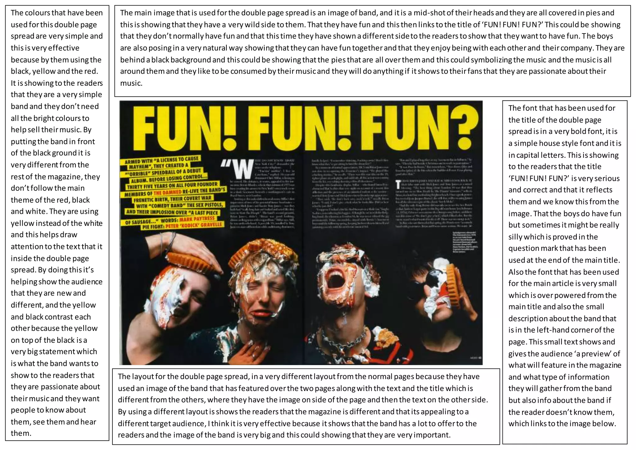
- 1. The main imagethatis usedforthe double page spreadis an image of band,and itis a mid-shotof theirheadsandtheyare all coveredinpiesand thisisshowingthattheyhave a verywildside tothem.Thattheyhave funand thisthenlinkstothe title of ‘FUN!FUN! FUN?’ Thiscouldbe showing that theydon’tnormallyhave funandthat thistime theyhave shownadifferentsidetothe readerstoshowthat theywantto have fun.The boys are alsoposingina verynatural way showingthattheycan have funtogetherandthat theyenjoybeingwitheachotherand theircompany.Theyare behindablackbackgroundand thiscouldbe showingthatthe piesthatare all overthemand thiscouldsymbolizingthe music andthe musicisall aroundthemand theylike tobe consumedbytheirmusicand theywill doanythingif itshowstotheirfansthat theyare passionate abouttheir music. The coloursthat have been usedforthisdouble page spreadare verysimple and thisisveryeffective because bythemusingthe black,yellowandthe red. It isshowingtothe readers that theyare a verysimple bandand theydon’tneed all the brightcoloursto helpsell theirmusic.By puttingthe bandin front of the blackgroundit is verydifferentfromthe restof the magazine,they don’tfollowthe main theme of the red,black and white.Theyare using yellowinsteadof the white and thishelpsdraw attentiontothe textthat it inside the double page spread.By doingthisit’s helpingshowthe audience that theyare newand different,andthe yellow and blackcontrast each otherbecause the yellow on topof the black isa verybigstatementwhich iswhat the band wantsto showto the readersthat theyare passionate about theirmusicand theywant people toknowabout them,see themandhear them. The font that hasbeenusedfor the title of the double page spreadisin a veryboldfont,itis a simple house style fontanditis incapital letters.Thisisshowing to the readersthat the title ‘FUN!FUN! FUN?’ isveryserious and correct andthat it reflects themand we knowthisfromthe image.Thatthe boysdo have fun but sometimesitmightbe really sillywhichisprovedinthe questionmarkthathas been usedat the endof the maintitle. Alsothe fontthat has beenused for the mainarticle isverysmall whichisoverpoweredfromthe maintitle andalsothe small descriptionaboutthe bandthat isin the left-handcornerof the page.Thissmall textshowsand givesthe audience ‘apreview’of whatwill feature inthe magazine and whattype of information theywill gatherfromthe band but alsoinfoaboutthe band if the readerdoesn’tknowthem, whichlinkstothe image below. The layoutfor the double page spread,ina verydifferentlayoutfromthe normal pagesbecause theyhave usedan image of the band that hasfeaturedoverthe twopagesalongwiththe textand the title whichis differentfromthe others,where theyhave the image onside of the page andthenthe texton the otherside. By usinga differentlayoutisshowsthe readersthatthe magazine isdifferentandthatitsappealingtoa differenttargetaudience,Ithinkitisveryeffective because itshowsthatthe band has a lotto offerto the readersandthe image of the band isverybigand thiscould showingthattheyare veryimportant.