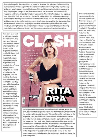
1. The main image forthe magazine isan image of ‘RitaOra’ she is known forherrevelling
outfitsandlotsof make-upbutforthisfrontcovershe isn’twearinghardlyanymake-up
and she iswearinga verysimple blackdress.Thiscouldbe showingthatthe magazine is
verysimple itgetsstraighttothe pointandit makesthe musicthat mainpointof the
magazine notthe modelsandartiststhat feature init.Alsointhe frontcover she isposing
on a tiger-printchairandinfront of a fluffypinkbackground.Thiscouldbe showingthe
audience thatthe magazine isintouchwiththe oldermusic,like the 80’s due to the fluffy
and background.She isalsoposingina verysimple pose showingthatshe isa veryserious
artistsand that hermusicis veryimportanttoher.In the descriptionbelowheritsays
‘destinyiscallingRitaOra’thiscouldreflectherfacial expressionandheroutfitshowing
that she isreadyto become densityandthisiswhatmagazine bringsforthe readers.
The informationthat
has beenusedinthe
sell linesisverylittle.
Theyhave onlyon sell
line andthat doesn’t
give muchinformation
it onlytellsthe readers
aboutthe artiststhat
feature inthe
magazine,orthey
couldbe artists that
relate to‘Rita Ora’so
it couldbe a way into
makingthe readers
wantto buy the
magazine due tothe
fact that these artists
mightbe mentioned
and featuredinthe
magazine.Bynot
givingmuch
informationawayitis
showingtothe readers
that the magazine
doesn’tlike togive
spoilersthatitwants
to keepthe readers
thinkingandguessing
aboutwhat could
feature inthe
magazine.Underthe
image of ‘RitaOra’ the
onlyothertextthat
have isthe title that is
‘RitaOra’ thisis
showingtothe readers
that theyaren’tgoing
to give much
informationaway
aboutRita Ora but
that theywill wentto
the readersto findout
for themselves.
Theyhave useda lot
of differentfontsfor
the front cover,they
have useda simple
sans serif fontforthe
informationthatwill
feature inthe
magazine andthena
verybold.Blockyfont
for the title of the
magazine because
thisshowsthat the
magazine isvery
simple itdoesn’thave
a fancy font,it
straightto the point
inexplainingthe
magazine.The last
fontthat theyhave
usedisthe same font
for the title butthey
have addeda shadow
behindthe textto
make it looklike it
was in3D thisgives
the magazine edge
showingthatRitaOra
isthe mainfocusof
the front coverand
alsothe textis onthe
left-handsideof the
page and thisis
where people eyes
will automaticallygo
whenreadingthe
magazine soby using
the textin boldand
witha shadowingitis
drawingthe most
attention.
The magazinescolourtheme forthisfrontcoveris black,white and
pink.Because the backgroundispinkandthenthe outfit,the chairand
the fontare all in blackand white.Thisisdifferentforeachissue of the
magazine,theydon’thave the same colourscheme butthe title will
alwaysbe inwhite because that’sthe mostrecognisable feature about
the magazine.Theyhave usedthe pinkbackgroundbecause itreally
contrastswell withthe blackdressthatRita Ora is wearingbutalsothe
shadowingthatisfeaturedinthe title of RitaOra’sname.Thishelps
draw attentiontothe informationthathasbeenshownandfeatured
inthe magazine.Because the whitetextthatisontop of the main
image isverynoticeable becausethe white reallystandsoutabove the
pinkbackground.